Learn how to adjust button styles to fit your brand and improve usability.
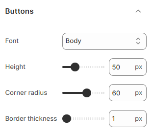
Buttons are crucial for navigation, calls to action, and customer engagement. Customizing their appearance allows you to make them stand out or blend seamlessly with your site's design.
How to access Button settings
Steps:
In the theme editor (Customize), click Theme settings.
Locate Buttons.
Enter the tags you want to show as badges.
Click Save.
Buttons settings options
Font
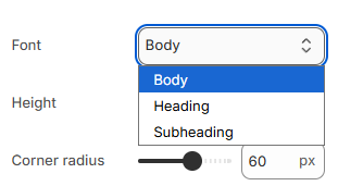
Choose a font for your button text. Options include Body, Heading, and Subheading, letting you match your buttons to the rest of your store’s text style.
Height
Set the height of your buttons from 40px to 80px.
Larger buttons stand out more, while smaller ones fit into compact designs.
Corner radius
Adjust the roundness of your button corners from 0px (sharp) to 60px (rounded).
Rounded corners give a modern look, while sharp corners keep things more traditional.
Border thickness
Set the border thickness between 1px and 4px.
Thicker borders make buttons more prominent, while thinner borders create a subtle, clean appearance.