
Theme Sections
Collection list: Flex carousel
2 min read
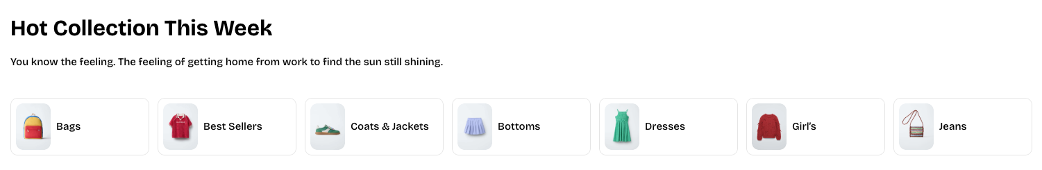
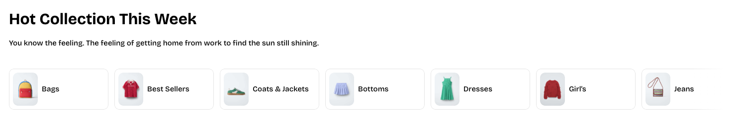
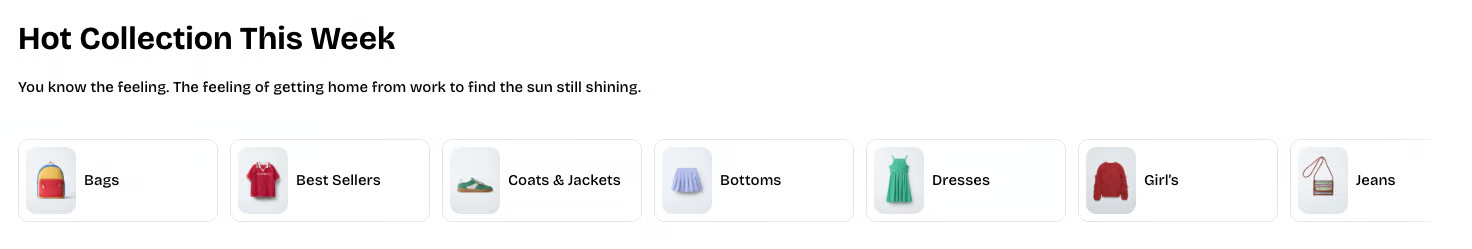
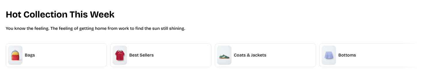
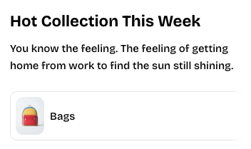
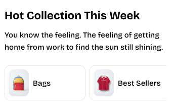
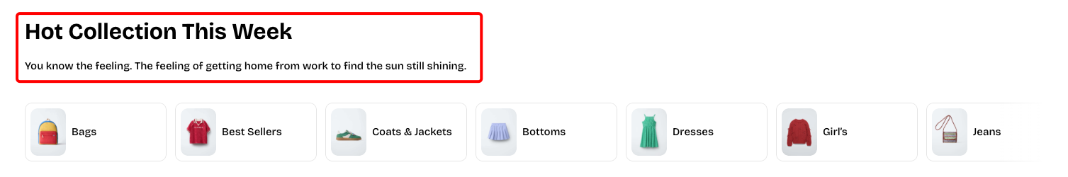
_g1EXx5Bx.jpg)
How to add a Collection list: Flex carousel section to your Shopify store
- In the theme editor (Customize), click Add section.
- Select Collection list: Flex carousel section.
- Make necessary changes.
- Save.
How to customize a Collection list: Flex carousel section
Section settings
- Container: Defines whether the section spans the full page width or stays within a fixed content width.
- Carousel settings
- Overflow content: Controls how off-screen items appear, either fully visible or with edge shadows.
- Slides per view: Sets how many collection cards are shown at once, either automatically or by a fixed column count.
- Horizontal gap: Adjusts the spacing between collection cards inside the carousel.
- Mobile layout
- Columns: Choose 1 or 2 columns on mobile.
- Horizontal gap (mobile): Controls the horizontal spacing between cards on mobile devices.
Block settings
Header
Collection item
- Collection: Selects the collection.
- Image: Allows you to upload a custom image; leave it blank to use the collection’s default image.
- Aspect ratio: Sets the shape of the image or adapts automatically based on the uploaded image.
- Title: Lets you enter a custom title; leave it blank to use the collection’s name.
- Width: Sets the display width of the collection item on desktop.
- Width mobile: Sets the display width of the collection item on mobile devices.
Image card
📝 Learn more about Image card block: Image card
Collection card
📝 Learn more about Collection card block: Collection card
Last updated