# Overview
### What is a theme section?
Theme sections are the building blocks of your Shopify storefront. Each section represents a modular piece of content—such as a banner, product list, slideshow, or testimonials—that you can add, remove, or reorder to design your pages without coding.
Every section is built from **blocks**, which control the internal content and layout of that section (e.g., headings, images, buttons, icons, videos, and more).
In Pebble, sections are highly flexible, responsive, and optimized for both design and performance.
Explore a full list of available sections in the theme editor.
### **How sections work in the theme editor**
Inside the theme editor, you can:
* **Add a section** → Choose from Pebble’s full library
* **Reorder sections** → Drag and drop to adjust page structure
* **Customize settings** → Adjust layout, appearance, and content
* **Add blocks** inside a section → [Learn more about blocks](https://docs.foxecom.com/pebble-theme/theme-blocks/overview)
* **Duplicate or remove sections** as needed.
Sections update in real time so you can preview your layout as you build.
### **Common settings available in most sections**
Although each section has its own unique features, many include a shared set of universal controls:
* [Container](#container)
* [Color Scheme](#color-scheme)
* [Border](#border)
* [Padding](#padding)
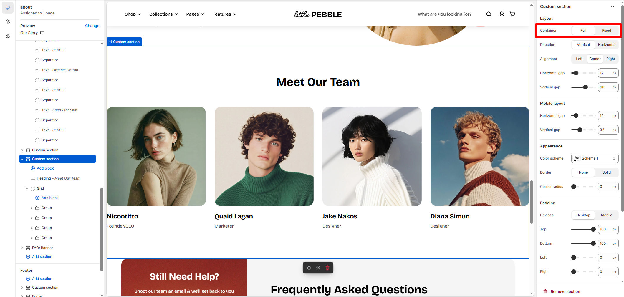
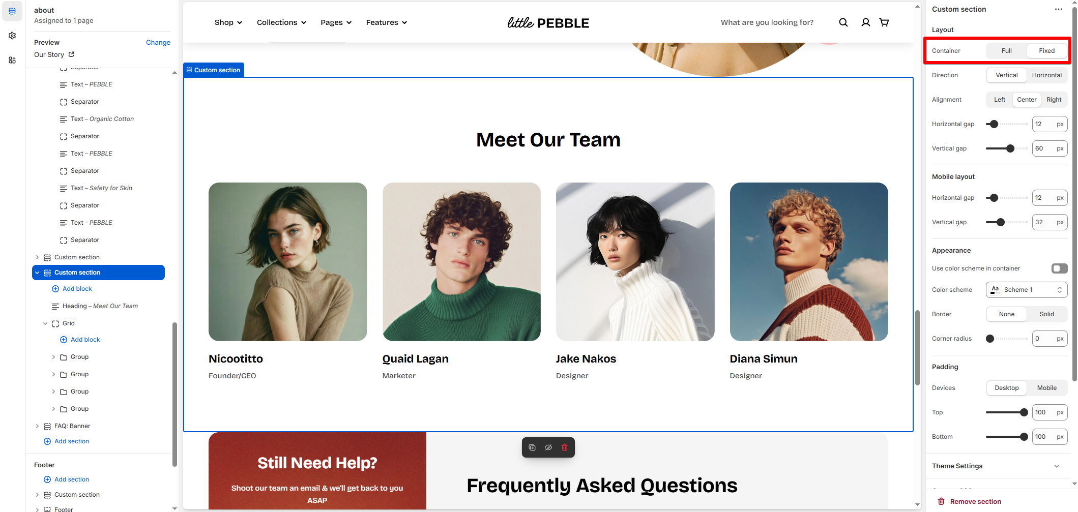
The **Container** setting controls how wide your content appears on the page.
Options:
* **Full** – Stretches the section across the full browser width.\
*Best for banners, marquees, hero sections, and full-bleed visuals.*
* **Fixed** – Keeps content within the theme's standard page width.\
*Best for text-heavy sections, product info, or content that needs consistent alignment with the rest of the page.*
Fixed width follows the **Theme settings** > [Page width](https://docs.foxecom.com/pebble-theme/theme-settings/layout#page-width).
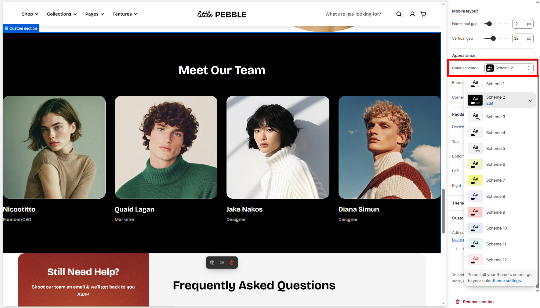
Color schemes let you quickly control section background and text contrast.
* Applies predefined color combinations from your theme settings.
* Ensures accessible contrast and consistent branding across your storefront.
*Learn more:* [Colors](https://docs.foxecom.com/pebble-theme/theme-settings/colors)
The **Border** setting adds visual definition around a section.
Options:
* **None** – No border applied.
* **Solid** – A thin, solid border around the entire section.
* Additional controls:
* **Border width**
* **Border opacity**
Padding controls the spacing *inside* the section.
**Devices:**
You can set padding for:
* Desktop
* Mobile
**Padding controls:**
* Top
* Bottom
* Left
* Right
Good padding ensures:
* Comfortable readability
* Proper breathing room around elements
* Visual consistency across sections
* Better mobile experience (reduce excessive top/bottom spacing).
### Explore Pebble sections
Hero banner
Blog posts
Collage: Editorial
Collection links: Background
Collection links: Image
Collection links: Scrolling
Collection links: Spotlight
Collection list
Collection list: Flex carousel
Collection tabs
Comparison gallery
Comparison table
Contact form
Countdown timer
Custom section
FAQ
Featured collection
Highlight text with image
Icon boxes
Image cards: Flex carousel
Images stack banner
Testimonials: Split full frame
Lookbook banner
Lookbook carousel
Masonry section
Media gallery
Newsletter
Press
Products bundle
Products bundle: Choose
Products highlight
Product highlight points
Product suggestion
Product tabs
Progress timeline
Rich text
Scrolling cards
Scrolling cards: Layered
Scrolling layers
Shop the look
Slideshow
Store locators
Testimonials
Testimonials: Split
Video cards: Flex carousel