Pebble Theme
Theme Settings

Colors

2 min read
image

One of the most important components of designing a visually appealing, functional, and accessible theme is color.

Not only does a well-designed color system reinforce a merchant’s branding, but it also has the power to enhance and improve user experiences.

How to access Colors settings

Steps:

  1. In the theme editor (Customize), click Theme settings.
  2. Locate Colors.
  3. Manage your Schemes and other element colors.
  4. Click Save.

Color schemes

What is a color scheme?

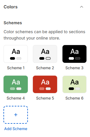
A color scheme is a set of coordinated colors used across different elements of your store.

image

In the Pebble theme, a color scheme can control:

  • Background
  • Background secondary
  • Text
  • Subtext
  • Border
  • Sale price
  • Primary button
  • Secondary button
  • Inputs (form fields)
  • Swatches (color swatch borders)
  • Notifications (Success, Error, Warning, Info, Out of Stock)
  • Progress bar

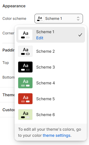
You can define different color schemes in your theme settings and apply the color schemes to different sections throughout your online store, using a color scheme picker.

Apply your color scheme

After defining your schemes, you can assign them using the Color scheme picker inside section/block settings.

image

The color scheme picker is only available in sections/blocks that support custom color schemes.

Other element colors

Badges

The Pebble theme allows you to fully customize the appearance of product badges.

Available badges:

  • New badge
  • Hot badge
  • Popular badge
  • Sale badge
  • Sold out badge

For each badge type, you can set:

  • Background color
  • Text color
To add custom badges to your store, go to Theme settings > Product badges.

Other colors

The Pebble theme also includes additional standalone color controls, such as:

  • Cart bubble background
image
image
Last updated