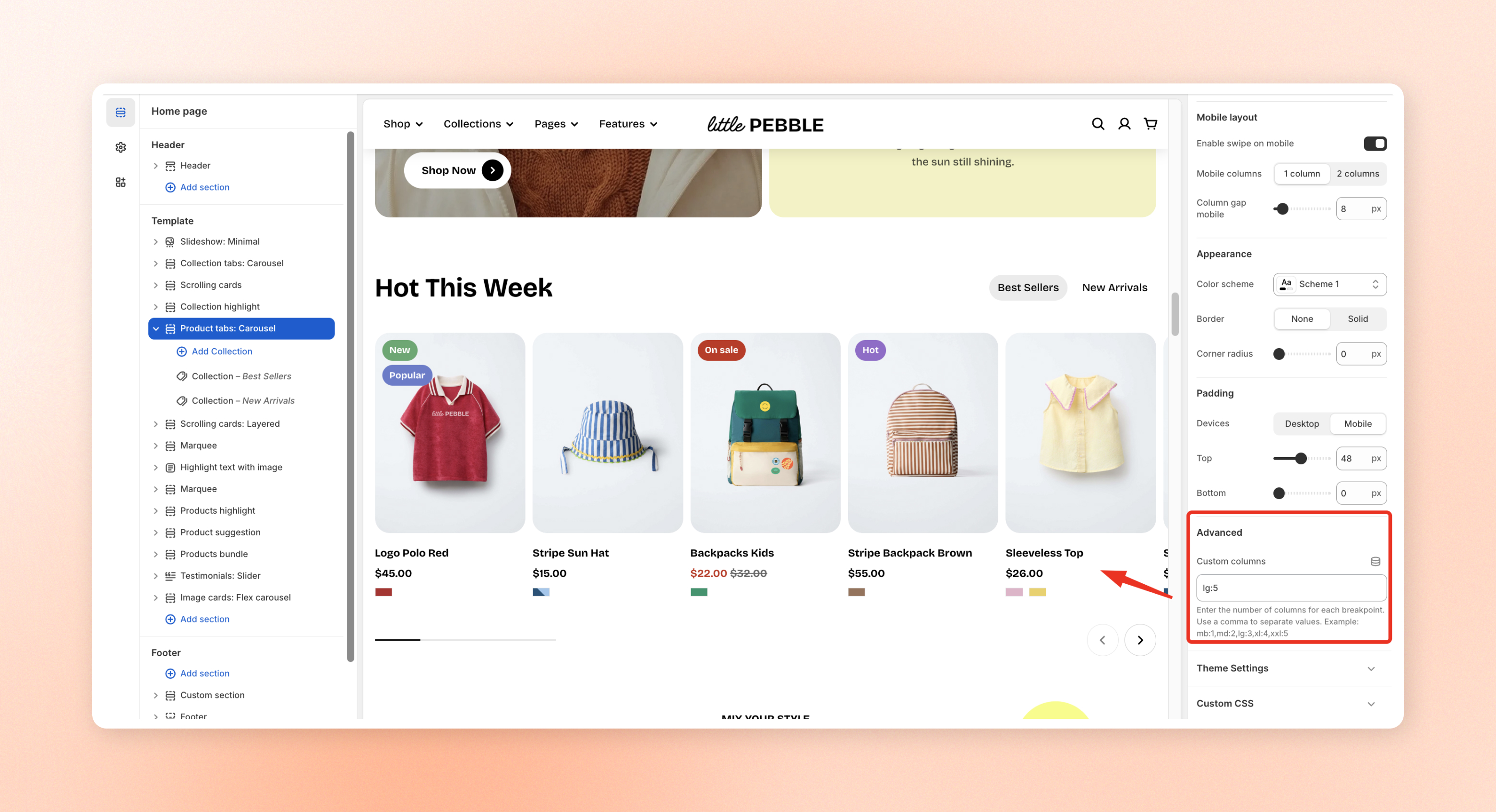
Custom columns
Configure how many columns are displayed across different screen sizes. This setting allows you to control the layout responsiveness for mobile, tablet, laptop, desktop, and large screens.
# What is a breakpoint?A breakpoint is a specific screen width where the website layout changes to adapt to different devices.
For example:
md (≥768px) means the layout settings will apply when the screen width is 768px or larger .If the screen is smaller than 768px, a smaller breakpoint (such as mb) will apply instead.
In short, breakpoints help control how your layout adjusts across different screen sizes.
Breakpoint Maximum width (.container) mb (≥576px) 540px md (≥768px) 720px lg (≥992px) 960px xl (≥1200px) 1140px xxl (≥1400px) 1320px
Container width refers to the maximum width of the main content area inside the page.
For example, when the screen is 992px wide or larger (lg) , the content area will have a maximum width of 960px .
# How to set up custom columnsIn advanced setting , enter the number of columns for each screen size (breakpoint). Separate each value with a comma.
Format: breakpoint:number
Example: mb:1,md:2,lg:3,xl:4,xxl:5
For example, mb:1,md:2,lg:3,xl:4,xxl:5 means the layout will display:
Mobile (mb): 1 column
Tablet (md): 2 columns
Laptop (lg): 3 columns
Desktop (xl): 4 columns
Large screens (xxl): 5 columns
Leave this field empty to use the theme’s default column settings.
# Supported sections for custom columnsCustom columns is available in the following sections/blocks:
Last updated about 1 month ago

_nbHBXnlc.jpg)