
Theme Sections
Slideshow
3 min read
How to add a Slideshow section to your Shopify store
- In the theme editor (Customize), click Add section.
- Select Slideshow section.
- Make necessary changes.
- Save.
How to edit the section Slideshow
Section settings
Layout
| Setting | Description |
|---|---|
| Enable header overlay | Allows the header to sit transparently over the slideshow.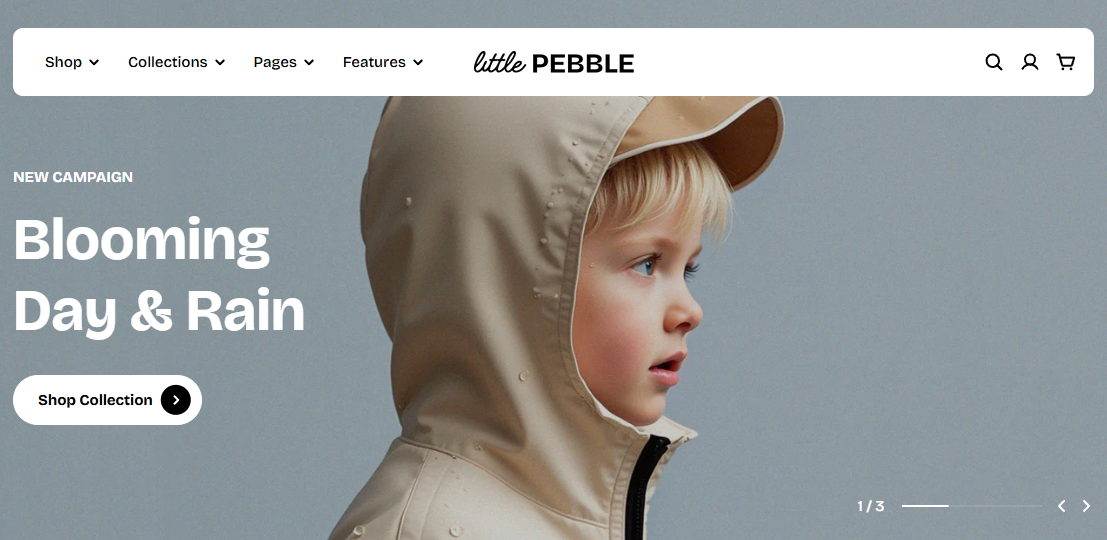 |
| Height | Controls the height of the slides. “Adapt” auto-adjusts based on the image. |
Carousel settings
| Setting | Description |
|---|---|
| Autoplay | Enables automatic slide movement. |
| Autoplay delay | Time between slides (seconds). Visible only when autoplay is ON. |
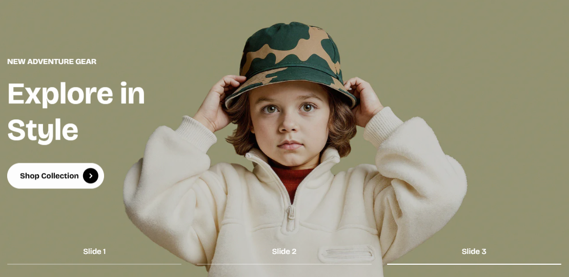
| Control type | Choose how users navigate the slideshow: Default or Progress text. |
| Control alignment | Left / center / right alignment for default controls. |
Block settings
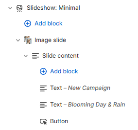
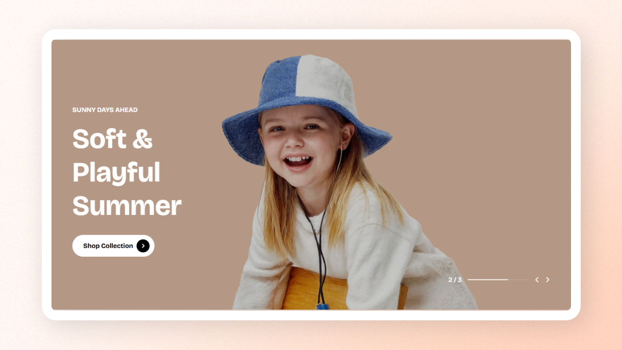
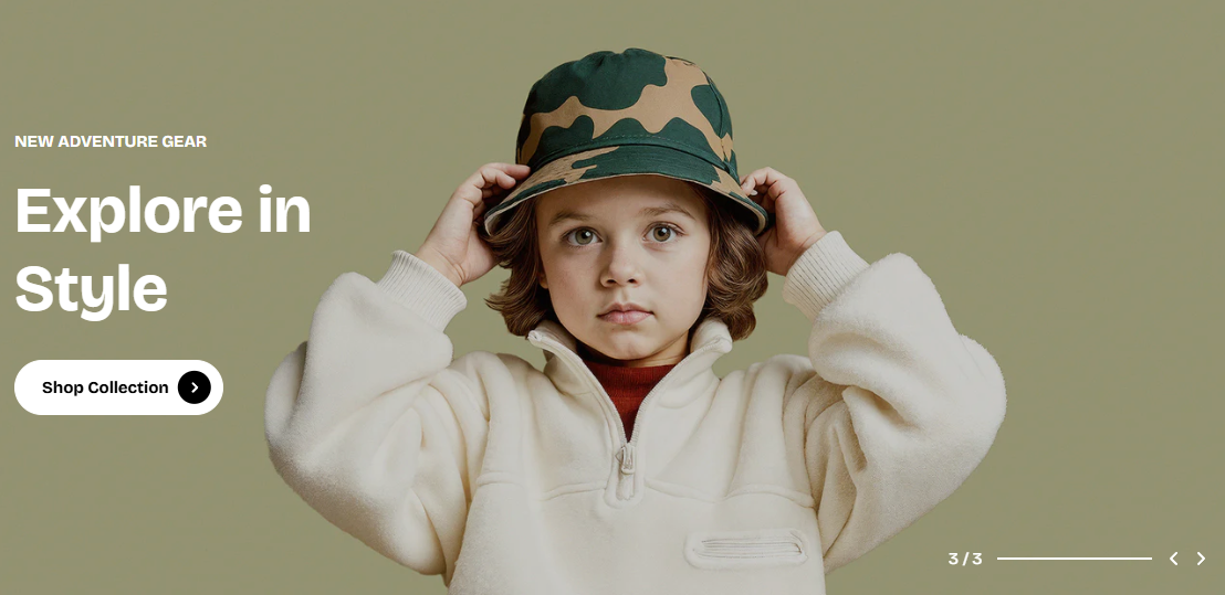
- Image slide – a hero slide using desktop/mobile images
- Video slide – a hero slide using autoplay looping video
- Slide content – the textual layer (heading, text, button, spacing, animations) that appears on top of the slide media
- Image: Upload the desktop image for the slide
- Enable overlay: Add a semi-transparent layer to improve text visibility.
- Content position: Controls where text appears over the image.
- Pagination label: The name that appears in the progress-text navigation. Useful for editorial storytelling.
- Use a mobile-specific image to avoid awkward cropping on small screens.
- Add an overlay when using busy lifestyle backgrounds to keep text readable.
- Place content where the image has natural empty space (“safe zones”).
- Video: Upload or select a Shopify-hosted video. Automatically loops, autoplays, and plays muted.
- Content position: Placement of the content area over the video.
- Pagination label: Label shown in progress-text navigation, visible only when using that control style.
- Use short videos (8–12s) to reduce load and maintain flow.
- Use clean, bright footage that loops well.
- Alignment: Select left/ center/ right alignment for the content stack.
- Row gap: Space between content blocks.
- Width: Choose content width: Fit, Fill, or Custom.
- Color scheme: Choose a scheme for the slide content. Learn more: Colors
- Transparent background: Remove the background to show only text.
| Block | Purpose |
|---|---|
| Text | Heading, paragraph, subheading — highly customizable. Learn more: theme-blocks/basic#text |
| Button | Primary, secondary, or link-styled button. Learn more: theme-blocks/basic#button |
| Spacer | Add vertical spacing between elements. |
Last updated