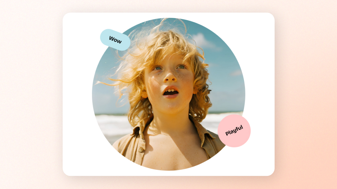
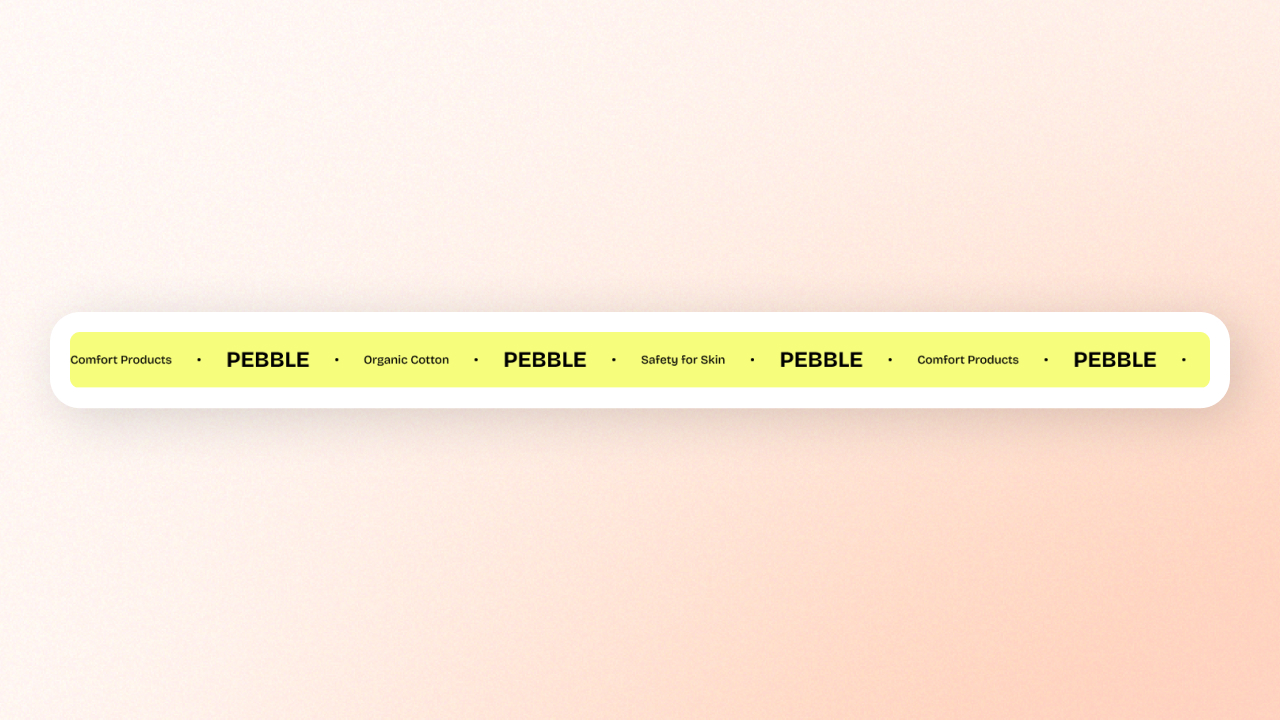
# Banners

<table data-view="cards"><thead><tr><th align="center"></th><th data-hidden data-card-cover data-type="image">Cover image</th><th data-hidden data-card-target data-type="content-ref"></th></tr></thead><tbody><tr><td align="center"><strong>Image with badges</strong></td><td><a href="/files/Q7Luy6Z0Q8uZkflsXQdz">/files/Q7Luy6Z0Q8uZkflsXQdz</a></td><td><a href="/pages/C2U2cyiytbNybBp8Mddo#image-with-badges">/pages/C2U2cyiytbNybBp8Mddo#image-with-badges</a></td></tr><tr><td align="center"><strong>Marquee</strong></td><td><a href="/files/UmbJ2cc7mRABTn1HHHzz">/files/UmbJ2cc7mRABTn1HHHzz</a></td><td><a href="/pages/C2U2cyiytbNybBp8Mddo#marquee">/pages/C2U2cyiytbNybBp8Mddo#marquee</a></td></tr></tbody></table>

<details>

<summary>Image with badges</summary>

<figure><img src="/files/7FbFtLEZgVG699ZhpS7A" alt=""><figcaption><p>An example of an Image with badges block and a Group of Text block</p></figcaption></figure>

The **Image with badges** block allows you to display an image along with customizable badges. The badges can be used to highlight key information, such as promotional tags, offers, or product features.

#### **⚙️ Block settings**

<table><thead><tr><th width="275.333251953125">Setting</th><th>Description</th></tr></thead><tbody><tr><td><strong>Image</strong></td><td>Upload the image that you want to display in the block. </td></tr><tr><td><strong>Image ratio</strong></td><td>Choose the aspect ratio of the image on desktop and mobile view separately.</td></tr><tr><td><strong>Rounded image</strong></td><td>Enable to make the image corners rounded.</td></tr><tr><td><strong>Border</strong></td><td>Choose whether to apply borders around the image.</td></tr></tbody></table>

#### **🏷️ Badge settings**

This block includes **multiple badges** that can be added to the image.&#x20;

<table><thead><tr><th width="275.333251953125">Setting</th><th>Description</th></tr></thead><tbody><tr><td><strong>Shape</strong></td><td><p>Choose the shape of the badge. Options include:</p><ul><li>None</li><li>Petal star</li></ul><div><figure><img src="/files/oGDC2fqbNmV8UxyWAHOg" alt=""><figcaption></figcaption></figure></div><ul><li>Multi-point star</li></ul><div><figure><img src="/files/Khb0fY3VOMKqeBUfqMUi" alt=""><figcaption></figcaption></figure></div><ul><li>Circle</li></ul><div><figure><img src="/files/Tvnoj75fcKbs40nvedmQ" alt=""><figcaption></figcaption></figure></div><ul><li>Scalloped circle</li></ul><div><figure><img src="/files/IeJNVZZhuaOhTF79ZVY5" alt=""><figcaption></figcaption></figure></div><ul><li>Custom: Upload a custom image to use as the badge shape.</li></ul></td></tr><tr><td><strong>Background color</strong></td><td>Choose a background color for the badge.</td></tr><tr><td><strong>Rotate</strong></td><td>Set the rotation angle of the badge for a tilted effect.</td></tr><tr><td><strong>Width</strong></td><td>Set the width of the badge. Adjust this depending on how prominent you want the badge to be.</td></tr><tr><td><strong>Offset (Left)</strong></td><td>Adjust the badge’s left position relative to the image.</td></tr><tr><td><strong>Offset (Top)</strong></td><td>Adjust the badge’s top position relative to the image.</td></tr><tr><td><strong>Text</strong></td><td>Set the text for the badge. This can be a tag, a price, a label like "New", or any other text you want to feature.</td></tr><tr><td><strong>Text preset</strong></td><td>Choose the font style for the text in the badge. <br><em>Learn more:</em> <a data-mention href="/pages/r4NenlkISxJJlRrFyhyI#text-presets">/pages/r4NenlkISxJJlRrFyhyI#text-presets</a></td></tr></tbody></table>

#### **💡 Best practices**

* Use **1:1 (square)** for logos or any content where equal height and width are needed. The **16:9 (landscape)** ratio is ideal for promotional banners or hero images.
* Badges can be used to highlight limited-time offers, product features, or special tags. Make sure the **text** is short and impactful.
* Adjust the **offset** to ensure badges don’t overlap with the key visual elements of the image. Try to position badges near the corners or areas that are less busy.

</details>

<details>

<summary>Marquee</summary>

<figure><img src="/files/DuU2tCQgSQJmPT0A5aIA" alt=""><figcaption></figcaption></figure>

The **Marquee** block is a dynamic feature that allows you to create a scrolling or moving content effect across your webpage. It’s perfect for highlighting important messages, announcements, or product features in an attention-grabbing way.

{% hint style="warning" %}
The Marquee block is a [private block](/pebble-theme/theme-blocks/overview.md#private-blocks), meaning it is restricted to certain sections.
{% endhint %}

#### **⚙️ Block settings**

<table><thead><tr><th width="275.3333740234375">Setting</th><th>Description</th></tr></thead><tbody><tr><td><strong>Direction</strong></td><td><p>Set the direction of the marquee. Choose between:</p><ul><li>Forward</li><li>Reverse</li></ul></td></tr><tr><td><strong>Speed</strong></td><td>Adjust the scrolling speed of the marquee.</td></tr><tr><td><strong>Rotate (Angle)</strong></td><td>Set the rotation angle of the marquee content (from -5° to 5°). This adds a slight tilt to the marquee items.</td></tr><tr><td><strong>Pause on hover</strong></td><td>Enable this setting to make the marquee content stop scrolling when the user hovers over it.</td></tr><tr><td><strong>Show edge fade</strong></td><td>Enable this setting to add a fading effect at the edges of the marquee content.</td></tr><tr><td><strong>Enable parallax</strong></td><td>Enable this setting to apply a parallax effect to the marquee content.</td></tr></tbody></table>

{% hint style="success" %}
Within the Marquee block, you can add nested blocks, including:

* [Basic](/pebble-theme/theme-blocks/basic.md#text)
* [Basic](/pebble-theme/theme-blocks/basic.md#button)
* [Basic](/pebble-theme/theme-blocks/basic.md#icon)
* Icon with text
  {% endhint %}

#### **💡 Best practices**

* Since the marquee moves continuously, keep the text short so it doesn’t overwhelm the user. A short call to action, like "Hurry, limited time offer!" or "Check out our latest collection!" works best.
* Enabling **Parallax** adds depth, but overuse can make the effect too distracting. Similarly, use **Pause on Hover** when you want to keep the content static for better visibility on hover.

</details>


---

# Agent Instructions: Querying This Documentation

If you need additional information that is not directly available in this page, you can query the documentation dynamically by asking a question.

Perform an HTTP GET request on the current page URL with the `ask` query parameter:

```
GET https://docs.foxecom.com/pebble-theme/theme-blocks/banners.md?ask=<question>
```

The question should be specific, self-contained, and written in natural language.
The response will contain a direct answer to the question and relevant excerpts and sources from the documentation.

Use this mechanism when the answer is not explicitly present in the current page, you need clarification or additional context, or you want to retrieve related documentation sections.
