
Global Sections
Footer
3 min read
Section overview
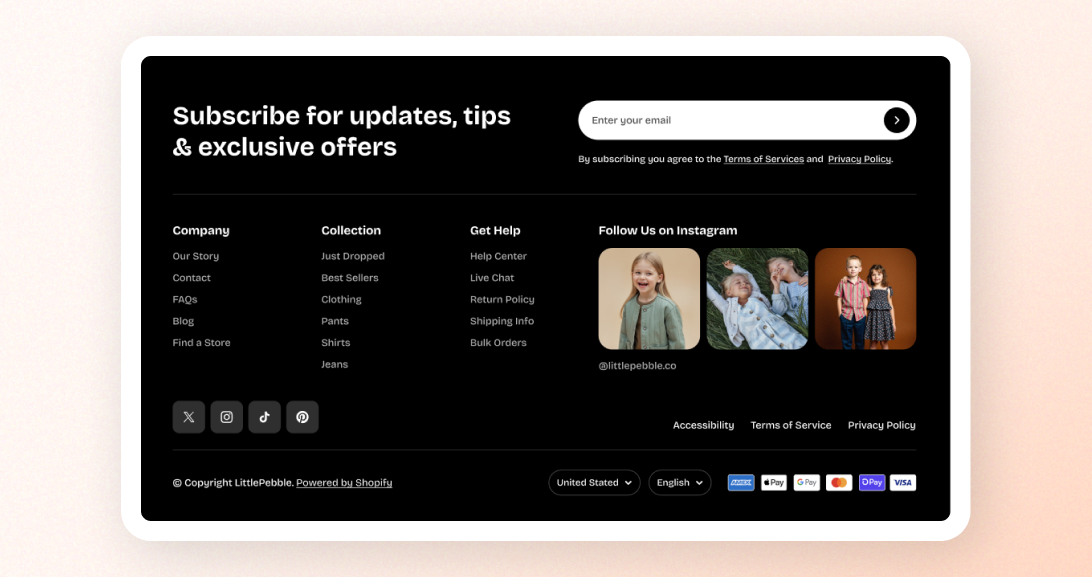
1. Footer top
- Contains blocks you add (footer columns)
- Typically used for menus, contact info, newsletter, or custom content
2. Footer bottom
- Social media icons
- Follow on Shop button
- Custom footer menu / quick links
- Currency & language selector
- Payment icons
- Copyright text
How to edit the Footer section
- In the theme editor (Customize), go to the Footer area.
- Select the Footer section.
- Make necessary changes.
- Click Save.
Section setting
| Setting | Description |
|---|---|
| Menu | Choose a menu to display as quick links in the bottom bar.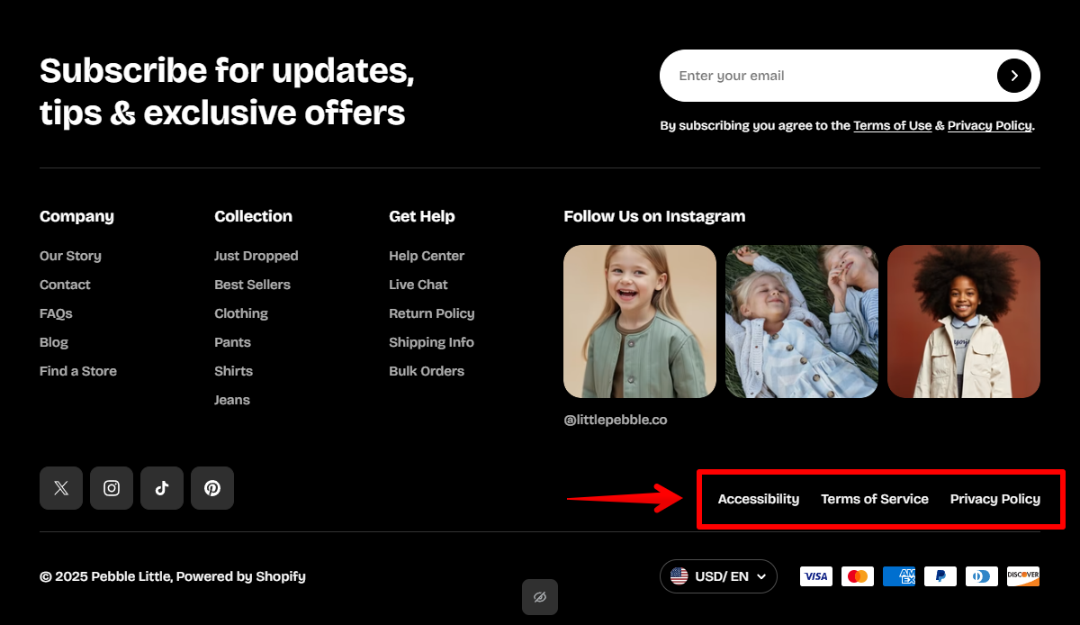 ✍️ See how to add and edit menus on Shopify Help Center |
| Enable Follow on Shop | Displays Shopify’s "Follow on Shop" badge (only if Shop Pay is configured for your store. Learn more). |
| Enable social media icons | Shows social icons if URLs are added in Theme Settings > Social media. Learn more |
| Enable language selector | Shows a language dropdown if multiple languages are published. Learn more: Language selector |
| Enable country selector | Shows a country/currency selector if multiple markets are configured. Learn more: Currency selector |
| Enable payment icons | Displays supported Shopify payment icons. |
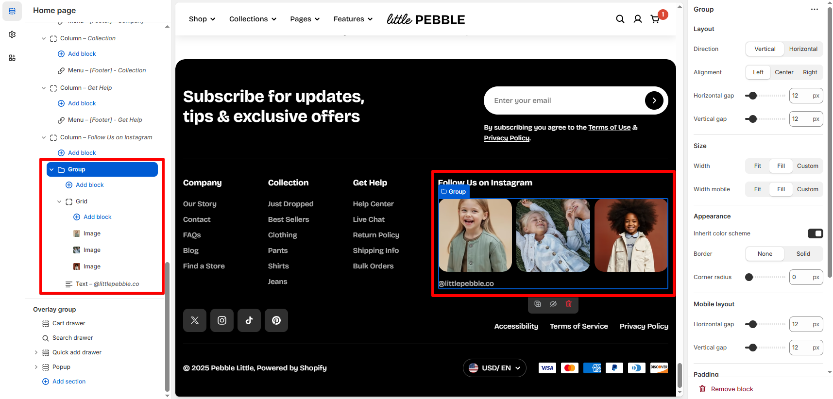
Block settings - Footer column
- About us
- Customer service menu
- Shop links
- Contact info
- Newsletter signup
⚙️ Column block
| Setting | Description |
|---|---|
| Width (%) | Sets how wide the column is inside the footer layout (10%–100%). Common values: 20–33%. |
| Heading | The title of the column.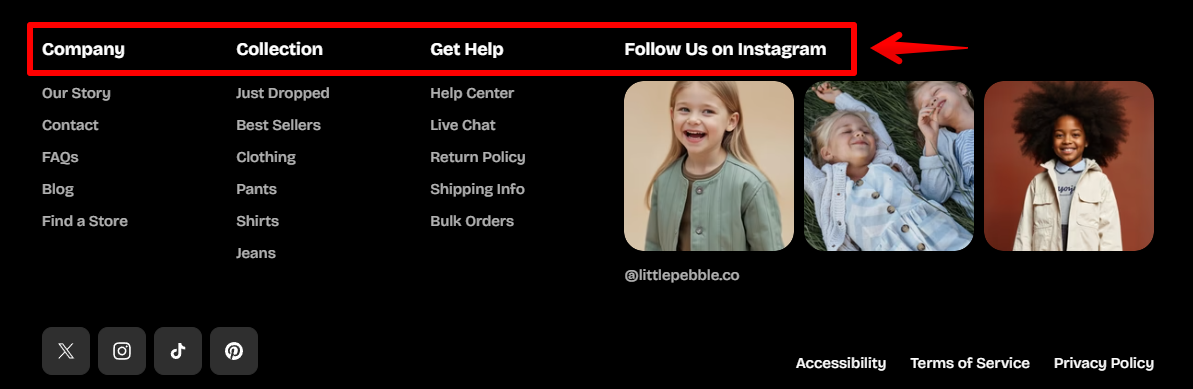 On mobile, leaving the title blank removes the accordion and keeps the content always visible. 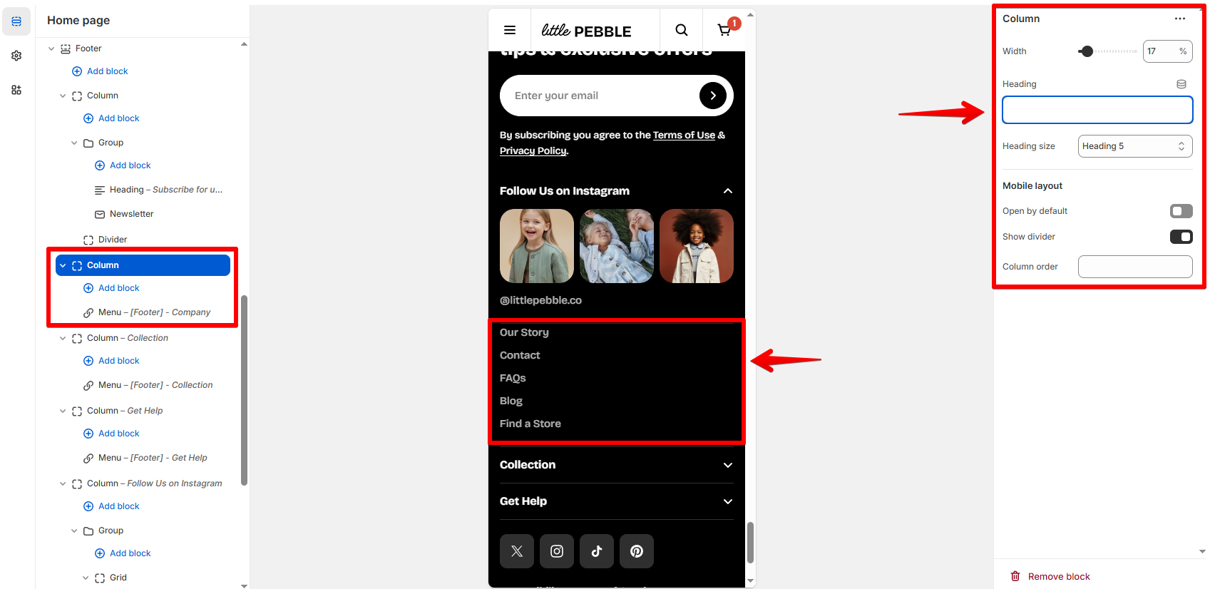 |
| Heading size | Choose the visual size of the column heading: H6 (small), H5 (default), or H4 (large). |
| Open by default (mobile) | When enabled, the accordion opens automatically on mobile. Useful for primary columns. |
| Enable divider | Adds a subtle dividing line between this column and the next. |
| Column order | Sets a custom desktop order using numeric values (lower number = appears earlier). Useful for rearranging layouts. |
📦 Supported nested blocks (Content inside the column)
| Block Type | Use Case |
|---|---|
| App block | Insert content from third-party apps. |
| Group | Create grouped content layouts. Learn more |
| Grid | Build multi-column content inside the footer column. Learn more |
| Icon | Add branded icons or visual markers. Learn more |
| Image | Display small logos, badges, or store graphics. Learn more |
| Video | Embed short videos. Learn more |
| Text | Add paragraphs, contact info, store hours, etc. Learn more |
| Button | Add CTAs. Learn more |
| Divider | Add separation inside the column content. Learn more |
| Newsletter | Add a newsletter signup form. Learn more |
| Footer menu | Add a Shopify menu. |
Best practices
- 25% each for a 4-column layout
- 33% for a 3-column layout
- 20 / 20 / 20 / 40 for a layout with a wider “About us” section
- Logos + text combinations
- Icon + text lists
- Mini contact cards
Last updated