
Theme Settings
Dialogs
1 min read
How to edit Dialogs
- In the theme editor (Customize), click Theme settings.
- Locate Dialogs.
- Make necessary changes.
- Click Save.
Dialogs settings options
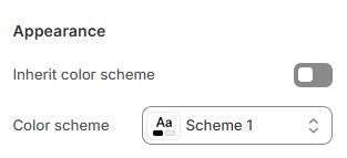
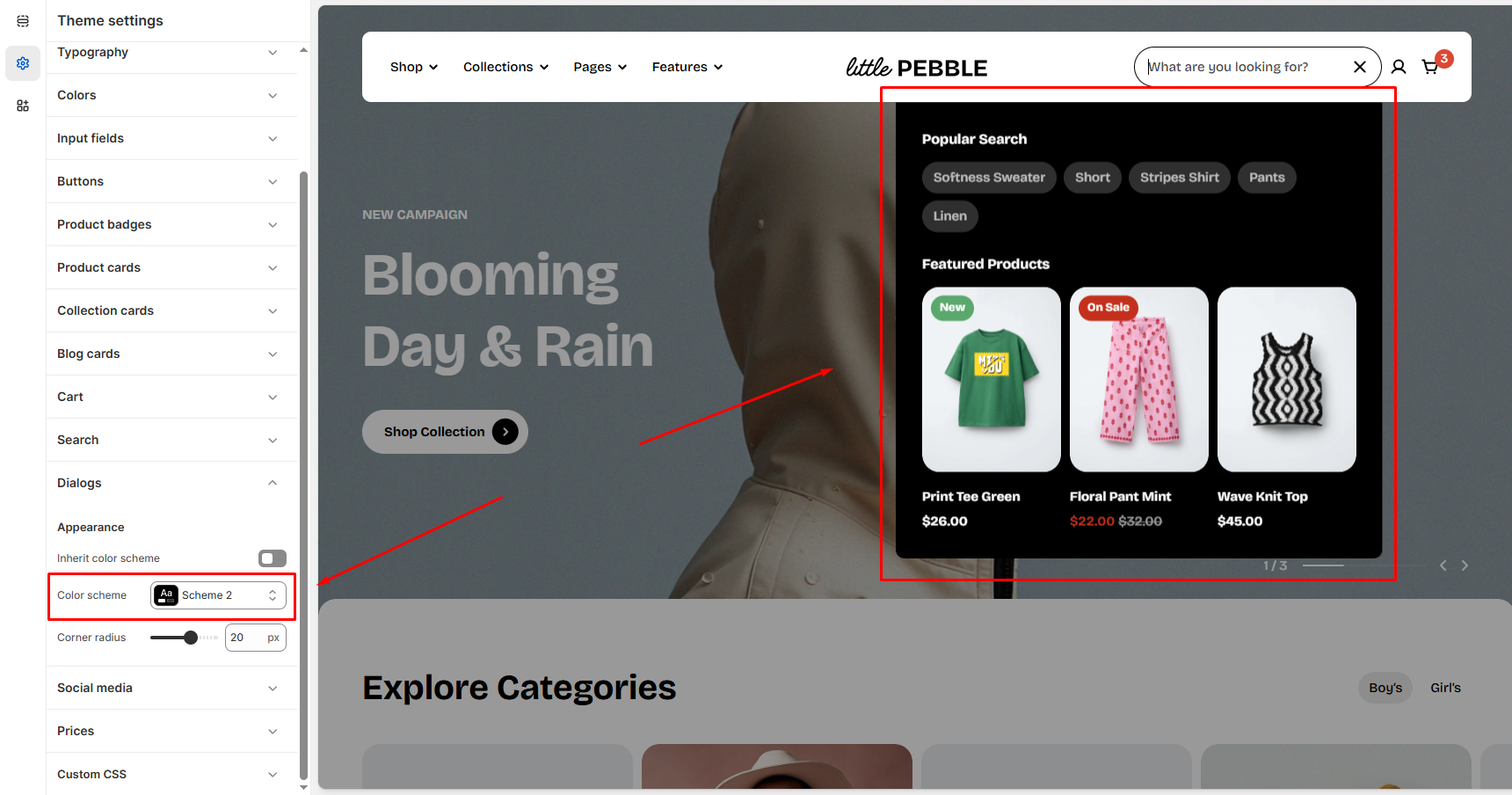
Appereance
Inherit color scheme
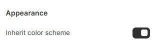
- ON:
- Dialogs automatically inherit the theme’s global color scheme.
- The Color scheme selector is hidden
- OFF:
- Reveals the Color scheme dropdown
- Let you choose a specific color scheme only for dialogs, for example, a dark modal on a light storefront.
Color scheme
To edit the color schemes, go to Theme settings > Colors
Corner radius
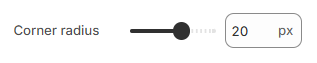
- Move the slider to change from 0px (sharp corners) to 32px (fully rounded).
Last updated