
Theme Settings
Cart
5 min read
How to edit Cart
- In the theme editor (Customize), click Theme settings.
- Locate Cart.
- Make necessary changes.
- Click Save.
Cart settings options
General
Cart type
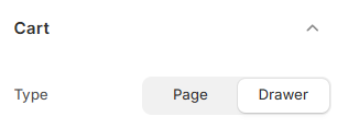
- Page: Customers go to a full cart page when they click the cart icon.
- Drawer: A slide-out panel opens on the right side. Customers can review items without leaving the product or home page.
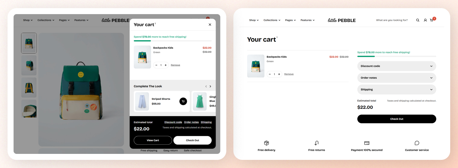
Cart drawer
Cart options
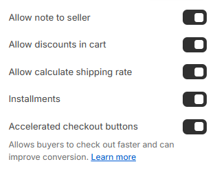
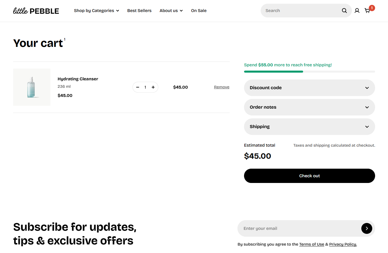
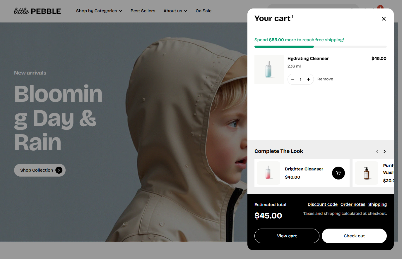
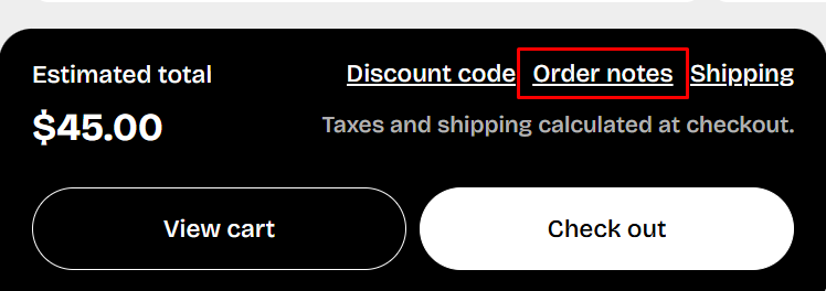
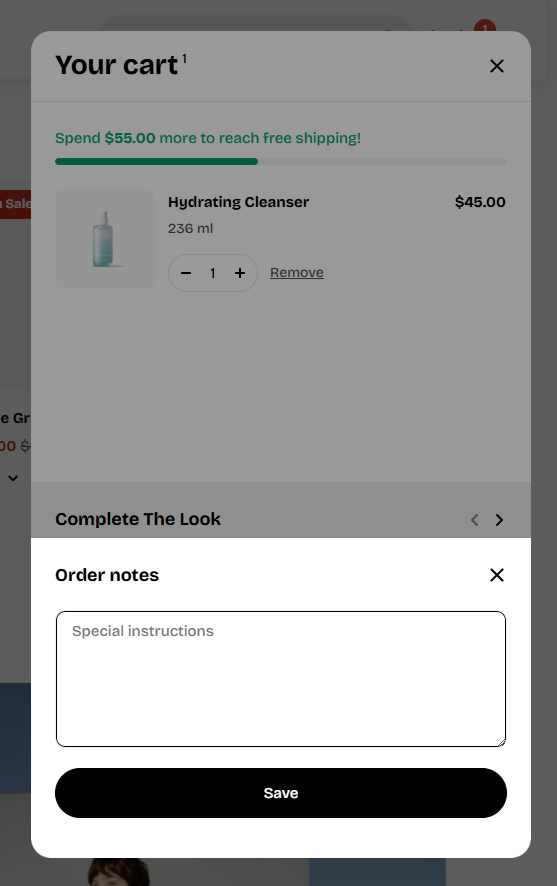
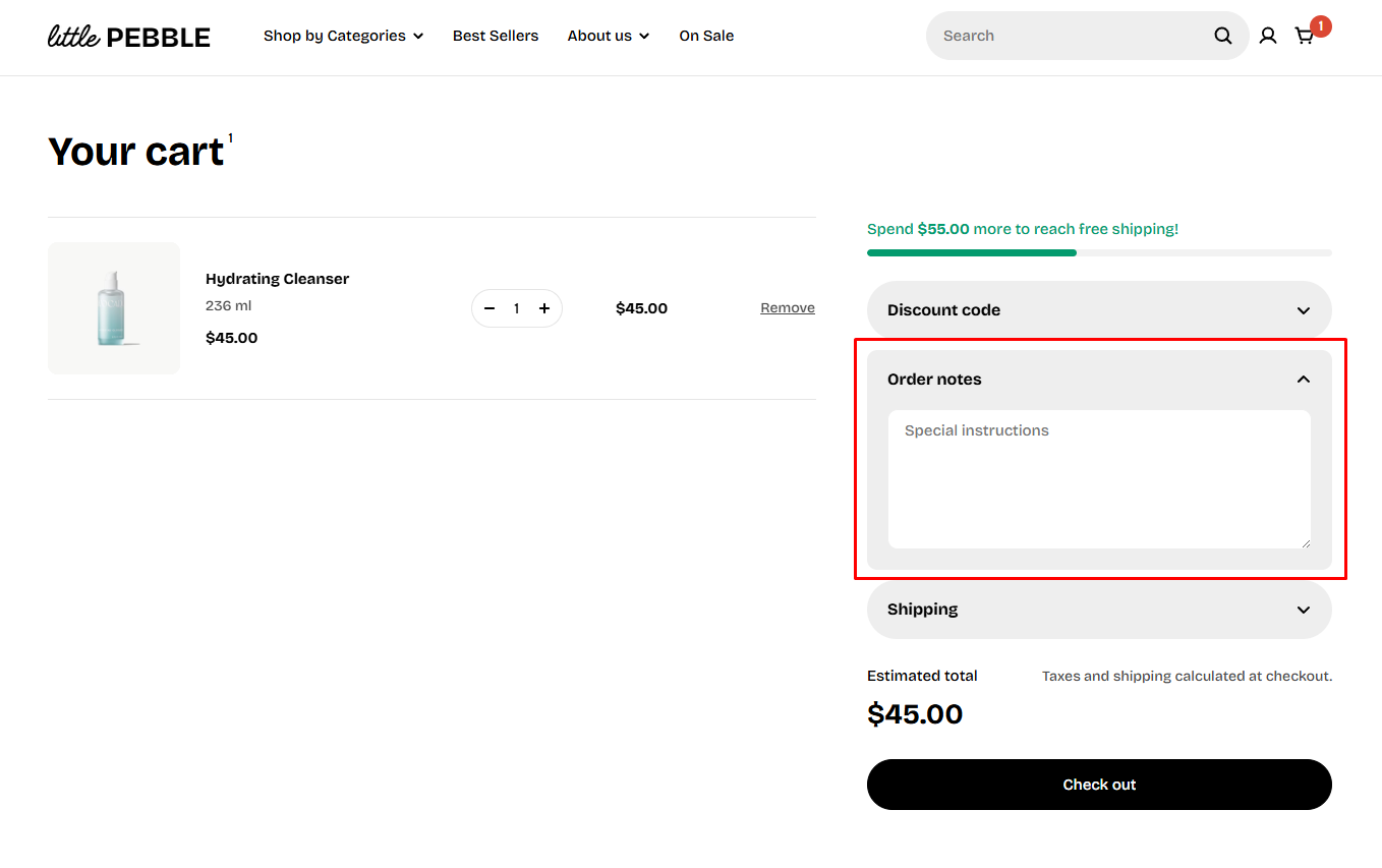
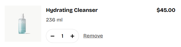
- Allow note to seller: Adds a message box so customers can leave order instructions or special notes.
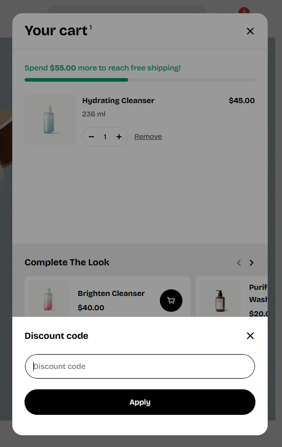
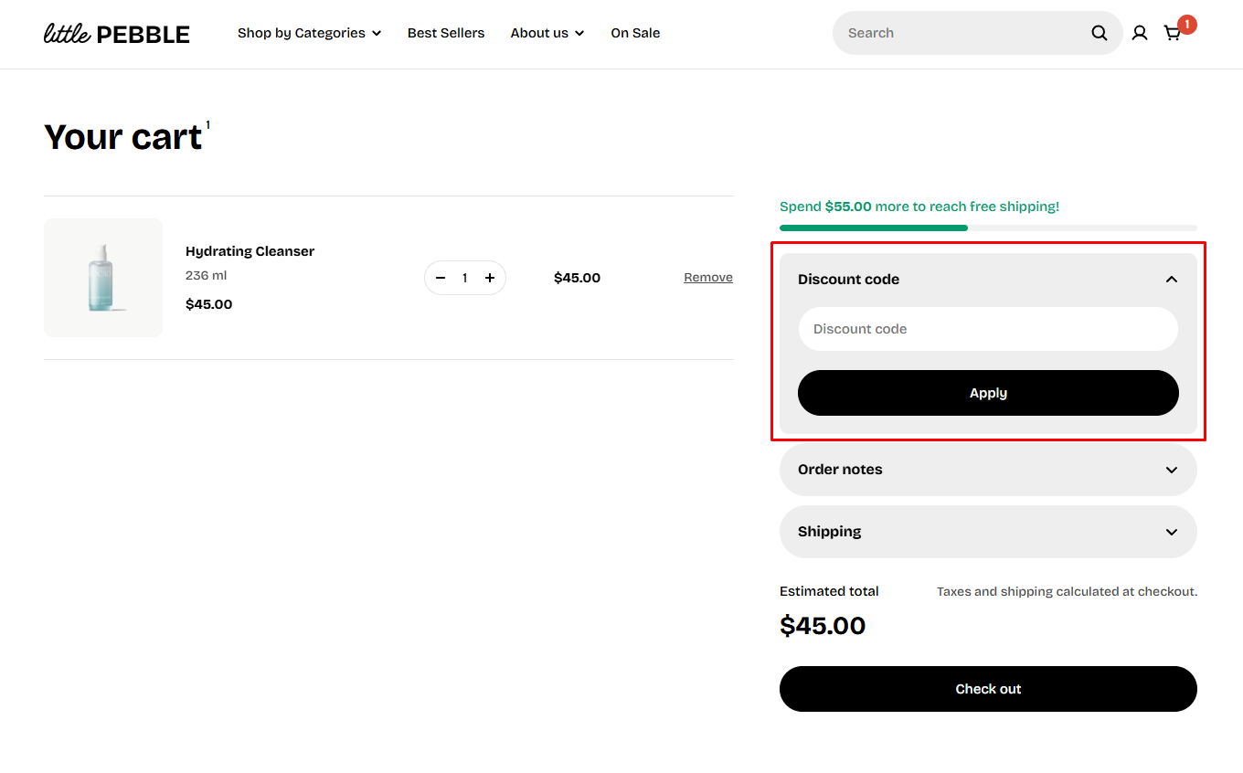
- Allow discounts in cart: Shows a discount code field directly in the cart, so customers can enter coupons before checkout.
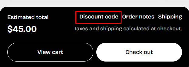
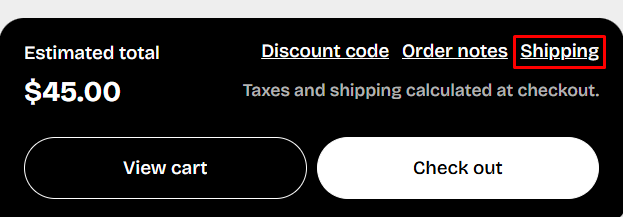
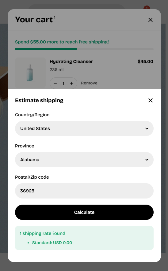
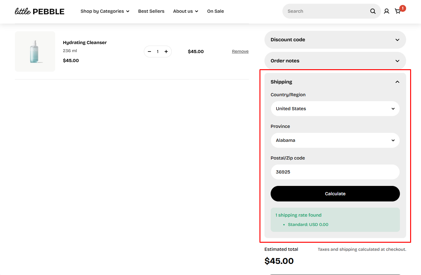
- Allow calculate shipping rate: Shows a shipping calculator that lets customers estimate shipping fees.
- Installments: Displays installment or payment-plan messaging (such as Shop Pay installments), if your payment provider supports it.
- Accelerated checkout buttons: Displays fast-checkout buttons (Shop Pay, Apple Pay, Google Pay). These let customers complete their purchase more quickly and can increase conversions. Learn more
Media
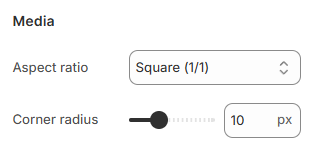
- Aspect ratio: Choose how product images are cropped or displayed. This helps you match your store’s photography style. Available options:
- Auto
- Square (1:1)
- Portrait (4:5)
- Portrait (3:4)
- Landscape (16:9)
- Landscape (4:3)
- Landscape (21:9)
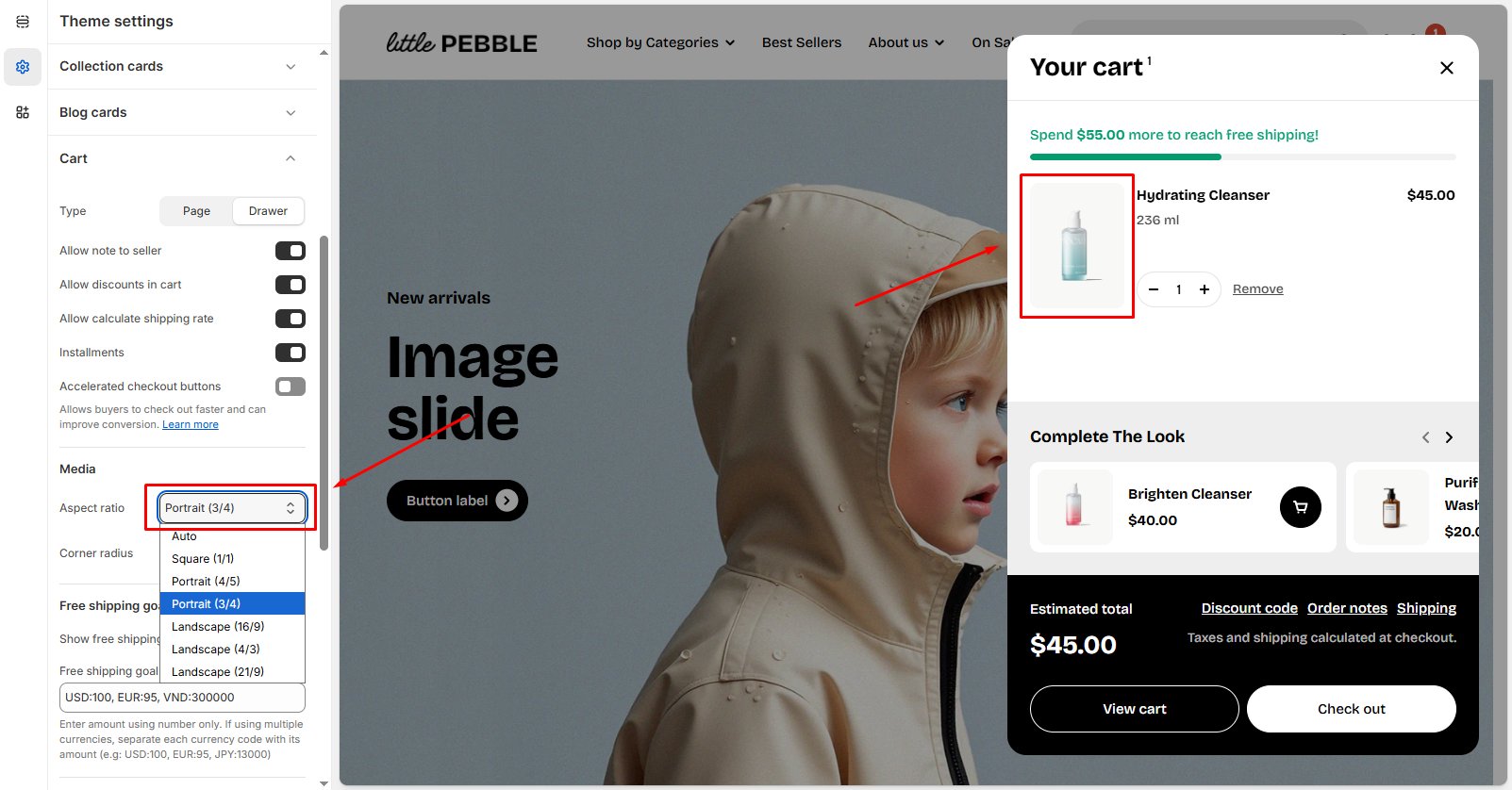
- Corner radius: Change the roundness of product image corners. Range: 0px (square) to 32px.
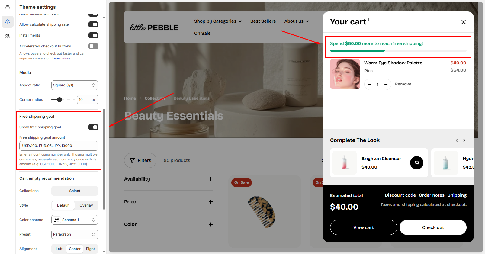
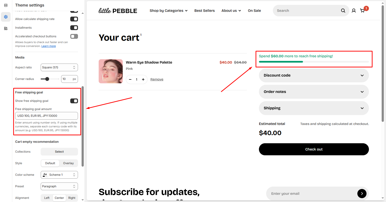
Free shipping goal
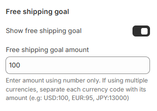
- Show free shipping goal: Toggle this option on to display the free shipping progress bar and message inside the cart.
- Free shipping minimum amount: Fill in the minimum spend for free shipping.
- Enter the amount using numbers only as the minimum spend for free shipping. Example:
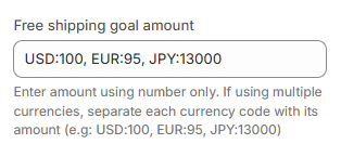
100 - If your store supports multiple currencies, you can specify each amount using the currency code, separated by commas.
- When custom values are provided, these amounts override Shopify’s automatic conversion.
- Example:
USD:100, EUR:95, JPY:13000
To ensure that customers receive free shipping at checkout, make sure that your shipping rates are properly configured.
The Free shipping goal is based on the store's primary currency. If no custom currency amounts are entered and a customer switches to another currency, the goal will be calculated using Shopify market exchange rates.
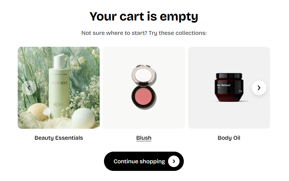
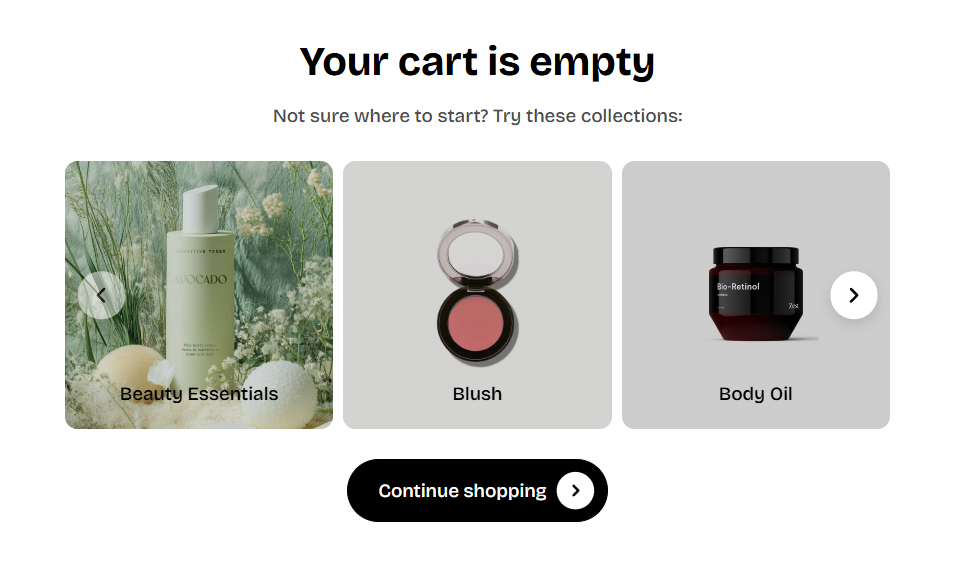
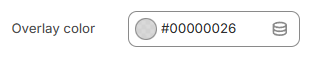
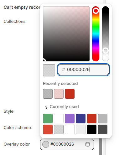
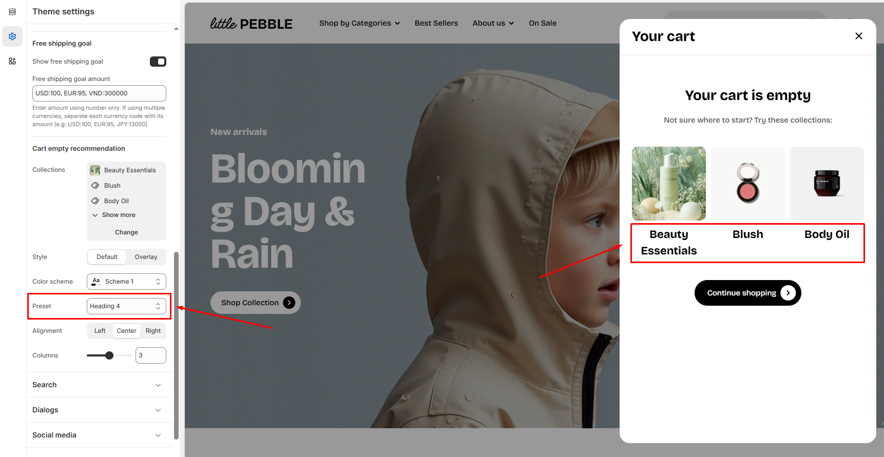
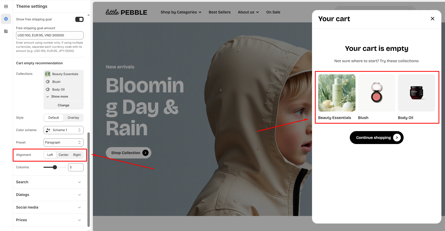
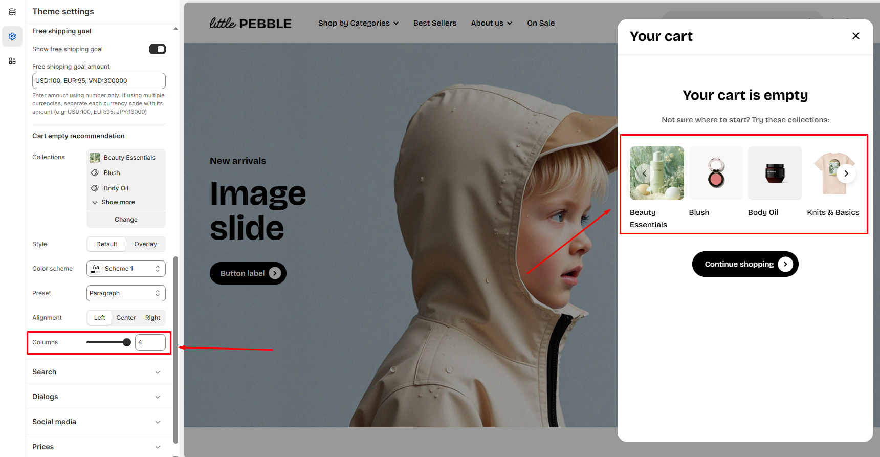
Cart empty recommendation
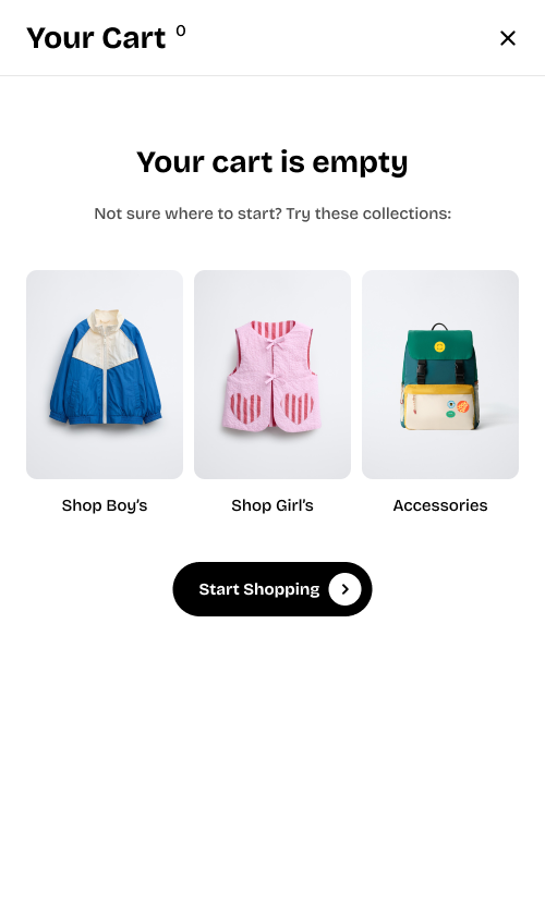
Collections
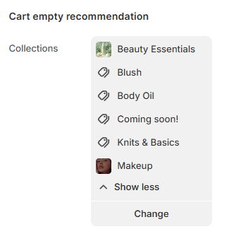
- Click Change to open the collection picker.
- You can select up to 6 collections.
- The selected collections will appear as recommendation cards when the cart is empty.
Display settings
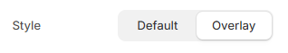
- Default: Text sits below the image. Clean and simple.
- Overlay: Text appears on top of the image. Ideal for high-quality photography.
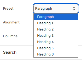
- Paragraph
- Heading 1 (largest)
- Heading 2–6 (descending sizes)
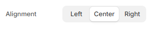
- Left
- Center
- Right
Gift wrapping
Create a gift wrap product
- From your Shopify admin, go to Products.
- Click Add product.
- Create a gift-wrap product just as you would create any other product.
- Make the necessary changes and click Save.
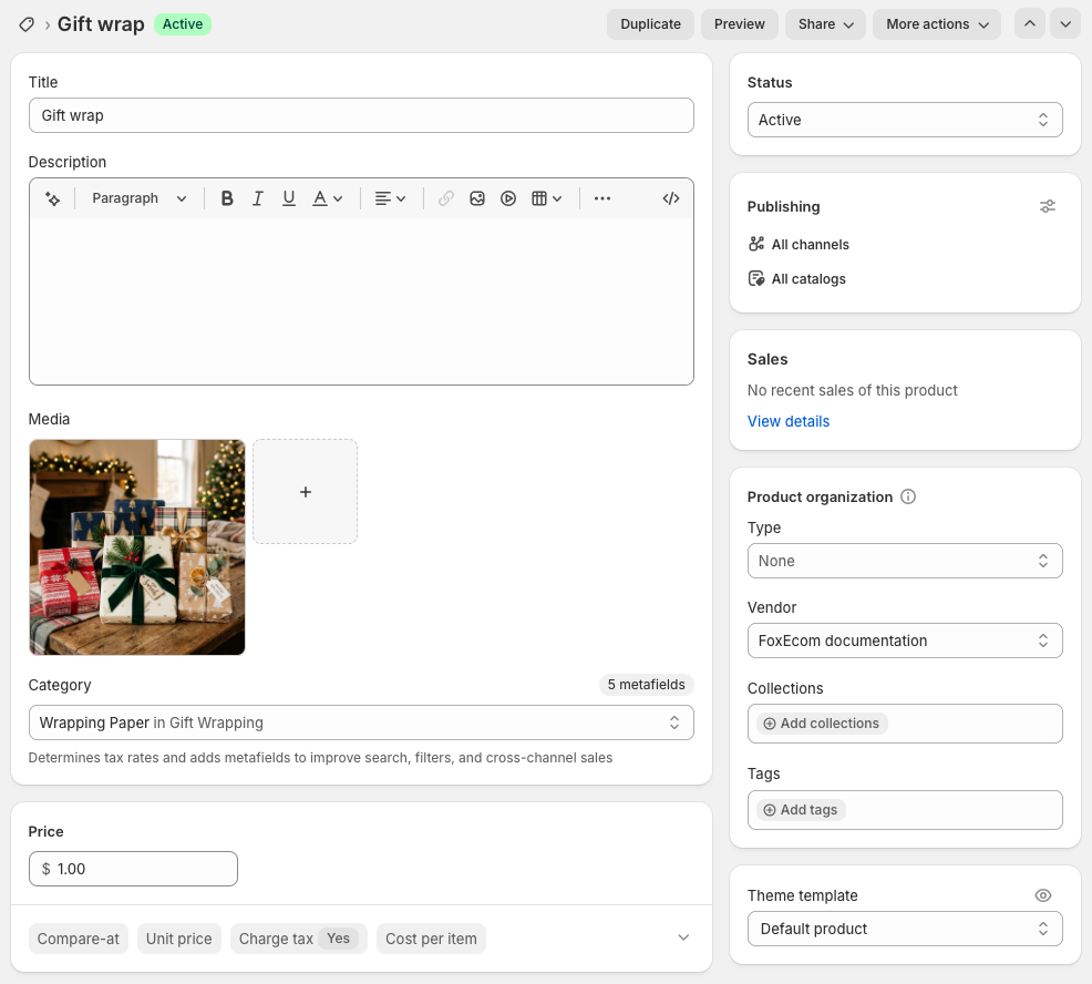
- Use the product description to explain your gift-wrap materials and style.
- Set the product price to charge for gift wrapping, or set it to 0 for free gift wrap.
- Upload an image to show customers how the gift wrapping looks.
- Make sure the gift-wrap product has inventory enabled, or disable inventory tracking if needed.
- For stores with multiple locations, uncheck Track quantity to avoid inventory tracking issues.
Set up the gift wrap product
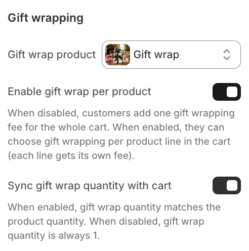
_7XFKsfPl.jpg)
_vA6bWL0P.jpg)
- When disabled, customers pay one gift-wrap fee for the whole cart.
- When enabled, customers can choose gift wrapping for each product separately.
_mNCDNnkG.jpg)
- When enabled, the gift-wrap quantity matches the product quantity.
- When disabled, the gift-wrap quantity is always 1.
_QPg2vp0i.jpg)
Last updated