
Theme Sections
Product tabs
2 min read
_KmF7wyXA.jpg)
How to add a Product tabs section to your Shopify store
- In the theme editor (Customize), click Add section.
- Select Product tabs: Carousel/Product tabs: Grid section.
- Make necessary changes.
- Save.
How to customize a Product tabs section
_3mJuXiuX.jpg)
Section settings
- Container: Determines whether the section spans the full width of the page or stays within a fixed content width.
- Section header:
- Heading: The main title text displayed at the top of the section.
- Highlight style: Applies an optional animated highlight effect to any text wrapped in italics.
- Preset: Selects the text style for the heading
- Animation type: Determines how the heading appears on screen using visual entrance effects.
- Animation delay: Sets the delay (in milliseconds) before the heading animation begins.
- Layout:
- Product count: Controls how many products are displayed in this tab.
- Type: Chooses whether products appear in a grid or a carousel layout.
- Columns: Sets how many products appear per row when using the grid layout.
- Column gap: Controls the horizontal spacing between product cards.
- Mobile layout:
- Enable swipe on mobile: Allows users to swipe horizontally through products on mobile devices.
- Mobile columns: Sets how many products appear per row on mobile.
- Column gap mobile: Controls horizontal spacing between products on mobile.
Block settings
Collection
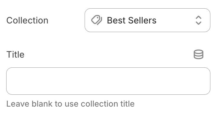
- Collection: Selects the product collection to display in this tab.
- Title: Allows you to set a custom tab title; leave it blank to use the collection’s default name.
You can go to Theme Settings > Product cards to customize your product card: Product cards
Last updated