# Input fields
_zPkUrYMf.jpg)
Input fields play a key role in your store’s user experience. Well-designed input fields help create a seamless and user-friendly interface for your customers, whether they’re filling out forms, or searching for products.
## How to access Input fields settings
Steps:
1. In the theme editor (**Customize**), click **Theme settings**.
2. Locate **Input fields**.
3. Make necessary changes.
4. Click **Save.**
## Input fields settings options
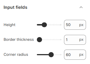
### Height
Set the height using the slider or enter a value between 40px and 80px.
Taller heights make input fields more prominent, while smaller heights create a more compact look.
### Border thickness
Adjust the border thickness between 1px and 4px.
Thicker borders make fields stand out, while thinner borders create a more subtle appearance.
### Corner radius
Set the corner radius between 0px (sharp corners) and 100px (fully rounded).
Larger values give a modern, rounded look, while smaller values keep the design minimal.