
Theme Sections
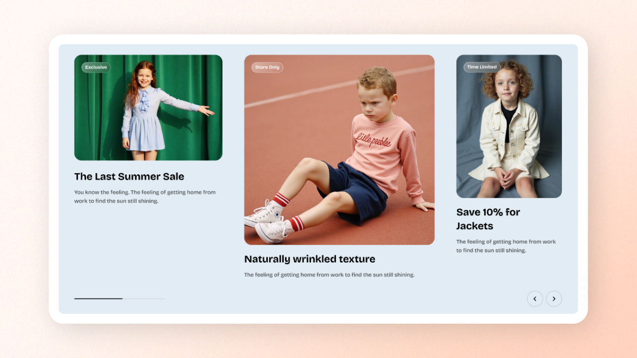
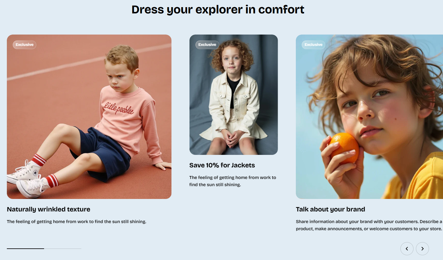
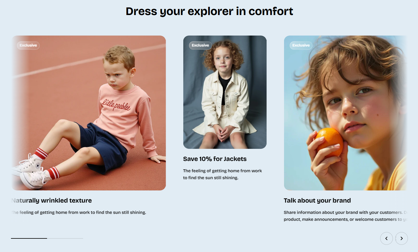
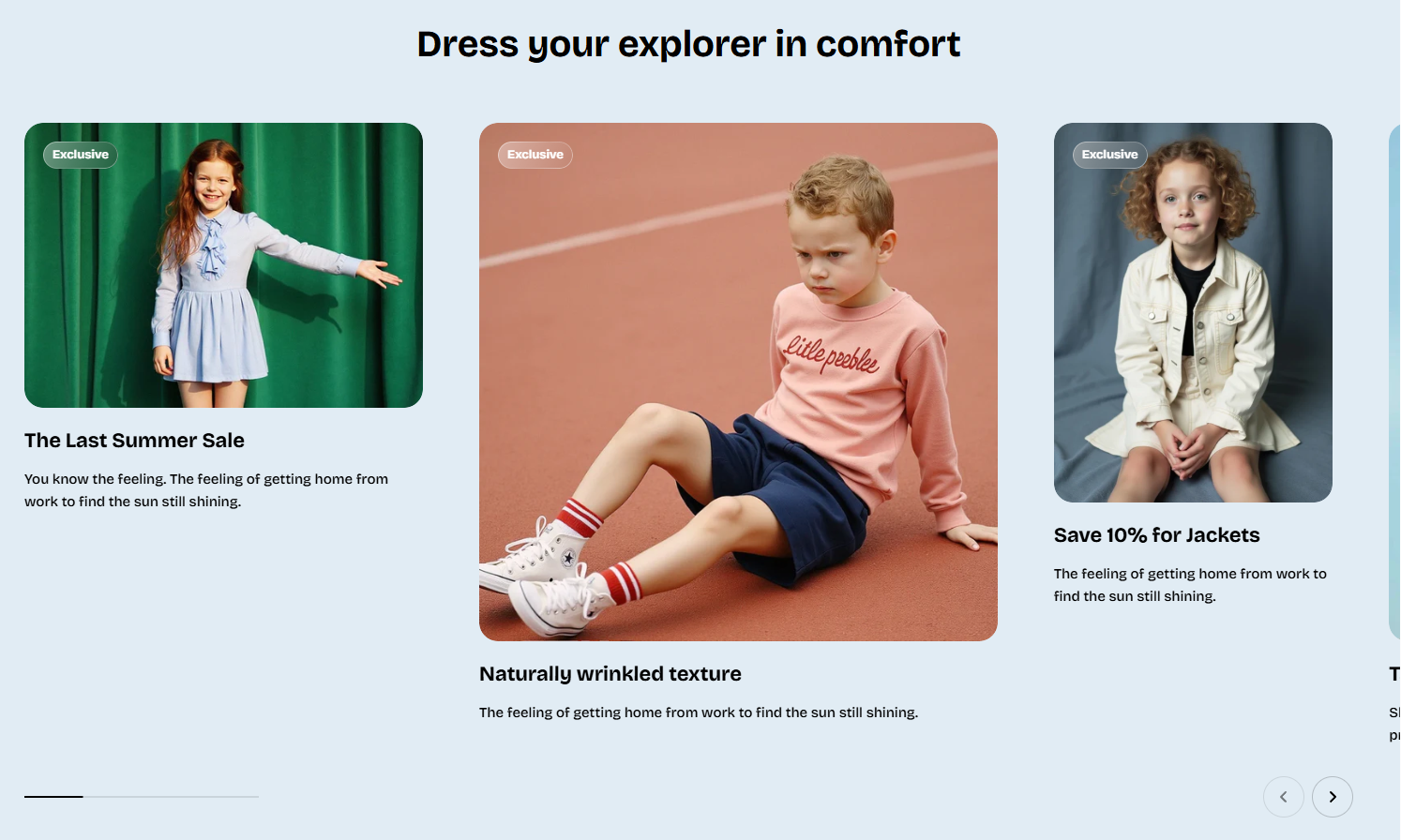
Image cards: Flex carousel
2 min read
How to add an Image cards: Flex carousel section to your Shopify store
- In the theme editor (Customize), click Add section.
- Select Image cards: Flex carousel section.
- Make necessary changes.
- Save.
How to edit the section Image cards: Flex carousel
Section settings
Carousel settings
| Setting | Description |
|---|---|
| Overflow content | Control whether items slightly peek outside the container (visible) or use edge shadows (edge-shadows). |
| Slides per view | Choose auto (free-size cards) or fixed columns. |
| Columns | Number of desktop columns (2–4). Visible only if using fixed columns. |
| Column gap | Horizontal space between cards on desktop. |
Carousel controls
| Setting | Description |
|---|---|
| Control type | Choose navigation style: none, standard arrows, or floating arrows. |
Block settings
- Image card
- Collection card
- Collection item (custom card)
Last updated