
Theme Sections
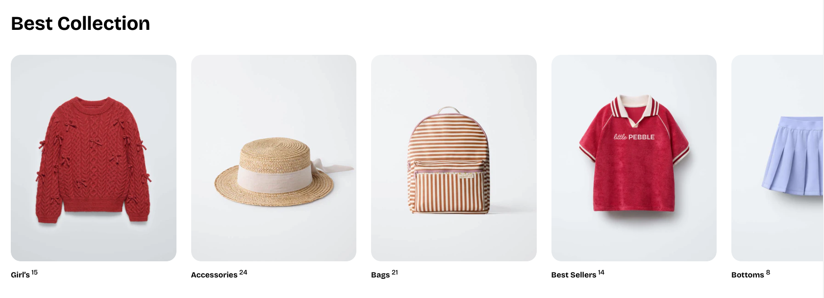
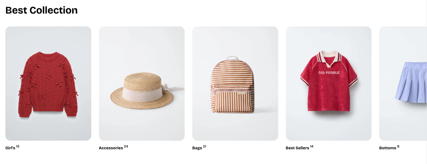
Collection list
2 min read
_vrNC2zvx.jpg)
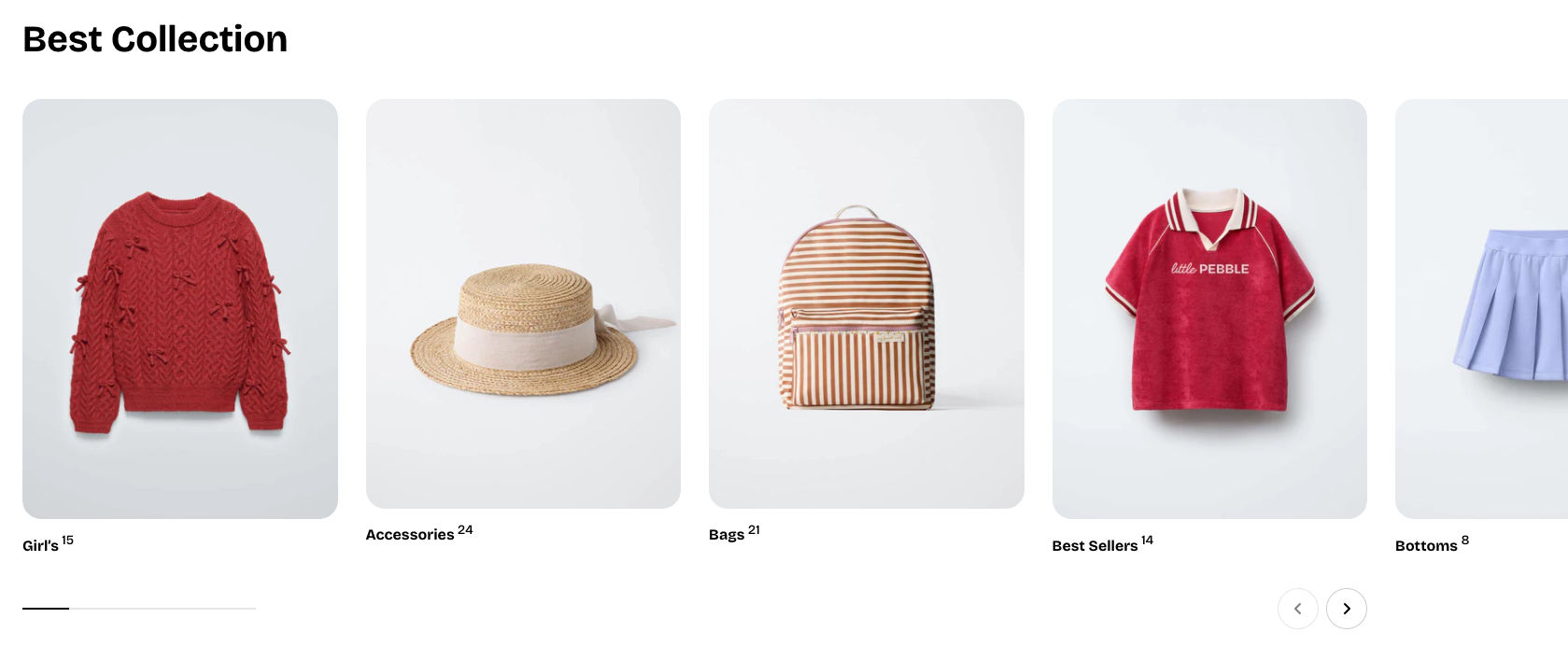
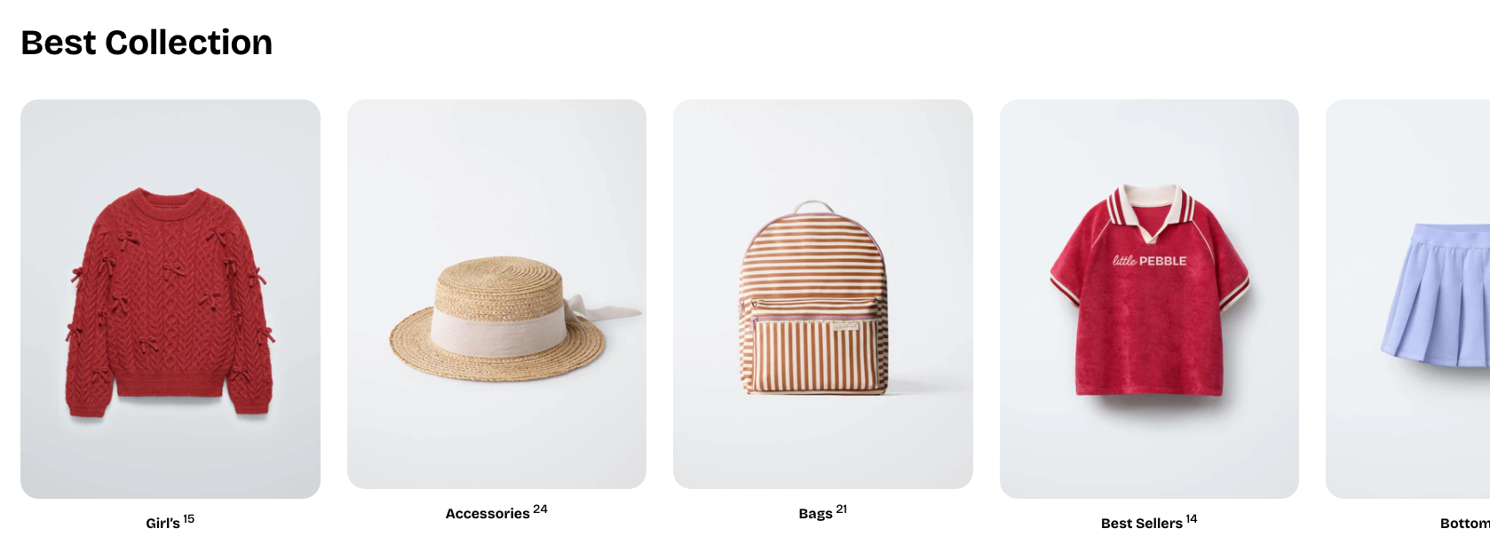
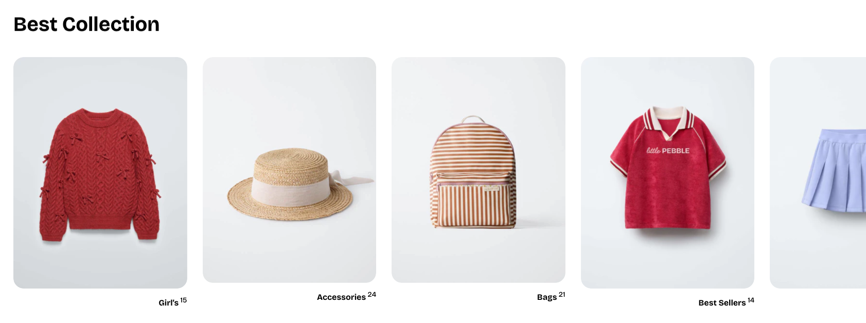
How to add a Collection list section to your Shopify store
- In the theme editor (Customize), click Add section.
- Select Collection list: Carousel/Collection list: Grid section.
- Make necessary changes.
- Save.
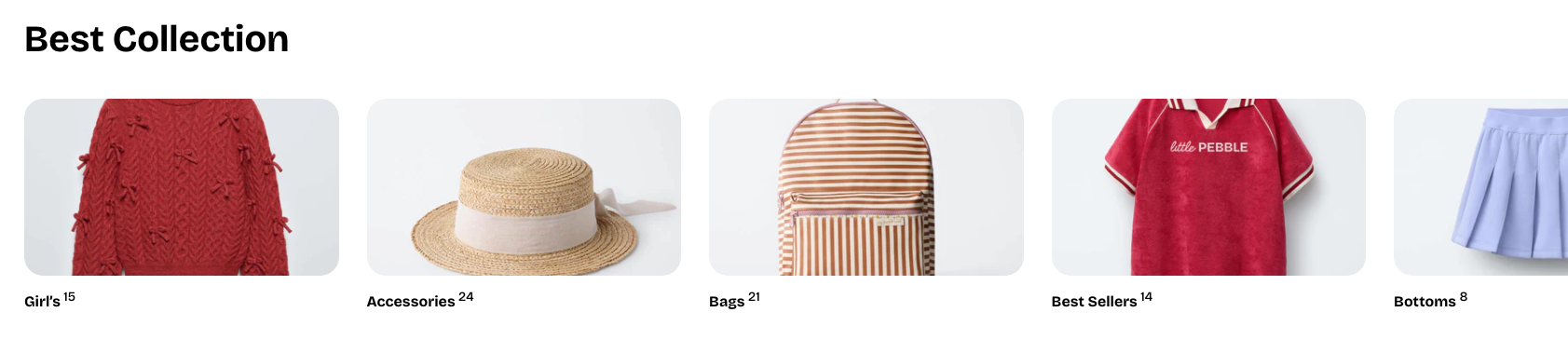
How to customize a Collection list section
_gxmQmIxX.jpg)
Section settings
- Collection: Selects collections display in this section.
- Layout:
- Container: Chooses whether the section spans the full page width or stays within a fixed content width.
- Type: Sets the layout style to either a grid or a carousel.
- Columns: Determines how many products appear per row in grid mode.
- Horizontal gap: Controls the spacing between products from left to right.
- Vertical gap: Controls the spacing between product rows from top to bottom.
- Control type: Selects the carousel navigation style, such as default arrows or a floating control (only available when using the carousel layout).
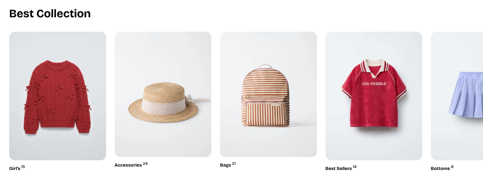
- Mobile layout:
- Enable swipe on mobile: Allows horizontal swiping to navigate products on mobile.
- Mobile columns: Sets how many products appear per row on mobile devices.
- Horizontal gap (mobile): Controls left-to-right spacing between products on mobile.
- Vertical gap (mobile): Controls top-to-bottom spacing between product rows on mobile.
Block settings
Collection card
- Aspect ratio: Sets the shape of the collection image.

- Go to Theme settings > Collection cards and set the aspect ratio there to use it as a global setting.
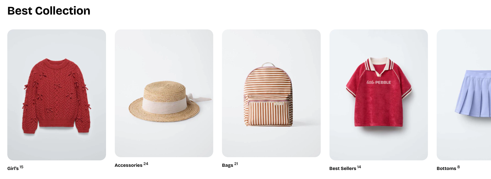
- The image ratio adapts to the original size of the uploaded image.
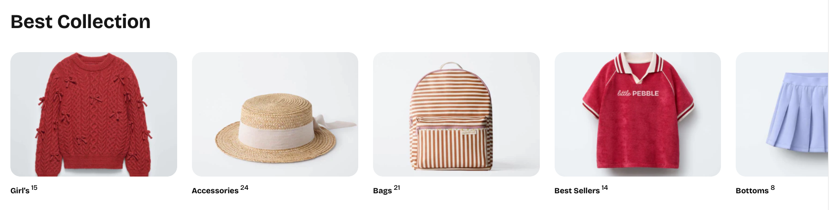
- Alignment: Controls the horizontal alignment of the collection title.

- Show product count: Toggles whether the number of products in the collection is displayed.
Nested dynamic blocks
Theme blocks
Last updated