
Theme Sections
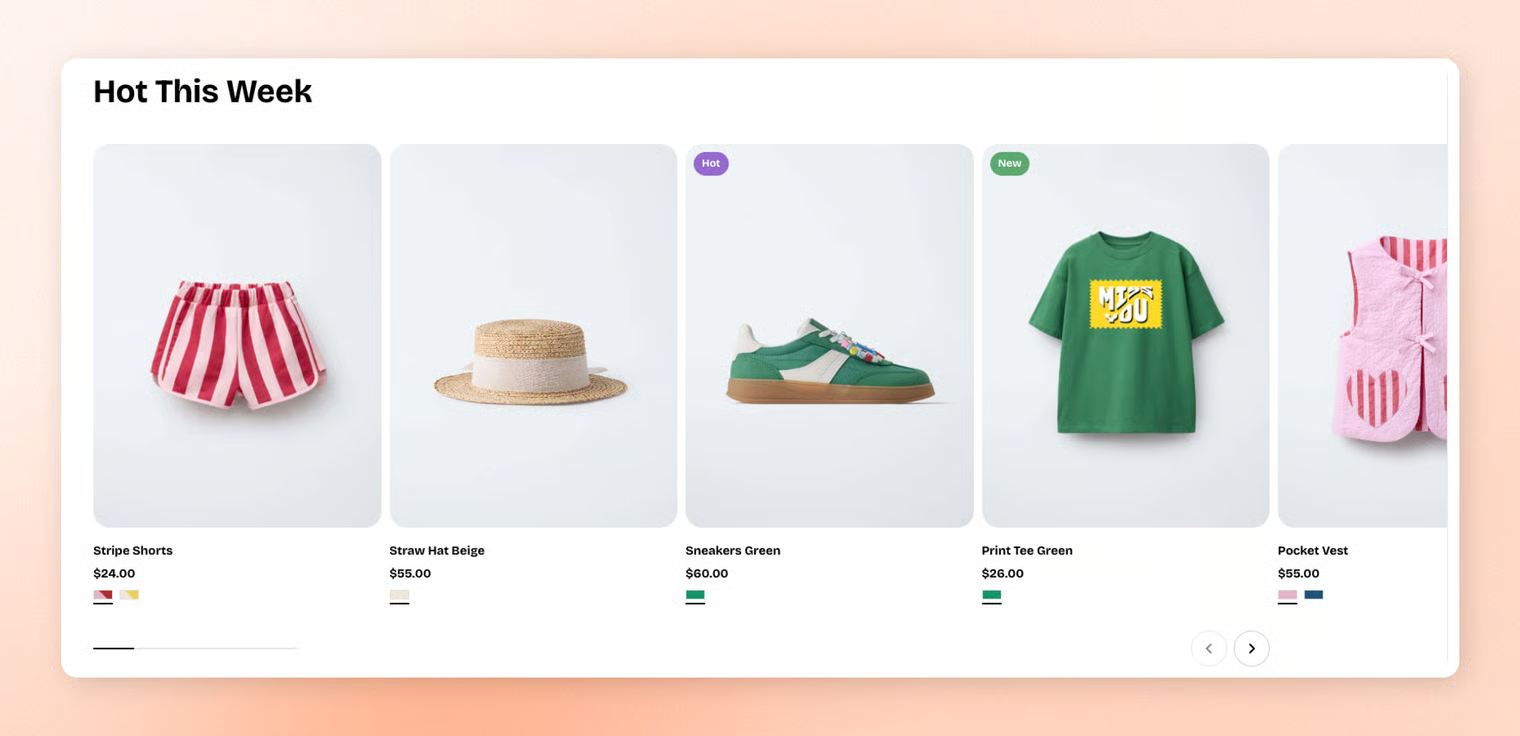
Featured collection
2 min read
_T8OHG4fQ.jpg)
How to add a Featured collection section to your Shopify store
- In the theme editor (Customize), click Add section.
- Select Featured collection: Carousel/Featured collection: Grid section.
- Make necessary changes.
- Save.
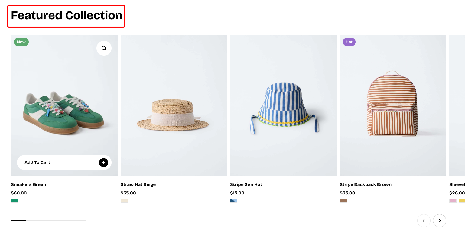
How to customize a Featured collection section
_WJeqDCWE.jpg)
Section settings
- Collection: Selects which product collection to feature in this section.
- Product count: Controls how many products from the collection are displayed.
- Layout:
- Container: Chooses whether the section spans the full page width or stays within a fixed content width.
- Type: Sets the layout style to either a grid or a carousel.
- Columns: Determines how many products appear per row in grid mode.
- Horizontal gap: Controls the spacing between products from left to right.
- Vertical gap: Controls the spacing between product rows from top to bottom.
- Mobile layout:
- Enable swipe on mobile: Allows horizontal swiping to navigate products on mobile.
- Mobile columns: Sets how many products appear per row on mobile devices.
- Horizontal gap (mobile): Controls left-to-right spacing between products on mobile.
- Vertical gap (mobile): Controls top-to-bottom spacing between product rows on mobile.
Block settings
Default nested blocks
📝 Learn more about customizing the header block: Text block
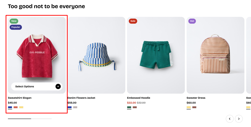
Nested dynamic blocks
Theme blocks
Last updated