
Theme Settings
Product cards
7 min read
How to edit Product cards
- In the theme editor (Customize), click Theme settings.
- Locate Product cards.
- Make necessary changes.
- Click Save.
Product cards settings options
Media
| Setting | Description |
|---|---|
| Aspect ratio | Defines how product images are cropped for consistent display: • Auto (default) - Uses the original aspect ratio. • Square (1/1) • Portrait (4/5) • Portrait (3/4) • Landscape (16/9) • Landscape (4/3) |
| Corner radius | Adjust how rounded the product image corners should be: • Move the slider to change from 0px (sharp corners) to 32px (fully rounded). 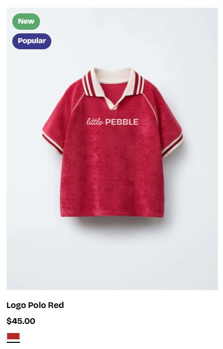 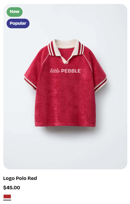 |
| Show second image on hover | 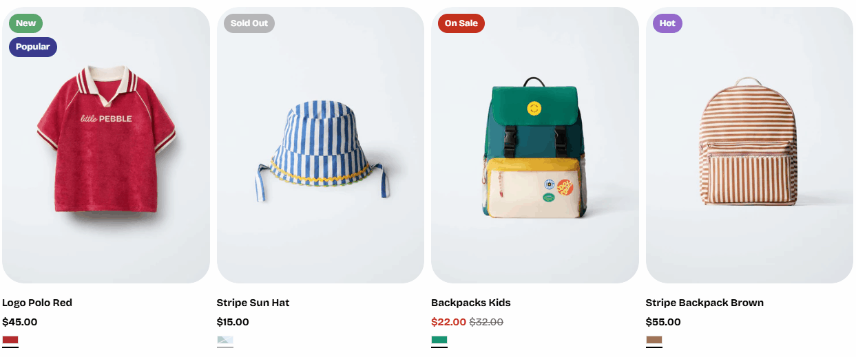 Enables a hover effect that switches to the product’s second image when the customer moves their cursor over the product card. Enables a hover effect that switches to the product’s second image when the customer moves their cursor over the product card. |
Content
| Setting | Description |
|---|---|
| Style | Choose the display style for product cards, including standard or card layout.  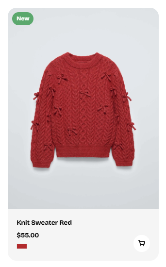 |
| Alignment | Controls how text aligns inside the product card: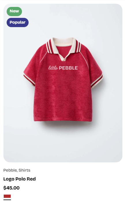 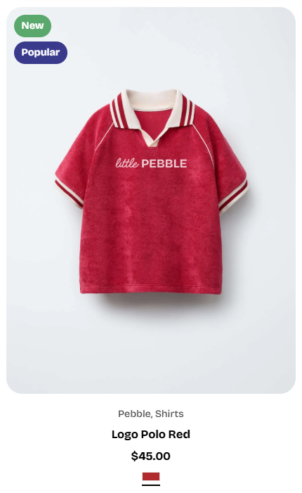  |
| Show product vendor | Toggle to display or hide the product vendor/brand above the product title.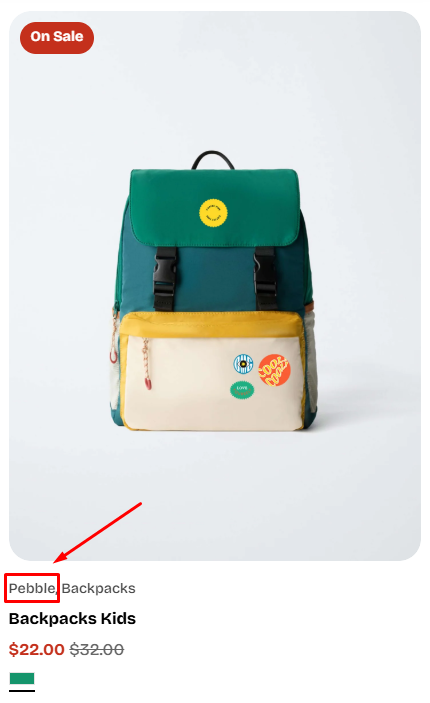 |
| Show product type | Toggle to display or hide the product type (e.g., "Hats", "Backpacks").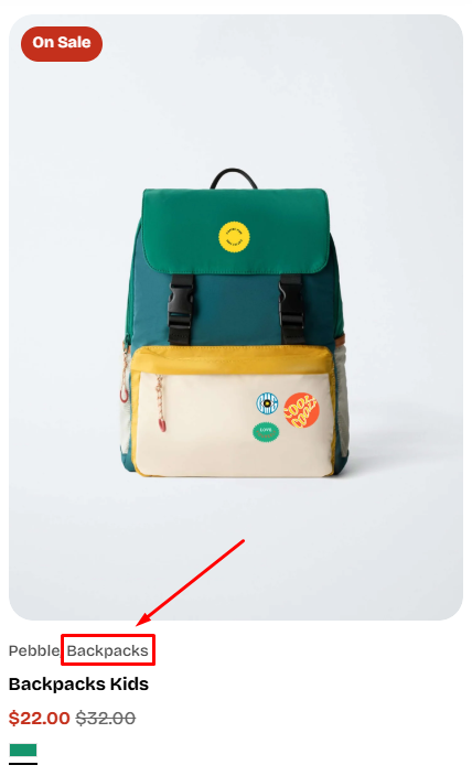 |
Badges
| Setting | Description |
|---|---|
| Layout | Defines how multiple badges (sale, sold out, custom) are arranged: • Vertical (stacked) • Horizontal (side by side) 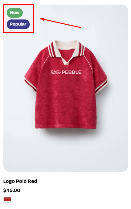 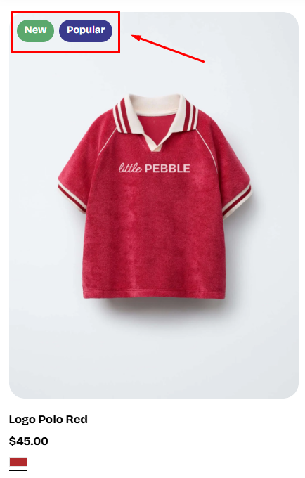 |
| Show custom badges | Enable this option to show badges created through product tags. ✍️ Learn how to add custom badges: Product badges To change the badges' colors, go to Theme settings > Colors |
| Show sold out badge | Toggle to display or hide a "Sold Out" badge on out-of-stock items.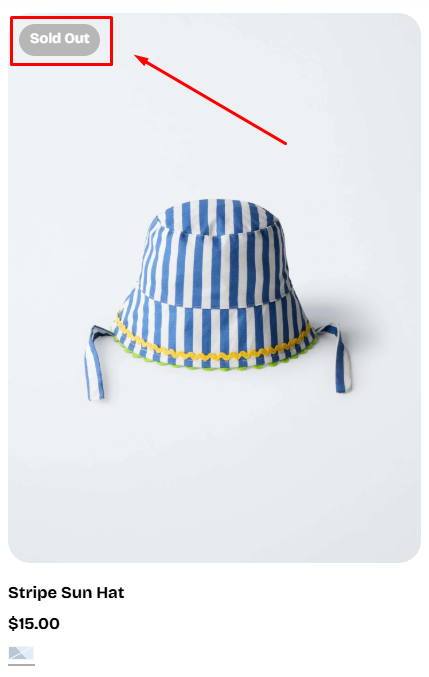 |
| Show sale badge | Toggle to show or hide a sale badge whenever a product has a discounted price (when the Compare-at price is larger than the Price). • Sale badge type: Choose how the sale badge displays discount information: • Text - Shows "On Sale" • Percentage - Shows a discount like "Save 20%" • Fixed amount - Shows amount saved like "Save $10.00" 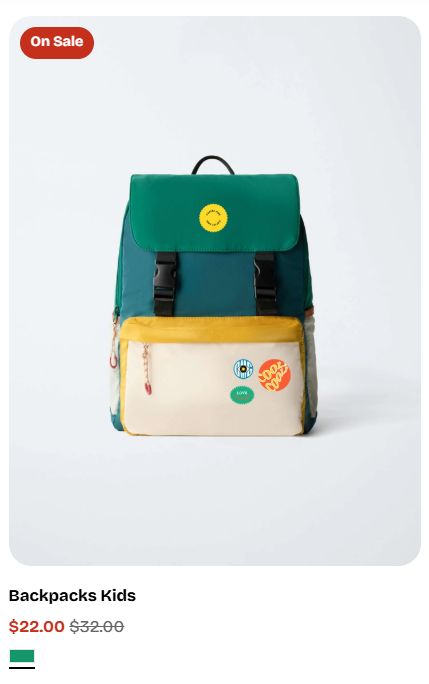 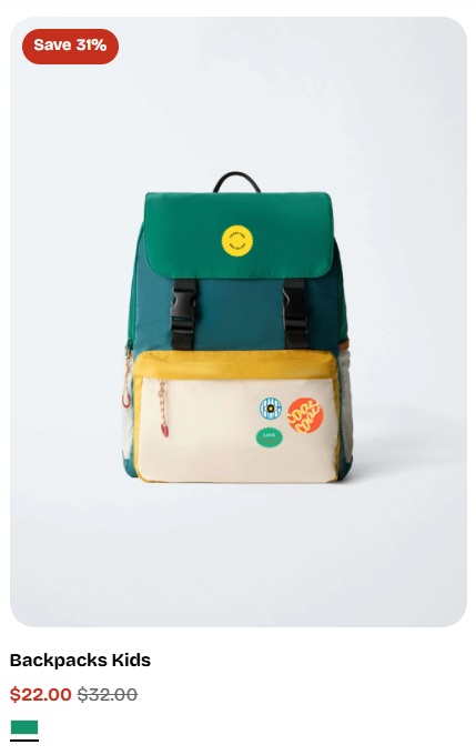 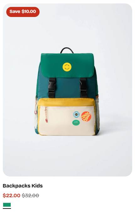 |
Swatches
| Setting | Description |
|---|---|
| Show swatches | Toggle this on to display color or pattern swatches under the product price.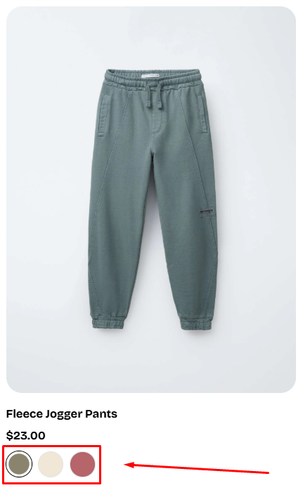 Learn how to setting up Swatches via Shopify Category Metafields. Note: • When Show swatches is OFF > all other swatch-related settings remain hidden. 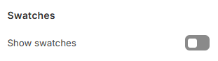 • When Show swatches is ON > additional swatch customization options appear (Show variant images, shape, width, max items). 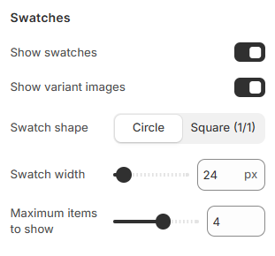 |
| Show variant images | When enabled, each swatch will display the variant’s assigned image (a miniature thumbnail) instead of using a solid color swatch.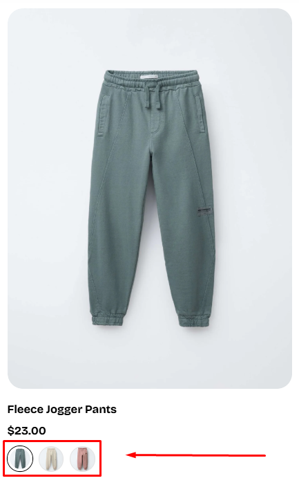 Fallback behavior: If Show variant images is ON but a specific variant does not have an assigned image, Pebble will automatically fall back to: 1. The swatch image defined in the color metafield (if available) 2. Otherwise, the color value (HEX/RGB) from the metafieldThis ensures every swatch always has a visible representation, no blank swatches. 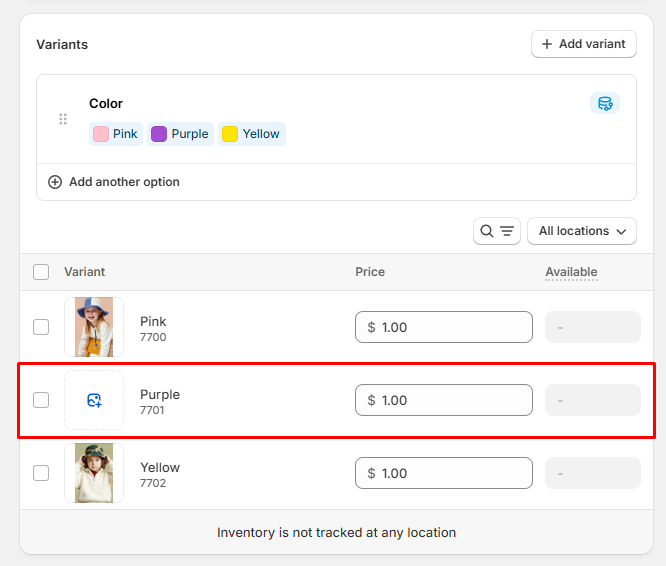 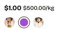 |
| Swatch shape | Choose how swatches are displayed visually: • Circle • Square (1/1) 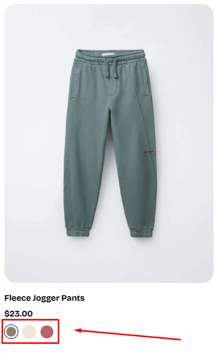 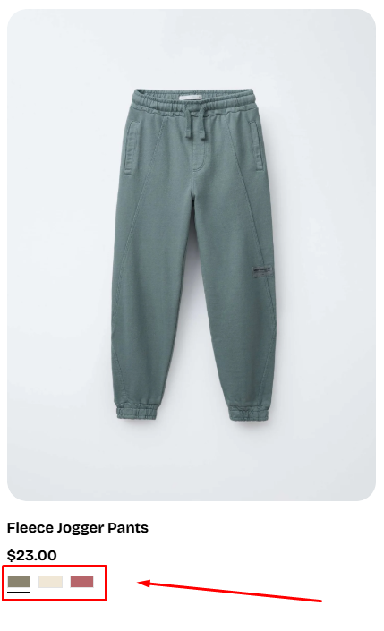 |
| Swatch width | Controls the size of each swatch. Available range: 20px – 100px. |
| Maximum items to show | Limits how many swatches appear before the remaining ones collapse into a "+X" indicator. • Range: 1 - 6 items. • Example: If a product has 3 colors and you set this to 2, customers will see 2 swatches + "+1". 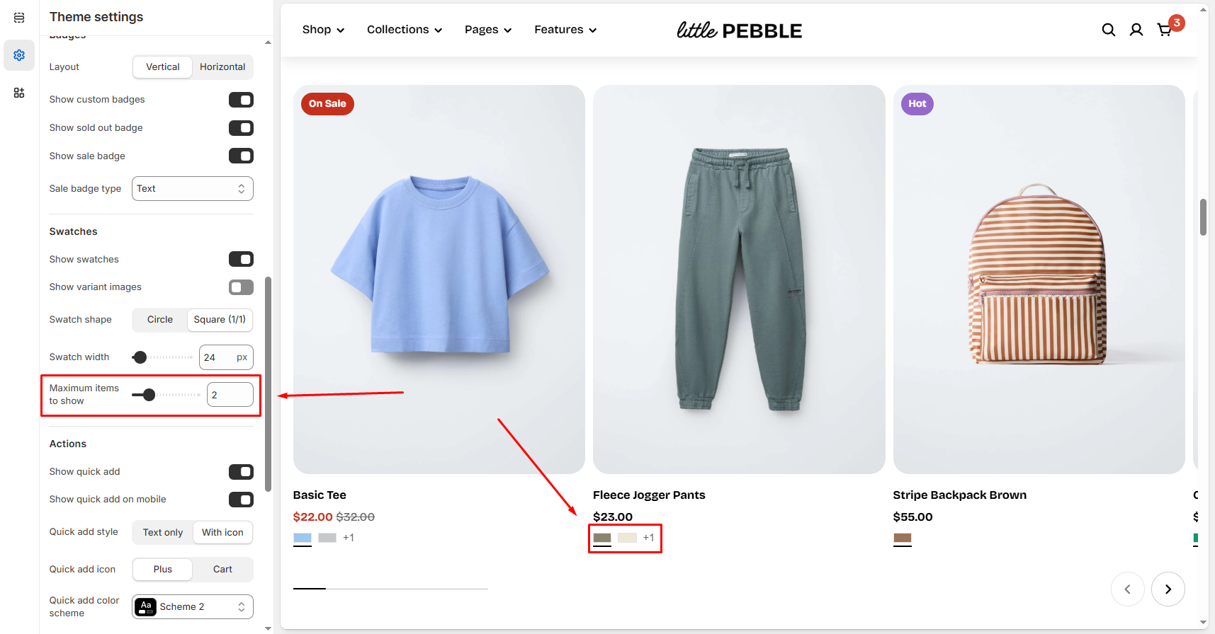 |
Actions
| Setting | Description |
|---|---|
| Show quick add | Adds an Add to cart or Choose options button directly on the product card. • Single variant products show Add to cart button which adds the item immediately. 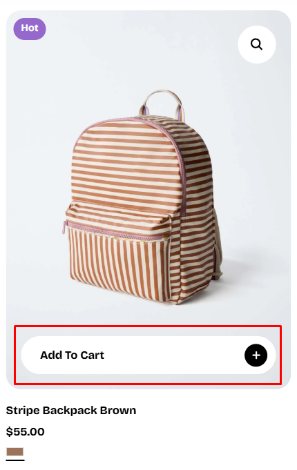 • Multi-variant products show Choose options button which opens the Quick View popup, allowing the customer to select a variant and add the product to the cart without leaving the page. 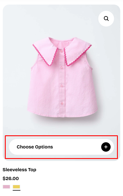 Note: The Quick Add button does not appear on sold-out products. |
| Show quick add on mobile | Enables Quick add functionality specifically for mobile users.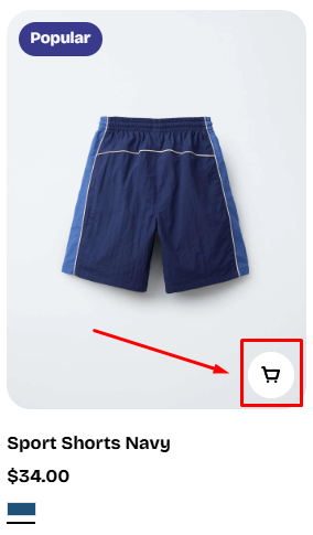 If the product has different variants, the quick view modal will be opened for customer to select the variant they want to added to the cart. |
| Quick add style | Choose how the Quick add button is displayed visually: • Text only • With icon 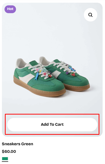 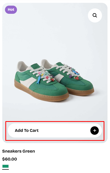 |
| Quick add icon | Select the icon used when the With icon style is enabled: • Plus • Cart 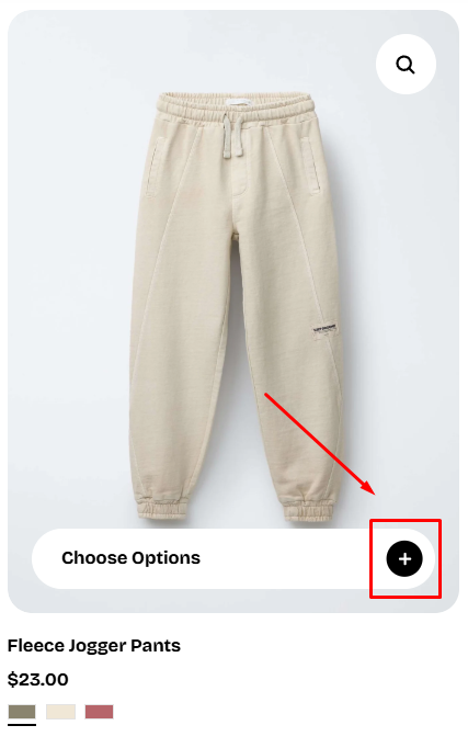 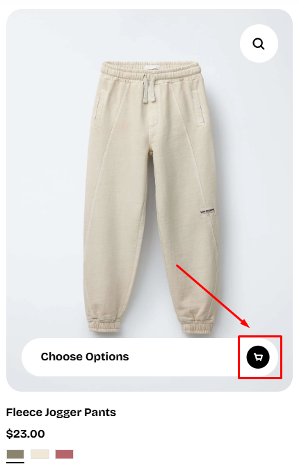 |
| Quick add color scheme | Select the color scheme applied to the Quick add button. This setting controls the button’s: • Background color • Text color • Border color • Hover state styling Color schemes are managed in: Theme settings > Colors. |
| Show quick view | Adds a Quick view icon (magnifying glass) on hover over the product image. Clicking opens a Quick view popup, allowing customers to see product details without leaving the page. 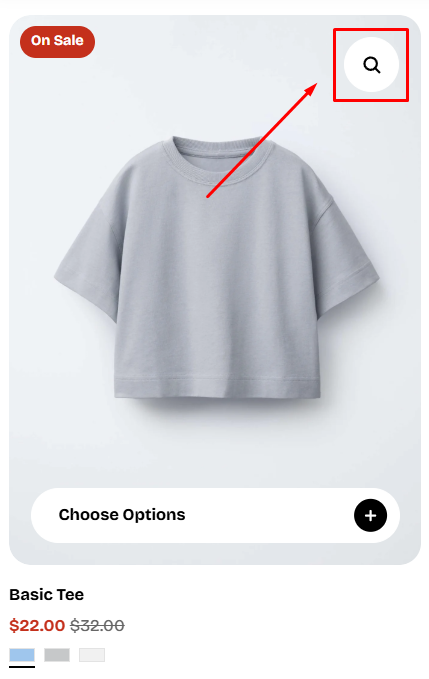 To customize your Quick view, see Quick add drawer. |
| Show quick view on mobile | Enables the Quick view icon and popup on mobile devices.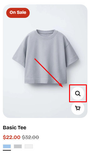 |
Last updated