
Theme Blocks
Collection
2 min read
_Tz88rMdk.jpg)
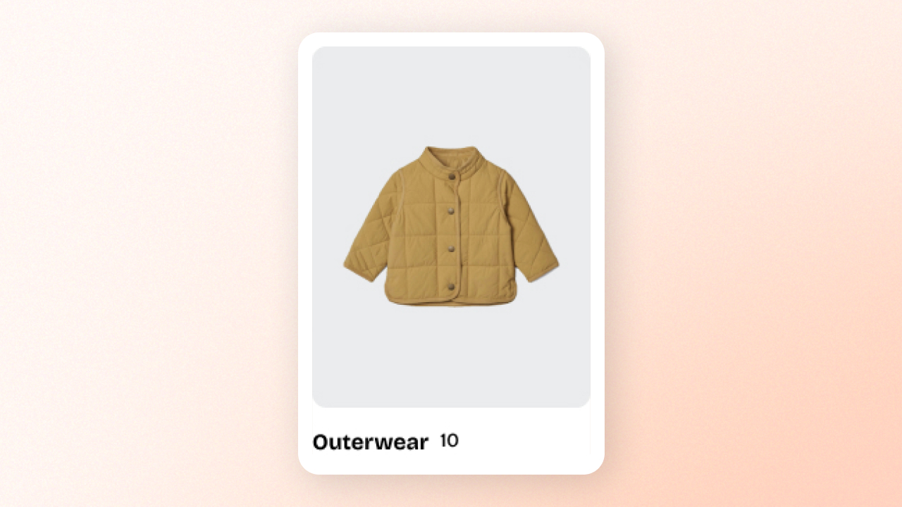
Collection card
⚙️ Block settings
| Setting | Description |
|---|---|
| Collection | Select the collection you want to showcase. This collection will be displayed as the primary content of the card. ✍️ Learn how to create collections in Shopify with our tutorial. |
| Text alignment | Choose the alignment for the text within the card. |
| Show product count | Enable this option to display the number of products in the selected collection. Useful for guiding customers to explore more. |
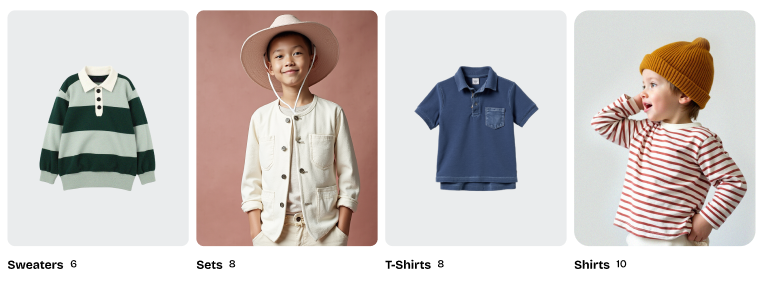
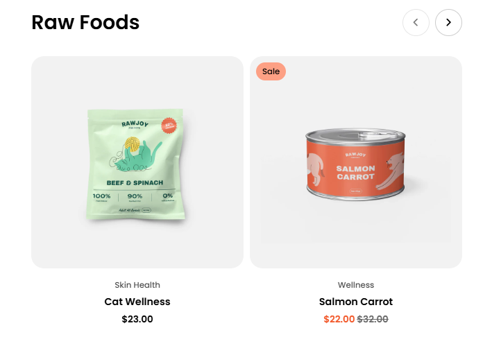
Featured collection
| Setting | Description |
|---|---|
| Collection | Select the collection you want to showcase. This collection will be displayed as the primary content of the card. ✍️ Learn how to create collections in Shopify with our tutorial. |
| Product count | Choose how many products to display from the selected collection. |
| Type | Select how products are displayed: Grid for a static layout or Carousel for a swipeable slider. |
| Columns | Set the number of product columns displayed on desktop devices. |
| Horizontal gap | Adjust the spacing between product cards. |
| Width | Set the section width for both desktop and mobile devices to either Fill or Custom. |
Learn more: Product cards
Last updated