
Collections And Products
Collections list page
2 min read
_KfXxckfP.jpg)
How to access Collections list page template
- From the theme editor (Customize), select the template selector.
- In the dropdown menu, select Collections list template.
- Make necessary changes.
- Save the settings.
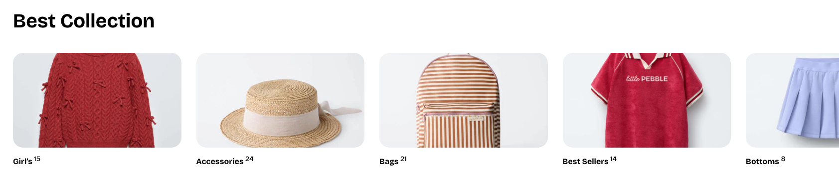
Collection list section
Section settings
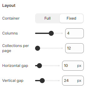
Layout
- Columns: Choose the number of collection cards to show per row on desktop.
- Collections per page: Set how many collections appear before pagination begins.
- Horizontal gap / Vertical gap: Adjust the horizontal and vertical spacing between collection cards.
Mobile layout
- Number of columns displayed on mobile.
- Horizontal and vertical spacing between collection cards.
Collection list block
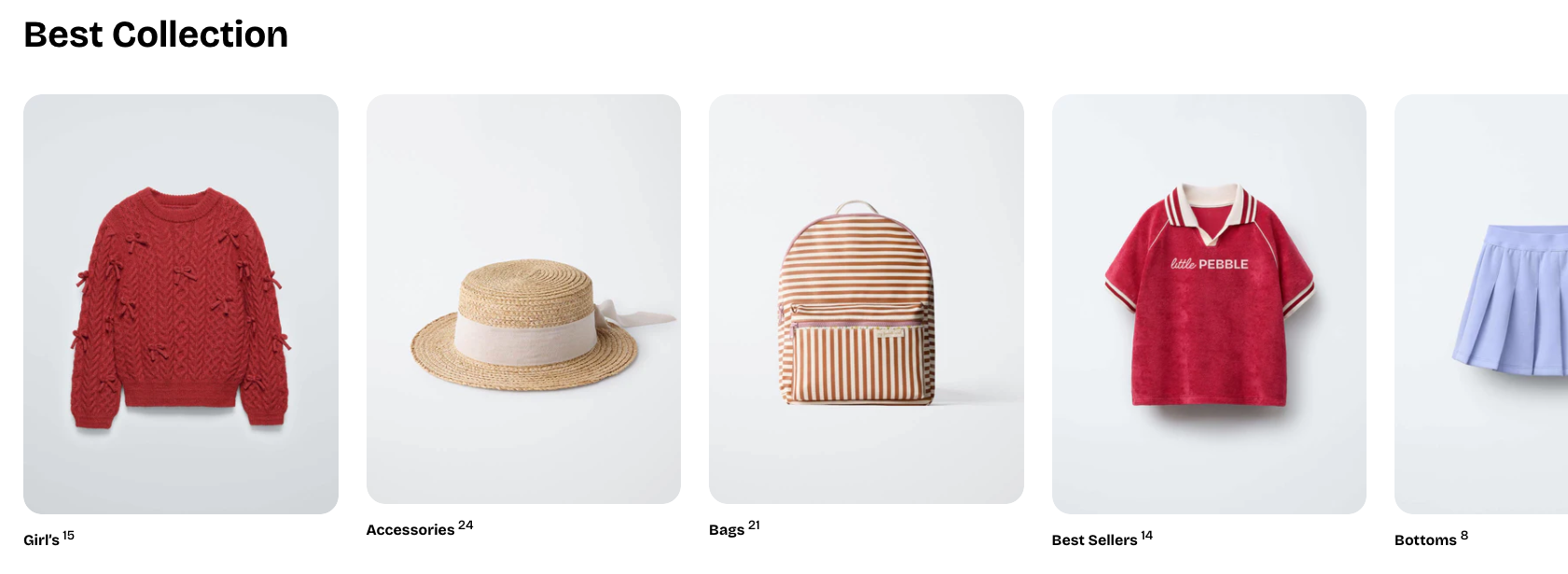
Collection card
- Aspect ratio: Sets the shape of the collection image.

- Go to Theme settings > Collection cards and set the aspect ratio there to use it as a global setting.
- The image ratio adapts to the original size of the uploaded image.
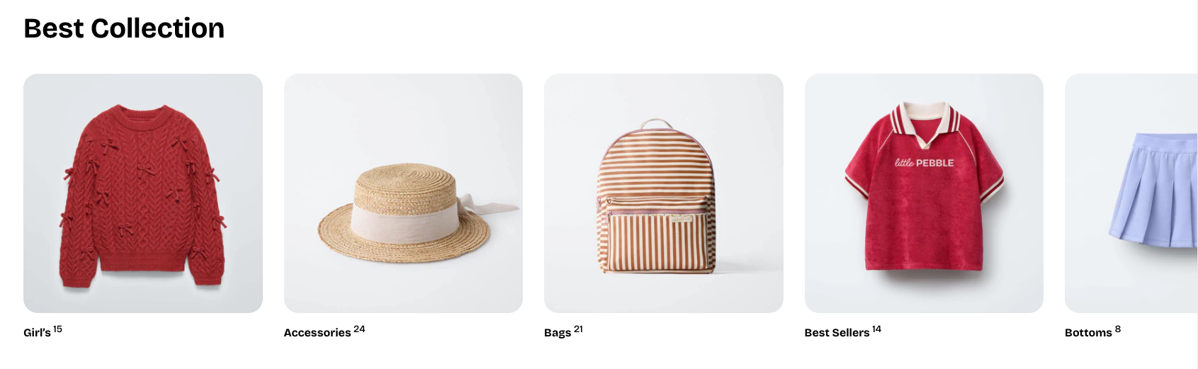
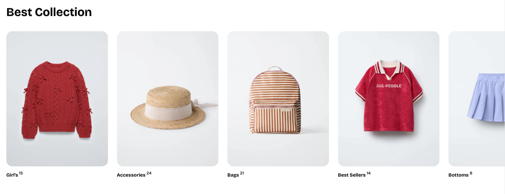
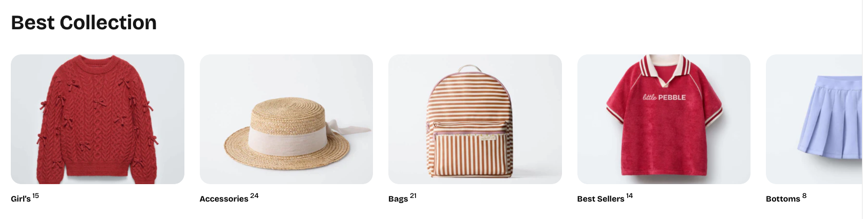
- Alignment: Controls the horizontal alignment of the collection title.

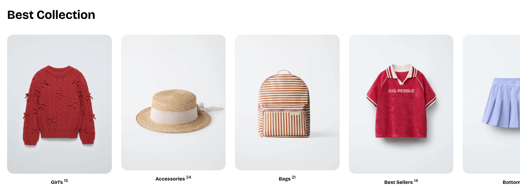
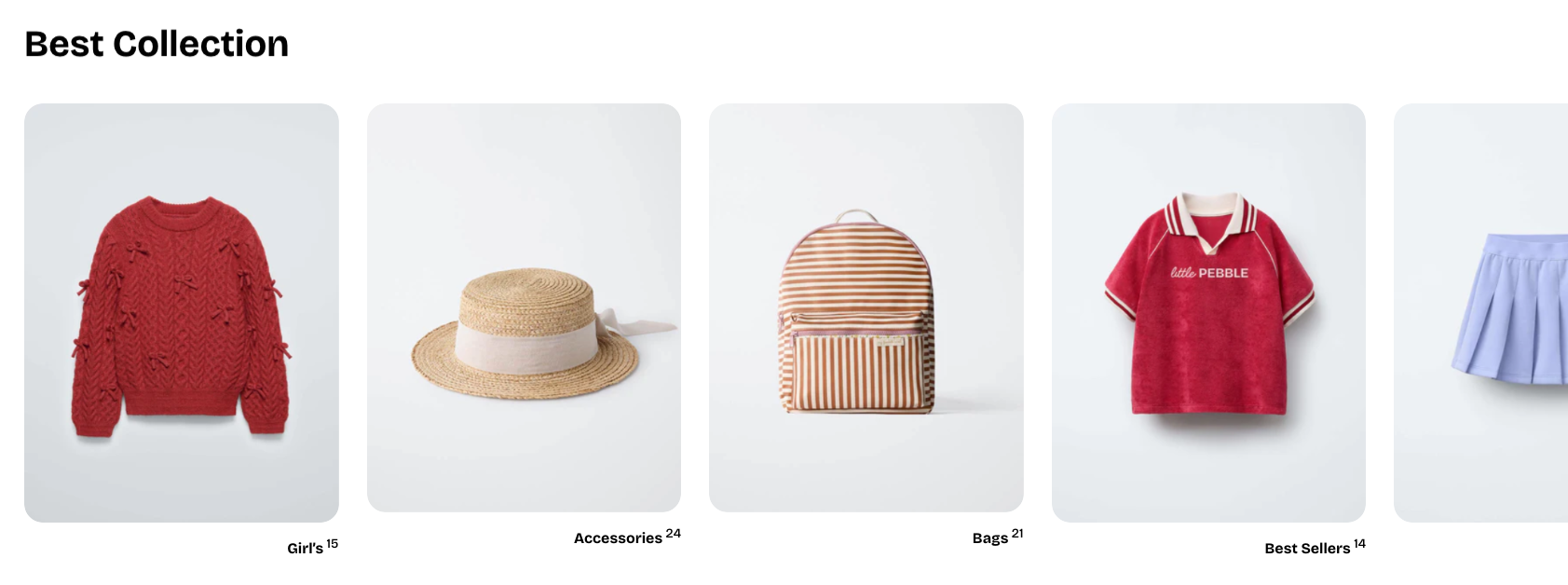
- Show product count: Toggles whether the number of products in the collection is displayed.
Nested dynamic blocks
Theme blocks
Other sections
Theme sections
Best practices
- Use high-resolution images for collection thumbnails so the grid looks clean and consistent.
- Order your collection blocks strategically — feature best-selling or seasonal collections first.
- Use the aspect ratio setting to ensure visual consistency across all cards.
Last updated