
Collections And ProductsProduct page
Product information
12 min read
How to navigate to the Product information section
- In the theme editor (Customize), open the template selector.
- Locate Products, and select a product template you want to make changes to.
- On the left sidebar, select the Product information section.
- Make necessary changes and Save.
How to edit the Product information section
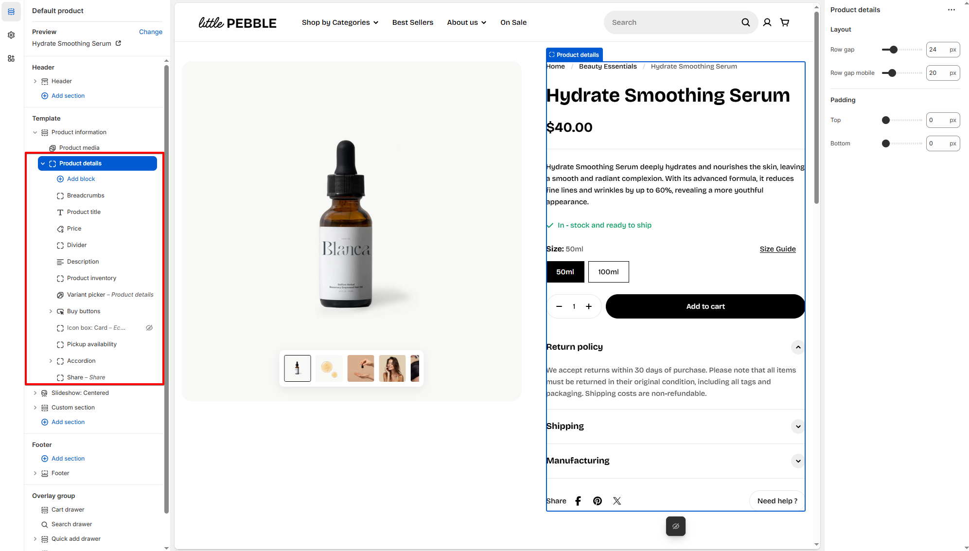
Section settings
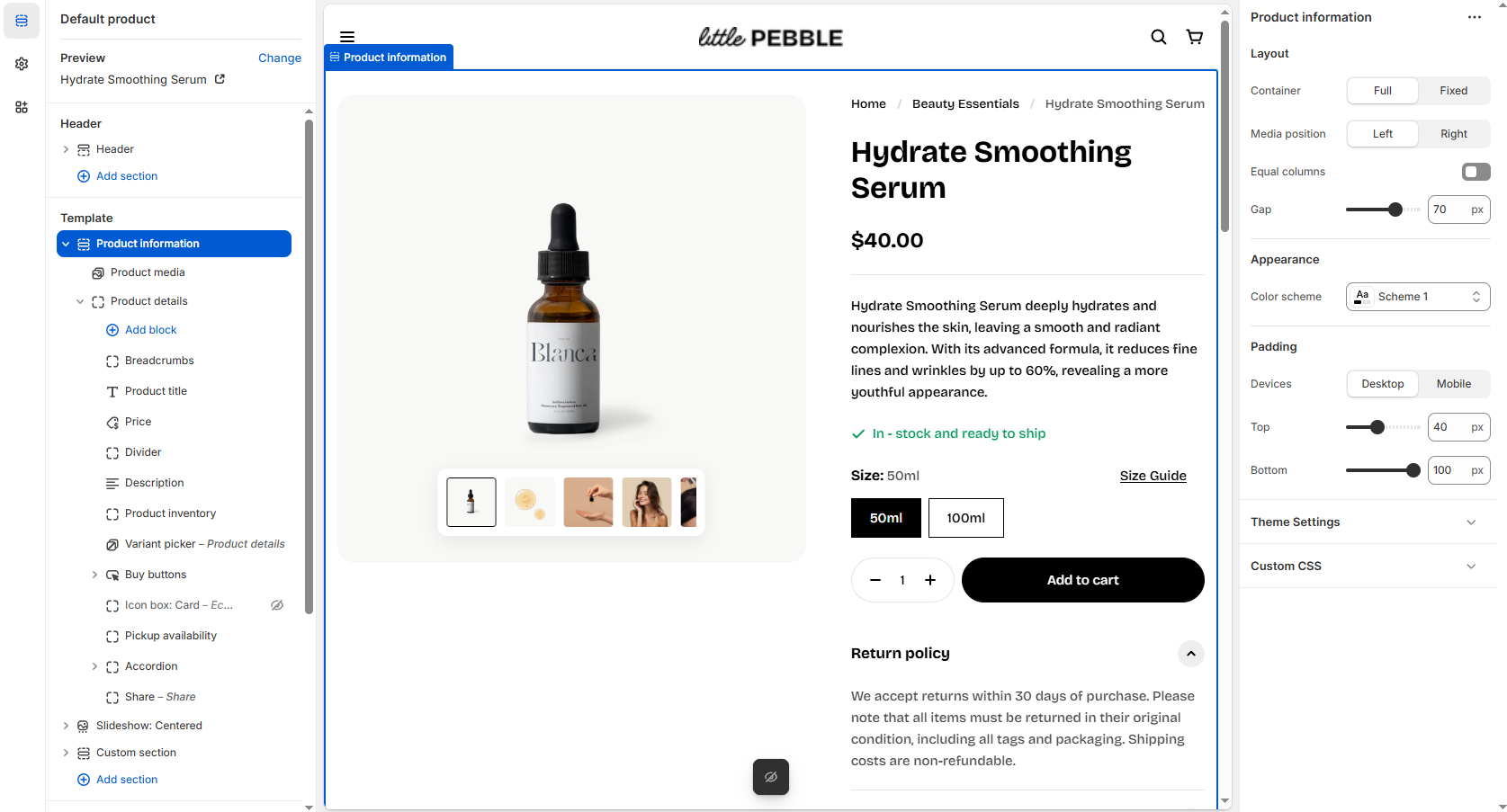
| Setting | Description |
|---|---|
| Container | Choose Full width or Fixed (Page width) layout. |
| Media position | Display product media on the left or right side of the details. |
| Equal columns | Makes the media and details columns equal width. |
| Gap | Adjust spacing between the media and details columns. |
| Color scheme | Apply a color scheme to this section. Learn more |
| Enable sticky add to cart | Keep the add to cart section visible while scrolling.  |
Block settings
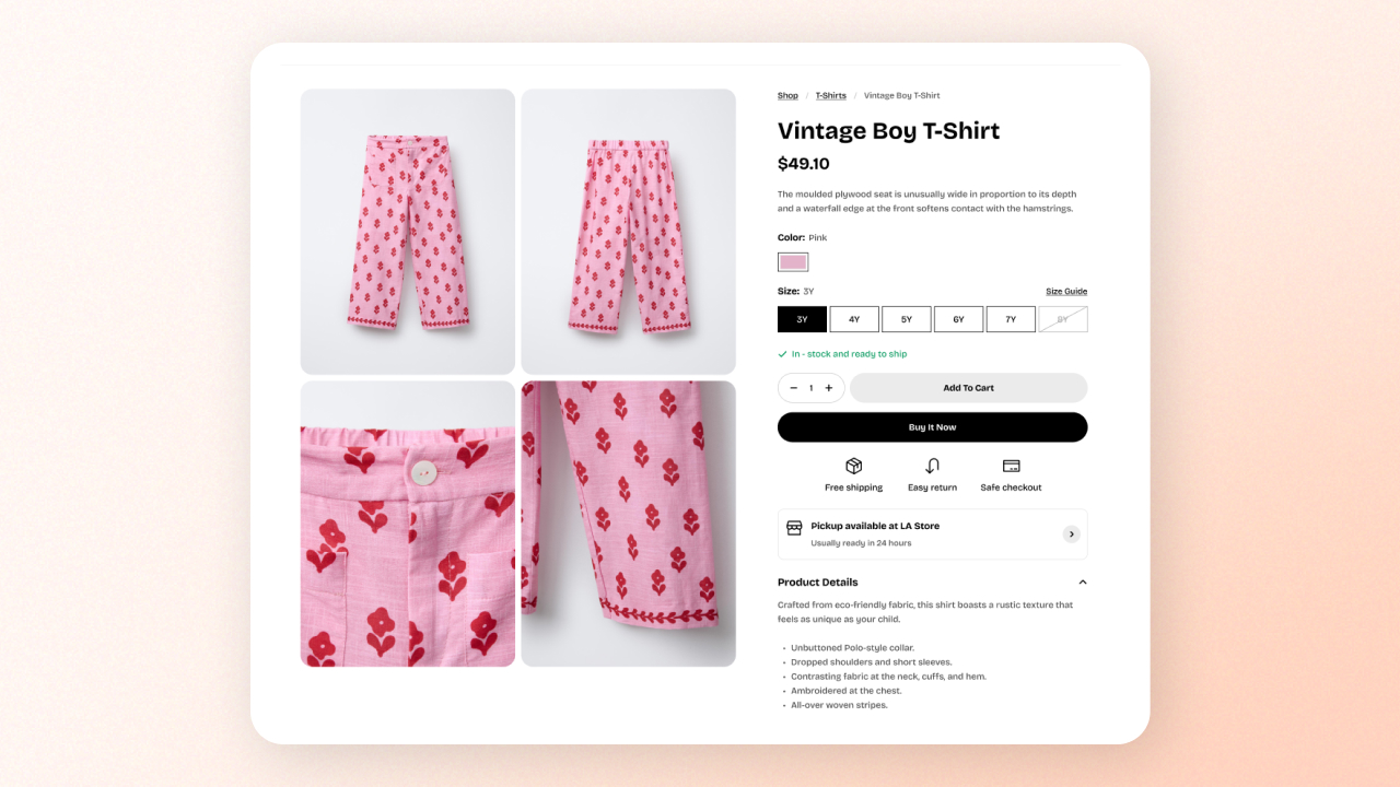
1. Media
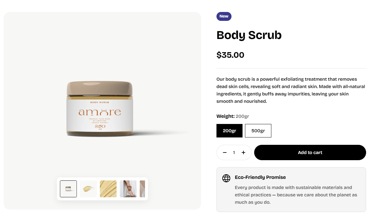
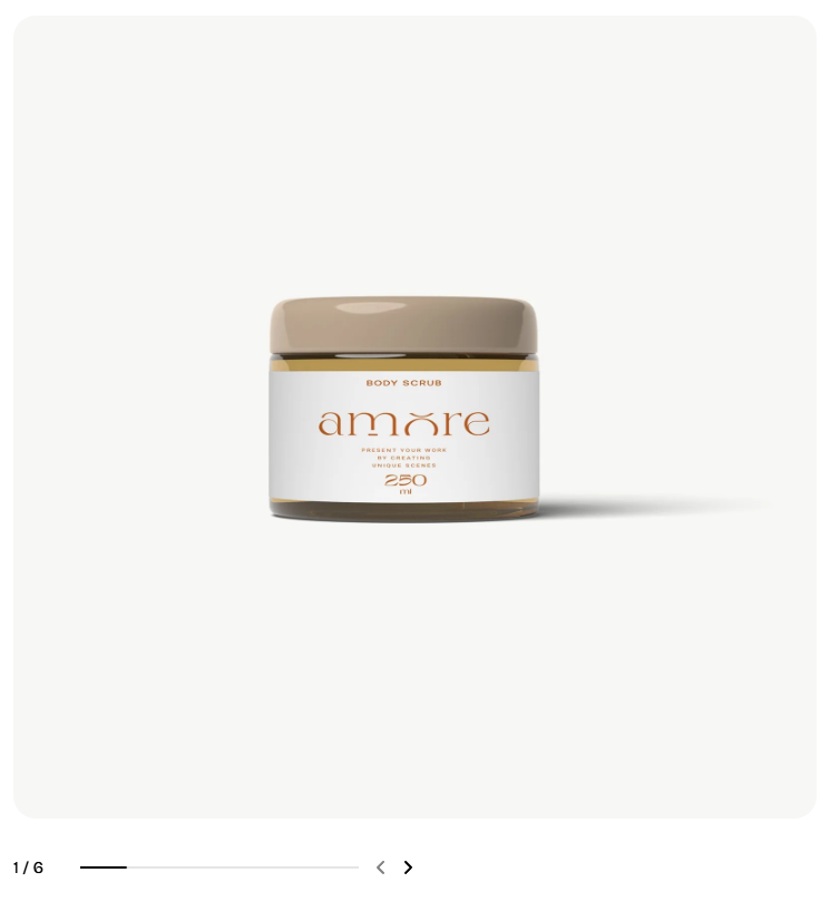
- Style: Select your preferred desktop layout for product media. On mobile, the media is displayed as a carousel.
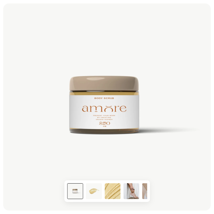
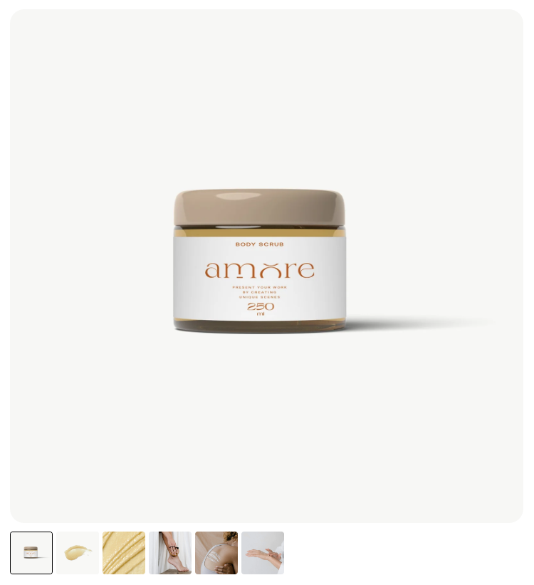
- Grid layout: If using grid, choose 1-column, 2-column, or grid-with-thumbnail layout.
- Grid gap: Spacing between media items when using a grid layout.
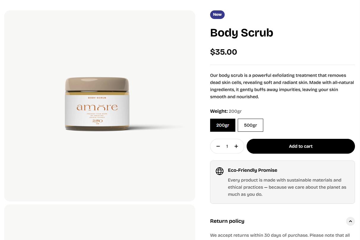
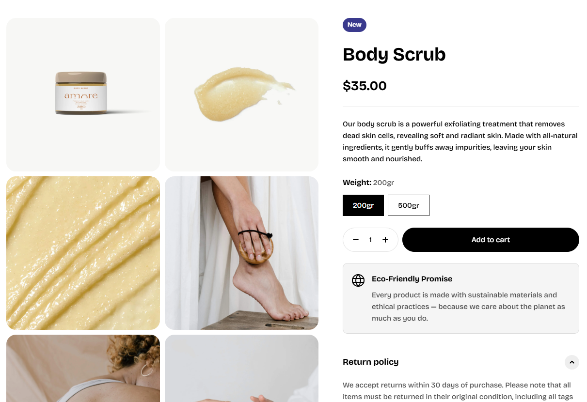
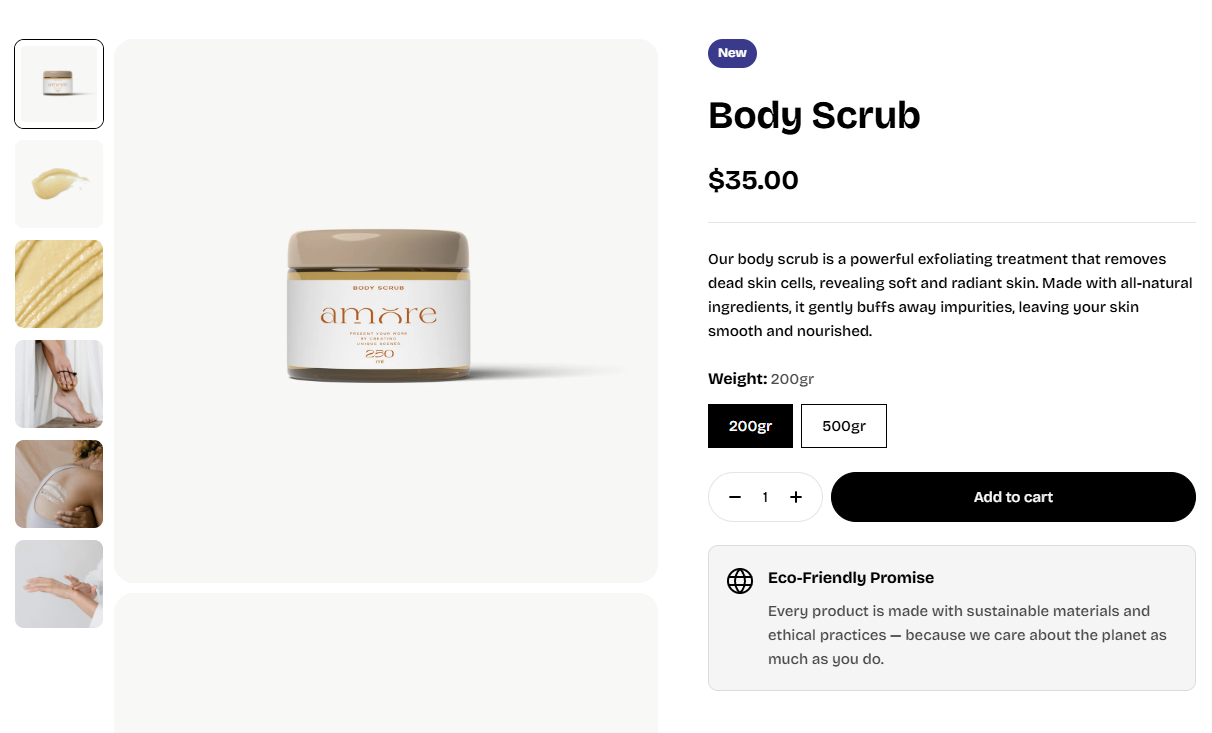
- Thumbnail: None/ Inside/ Outside.
- Thumbnail aspect ratio: Control cropping of small thumbnail items separately.
- Media aspect ratio: Control how the main media is cropped (square, portrait, landscape, auto).
- Border radius: Round the corners of media items. This applies to the thumbnails as well.
- Extend media to screen edge: Makes visuals extend horizontally when container = “page” (great for immersive layouts).
| Setting | Description |
|---|---|
| Video autoplay | Automatically plays product videos (muted) in the gallery. |
| Enable zoom | Enables image zoom interaction on desktop. |
- Hide unselected variant media: When enabled, the gallery only shows media for the selected variant, cleaning up the viewer.
2. Product details
Last updated