
Collections And ProductsCollection page
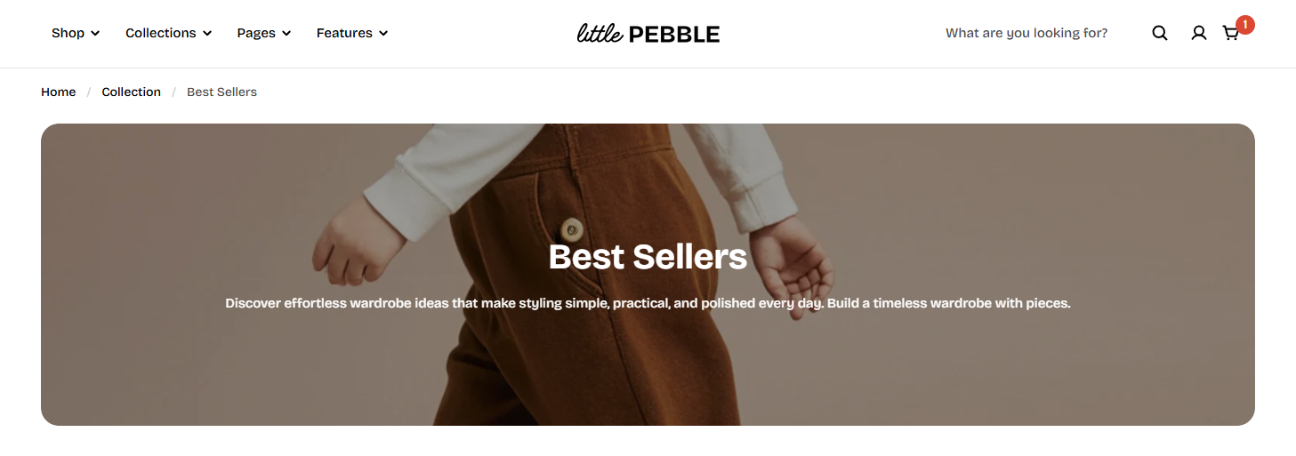
Collection banner
4 min read
How to add a Collection banner section
- In the theme editor (Customize), open the template selector.
- Select Collections, then Default collection.
- On the left-side bar, add Collection banner.
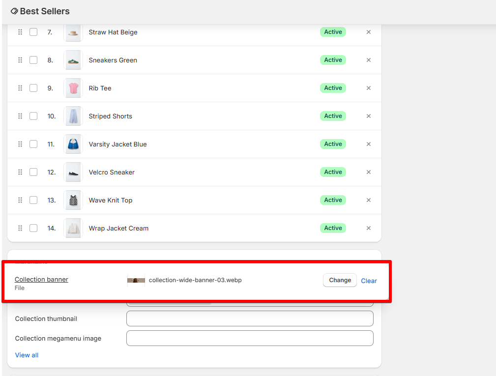
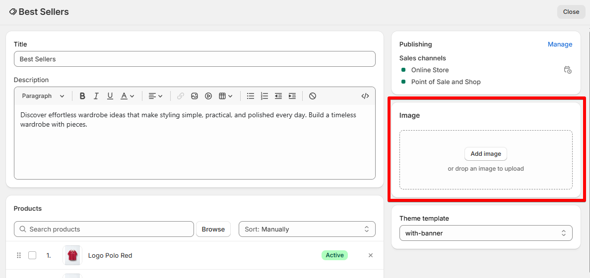
Add a description or image by editing your collection. Learn more
How to edit a Collection banner
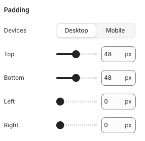
Section settings
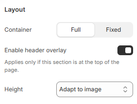
Layout
- Container: You can adjust the banner to display full width or within a fixed-width container using the two options Full / Fixed.
- Set an Image height for the banner:
- Adapt to image
- Large
- Medium
- Small
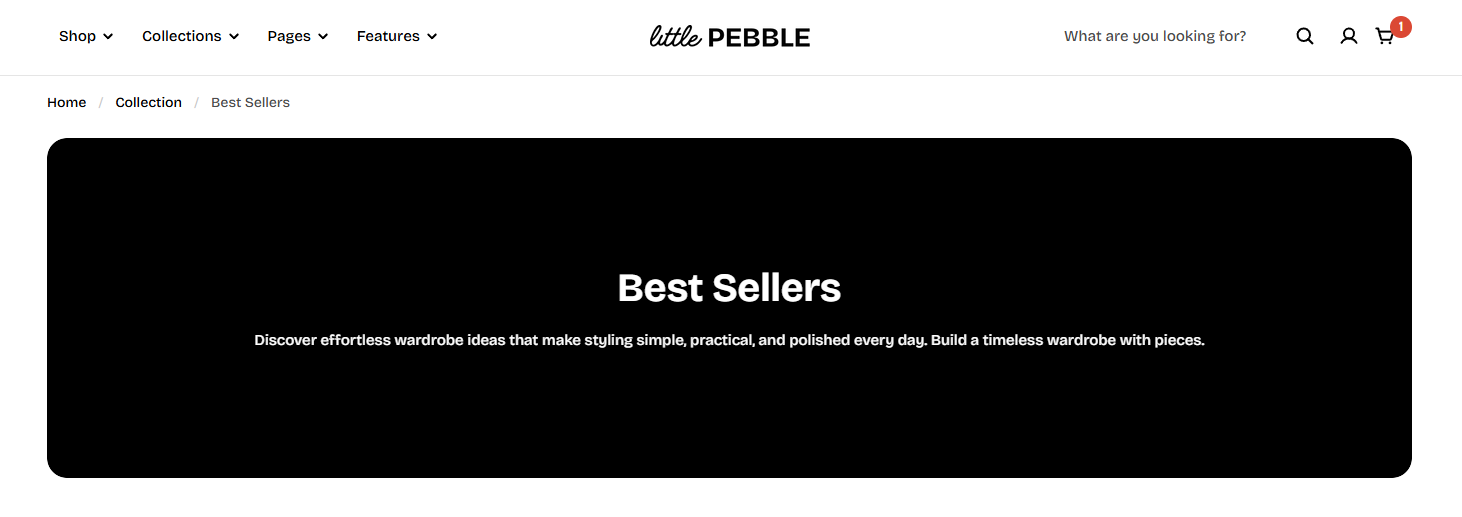
- Enable header overlay if you want the header to overlay your banner.
Media
- Show image: Enable Show image to display a banner image for the collection.
Image display priority
-
Collection metafield image. See How to add an image banner to your collection using metafields
-
Collection featured image (set in the collection editor. Learn more)
Special cases:
- Media overlay: Enable Media overlay if you want to add a color overlay on top of the image, then customize the color Overlay color.
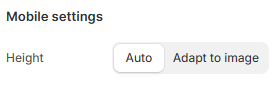
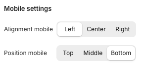
Mobile settings
Collection banner block
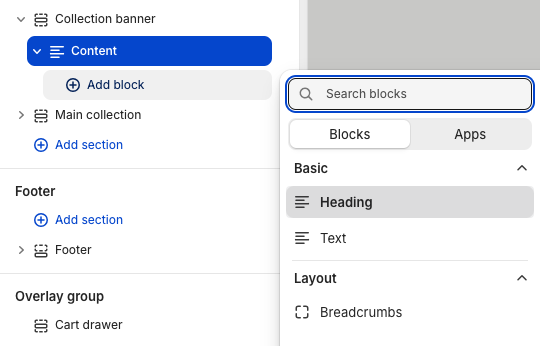
Content
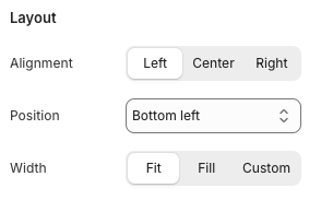
- Alignment allows you align the banner text to the left/center/right, and adjust the position of the banner content to wherever you want it to appear.
- You can also adjust the content width with three options: Fit / Custom / Fill.
Breadcrumbs
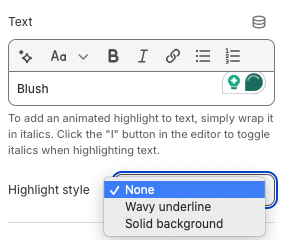
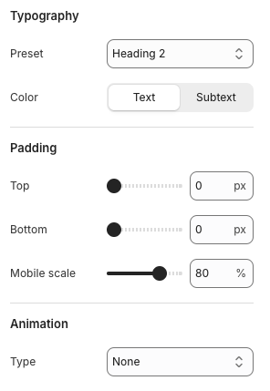
Heading
- None
- Wavy underline
- Solid background
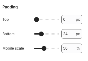
- Top padding
- Bottom padding
- Mobile scale
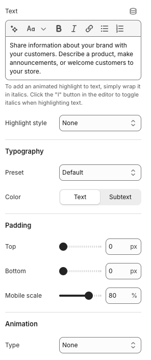
Text
Add an Image banner to your Collection using Metafields
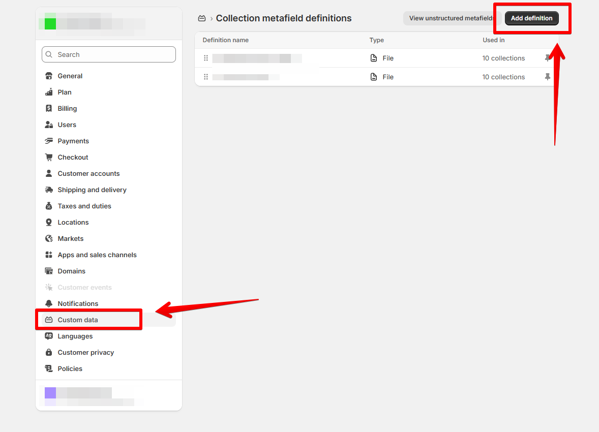
Step 1: Create product metafield definitions
- Go to Shopify Settings > Custom data > Collections
- Select Add definition
- Create 2 new metafield definitions:
- Namespace and key:
- For desktop banner:
foxtheme.collection_banner - For mobile banner:
foxtheme.collection_banner_mobile
- For desktop banner:
- Type: File (Image)
- Namespace and key:
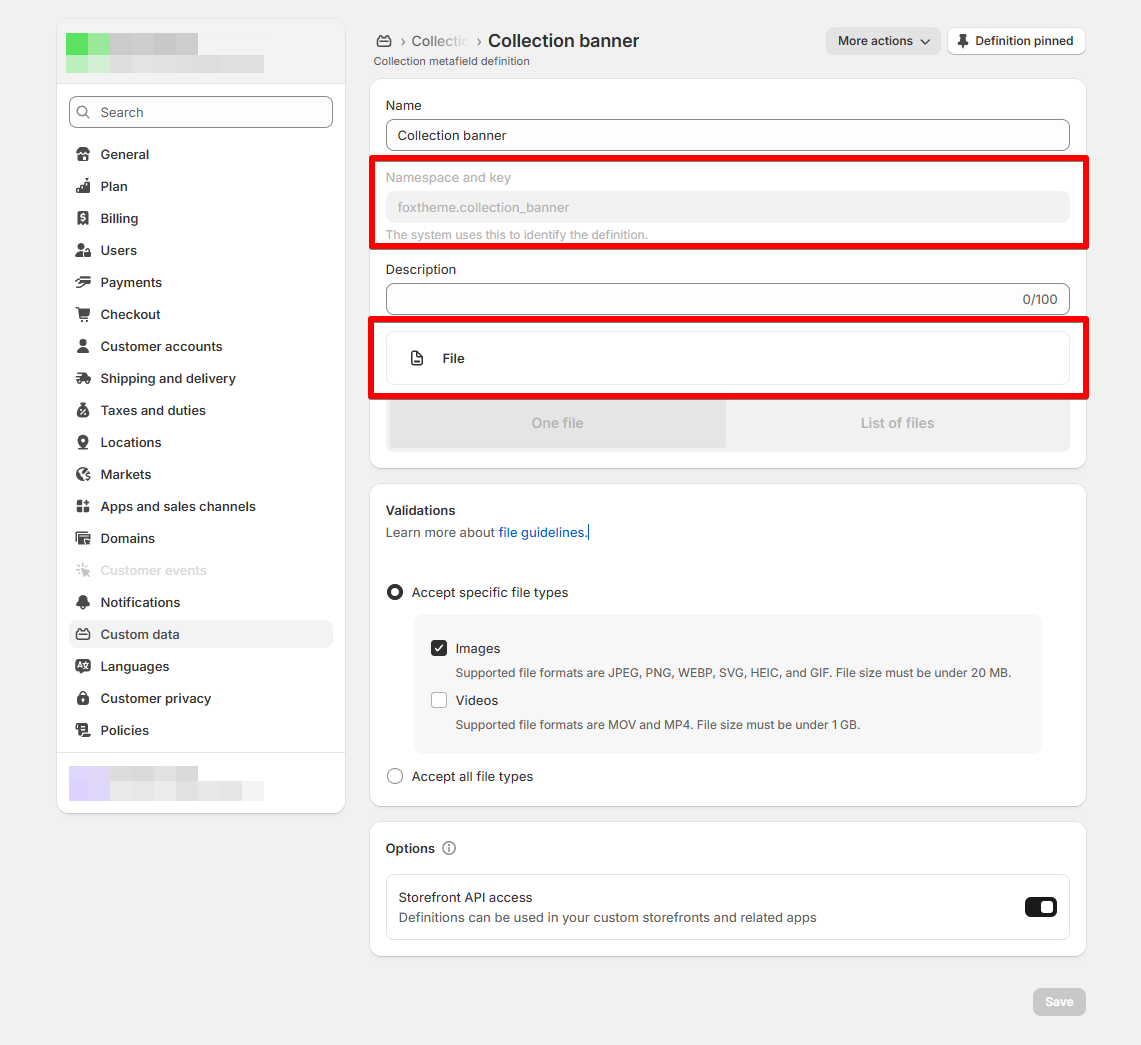
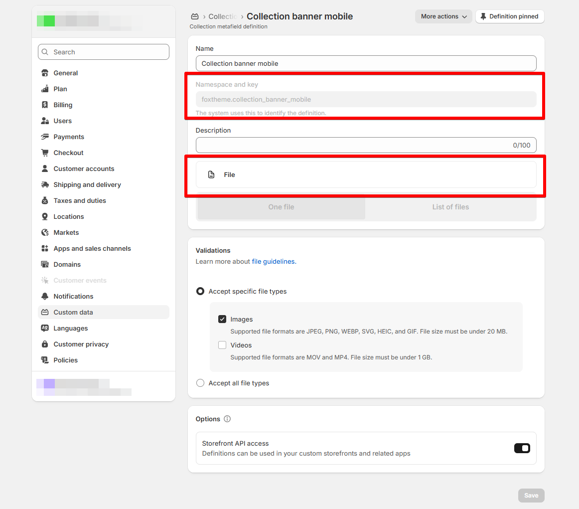
- Save the metafield definition.
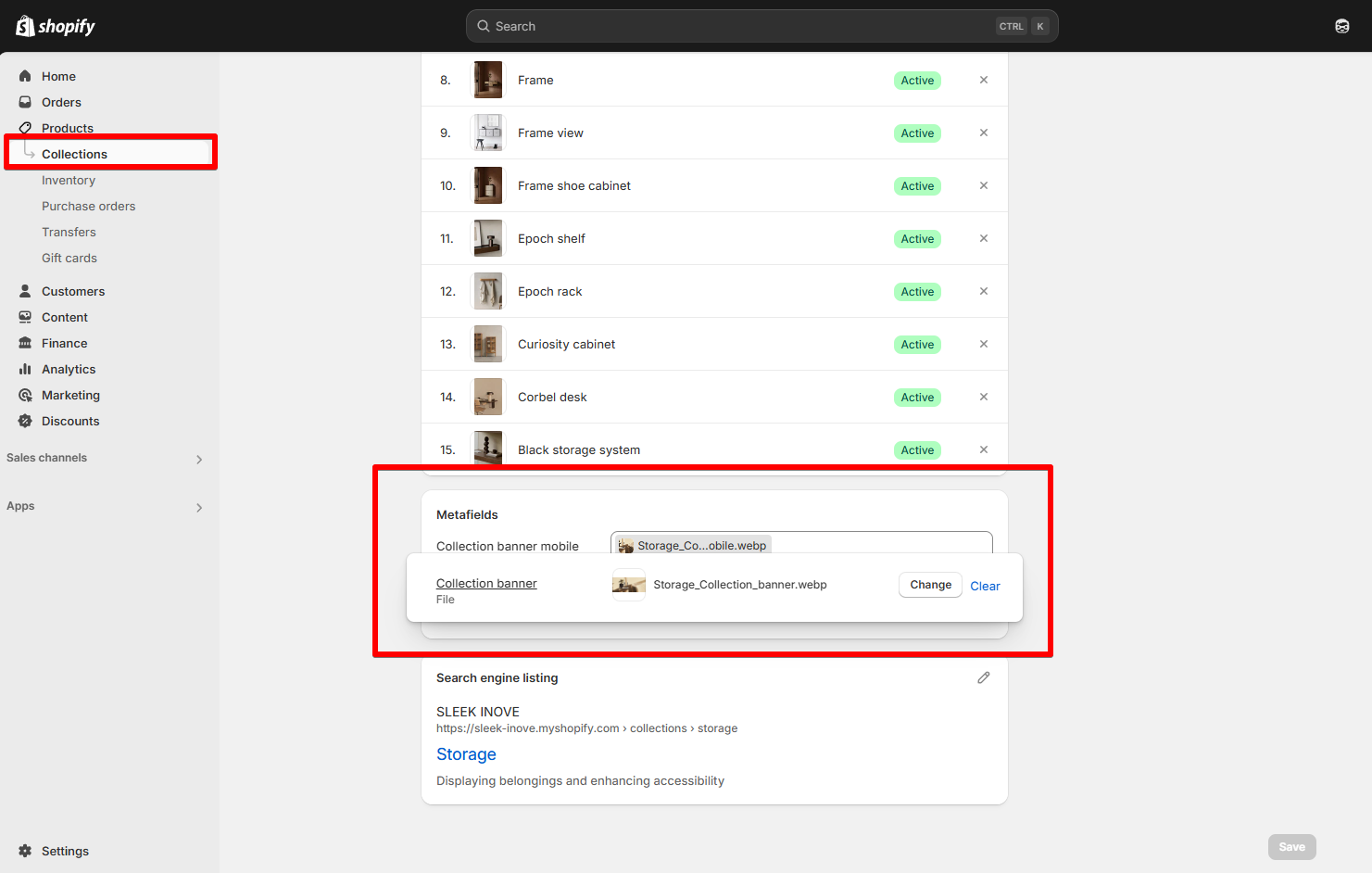
Add metafield value for collections
Last updated