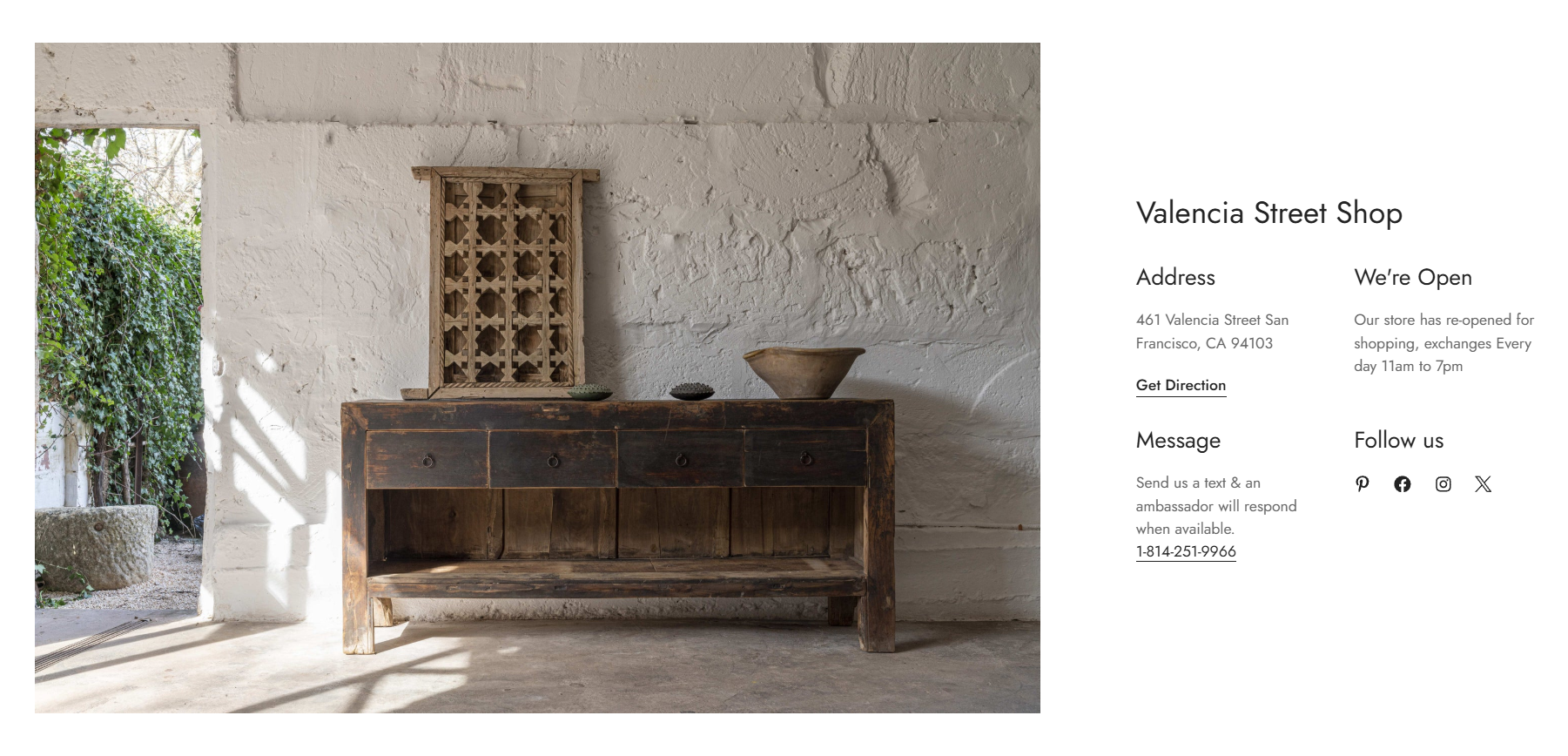
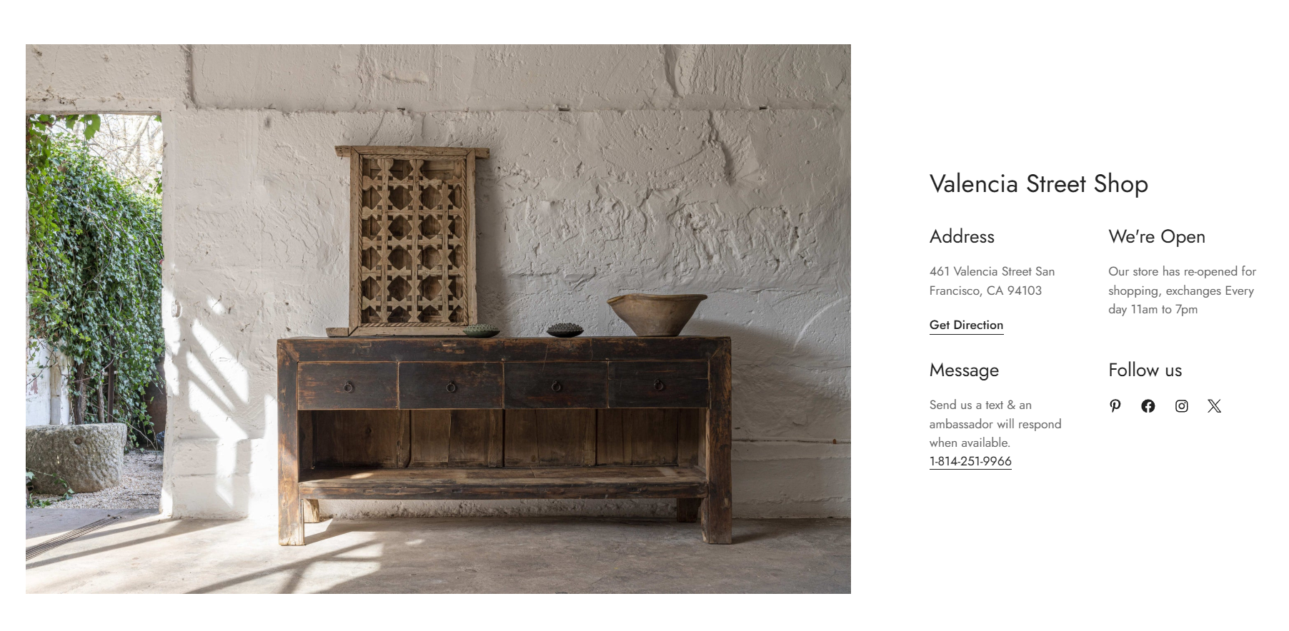
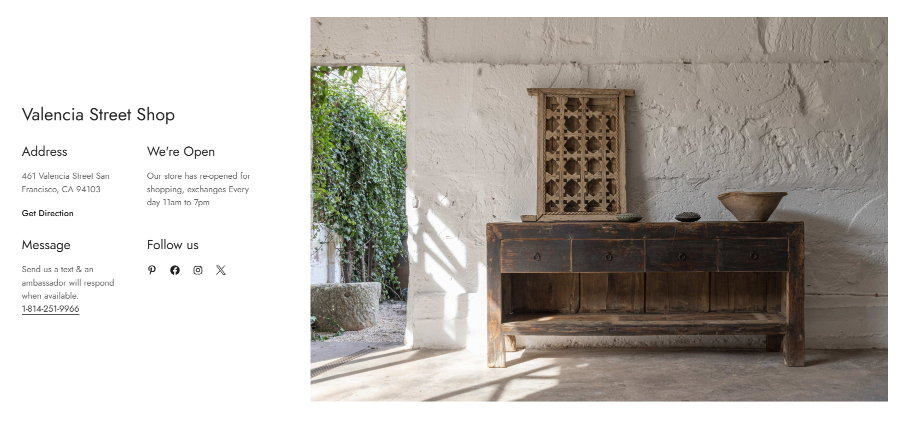
The Store locator section lets you easily display store locations with their exact addresses to make the shopping experience easier and more seamless for customers.
You can showcase:
Store addresses
Opening hours
Contact information
Social media links
Store images
Additional store details
Whether you are opening new branches, relocating stores, or updating business hours, simply edit the Store locator section to keep customers informed.
The Store locator section is only available in Minimog version 6.0.0 and above . ✨
# How to add a Store locator section to your Shopify storeSteps:
In the theme editor (Customize) , click Add section.
Select Store locator.
Make necessary changes.
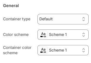
Save the settings. # How to edit a Store locator section# Section settings# GeneralYou can choose your Container type for the collection list as:
Default
Full width
Use container box
Select the Color scheme for the section.
Set up your Color schemes anytime in the Theme settings >
Colors .
Select the Container color scheme for the content area inside the section.
This allows you to create contrast between:
The section background
The store information container
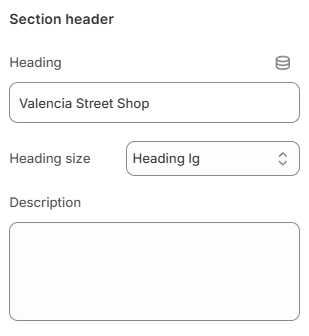
Enter the Heading for the Store locator section.
Choose the Heading size as:
Heading xs
Heading sm
Heading md
Heading lg
Heading xl
Heading 2xl
Add an optional Description using the rich text editor.
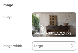
# ImageUpload an Image for the store location.
Choose the Image width as:
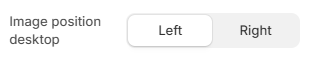
Choose the Image position desktop as:
This setting controls whether the image appears before or after the store information on desktop devices.
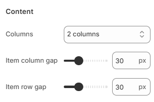
# ContentChoose the number of Columns for the store information layout:
1 column
2 columns
3 columns
Adjust the Item column gap to control the horizontal spacing between content blocks (0-100px).
Adjust the Item row gap to control the vertical spacing between content blocks (0-100px).
These settings help create a cleaner and more organized store information layout.
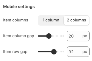
# Mobile settingsChoose the number of Item columns displayed on mobile devices:
Adjust the Item column gap for mobile spacing (0-50px).
Adjust the Item row gap for mobile spacing (0-50px).
Use smaller gaps for compact layouts or larger gaps for improved readability.
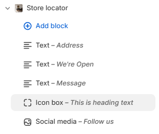
# Block settingsThe Store locator section supports the following blocks:
You can combine multiple blocks to build a flexible store information layout.
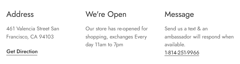
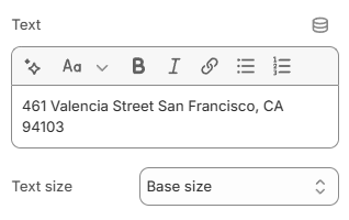
# TextThe Text block is commonly used for:
Store address
Opening hours
Phone numbers
Email information
Direction links
Store notices
Content settings
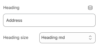
Enter the Heading for the text block.
Choose the Heading size as:
Heading xs
Heading sm
Heading md
Heading lg
Heading xl
Heading 2xl
Add the Text content using the rich text editor.
Select the Text size as:
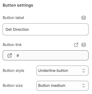
Button settings
Display a call-to-action button to redirect customers to your desired pages.
Add a Label and Link for one or both, then choose a Button style:
Primary button
Secondary button
Underline button/White button
Leave the Button label field blank to hide the button.
and adjust the Button size:
Button small
Button medium
Button large
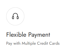
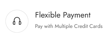
# Icon boxThe Icon box block is commonly used for store services, feature highlights, brand values, promotional content, and support information.
Choose the Layout for the Icon box:
Image settings
Upload an Image for the Icon box block.
You can also use Image from URL to display an external image.
Adjust the Image width in pixels. Leave the field blank to use the original image width.
Add an Image link to make the image clickable.
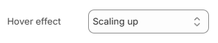
Choose the Hover effect for the image:
None
Zoom in
Scaling up
Scaling down
Content settings
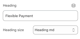
Enter the Heading text for the Icon box.
Choose the Heading size as:
Heading xs
Heading sm
Heading md
Heading lg
Heading xl
Heading 2xl
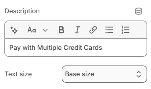
Add a Description using the rich text editor.
Select the Text size for the description:
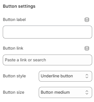
Button settings
Display a call-to-action button to redirect customers to your desired pages.
Add a Label and Link for one or both, then choose a Button style:
Primary button
Secondary button
Underline button
White button
Leave the Button label field blank to hide the button.
and adjust the Button size:
Button small
Button medium
Button large
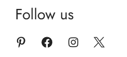
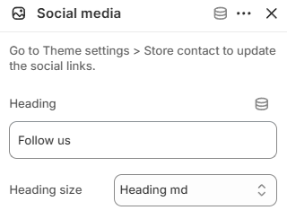
The Social media block displays your store’s social media icons. This helps customers follow your brand, stay updated and connect through social platforms.
Enter the Heading for the social media block.
Choose the Heading size as:
Heading xs
Heading sm
Heading md
Heading lg
Heading xl
Heading 2xl
Update your social media links anytime in
Theme settings > Store contact .