
Theme Sections
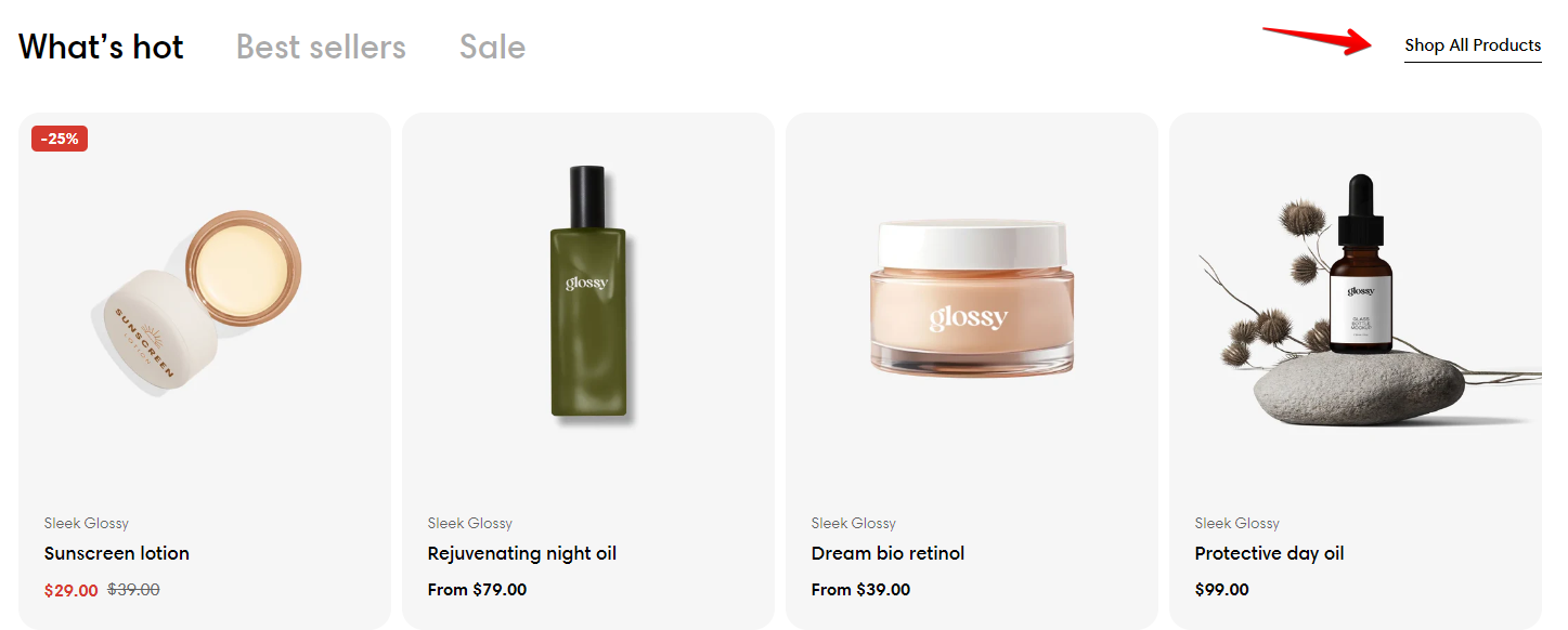
Product tabs
2 min read
How to add a Product tabs section
- In the theme editor (Customize), click Add section.
- Locate Product tabs.
- Make necessary changes.
- Save.
How to edit a Product tabs section
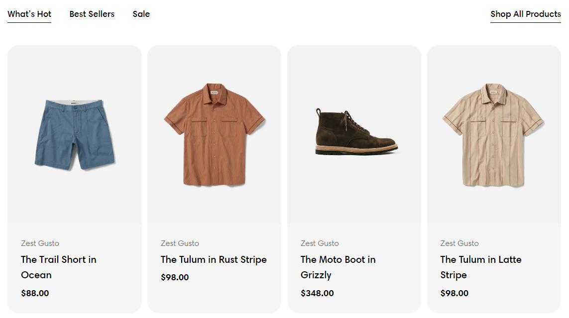
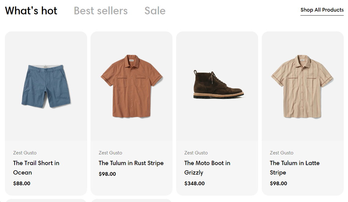
Section settings
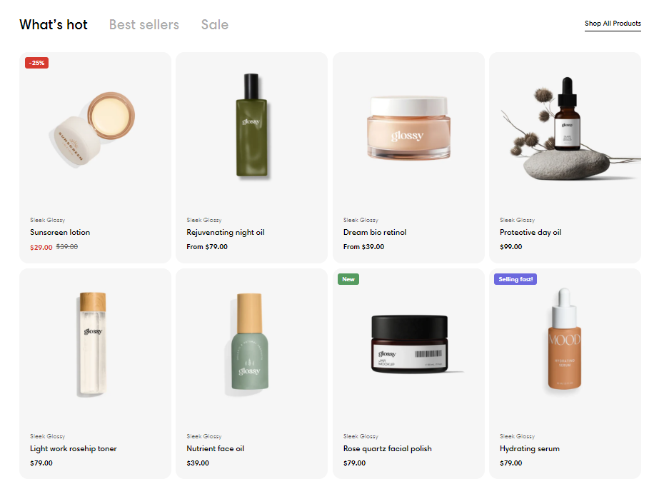
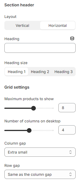
Section header
- Layout: The position of the section header vs the tabs.
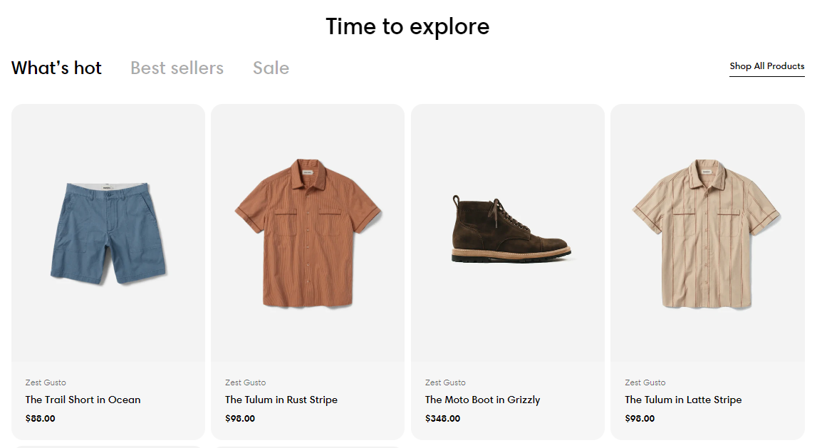
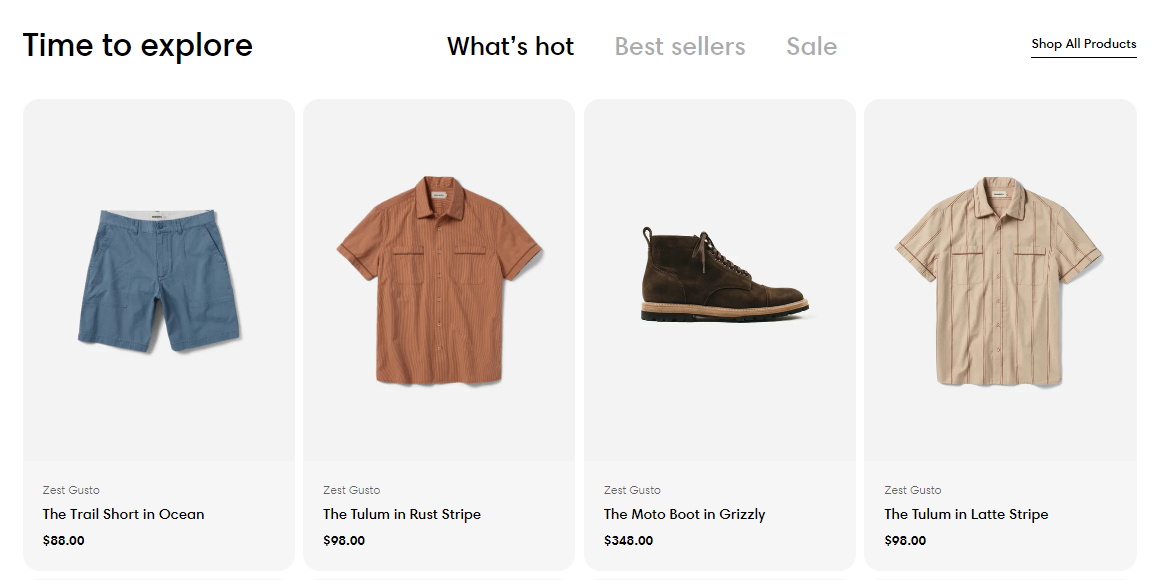
- Heading size: The font size of the section header.
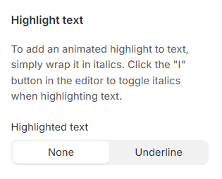
Highlight text
Grid settings
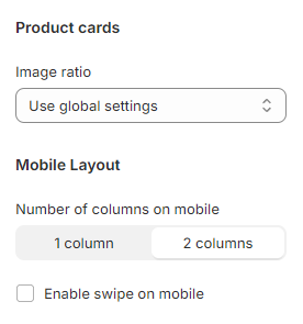
Product cards
- Image ratio: The ratio of image shown on product cards.
Mobile layout
- Number of columns on mobile: 1/ 2 columns.
- Enable swipe on mobile: Show the product list as swipeable on mobile view instead of the default grid layout.
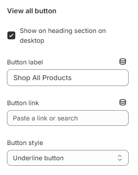
View all button
- Show on heading section on desktop: If the option is selected, the button will display beside the tab names. By default, the view all button when added will show at the end of the product list.
- Button label: Add a label to show the button.
- Button link: Link the button to your desired page. For example: Your all products page.
- Button style: Primary button/ Secondary button/ Underline button.
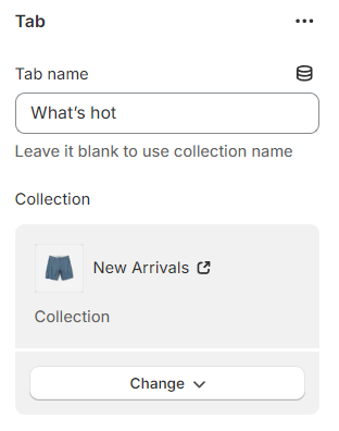
Tab settings
Block settings
Last updated