
Collections And ProductsProduct page
Product information
8 min read
How to add a Product information section
- In the theme editor (Customize), open the template selector.
- Locate Products, and select a product template you want to make changes to.
- On the left-sidebar, add Product information section.
- Make necessary changes > Save.
How to edit the Product information section
General settings
Sticky content on desktop
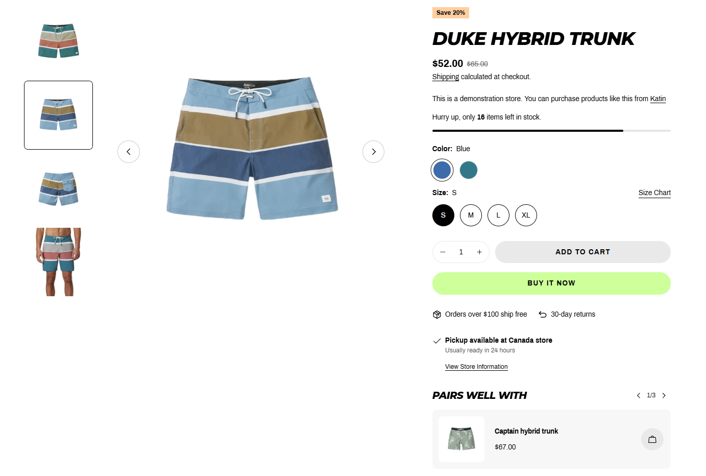
Media settings
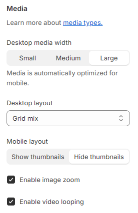
- Desktop media width: Small/Media/Large.
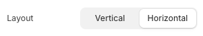
- Desktop layout: Set how the media is displayed on the desktop.
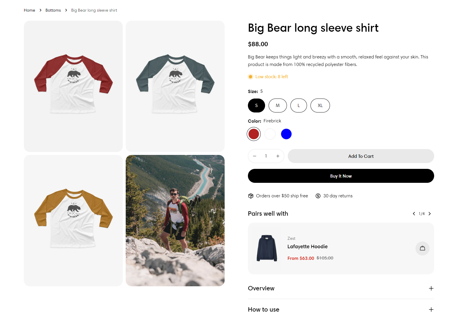
To know more about media, see Product media.
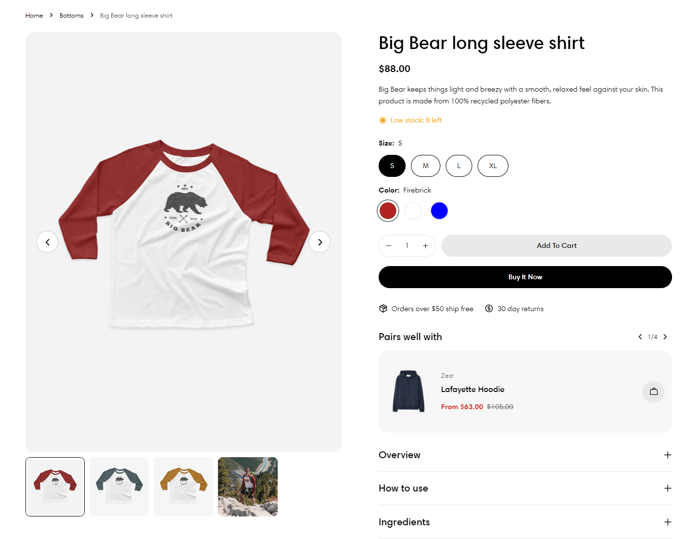
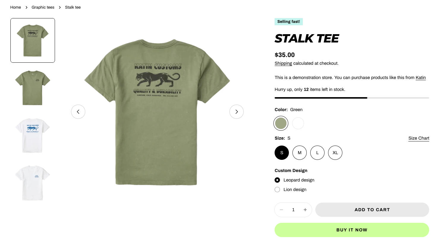
An example of product image zoom
Product Information blocks
- Title
- Price
- Description
- Variant picker
- Buy buttons
- Text
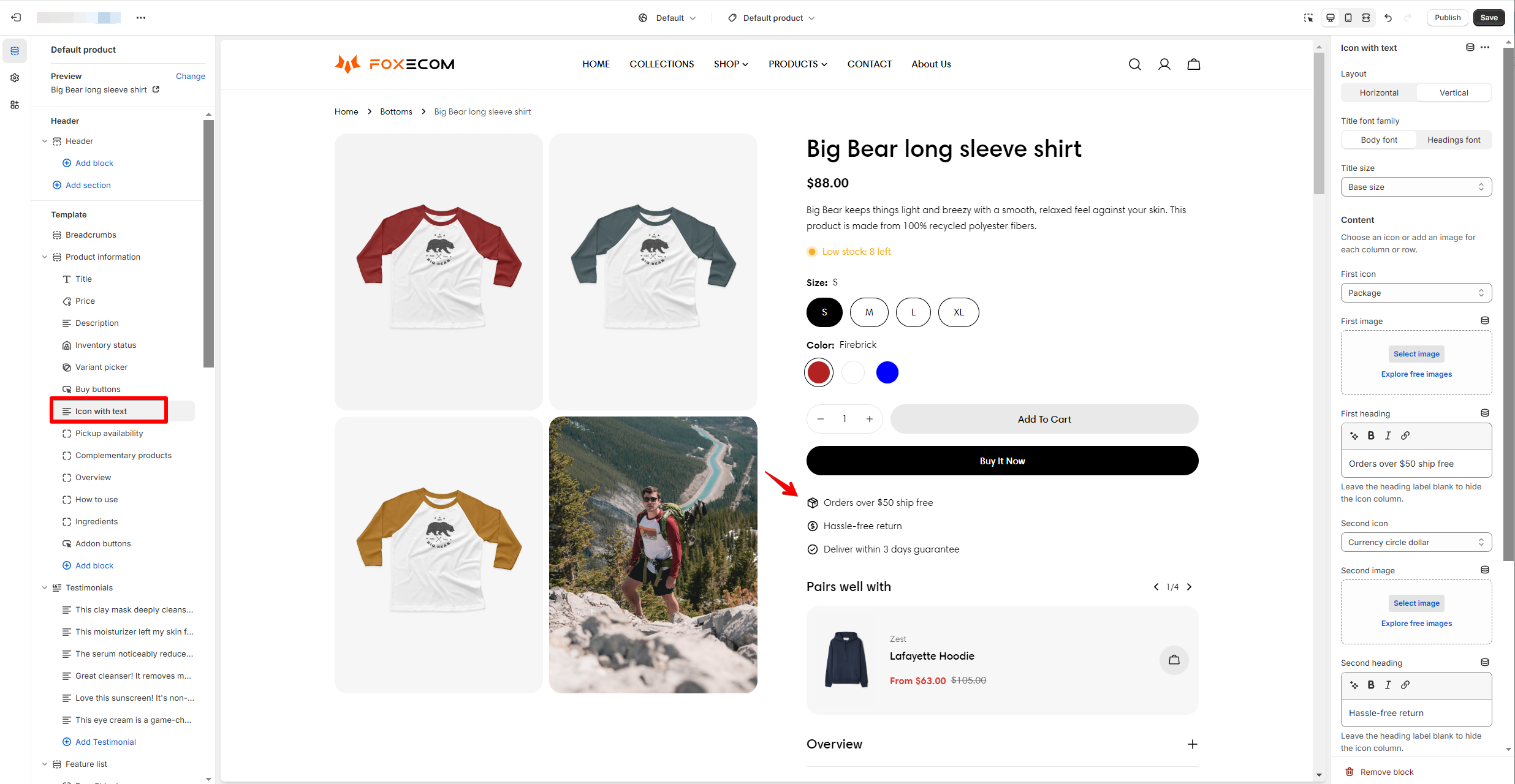
- Icon with text
- Collapsible row
- Inventory status
- Pickup availability
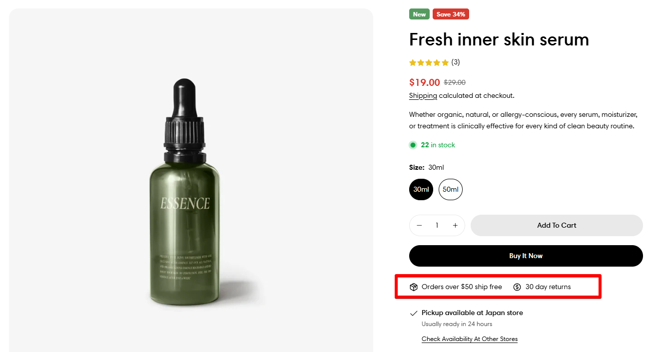
- Shipping
- SKU
- Pop-up
- Badges and tags
- Complementary products
- Addon buttons
- Custom liquid
- Line item property 🔥
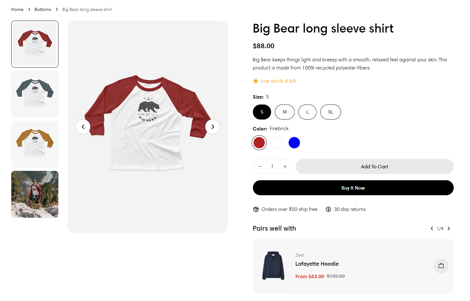
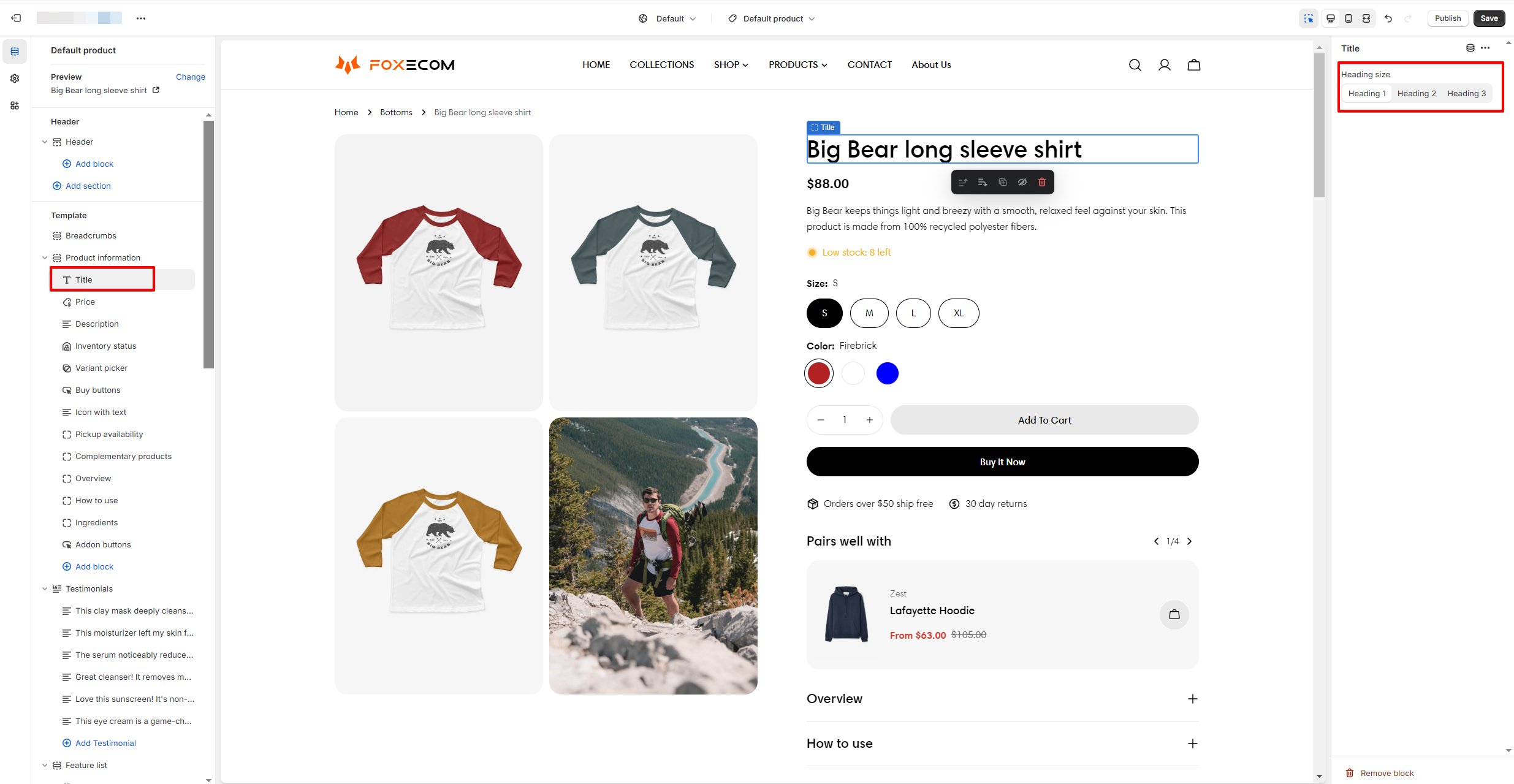
1. Title
2. Price
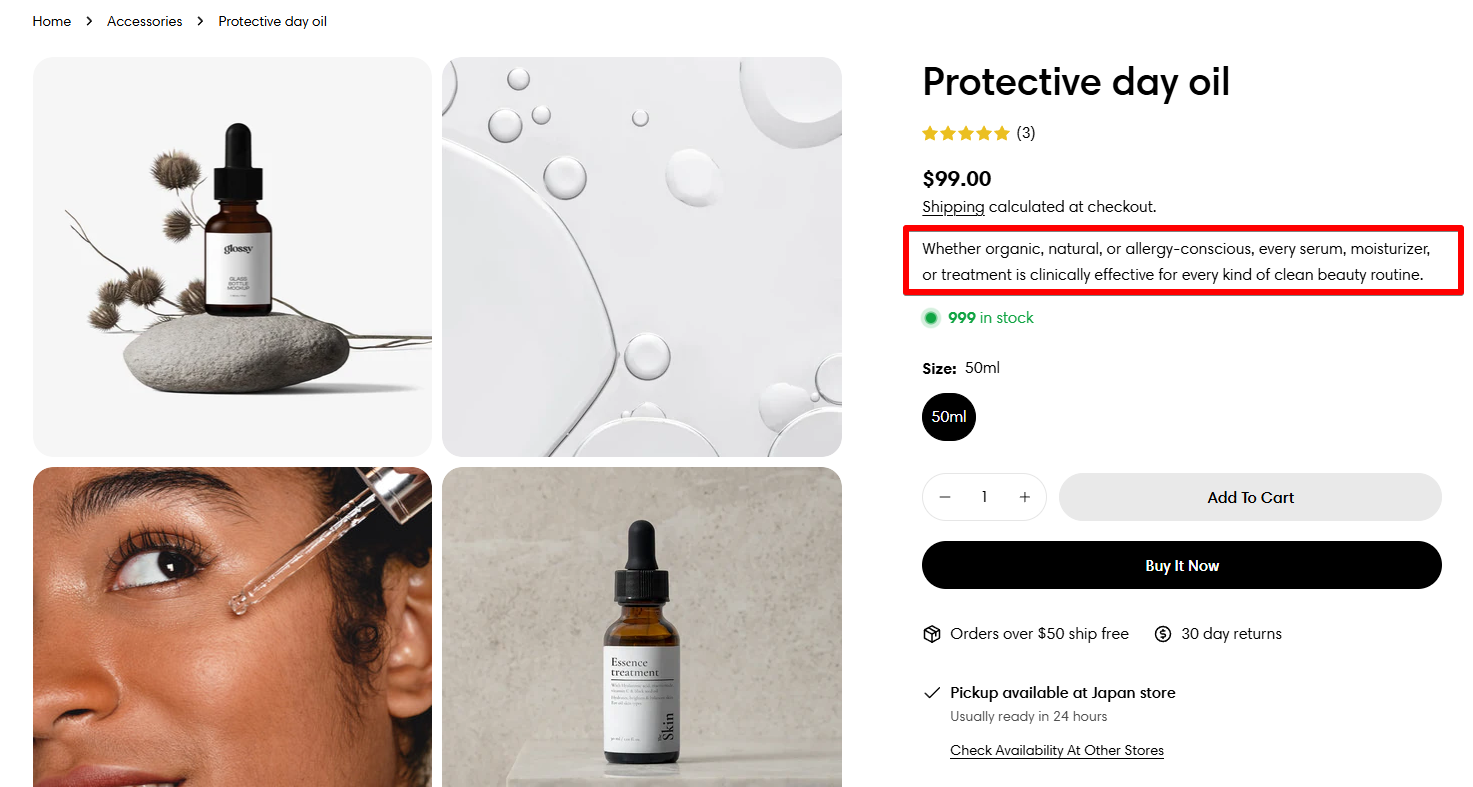
3. Description
✍Not sure how to add a description to your product? See our tutorial here.
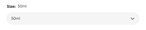
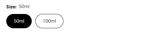
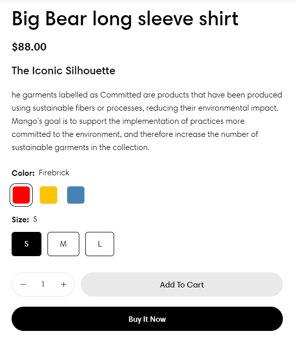
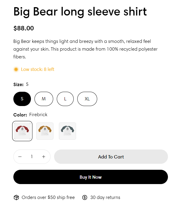
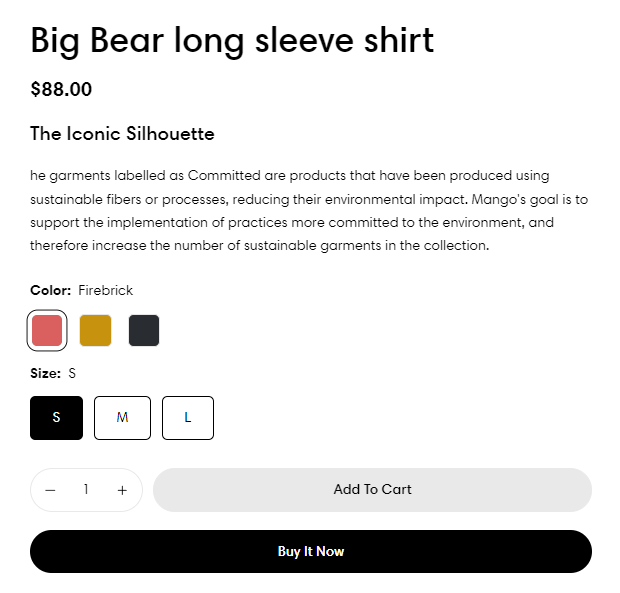
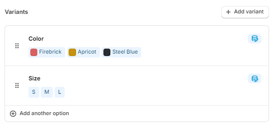
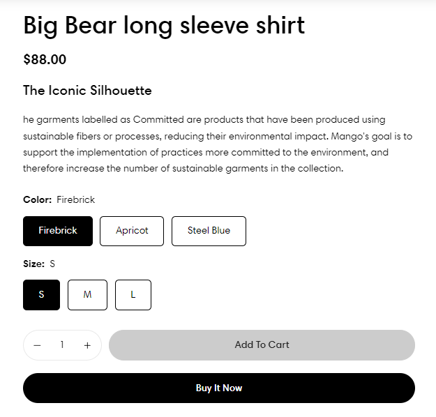
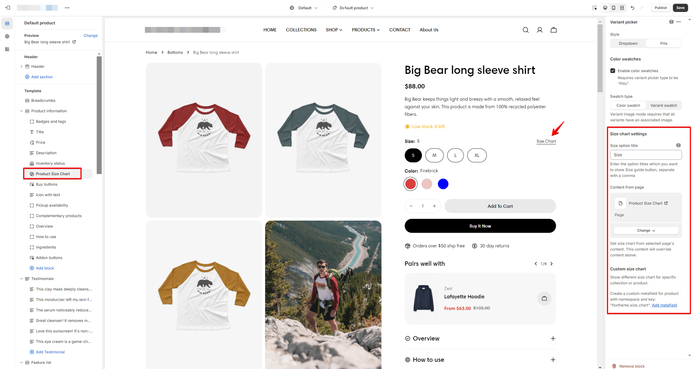
4. Variant picker
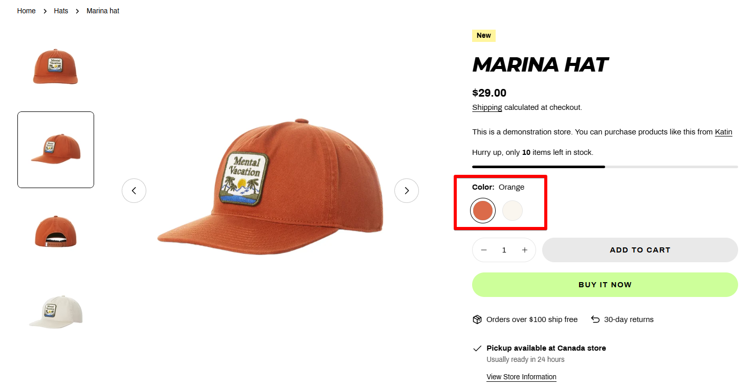
- Style: Dropdown/ Buttons
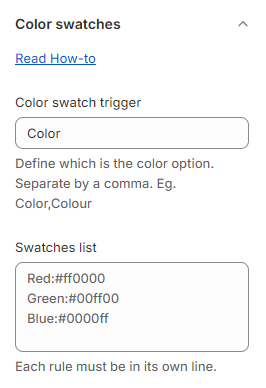
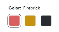
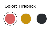
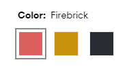
- Swatches
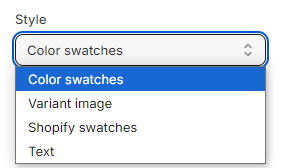
Set the Color swatch trigger for your product option and add your Swatches list in Theme settings > Color swatches.
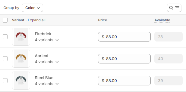
Make sure you have associated your product variants with their images in Shopify Products > Variants.
For more information on setting up native color swatches, please check the Shopify documentation.
Note: Make sure you set the ✅ Color swatch trigger for your color option in Theme settings > Color swatches.
- Size chart
Add the Option name you want to display your size chart and select a page created in Shopify Pages or use metafields to display dynamic content.
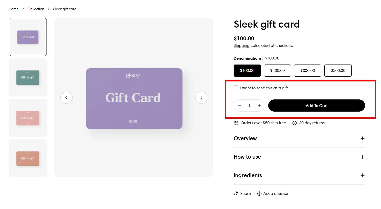
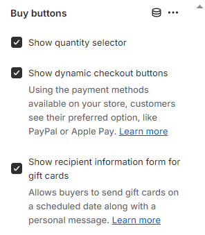
5. Buy buttons
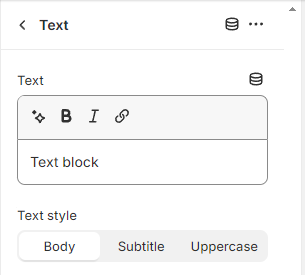
6. Text
7. Icon with text
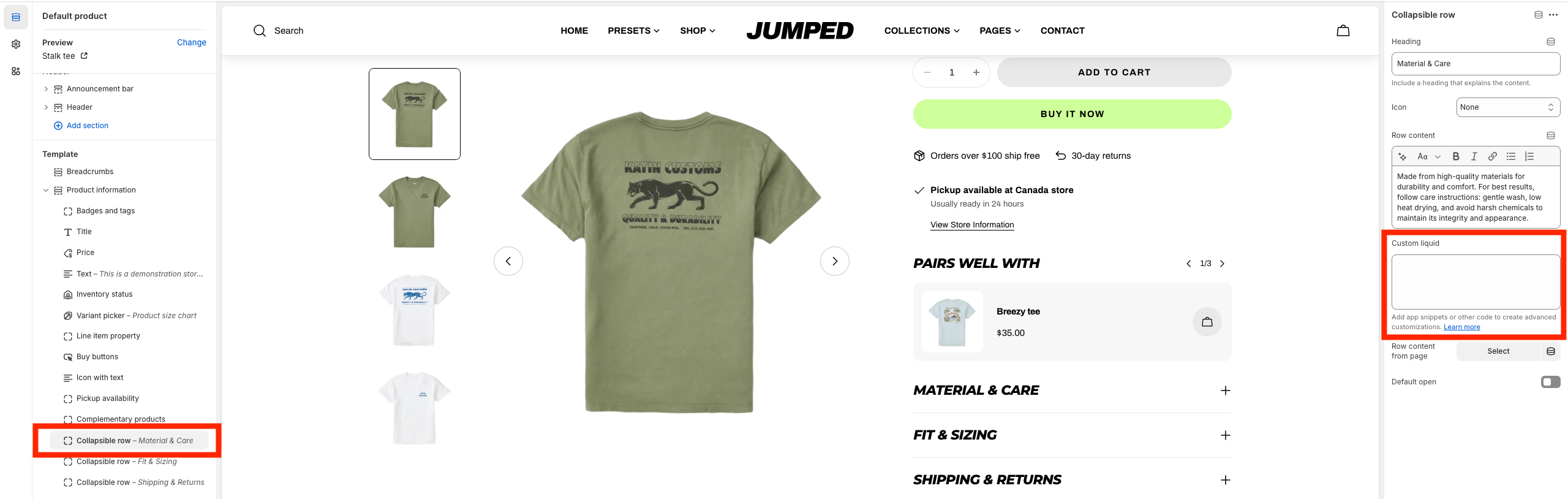
8. Collapsible row
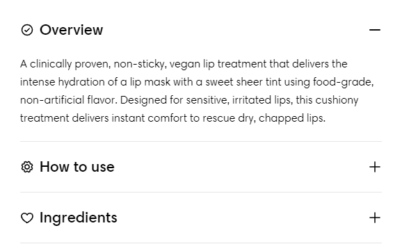
- Heading: To include a heading explaining the content.
- Icon: To add an icon before the block's heading.
- Row content: To add the tab content. The copy can be added via the theme editor or pulled from a page in Shopify Pages.
- Custom liquid: Add app snippets or other code to create advanced customizations. Learn more
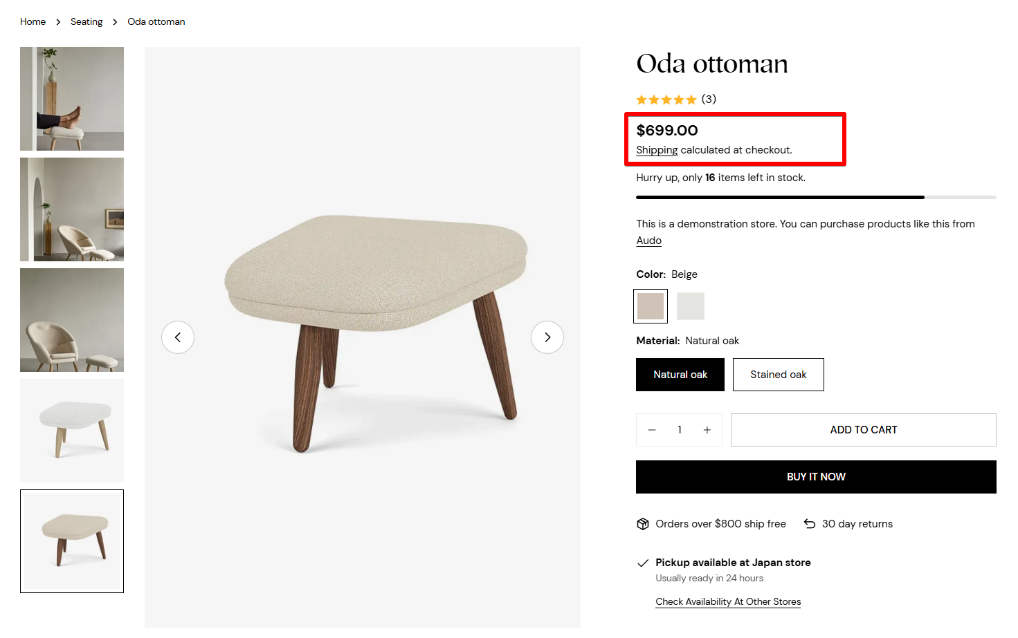
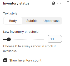
9. Inventory status
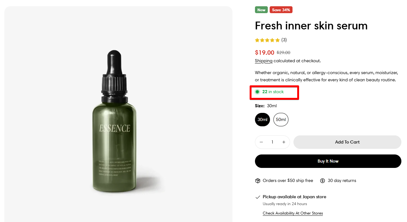
- check the option Track quantity;
- uncheck Continue selling when out of stock.
10. Pickup availability
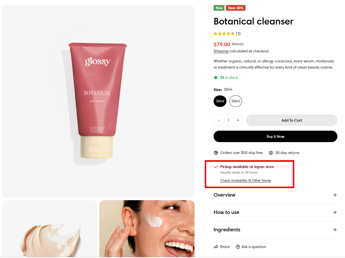
Set up Local Pickup option
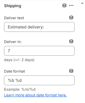
11. Shipping information
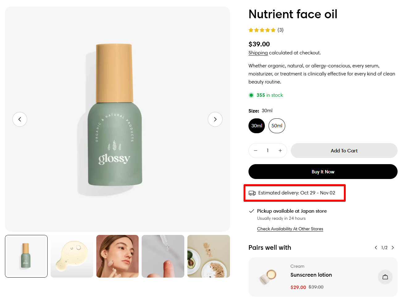
⚙️ Find more about the available date format here.
12. SKU
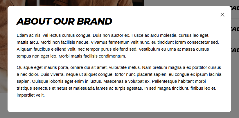
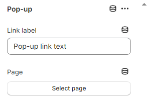
13. Pop-up
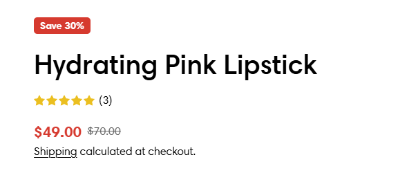
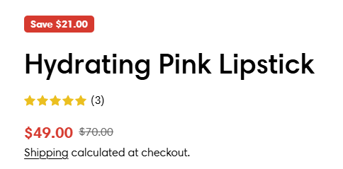
14. Badges and tags
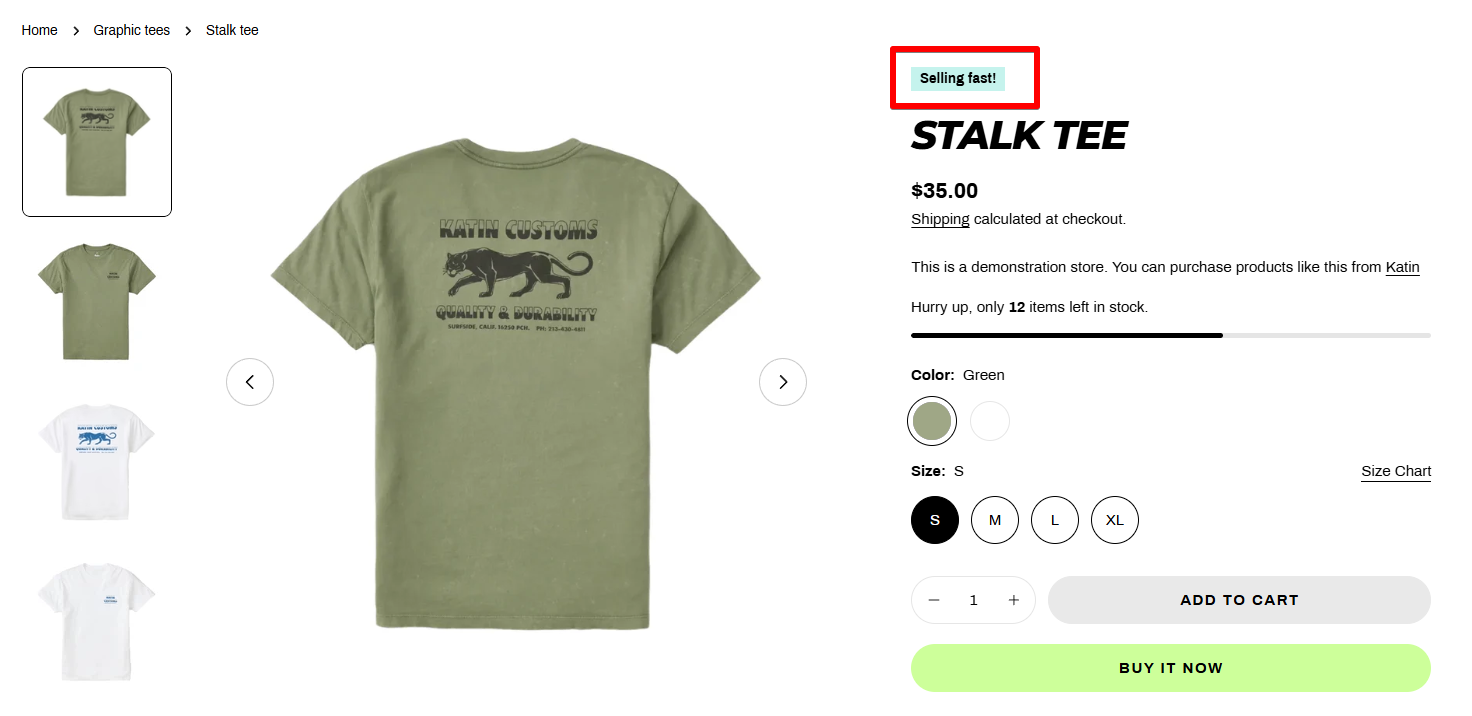
Add custom badges to products
Go to Theme settings > Colors to change the badges' color.
15. Complementary products
- Heading: The title of the block.
- Show as collapsible row: When selected, the content isplays as collapsed under a row tab. When a customer clicks a title, the tab expands to display additional content.
- Icon: Select an icon to pair with your heading when complementary products are shown as a collapsible row.
- Maximum products to show: Select the maximum number of complementary products to show. Select a value between 1 and 10.
- Number of products per page: The number of complementary products that you want to display per slider page. Select a value between 1 and 4.
- Image ratio: Determines the aspect ratio of the product card images.
- Enable quick add button: The "quick add" button allows customers to add a product to their cart from the product card. If the product has variants, then the button reads Choose options and displays the product details in a pop-up. The customers can then select their desired variants, add to cart, check out immediately with the Buy it now option, or else click to view a product's full details. The Buy it now option needs to be set up separately from the product page to appear in the quick add options. When the Buy it now option isn't set up, customers can still add the product to their cart.
Learn how to use the Shopify Search & Discovery app to choose complementary products for your website’s product pages.
16. Addon buttons
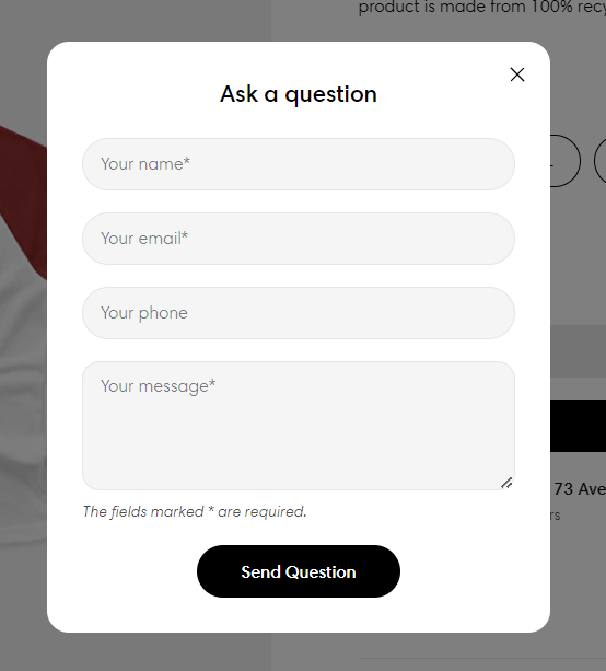
The Ask a question form sends all submissions to the Sender email address of your store. You can change the sender email address in the Store details settings page of your Shopify admin.
17. Custom liquid
Add app snippets or other code to create advanced customizations. Learn more
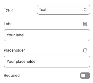
18. Line item property
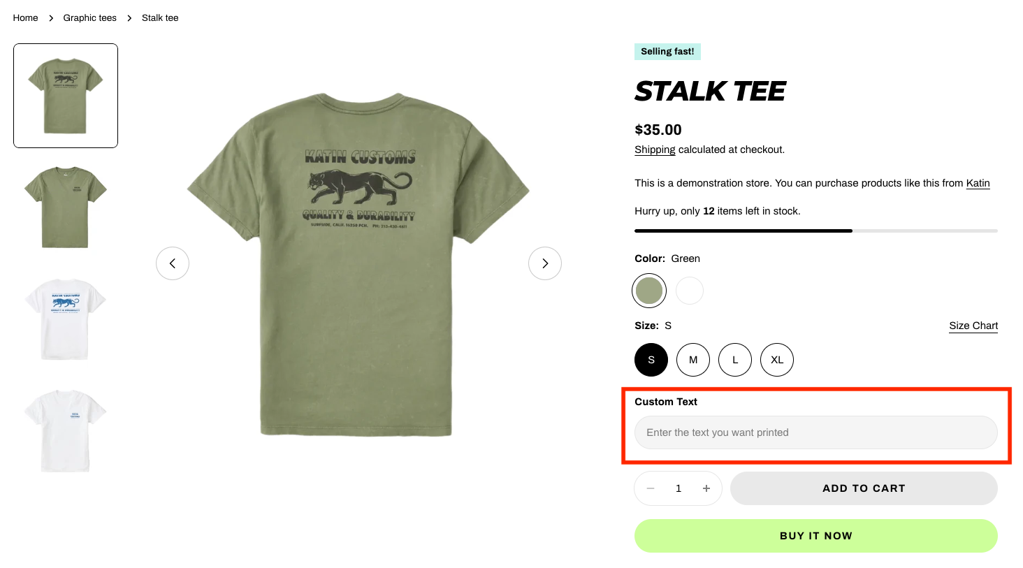
- Type: Select the type as Text/Textarea/Select/Checkbox/Radio.
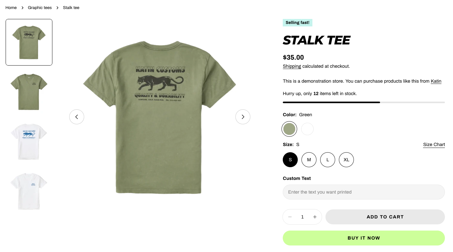
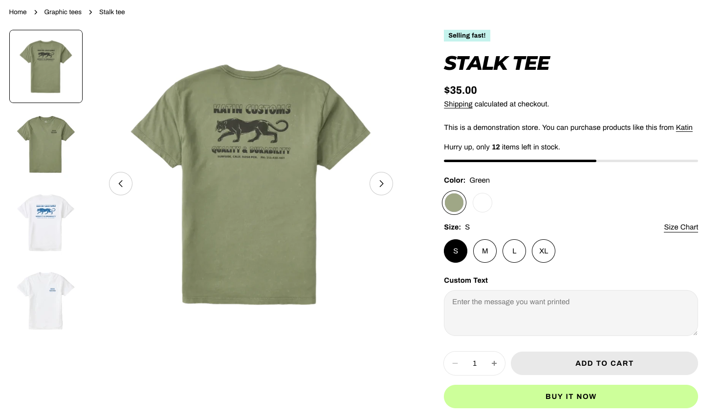
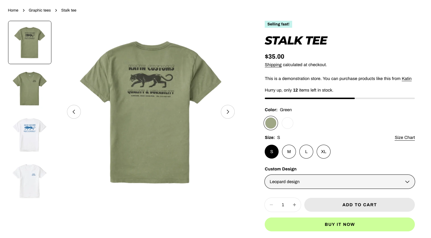
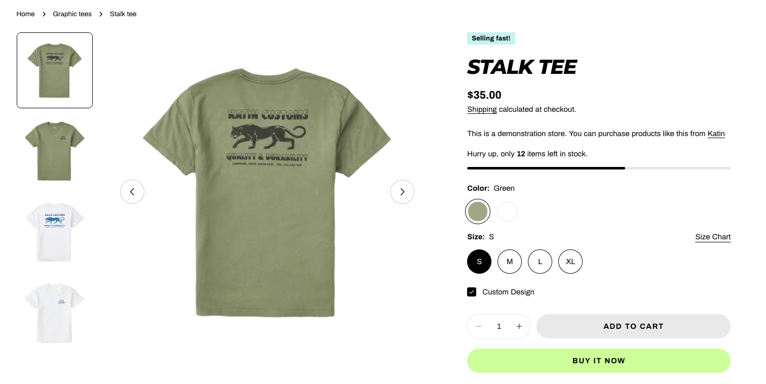
- Label: Display the title or question shown to the customer.
- Placeholder: Provide guide text inside the input box to suggest customer what to enter.
- Required: Toggle on to make the property mandatory before the product can be added to the cart.
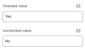
- Checked/Unchecked Value (Checkbox only): Define the values that are stored when the checkbox is checked or unchecked.
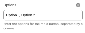
- Options (only for Select, Radio): Enter a list of choices separated by commas.
- Layout (Radio only): Set how the line item options are displayed.
Last updated