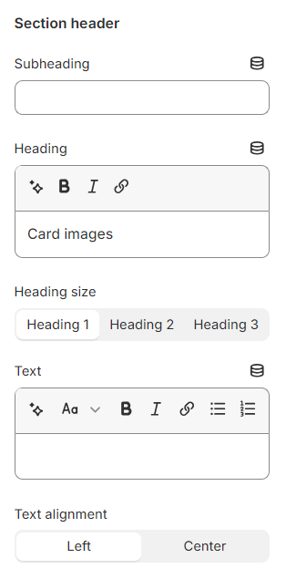
Use the provided text fields to add a suitable Heading, Subheading, and Text.
Leave them blank if you do not want to display them
You can also change the Heading size to Heading 1/ Heading 2/ Heading 3 and the Text alignment to Left/ Center to make the content look balanced on your website.
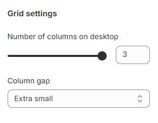
Set the Number of columns on desktop view between 1-3 column(s), and choose your favorable Column gap as Extra large/ Large/Medium/Small/ Extra small/ None.
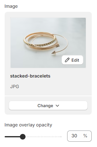
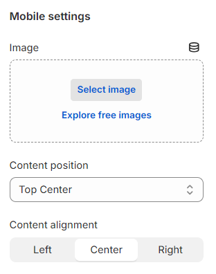
Click Select image to assign the image to the banner on the desktop and use the slider to change the Image overlay opacity.
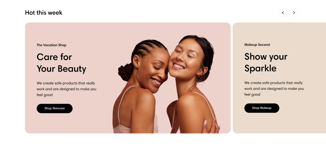
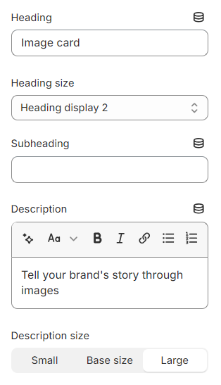
Add some text for the banner’s Heading, Subheading, and Description.
Leave them blank if you do not want to display them.
You can also change the Heading size (Heading display 1/ Heading display 2/ Heading display 3/ Heading 1) and the Description size (Small/ Base size/ Large) to make your image card block look more balanced.
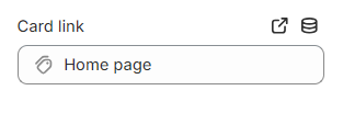
Add a call-to-action button that directs customers to the target page specified in the Card link field.
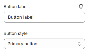
Add a Label then choose a Button style
Primary button
Secondary button
Underline button
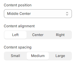
Furthermore, you can also modify the look as well as the position of the content by changing these properties:
Content position: Top left/ Top center/ Top right/ Middle left/ Middle center/ Middle right/ Bottom left/ Bottom center/ Bottom right