
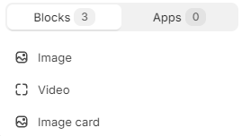
Theme Sections
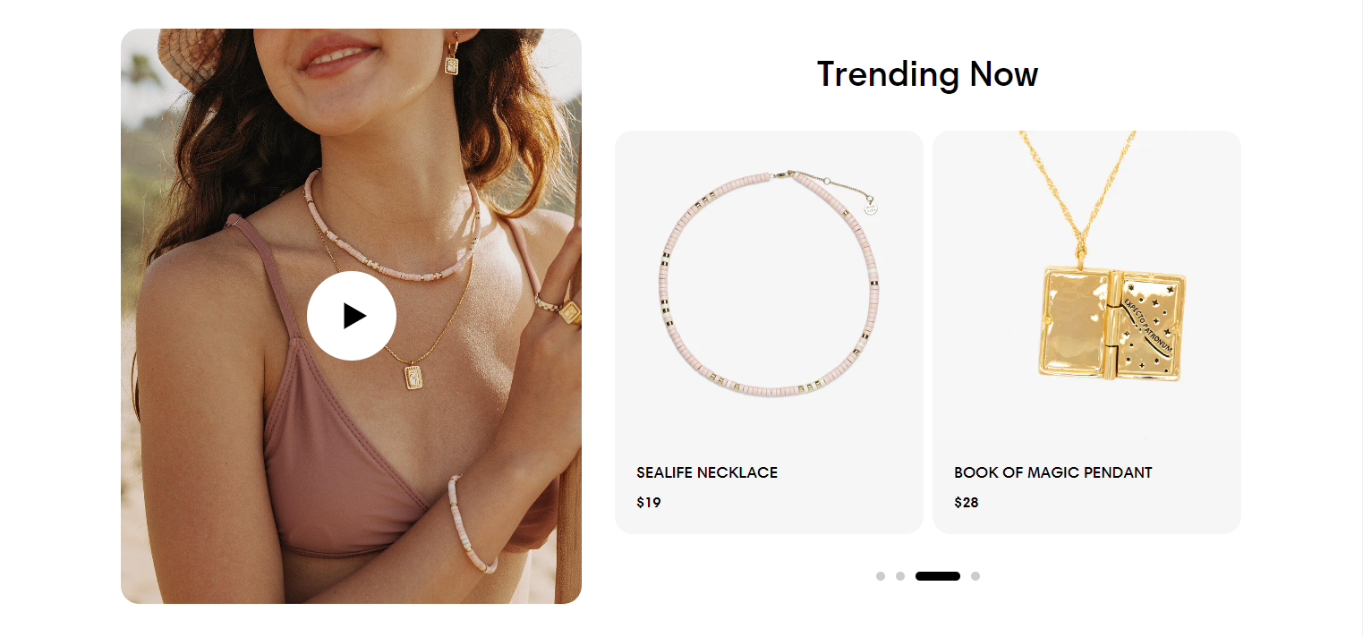
Media with collection
4 min read
How to add a Media with collection section
- In the theme editor (Customize), click Add section.
- Select the Media with collection section.
- Make necessary changes.
- Save the settings.
How to edit a Media with collection section
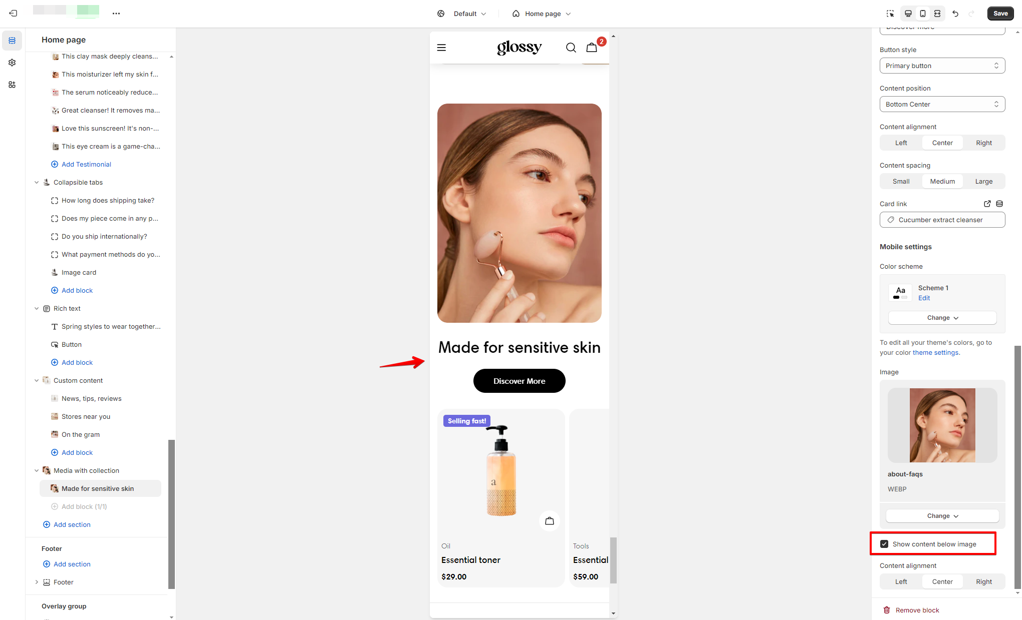
Section settings
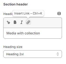
Section header
- Leave it blank if you do not want to display it
- Heading xs
- Heading sm
- Heading md
- Heading lg
- Heading xl
- Heading 2xl
- Display md
- Display lg
- Display xl
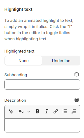
Highlight text
- Leave them blank if you do not want to display them
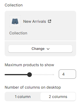
- Collection: Select a collection to display the product list alongside the video/image. This allows viewers to instantly identify the products featured in the video and explore them further.
- Maximum products to show: Set the maximum number of products to show on the list (between 2-6 products).
- Number of columns on desktop: 1-2 columns.
Mobile layout
- Number of columns on mobile: The product list will be displayed below the media on mobile view. Set the product grid to show on 1-2 columns.
- Enable swipe on mobile: Make the product list swipeable on mobile view.
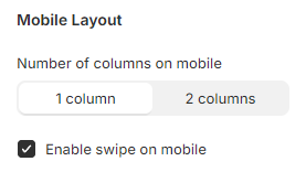
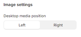
Image settings
- Desktop media position: Control whether the media is on the left or right side of the chosen product list on the desktop view.
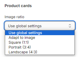
Product cards
- Image ratio: Adjust the image ratio of the product cards to 1 of the following values:
- Use global settings (Theme settings > Product card)
- Adapt to image
- Square
- Portrait
- Landscape
Block settings
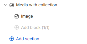
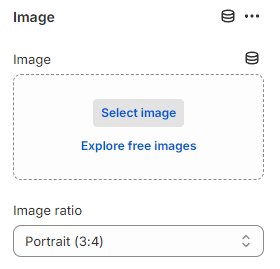
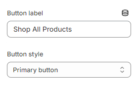
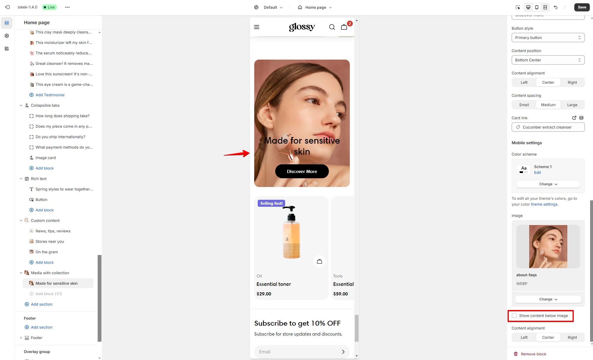
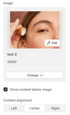
Image
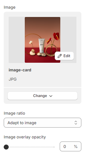
- Image: Select an image to display as the featured media.
- Image ratio: Set the image ratio of the featured image:
- Adapt to image
- Square (1:1)
- Portrait (3:4)
- Landscape (4:3)
Video
- Video: Select a video that you've uploaded to Shopify Files or insert a YouTube or Vimeo video URL.
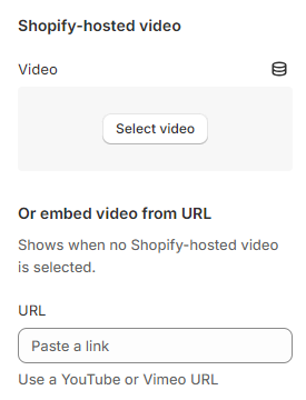
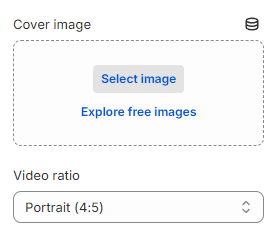
- Cover image: Select a cover image for the featured video.
- Video ratio: Set the image ratio of the featured video:
- Adapt to image
- Square (1:1)
- Portrait (4:5)
- Landscape (4:3)
- Widescreen (16:9)
- Vertical (9:16)
- Video alt text: Describe the video for customers using screen readers.
- Enable video autoplay: Video are muted automatically to allow autoplay.
- Enable video looping: Video is looped automatically.
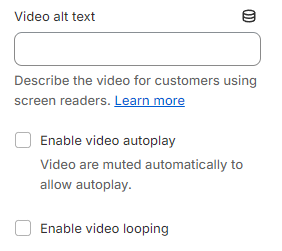
Image card
- Adapt to image
- Square (1:1)
- Portrait (3:4)
- Landscape (4:3)
- Heading xs
- Heading sm
- Heading md
- Heading lg
- Heading xl
- Heading 2xl
- Display md
- Display lg
- Display xl
- Leave them blank if you do not want to display them
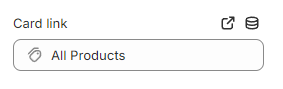
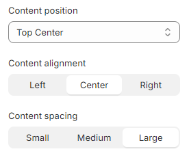
- Content position: Top left/ Top center/ Top right/ Middle left/ Middle center/ Middle right/ Bottom left/ Bottom center/ Bottom right
- Content alignment: Left/ Center/ Right
- Content spacing: Small/ Medium/ Large
Last updated