Press
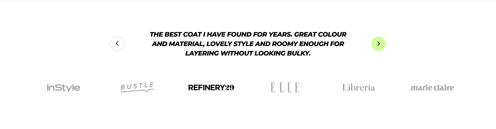
A Press section can disclose a better insight into what the store is selling whether it is a product or a vendor, etc.
In this article, we will show you how to add a Press section.
# How to add a Press section to your Shopify storeSteps
In the theme editor (Customize) , click Add section.
Select Press .
Make necessary changes.
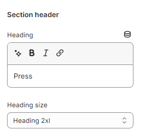
Save the settings. # How to edit a Press section# Section settingsUse the provided text fields to add a suitable Heading . Leave it blank if you do not want to display it
You can also change the Heading size to:
Heading xs
Heading sm
Heading md
Heading lg
Heading xl
Heading 2xl
Display md
Display lg
Display xl
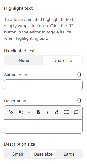
# Highlight textUse the provided text fields to add a suitable Subheading and Description . Leave them blank if you do not want to display them.
You can also change the Description size to Small/ Base size/ Large to make the content look balanced on your website.
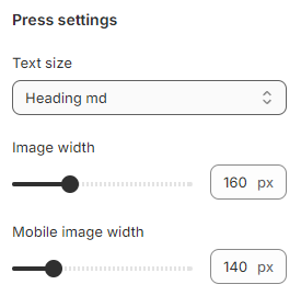
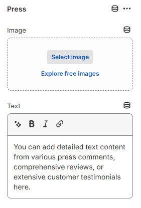
# Press settingsAdjust the Text size for the press testimonial to:
Heading xs
Heading sm
Heading md
Heading lg
Heading xl
Heading 2xl
Display md
Display lg
Display xl
Use the Image width and Mobile image width slider to change the width of press thumbnails between 100px and 300px on both desktop and mobile.
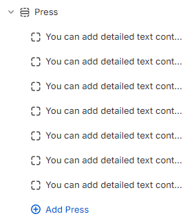
# Block settingsYou can add multiple Press blocks to the Press section.
Choose an Image for the Press block to clearly illustrate what you want to convey.
Last updated about 1 month ago