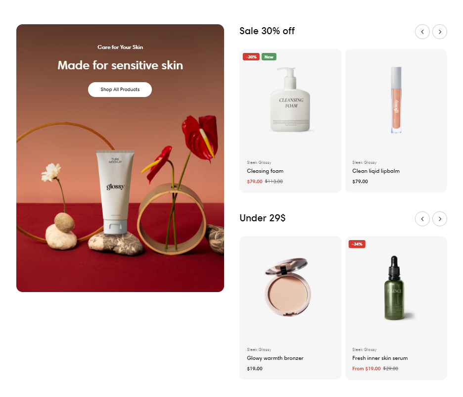
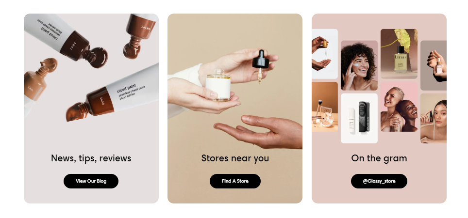
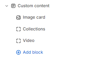
The Custom content section provides design flexibility and a customizable layout to display any type of content such as videos, featured collections, or even image cards, etc.
This section makes room for customization beyond standardized templates in Sleek theme, empowering you to create visually appealing and engaging pages tailored to your business needs and branding requirements.
In this article, we will show you how to add a Custom content section.
#How to add a Custom content section to your Shopify store
Steps
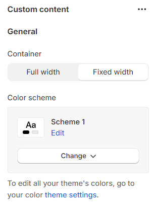
In the theme editor (Customize), click Add section
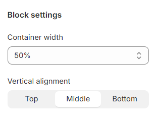
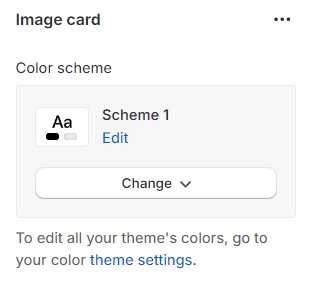
Adjust the Container (Full width/ Fixed width) and Color scheme for this section.
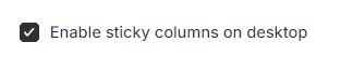
Especially, if there is a block with a longer height, you can Enable sticky columns on desktop to make the shorter height blocks sticky while scrolling.
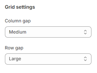
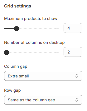
You can modify the Column gap and Row gap in your Custom content as Extra large/ Large/ Medium/ Small/ Extra small/ None / Same as the column gap (special value of the Row gap option).
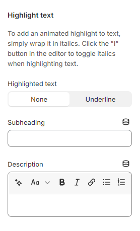
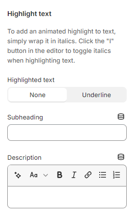
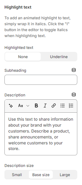
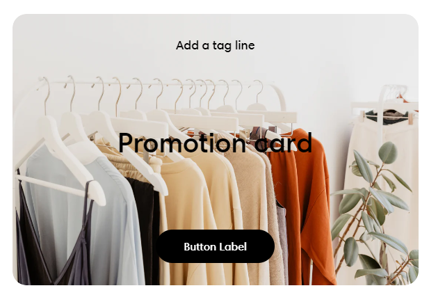
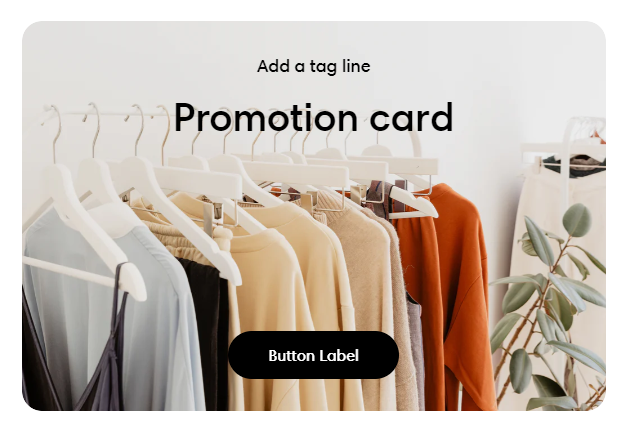
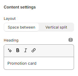
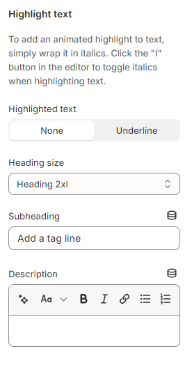
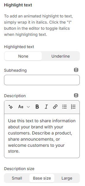
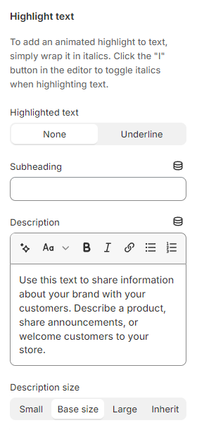
Use the provided text fields to add a suitable Subheading and Description.
Leave them blank if you do not want to display them
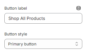
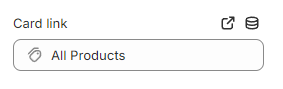
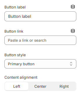
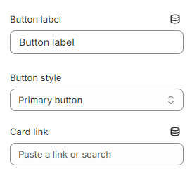
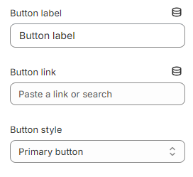
Add a call-to-action button that directs customers to the target page specified in the Card link field. Add a Label then choose a Button style (Primary button/ Secondary button/ Underline button).
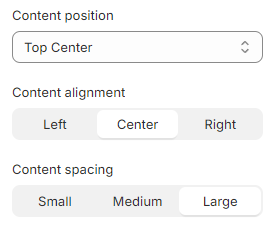
Furthermore, you can also modify the look as well as the position of the content by changing these properties:
Content position: Top left/ Top center/ Top right/ Middle left/ Middle center/ Middle right/ Bottom left/ Bottom center/ Bottom right
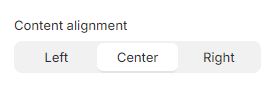
Content alignment: Left/ Center/ Right
Content spacing: Small/ Medium/ Large
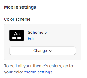
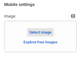
In Mobile settings:
Adjust the Color scheme for the image card block on mobile.
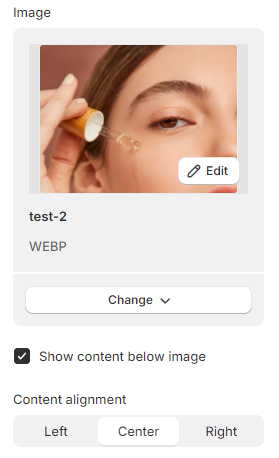
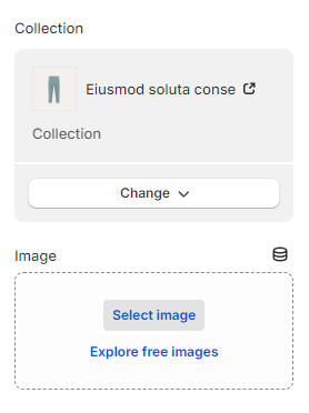
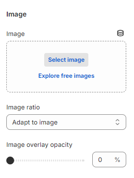
Especially, if you want to display a different card image on the mobile device, you can insert another image to the Image field.
You are able to display the content below or above the collapsible tabs by enabling/disabling the Show content below image checkbox.
Moreover, the block also allows you to change Content alignment on mobile.
Use the provided text fields to add a suitable Subheading and Description.
Leave them blank if you do not want to display them
You can also change the Description size to Small/ Base size/ Large to make the content look balanced on your website.
Add a call-to-action button that directs customers to the target page specified in the Button link field. Add a Label then choose a Button style (Primary button/ Secondary button/ Underline button).
Furthermore, you can also modify the look as well as the position of the content by changing Content alignment (Left/ Center/ Right)
Use the provided text fields to add a suitable Subheading and Description.
Leave them blank if you do not want to display them
Add a call-to-action button that directs customers to the target page specified in the Card link field. Add a Label then choose a Button style (Primary button/ Secondary button/ Underline button).
Furthermore, you can also modify the look as well as the position of the content by changing the value of Content alignment to Left/ Center/ Right.
In Mobile settings, if you want to display a different card image on the mobile device, you can insert another image into the Image field.
Use the provided text fields to add a suitable Subheading and Description.
Leave them blank if you do not want to display them
You can also change the Description size to Small/ Base size/ Large to make the content look balanced on your website.
Add a call-to-action button that directs customers to the target page specified in the Button link field. Add a Label then choose a Button style (Primary button/ Secondary button/ Underline button).
Furthermore, you can also modify the look as well as the position of the content by changing the value of Content alignment to Left/ Center/ Right.
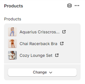
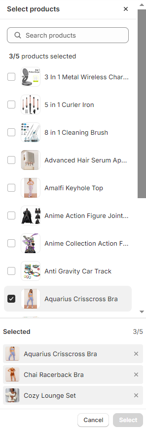
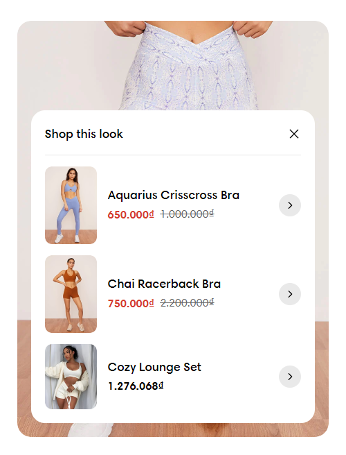
You can add up to 5 Products to display on each block.
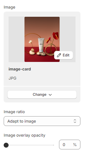
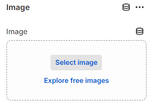
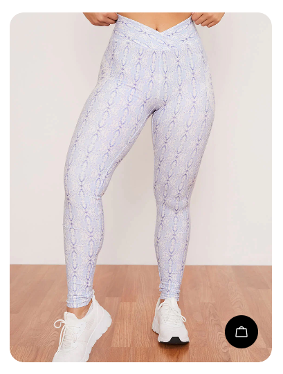
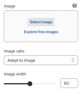
Select an outstanding Image for the media of the lookbook card to draw customers' attention.
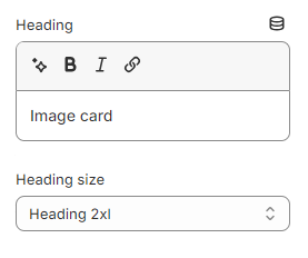
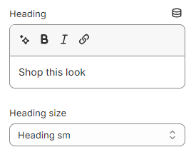
Insert suitable content for the Heading of the product list pop-up in the lookbook card.
Leave it blank if you do not want to display it
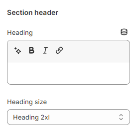
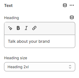
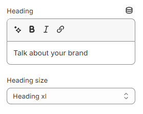
You can also change the Heading size to:
Heading xs
Heading sm
Heading md
Heading lg
Heading xl
Heading 2xl
Display md
Display lg
Display xl
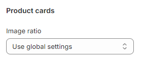
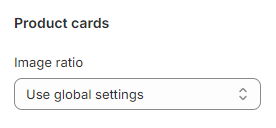
In Product cards:
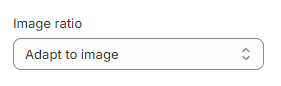
Select the product card's Image ratio as:
Use global settings
Adapt to image
Square (1:1)
Portrait (3:4)
Landscape (4:3)
To adjust the Use global settings option value, navigate to the "Customize" menu of your theme and click on the "Theme settings" button. This will take you to a menu where you can adjust various global theme settings.
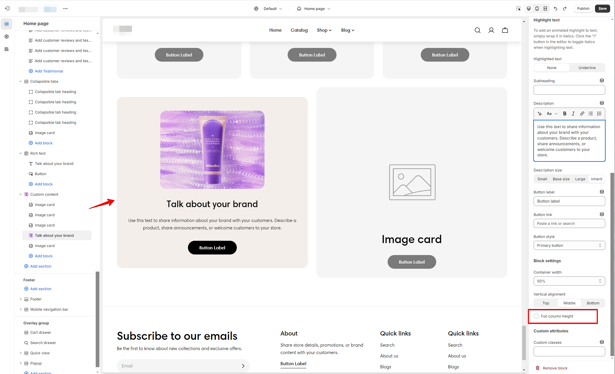
You can also enable the Full column height checkbox to ensure the block consistently extends to the full height of the column.
Use the provided text fields to add a suitable Subheading and Description. Leave them blank if you do not want to display them.
You can also change the Description size to Small/ Base size/ Large/ Inherit to make the content look balanced on your website.
Add a call-to-action button that directs customers to the target page specified in the Button link field. Add a Label then choose a Button style (Primary button/ Secondary button/ Underline button).
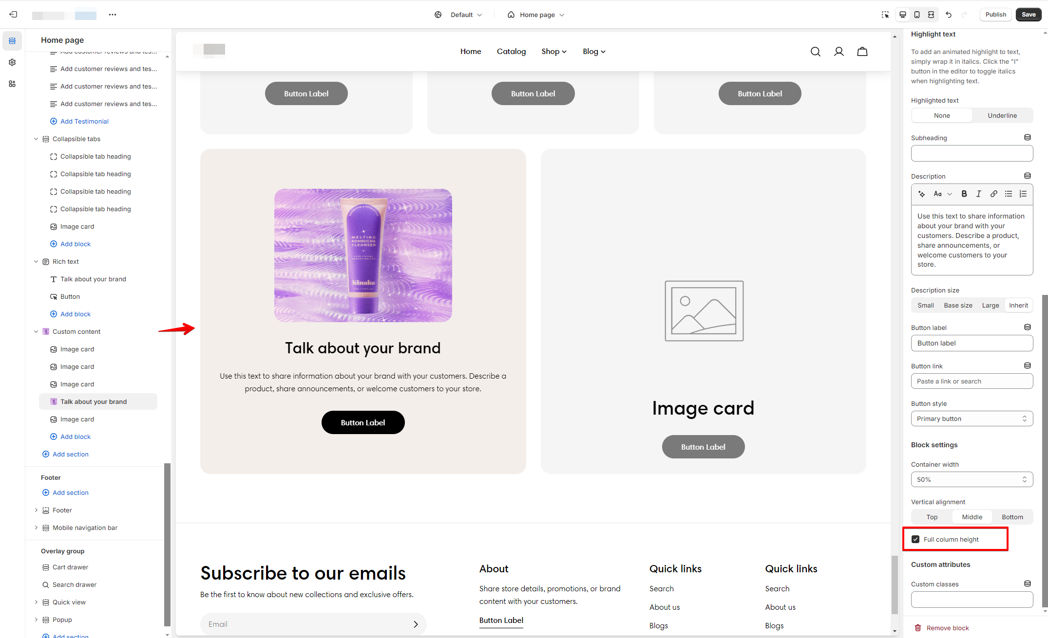
You can also enable the Full column height checkbox to ensure the block consistently extends to the full height of the column (when the block's original height is smaller than the column's height).