Collections showcase

Set up a dynamic and elegant Collections showcase section enhancing the shopping experience and drives sales

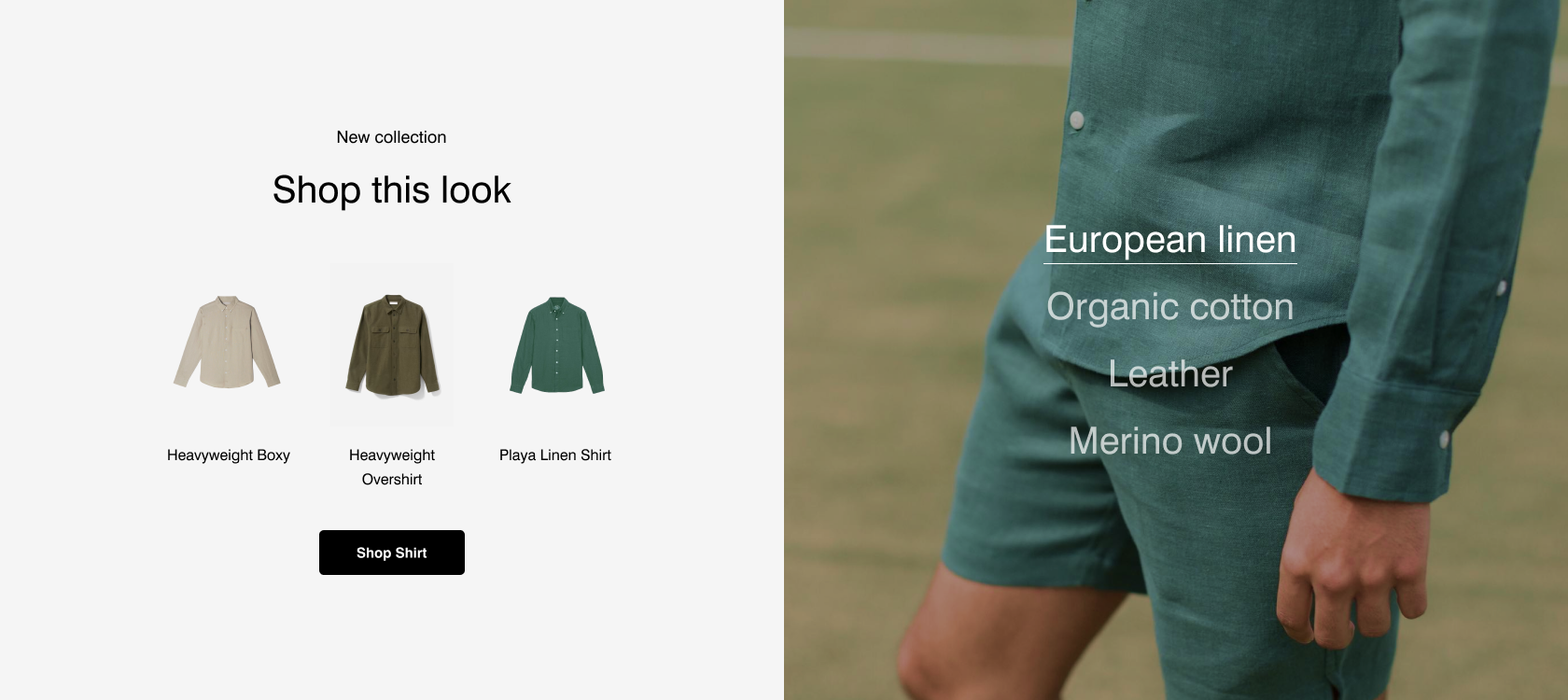
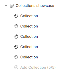
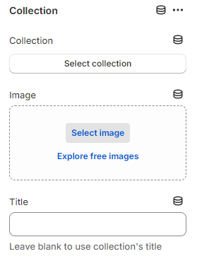
The Collections showcase section is designed to highlight specific collections through a unique layout and smooth visual effects. This feature helps to effectively convey information about the collection, capturing the attention of visitors and encouraging them to explore the products further.

In this article, we will show you how to add a Collections showcase section.

How to add a Collections showcase section to your Shopify store

Steps

  1. In the theme editor (Customize), click Add section.

  2. Select Collections showcase.

  3. Make necessary changes.

  4. Save the settings.

How to edit a Collections showcase section

Section settings

General

Adjust the Container (Fixed width/Full width) for this section.

Section header

Use the provided text fields to add a suitable Heading.

  • Leave it blank if you do not want to display it

You can also change the Heading size to:

  • Heading xs

  • Heading sm

  • Heading md

  • Heading lg

  • Heading xl

  • Heading 2xl

  • Display md

  • Display lg

  • Display xl

Highlight text

How to apply Highlight text to the section heading and block headings?

Use the provided text fields to add a suitable Subheading.

Collection settings

Adjust the Color scheme for the collection showcase banner.

You can change the position of the collection showcase banner to the Left or Right by using the Desktop image position setting.

Select the suitable Image ratio for the banner as:

  • Adapt to image

  • Square (1:1)

  • Portrait (3:4)

  • Landscape (4:3)

Adjust the Overlay opacity between 0 and 100% to create various levels of transparency for the banner.

Moreover, you can also change the Title size for the collection showcase tabs as:

  • Heading xs

  • Heading sm

  • Heading md

  • Heading lg

  • Heading xl

  • Heading 2xl

  • Display md

  • Display lg

  • Display xl

Product cards

Select the product card's Image ratio as:

  • Use global settings

  • Adapt to image

  • Square (1:1)

  • Portrait (3:4)

  • Landscape (4:3)

To set up other addons such as badges, buttons, etc. to the product cards, check out this article:

Product cards

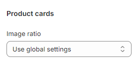
To adjust the Use global settings option value, navigate to the "Customize" menu of your theme and click on the "Theme settings" button. This will take you to a menu where you can adjust various global theme settings

Slider settings

Use the slider to adjust the Maximum products to show (between 1 and 6) in each collection block.

Block settings

In the Collections showcase section, you can add up to 5 Collection blocks.

Add a preferable or unique Collection that you want to showcase and give this collection a Title.

  • If you want to use the collection name, leave the Title field for the collection blank.

You can choose the background image for the collection showcase banner containing the collection showcase tabs.

The call-to-action button will direct customers to the collection pages.

Give the button a label (leave the label blank to hide the button), a specific Button style

  • Primary button

  • Secondary button

  • Underline button

Last updated