
Theme Sections
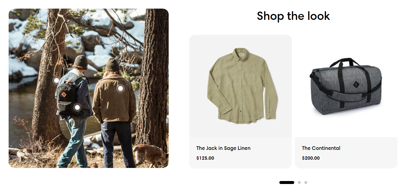
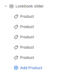
Lookbook slider
2 min read
How to add a Lookbook slider
- In the theme editor (Customize), click Add section.
- Locate Lookbook slider.
- Make necessary changes.
- Save.
How to edit a Lookbook slider
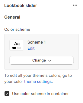
Section settings
General
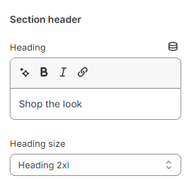
Section header
- Leave it blank if you do not want to display it
- Heading xs
- Heading sm
- Heading md
- Heading lg
- Heading xl
- Heading 2xl
- Display md
- Display lg
- Display xl
Highlight text
- Leave them blank if you do not want to display them
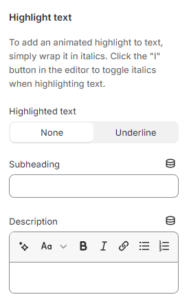
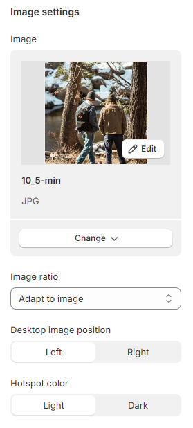
Image settings
- Image: Select/upload an image to the lookbook.
- Image ratio: Adapt to image/ Square/ Potrait/ Landscape.
- Desktop image position: Set where the image is displayed on desktop - Left/ Right.
- Hotspot color: Set the color of the hotspot - Light/ Dark.
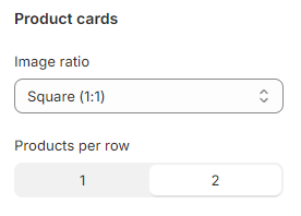
Product cards
- Image ratio: Set the image ratio of the product cards.
- Products per row: 1-2 products
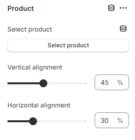
Block settings
Last updated