A Collections slider displays a single-column carousel of selected collections, featuring a special large images slider for each collection to attract visitors' attention.
# How to add a Collections slider sectionSteps
In the theme editor (Customize) , click Add section.
Locate Collections slider.
Make necessary changes.
Save. # How to edit a Collections slider section# Section settings# General Enable the Use color scheme in container checkbox if you want to use the scheme for the container only.
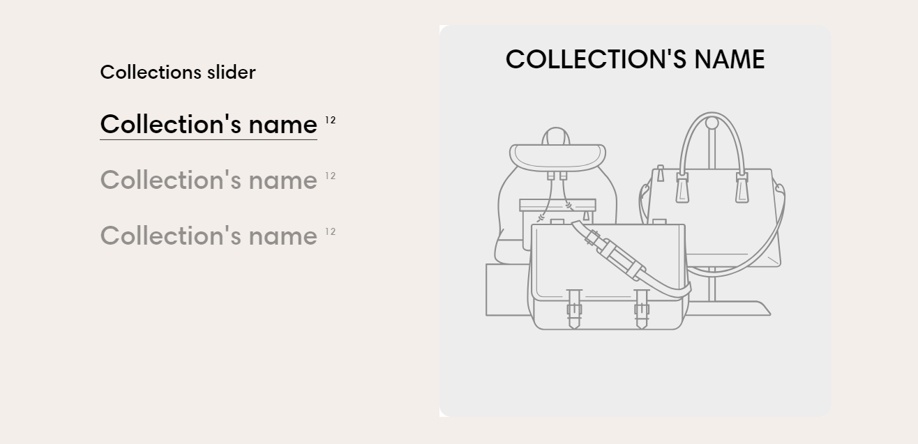
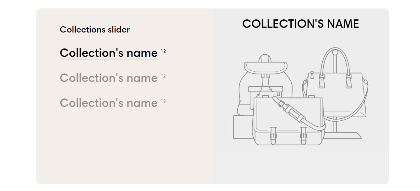
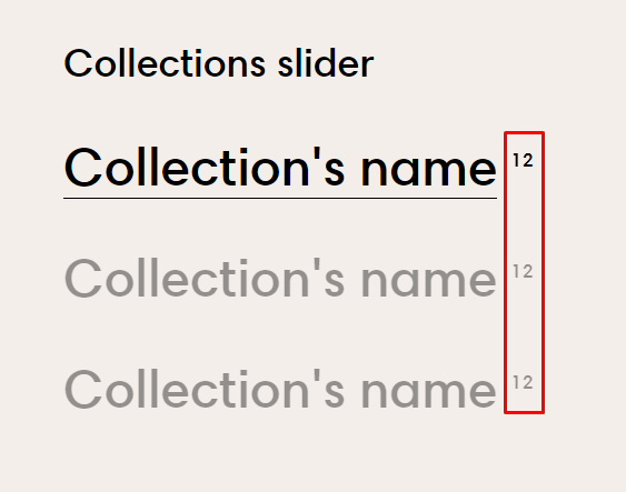
You can also display the number of the product in the collection blocks by enabling the Show product count checkbox.
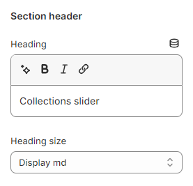
Add the content you want in the Heading to attract customers' attention
Leave it blank if you do not want to display it
You can also change the Heading size to:
Heading xs
Heading sm
Heading md
Heading lg
Heading xl
Heading 2xl
Display md
Display lg
Display xl
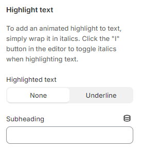
# Highlight textUse the provided text fields to add a suitable Subheading .
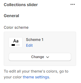
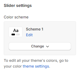
# Slider settings Adjust the Color scheme for the slider.
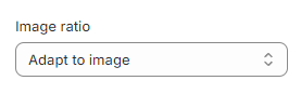
Select the Image ratio for the image slide as:
Adapt to image
Square (1:1)
Portrait (3:4)
Landscape (4:3)
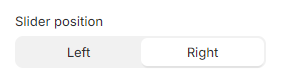
You can change the image Slider position to the Left or Right
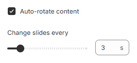
Enable Auto-rotate content so the image slider will run automatically. The duration time to change slides is between 2-10 seconds.
If you do not want to use rotation, they can disable it
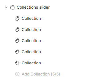
# Block settingsIn the Collections slider section, you can add up to 5 Collection blocks.
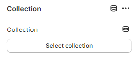
Select a preferable or unique Collection that you want to show on the Collections slider.
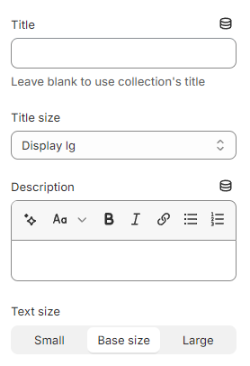
Add the content you want in the Title and Description for the collection tab to attract customers' attention
Leave the Title blank if you want to use the collection's title.
You can also change the Title size to:
Heading xs
Heading sm
Heading md
Heading lg
Heading xl
Heading 2xl
Display md
Display lg
Display xl
and the Text size for the Description to:
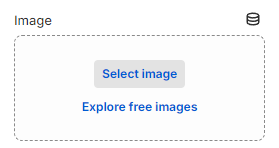
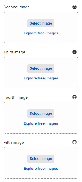
Moreover, you can display up to 5 featured images for each collection block in the slider.