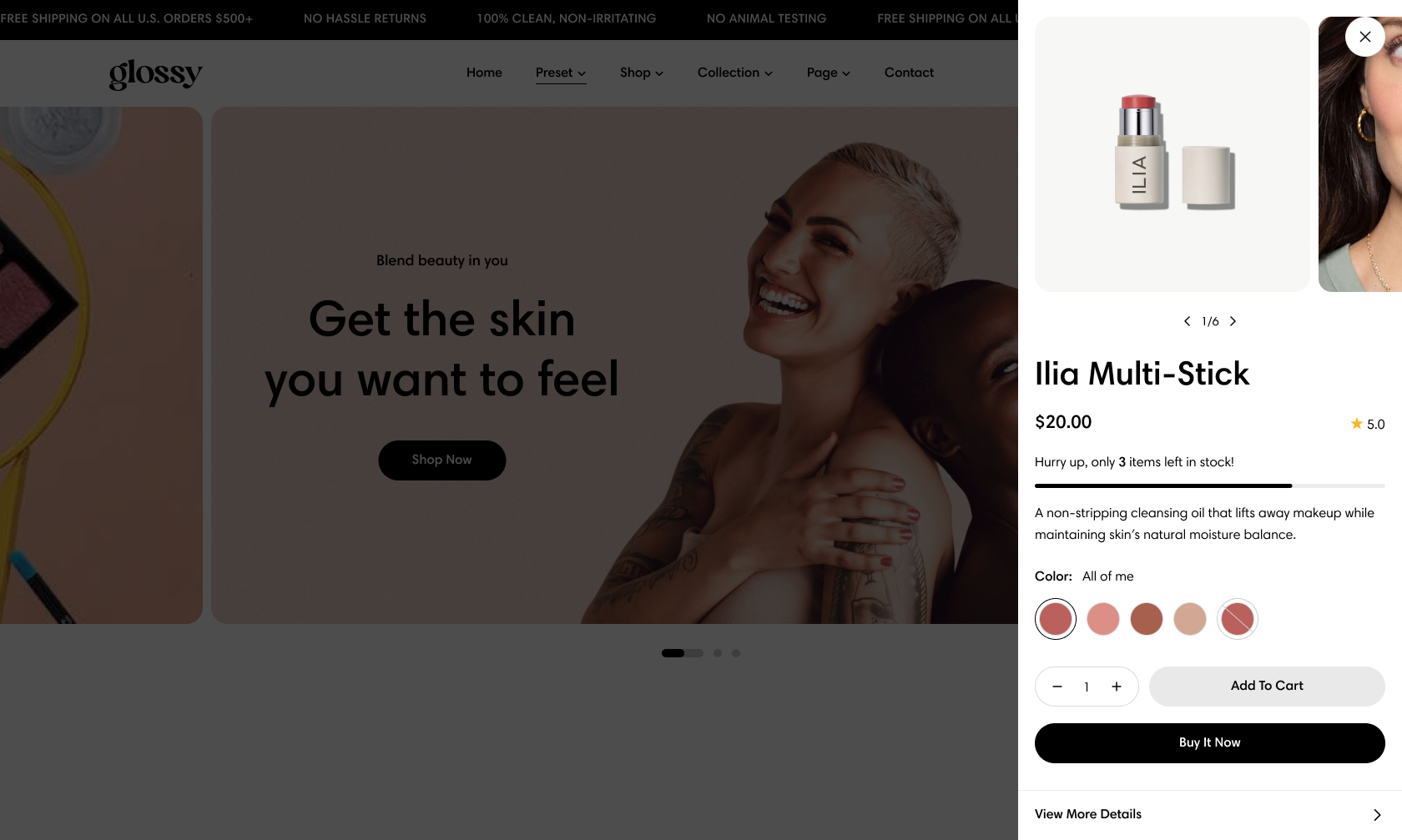
The Product Quick view option offers several unbeatable benefits:
Improved shopping experience: It's easier for your customers to select and add any items to cart without loading the whole product age and clicking back-and-forth between the product page and the item pages for details.
Reduced server load: The product page is not reloaded when the shopper selects this feature.
Display of discounted pricing and other details: You can utilize the quick view feature to show discounts before the cart page.
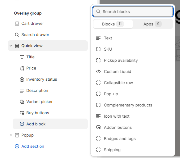
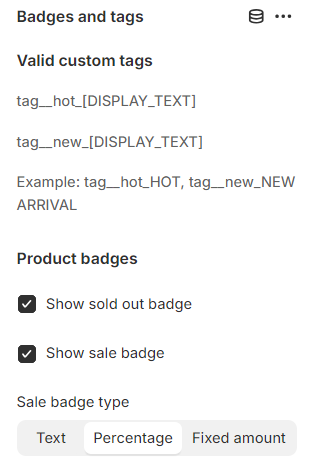
You can manage which elements are shown on the Quick View - such as the buy buttons, variant picker, price, SKU, complementary products, badges and tags, etc.
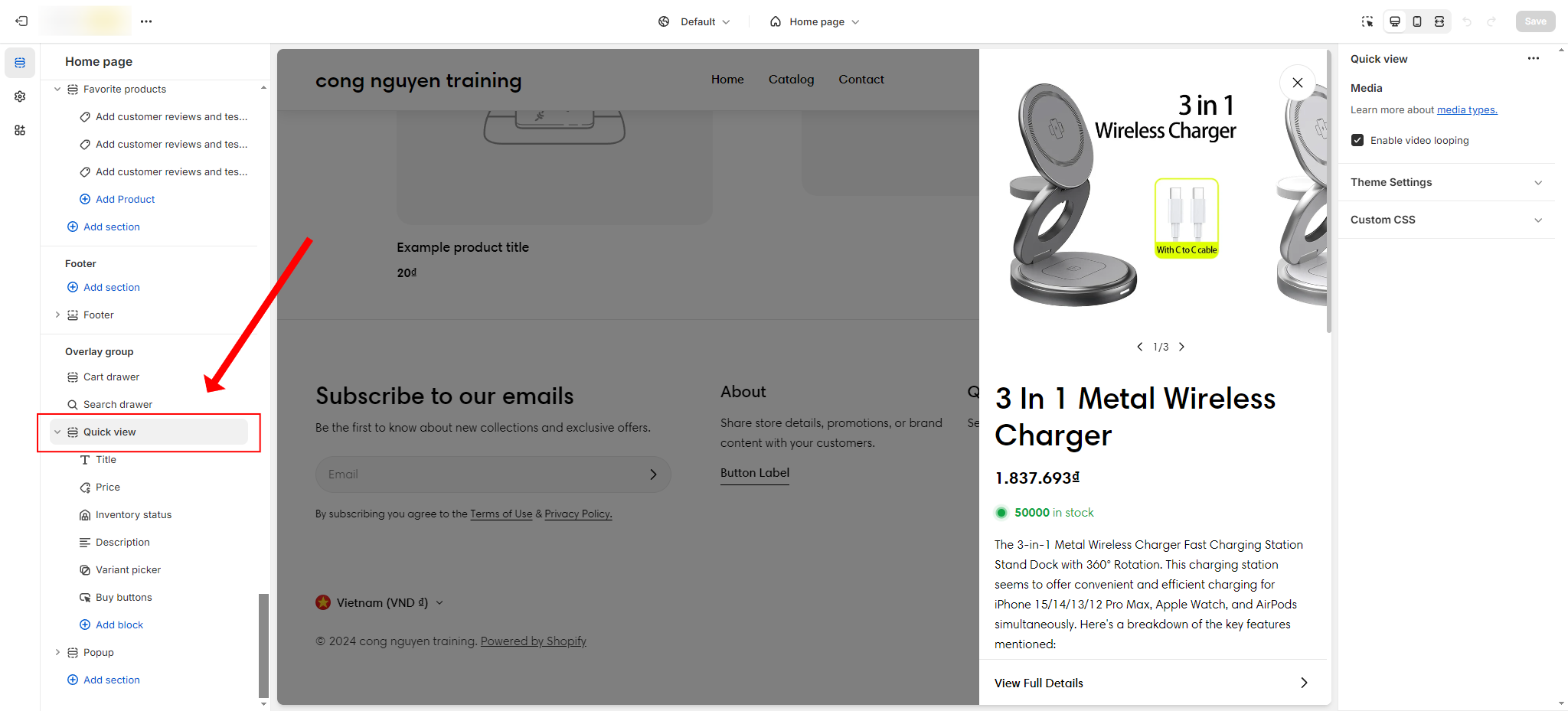
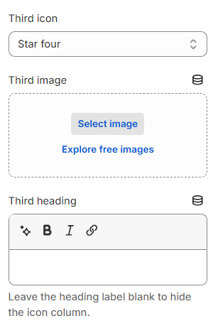
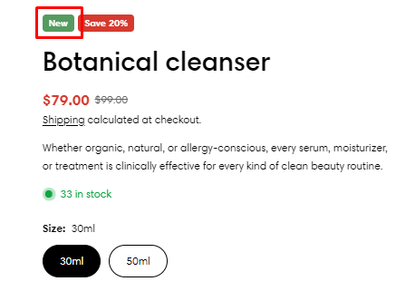
The Quick view blocks: Title, Price, and Description will be pulled from the product page to display in this section. You do not need to modify these blocks.
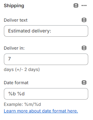
Enable/ disable showing delivery estimation and shipping text.
Add info regarding the delivery, and shipping text to the Deliver text field, and the number of days that the package will arrive to the Deliver in field.
You can adjust the Date format of the shipping block. To know more about the date format, see here.
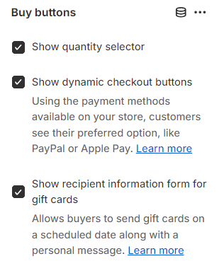
To include a direct-to-checkout button, enable the ✅ Show dynamic checkout button option.
You can display the quantity selector so customers can select a specific item quantity by enabling the ✅ Show quantity selector.
The Add-to-cart button will be shown automatically when adding the Buy buttons block.
To let customers send gift cards on a scheduled date along with a personal message, enable ✅ Show recipient information form for gift cards. Learn more
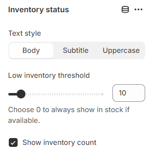
The inventory status block lets you display the stock status of individual products, so your customers would know if a product is in-stock, running low in quantity, or when more stock arrives.