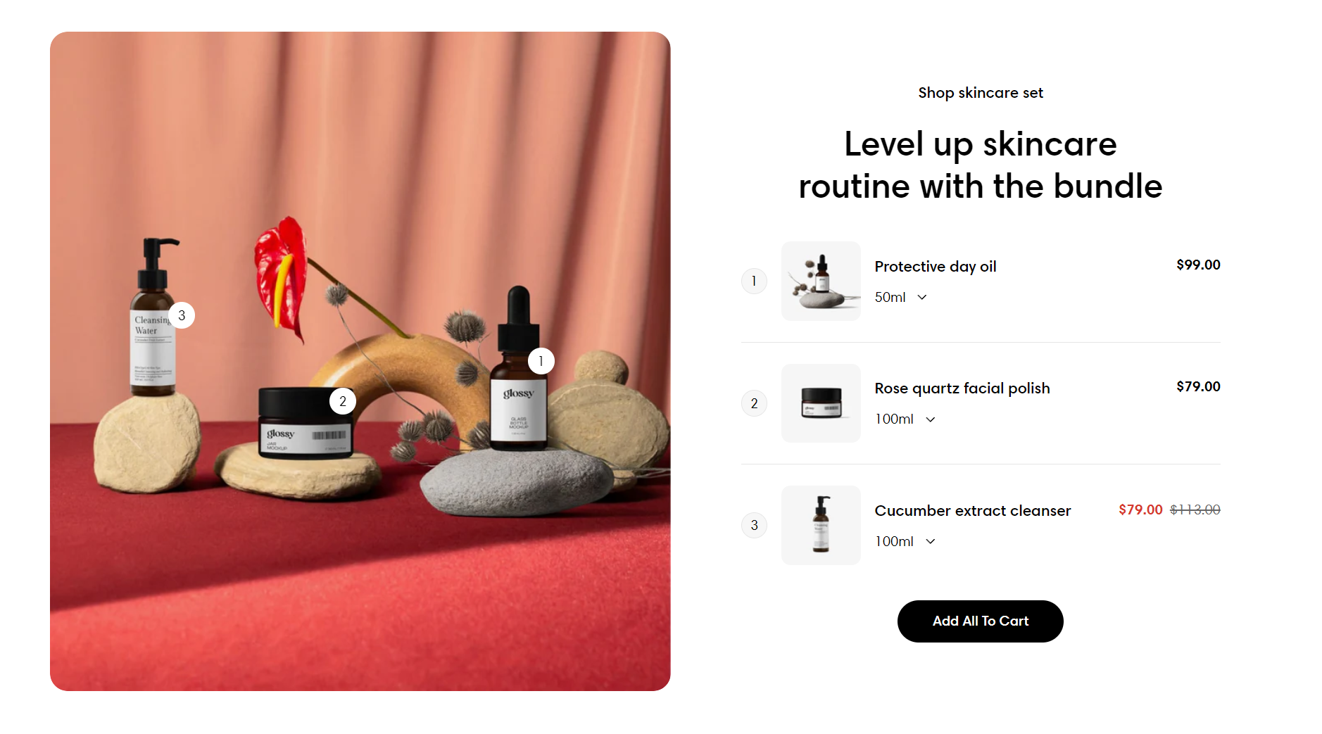
You can bundle multiple products or services together and sell them as a package deal.
The Products bundle section in Sleek theme provides a special hover effect that highlights your products and draws customers' attention.
# How to add a Products bundle sectionSteps:
In the theme editor (Customize ) > click Add section
Select Products bundle.
Make necessary changes.
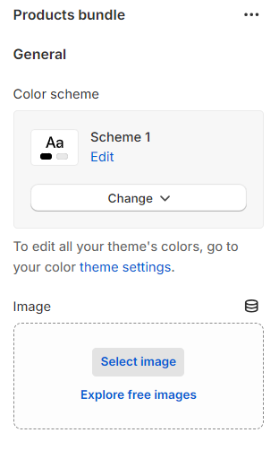
Save. # How to edit a Products bundle section# Section settings# GeneralAdjust the Color scheme for this section.
In Shopify, the
Color scheme (a set of colors) of your store can be set within the
Theme settings . It helps group elements and their respective colors, making your store visually appealing and cohesive. You can apply the color schemes to different sections throughout your online store with a color scheme picker.
Select an appropriate Image that is relevant to all the products in the bundle or has the products' appearance in it. This will help you accurately position the hotspots.
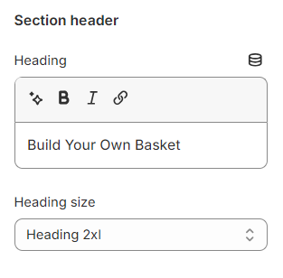
Use the provided text fields to add a suitable Heading .
Leave it blank if you do not want to display it
You can also change the Heading size to:
Heading xs
Heading sm
Heading md
Heading lg
Heading xl
Heading 2xl
Display md
Display lg
Display xl
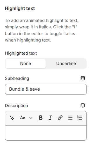
# Highlight textUse the provided text fields to add a suitable Subheading and Description .
Leave them blank if you do not want to display them
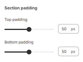
# Section padding You can modify the spacing above and below the section by adjusting the slider to change the values of the Top padding and Bottom padding .
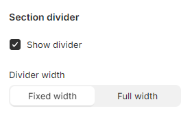
# Section dividerThis divider line provides a clear boundary between the current section and the above.
To activate the divider line, enable the ✅ Show divider checkbox.
You can choose a suitable Divider width for it (Fixed width/ Full width).
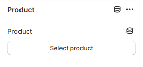
# Block settings# ProductWhen you hover over a specific product in the bundle, the corresponding hotspot will stand out among the other hotspots on the main image.
Choose a desirable/ active Product from your Shopify Products to bundle together.
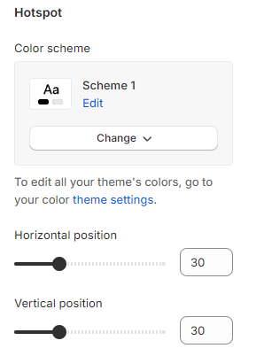
# HotspotWhen you hover over a particular hotspot on the main image, the product corresponding to it will stand out among the other blurred products.
This setting allows you to select a Color scheme for the Hotspot.
In addition, to tag hotspots on the background image, use the Vertical and Horizontal position to adjust the hotspot icon position.