
Pages Global Sections
Announcement bar
3 min read

- shipping information,
- new stock alerts,
- any promotions, such as sales or new gift cards, etc.
How to add an Announcement bar section to your Shopify store
- In the theme editor (Customize),> click Add section.
- Select the Announcement bar.
- Make necessary changes.
- Save the settings.
How to edit an Announcement bar section
Section settings
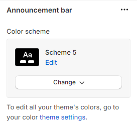
In Shopify, the Color scheme (a set of colors) of your store can be set within the Theme settings. It helps group elements and their respective colors, making your store visually appealing and cohesive. You can apply the color schemes to different sections throughout your online store with a color scheme picker.
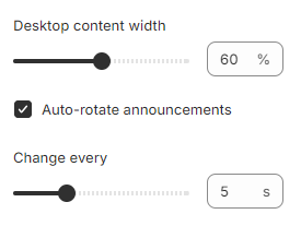
- Desktop content width: Determine the width of the announcement content on the desktop (20% - 100%).
- Auto-rotate announcements: Change the announcement slides automatically (when there are 2 announcements or more) across the browser or device.
- Change every: Set a duration for the slider to change every 3-10s (when the Auto-rotate slides option is enabled).
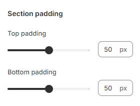
Section padding
Block settings
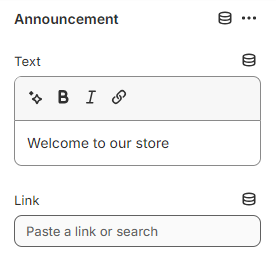
Announcement
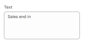
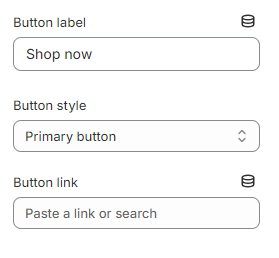
- Text: Input the information needed.
- Link: Direct customers to a specific page when clicking the bar.
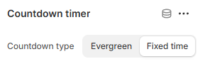
Countdown timer

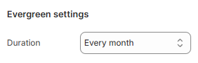
- Evergreen: A repeating countdown that resets after a specified duration (e.g., every month).
- This is useful for recurring sales, daily deals, or subscription cycles.
See Changelog.
- Fixed time: A one-time countdown that ends at a specific date and time.
- Ideal for limited-time promotions, event registrations, or product launches.
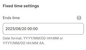
| Name | Format | Example |
|---|---|---|
| 24 hour format | YYYY/MM/DD HH:MM | 2023/10/04 23:30 |
| 12 hour format | YYYY/MM/DD HH:MM aa | 2023/10/04 11:30 PM |
Best practices
- Use short texts (make sure you try your store on mobile, where it is narrower).
- Limit the number of rotating texts to 2 or 3. While you can use more, your customers probably won't see them.
- An announcement bar can be easy to miss due to its small size. Therefore, avoid using the announcement bar for critical information. Instead, use a bigger section in the page.
Last updated