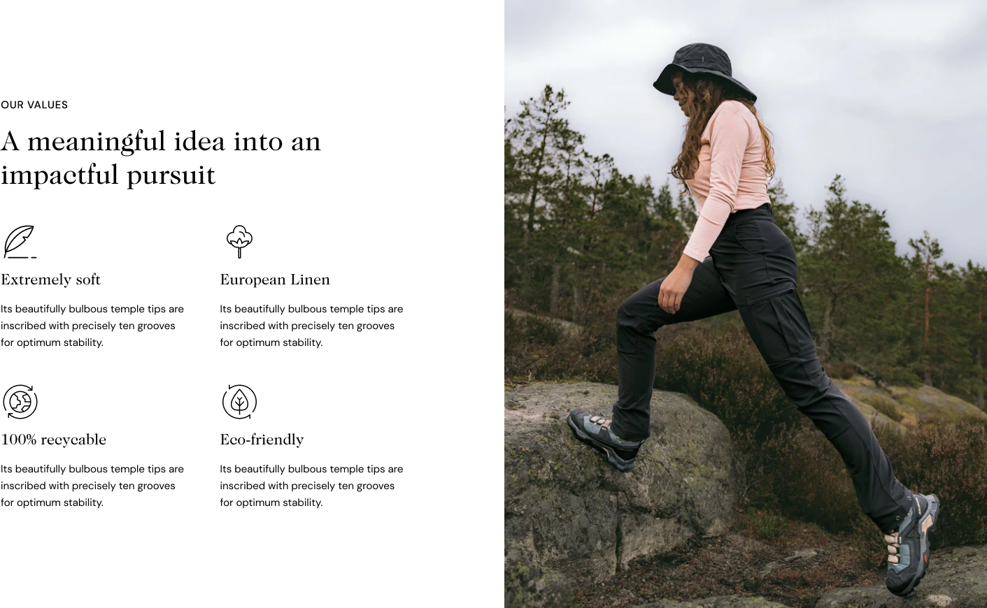
The Image with text columns section lets you display a large image next to multiple columns where each includes an image alongside text content.
It's a visually appealing way to showcase features, products, services, or any other information in a structured and engaging format.
# How to add the Image with text columns sectionSteps
In the theme editor (Customize) , click Add section.
Locate Image with text columns.
Make necessary changes.
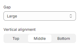
Save. # How to edit the Image with text columns section# Section settings# GeneralFurthermore, you can change the Gap between text columns and image to None/ Extra small/ Small/ Medium/ Large/ Extra large, and Vertical alignment to Top/ Middle/bottom to achieve a balanced appearance within the section.
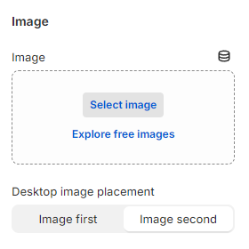
# Image Add an Image or image link (Connect dynamic source) that you prefer for your Image with text columns section.
You can also adjust Desktop image placement to Image first/ Image second.
Note: Image first is the default mobile layout
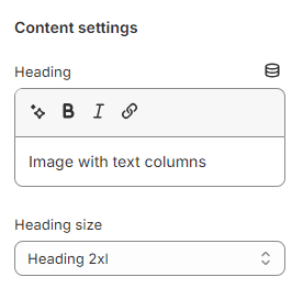
# Content settings Add the content you want in the Heading to attract customers' attention
Leave it blank if you do not want to display it
You can also change the Heading size to:
Heading xs
Heading sm
Heading md
Heading lg
Heading xl
Heading 2xl
Display md
Display lg
Display xl
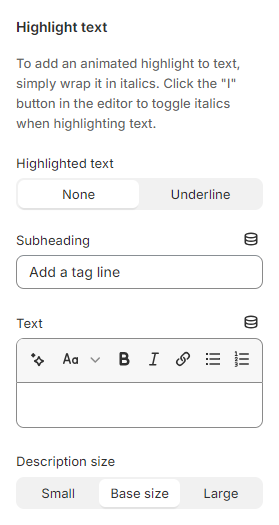
# Highlight textUse the provided text fields to add a suitable Subheading and Text .
Leave them blank if you do not want to display them
You can also change the Description size to Small/ Base size/ Large to make the content look balanced on your website.
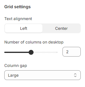
# Grid settingsThese grid settings allow you to modify the layout and alignment for the text Column blocks.
Change the Text alignment to Left or Center.
You are able to adjust the Number of columns on desktop from 1 to 3 columns and Column gap between the text Column blocks.
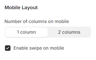
# Mobile layoutYou can Enable swiping on mobile or display the collections in a 2-grid column layout.
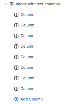
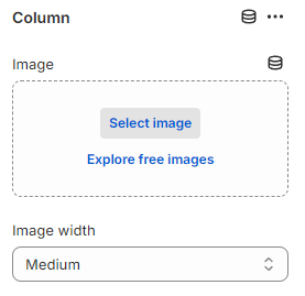
# Block settingsIn the Image with text columns section, you can add multiple Column blocks.
Add an Image that you prefer to display on each Column block.
You can adjust the width of the image in the Image width field:
Full width of column
Extra large
Large
Medium
Small
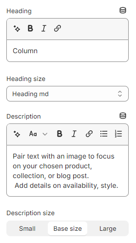
Add the content you want in the Heading and Description for the Column block.
Leave them blank if you do not want to display them
You can also change the Heading size to:
Heading xs
Heading sm
Heading md
Heading lg
Heading xl
Heading 2xl
Display md
Display lg
Display xl
and the Description size to: