Featured collection

How to display products from a selected collection in an engaging and attractive section

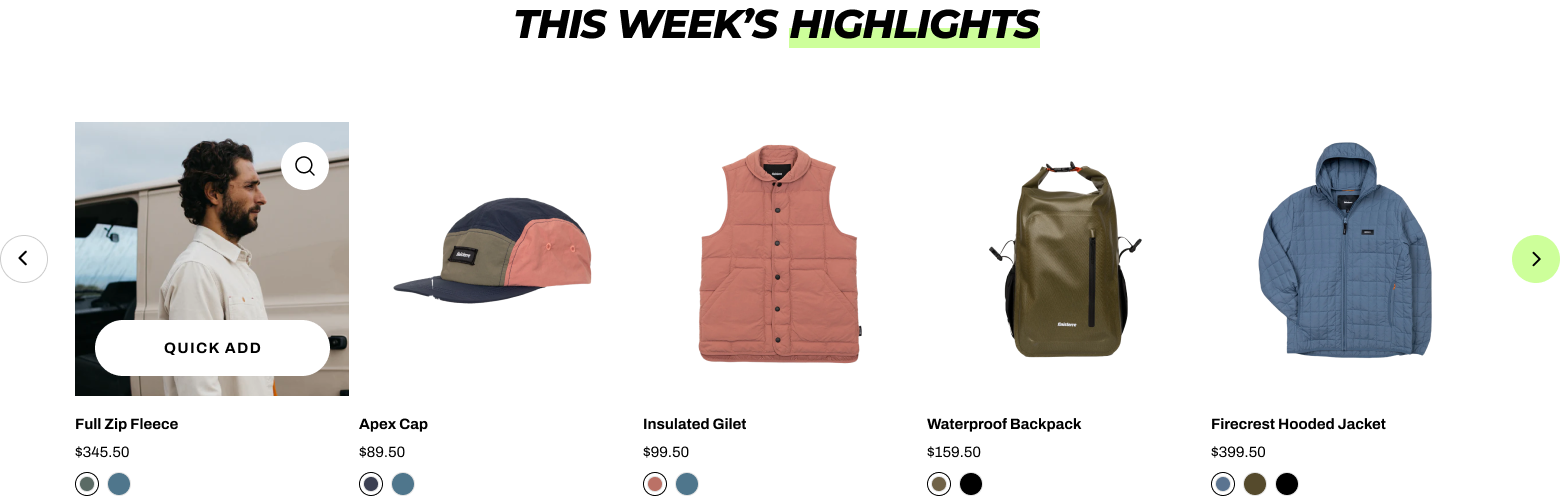
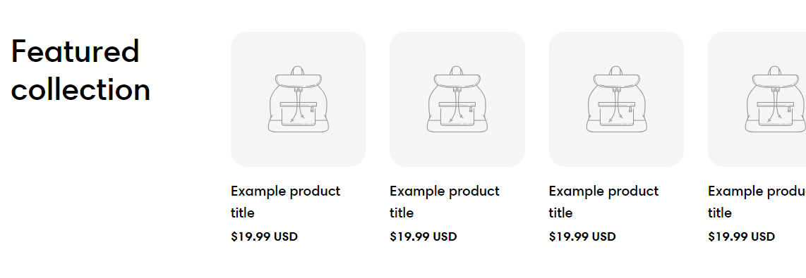
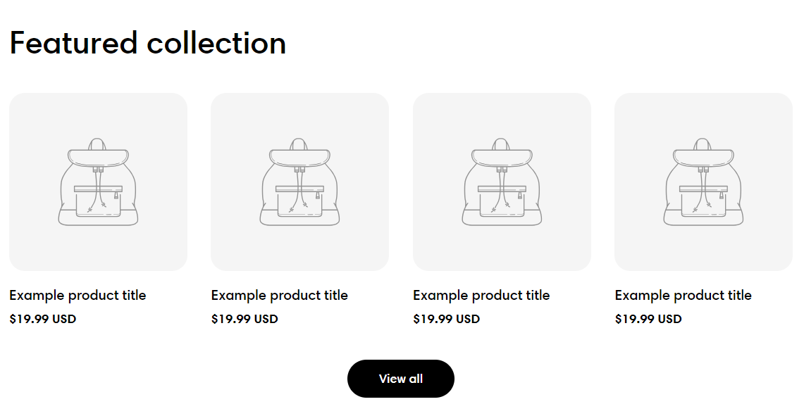
Featuring collections can help merchants promote sales and new collections. This article will show you how to add and customize your featured collection section in Sleek.

Steps

  1. In the theme editor (Customize), click Add section.

  2. Locate Featured collection.

  3. Make necessary changes.

  4. Save.

General

Adjust the Color scheme for this section.

Section header

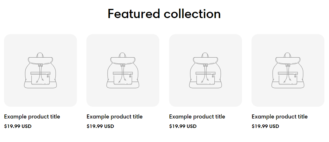
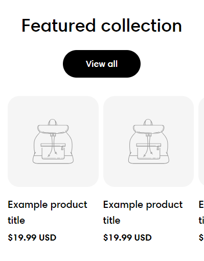
You can choose your preferred section header Layout (Vertical/ Horizontal/ Standing column).

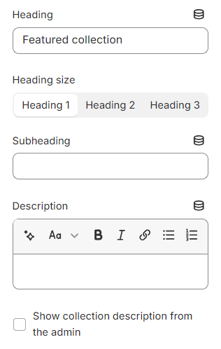
Use the provided text fields to add a suitable Heading/ Subheading/ Description.

  • Leave them blank if you do not want to display them.

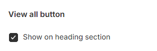
Adjust the Heading size (Heading 1/ Heading 2/ Heading 3) and enable Show collection description from the admin checkbox if you wish to show the collection's description set in the admin.

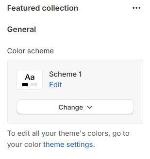
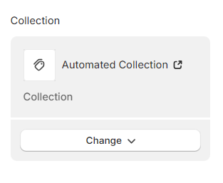
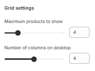
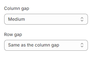
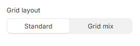
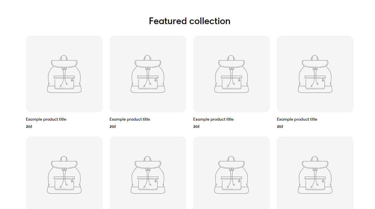
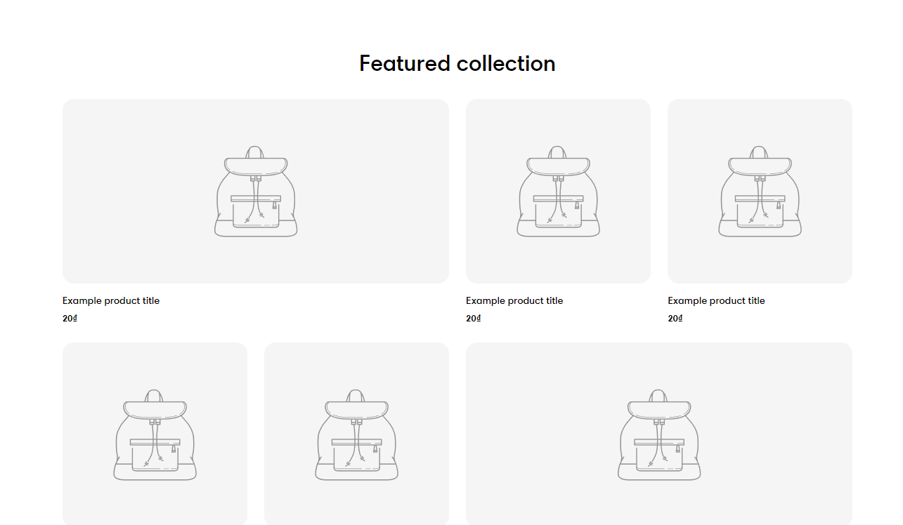
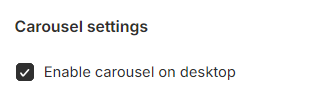
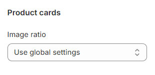
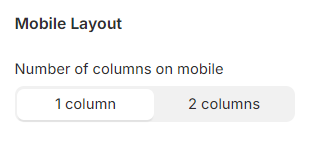
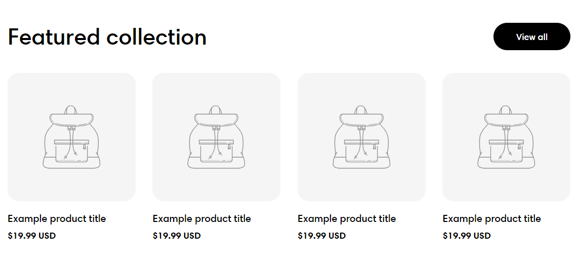
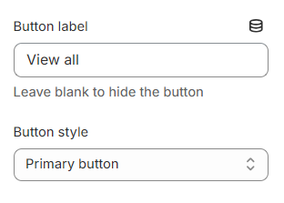
Here you can choose to display the collection you want and set up product cards.

  • Select the collection to show.

To create collections for your store, see Collections.

Grid settings

Use the slider to adjust the Maximum products to show (between 2 and 12) and the Number of columns on desktop (between 2 and 6).

You can also control the suitable spacing between the product cards by selecting Column gap and Row gap options.

Provide the Featured collection with an appealing and appropriate Grid layout:

  • Standard

  • Grid mix

You can enable the carousel effect in your featured collection by choosing Enable carousel on desktop checkbox.

Carousel shows only when the number of products is larger than the number of columns.

Product cards

Select the product card's Image ratio as:

  • Use global settings

  • Adapt to image

  • Square (1:1)

  • Portrait (3:4)

  • Landscape (4:3)

To set up other addons such as badges, buttons, etc. to the product cards, check out this article:

Product cards

Mobile layout

You can adjust the Number of columns on mobile to 1 column or 2 columns.

If you are not into the grid layout, you can use the carousel layout by selecting the Enable swipe on mobile.

View all button

Add a call-to-action View all button to direct customers to collection pages.

This button can be positioned on the header on both desktop and mobile by enabling the Show on heading section checkbox.

You can also insert the Button label

  • Leave the label blank if you want to hide the button.

Moreover, the Button style can be changed to the Primary button/ Secondary button/ Underline button.

Last updated