Sleek
Try Sleek freeResourcesOther solutions
  • What is Sleek theme
  • Changelog
  • Refund policy
  • Support policy
  • Getting started
    • Install Sleek theme
    • Set up my store as Sleek demo
    • Update Sleek theme
    • Theme license & Transfer
  • BUILD FOR SUCCESS SERIES
    • Homepage for Health & Beauty 🔥
  • Page's global sections
    • General settings
    • Announcement bar
    • Cart drawer
    • Header
      • Mega menu
      • Use Country/ Region selector
      • Use Language selector
    • Footer
    • Mobile navigation bar
    • Pop-up
    • Quick view
  • Theme sections
    • Before/ After image slider
    • Blog post
    • Card images
    • Collage tabs
    • Collapsible tabs
    • Collection image showcase
    • Collection list
    • Collections showcase
    • Collections slider
    • Contact form
    • Countdown timer
    • Custom content
    • Custom liquid
    • Email signup
    • Favorite products
    • Feature list
    • Featured product
    • Featured collection
    • Featured products tab
    • Highlight text with image
    • Image gallery
    • Image with text
    • Image with text columns
    • Image with text overlay
    • Layered images with text
    • Lookbook banner
    • Lookbook cards
    • Lookbook slider
    • Media with collection
    • Multicolumn
    • Press
    • Products bundle
    • Product tabs
    • Product showcase
    • Recently viewed products
    • Rich text
    • Scrolling promotion
    • Slideshow
    • Store locator
    • Testimonials
    • Video
    • Video hero
    • Video with text
  • Theme settings
    • General 🔥
    • Animations
    • Buttons
    • Custom CSS
    • Blog cards
    • Cart
    • Collection cards
    • Color swatches
    • Colors
    • Currency format
    • Layout
    • Logo
    • Product cards
    • Search behavior
    • Social media
    • Typography
  • Collections & Products
    • Product page
      • Product template
      • Breadcrumbs
      • Product information
      • Related products
      • Sticky add to cart bar
      • Quick order list 🔥
    • Collection page
      • Collection template
      • Collection banner
      • Product grid
    • Collections list page
  • Other pages
    • 404 page
    • Blogs
    • Blog posts
    • Cart
    • Password
    • Search page
  • FAQs
    • Generic
      • Add gift wrap option to my cart
      • Combined listings app
      • Customize the checkout
      • How to add custom fonts in Sleek? 🔥
      • How to remove 'Powered by Shopify' in Copyright
      • Remove text Tax included and Shipping calculated at checkout below the product price
      • JavaScript events for developers
    • Collection
      • Change the default sorting of a collection
    • Product
      • Set up quantity rules and volume pricing 🔥
      • Add custom badges using product tags
      • Set up Local Pickup option
      • Show dynamic content for Products using Metafields 🔥
  • Troubleshooting
    • Mega menu not working when changing the store languages
Powered by GitBook
On this page
  • How to add a Lookbook cards section to your Shopify store
  • How to edit a Lookbook cards section
  • Section settings
  • Block settings
  • Best practices
  1. Theme sections

Lookbook cards

Create a visually striking Lookbook section that highlights your products in action.

PreviousLookbook bannerNextLookbook slider

Last updated 9 months ago

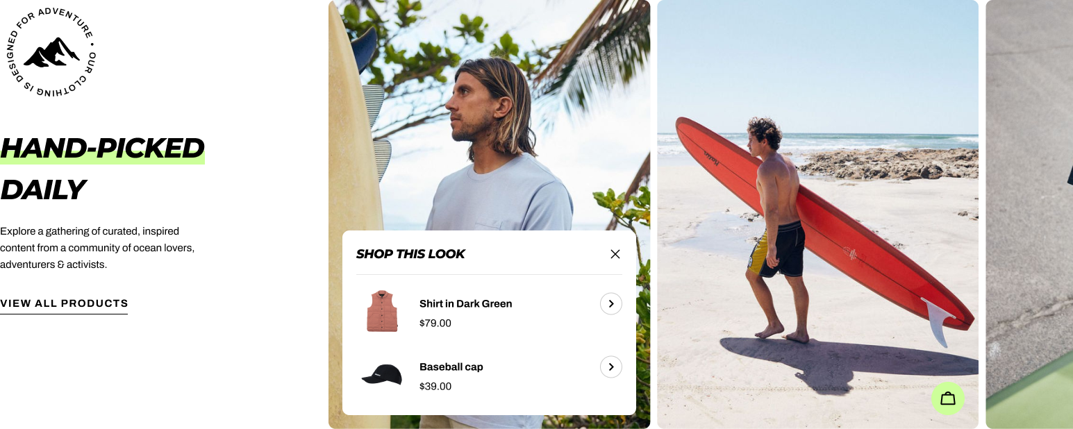
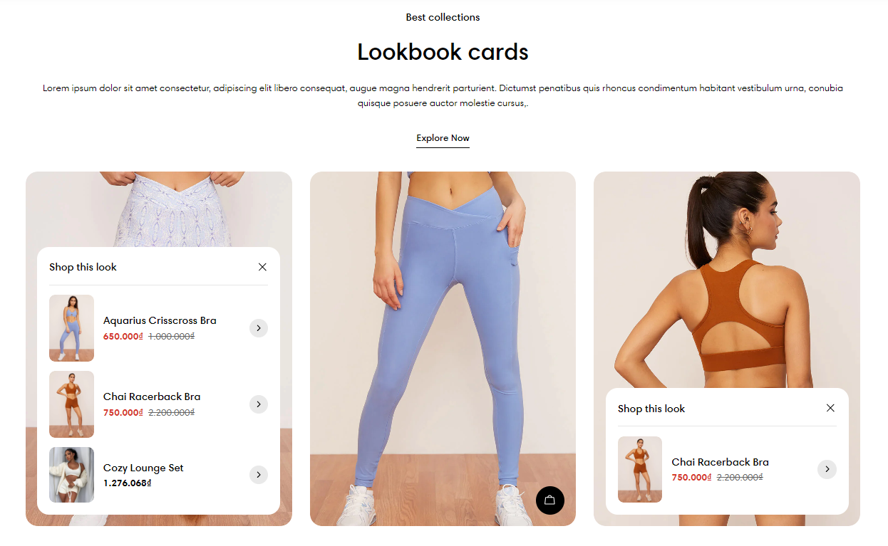
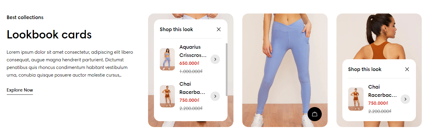
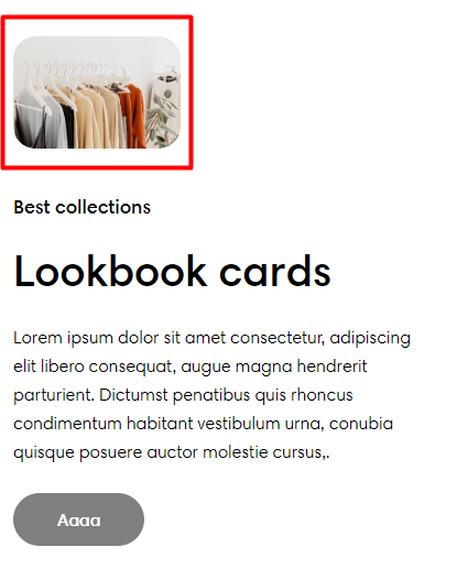
The Lookbook cards section helps you showcase multiple products in stunning pop-ups in a combination of captivating visuals and easy navigation. Include pins of products on images in which each pin directs customers to the product details, creating an interactive shopping experience and boosting sales with this dynamic feature.

In this article, we will show you how to add a Lookbook cards section.

How to add a Lookbook cards section to your Shopify store

Steps

  1. In the theme editor (Customize), click Add section.

  2. Select Lookbook cards.

  3. Make necessary changes.

  4. Save the settings.

How to edit a Lookbook cards section

Section settings

Section header

Choose your preferred section header's Layout: Vertical/ Standing column.

Use the provided text fields to add a suitable Heading. Leave it blank if you do not want to display it.

Change the Heading size as you like:

  • Heading xs

  • Heading sm

  • Heading md

  • Heading lg

  • Heading xl

  • Heading 2xl

  • Display md

  • Display lg

  • Display xl.

Highlight text

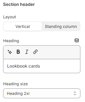
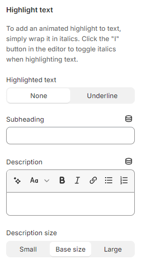
Use the provided text fields to add a suitable Subheading and Description. Leave them blank if you do not want to display them

You can also change the Description size to Small/ Base size/ Large to make the content look balanced on your website.

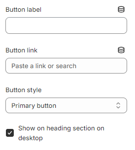
Add a call-to-action button that directs customers to the targeted page specified in the Button link field. Add a Button label then choose a Button style (Primary button/ Secondary button/ Underline button).

If the Show on heading section on desktop checkbox is selected, the button will display on the section header. By default, this button when added will show at the end of the section.

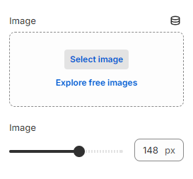
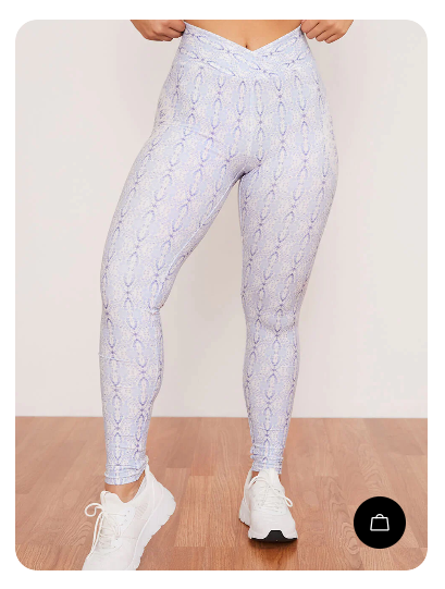
Select a preferred Image to display on top of the section header and adjust the image width (size) between 60px and 200px. The image height will be scaled proportionally.

Grid settings

Use the slider to adjust the Number of columns on desktop (between 2 and 4) for the Products blocks.

Control the spacing between the blocks by selecting Column gap and Row gap options:

  • Column gap: Extra large/ Large/Medium/Small/ Extra small/ None.

  • Row gap: Extra large/ Large/Medium/Small/ Extra small/ None/ Same as the column gap.

Carousel settings

Product cards

Select the product card's Image ratio as:

  • Use global settings

  • Adapt to image

  • Square (1:1)

  • Portrait (3:4)

  • Landscape (4:3)

To adjust the Use global settings of the Product cards, navigate to the Theme settings > Product cards.

See more: Product cards

Mobile layout

If you are not into the grid layout on mobile view, you can use the carousel layout by selecting the option Enable swipe on mobile.

Block settings

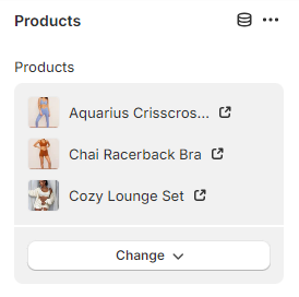
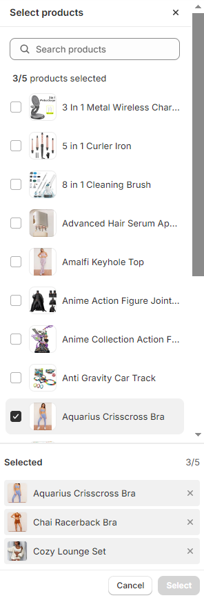
Add Products blocks to showcase your stunning images and interactive product lists within each block.

  • Add up to 8 Product blocks to the section.
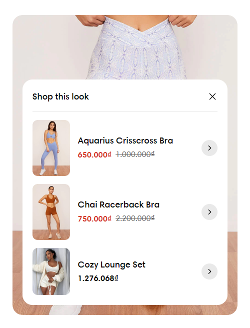
  • Pin up to 5 products for each block.

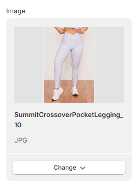
Select an Image for each of the product lists.

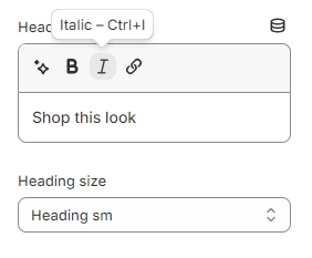
Enter the Heading text to display as the title of the product list pop-up in the lookbook card and set a Heading size for it. Leave it blank if you do not want to display it.

Best practices

  • Use images of the default ratio of 3/4 so that the images won't be cropped.

  • For each image, pin it with 1-3 products for best optimization and visual effects.

See:

You can Enable the carousel on desktop (the number of added Products blocks > the ).

Do:

✅
number of columns on desktop
How to apply Highlight text to the section heading and block headings?
Try Foxify free now