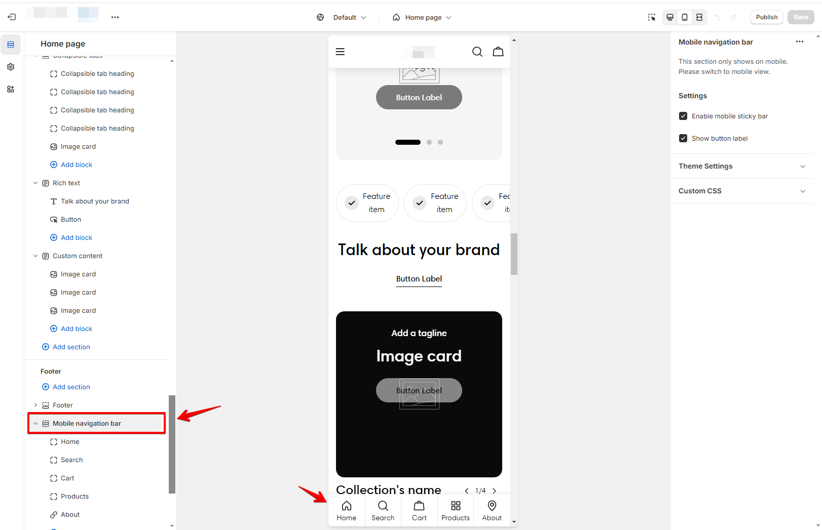
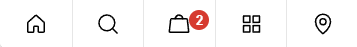
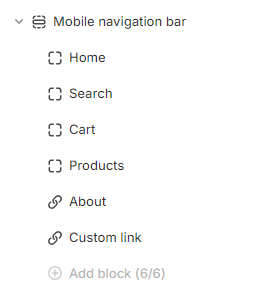
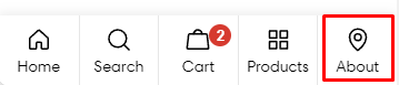
The Mobile navigation bar section is a fixed navigation menu that remains visible at the bottom of the mobile screen as the users scroll up/down.
A navigation bar helps your users navigate through your website with ease on limited mobile screens. It is different from the sticky header that appears on the top.
In this article, we will show you how to set up a Mobile navigation bar section.
The Mobile navigation bar feature is available on ✨ Sleek version 1.4.0 and above ✨
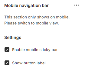
Check the Enable mobile sticky bar box to show the sticky navigation bar on mobile to let customers shopping easier by ensuring it remains visible as users scroll through the page.
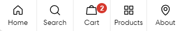
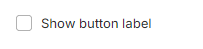
The Show button label is checked, making the label text (like "Home" or "Cart") visible below each icon for better clarity.