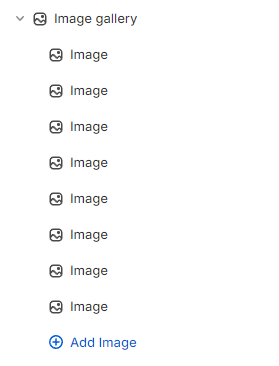
The Image gallery section visually showcases products, portfolios, or photoshoots like a gallery effectively.
This feature allows you to present multiple images in a visually appealing manner, enhancing user engagement and increasing the likelihood of conversions by providing potential customers with a clearer view of what is being offered.
In this article, we will show you how to add an Image gallery section.
#How to add an Image gallery section to your Shopify store
Steps
In the theme editor (Customize), click Add section.
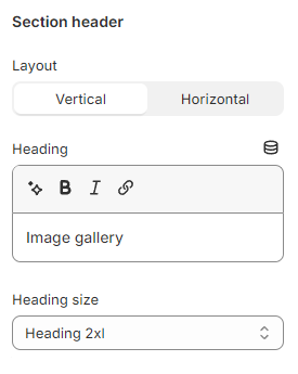
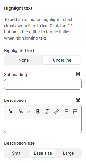
Use the provided text fields to add a suitable Subheading and Description.
Leave them blank if you do not want to display them.
You can also change the Description size to Small/ Base size/ Large to make the content look balanced on your website.
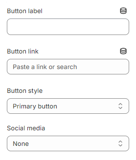
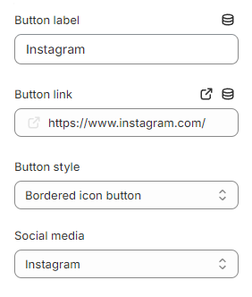
Additionally, this section setting lets you add the call-to-action button to redirect customers to your desired page or social media page.
Provide a Button label and Button link for this button, then choose a Button style (Primary button/ Secondary button/ Underline button/ Bordered icon button).
Select a suitable Social media icon for this button (Instagram/ Facebook/ Twitter)
Choose None to display the normal button without an icon.

_V6Sp3gmc.png)