Sleek
Try Sleek freeResourcesOther solutions
  • What is Sleek theme
  • Changelog
  • Refund policy
  • Support policy
  • Getting started
    • Install Sleek theme
    • Set up my store as Sleek demo
    • Update Sleek theme
    • Theme license & Transfer
  • BUILD FOR SUCCESS SERIES
    • Homepage for Health & Beauty 🔥
  • Page's global sections
    • General settings
    • Announcement bar
    • Cart drawer
    • Header
      • Mega menu
      • Use Country/ Region selector
      • Use Language selector
    • Footer
    • Mobile navigation bar
    • Pop-up
    • Quick view
  • Theme sections
    • Before/ After image slider
    • Blog post
    • Card images
    • Collage tabs
    • Collapsible tabs
    • Collection image showcase
    • Collection list
    • Collections showcase
    • Collections slider
    • Contact form
    • Countdown timer
    • Custom content
    • Custom liquid
    • Email signup
    • Favorite products
    • Feature list
    • Featured product
    • Featured collection
    • Featured products tab
    • Highlight text with image
    • Image gallery
    • Image with text
    • Image with text columns
    • Image with text overlay
    • Layered images with text
    • Lookbook banner
    • Lookbook cards
    • Lookbook slider
    • Media with collection
    • Multicolumn
    • Press
    • Products bundle
    • Product tabs
    • Product showcase
    • Recently viewed products
    • Rich text
    • Scrolling promotion
    • Slideshow
    • Store locator
    • Testimonials
    • Video
    • Video hero
    • Video with text
  • Theme settings
    • General 🔥
    • Animations
    • Buttons
    • Custom CSS
    • Blog cards
    • Cart
    • Collection cards
    • Color swatches
    • Colors
    • Currency format
    • Layout
    • Logo
    • Product cards
    • Search behavior
    • Social media
    • Typography
  • Collections & Products
    • Product page
      • Product template
      • Breadcrumbs
      • Product information
      • Related products
      • Sticky add to cart bar
      • Quick order list 🔥
    • Collection page
      • Collection template
      • Collection banner
      • Product grid
    • Collections list page
  • Other pages
    • 404 page
    • Blogs
    • Blog posts
    • Cart
    • Password
    • Search page
  • FAQs
    • Generic
      • Add gift wrap option to my cart
      • Combined listings app
      • Customize the checkout
      • How to add custom fonts in Sleek? 🔥
      • How to remove 'Powered by Shopify' in Copyright
      • Remove text Tax included and Shipping calculated at checkout below the product price
      • JavaScript events for developers
    • Collection
      • Change the default sorting of a collection
    • Product
      • Set up quantity rules and volume pricing 🔥
      • Add custom badges using product tags
      • Set up Local Pickup option
      • Show dynamic content for Products using Metafields 🔥
  • Troubleshooting
    • Mega menu not working when changing the store languages
Powered by GitBook
On this page
  • How to add a Collection list
  • How to edit a Collection list
  • Section settings
  • Block settings
  1. Theme sections

Collection list

A guide to set up a list of featured collections.

PreviousCollection image showcaseNextCollections showcase

Last updated 9 months ago

The collection list displays a quick list of desired collections to catch visitors' attention.

How to add a Collection list

Steps

  1. In the theme editor (Customize), click Add section

  2. Locate Collection list

  3. Save.

How to edit a Collection list

Section settings

Layout

Choose your preferred collection list Layout to draw customers' attention.

Section header

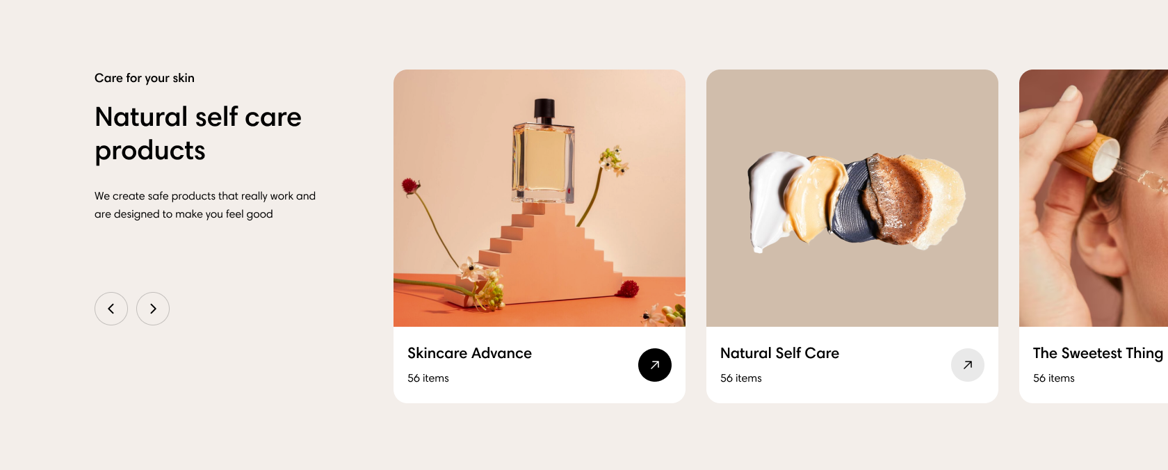
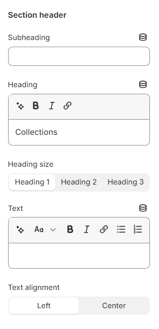
Use the provided text fields to add a suitable Heading, Subheading, and Text.

  • Leave them blank if you do not want to display them

You can also change the Heading size to Heading 1/ Heading 2/ Heading 3 and the Text alignment to Left/ Center to make the content look balanced on your website.

Highlight text

Use the provided text fields to add a suitable Text.

  • Leave it blank if you do not want to display it

You can also change the Description size to Small/ Base size/ Large to make the content look balanced on your website.

Card settings

Moreover, you can change the card's Style:

  • Use global settings

  • Standard

  • Card

Select the card's Image ratio as:

  • Adapt to image

  • Square (1:1)

  • Portrait (3:4)

  • Landscape (4:3)

Grid settings

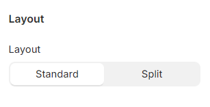
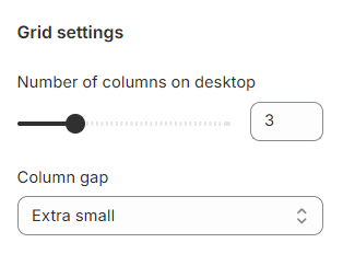
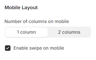
Set the Number of columns for desktop view between 2-6 columns; and choose your favorable Column gap as Extra large/ Large/Medium/Small/ Extra small/ None.

Carousel settings

Mobile layout

Block settings

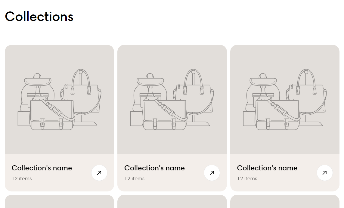
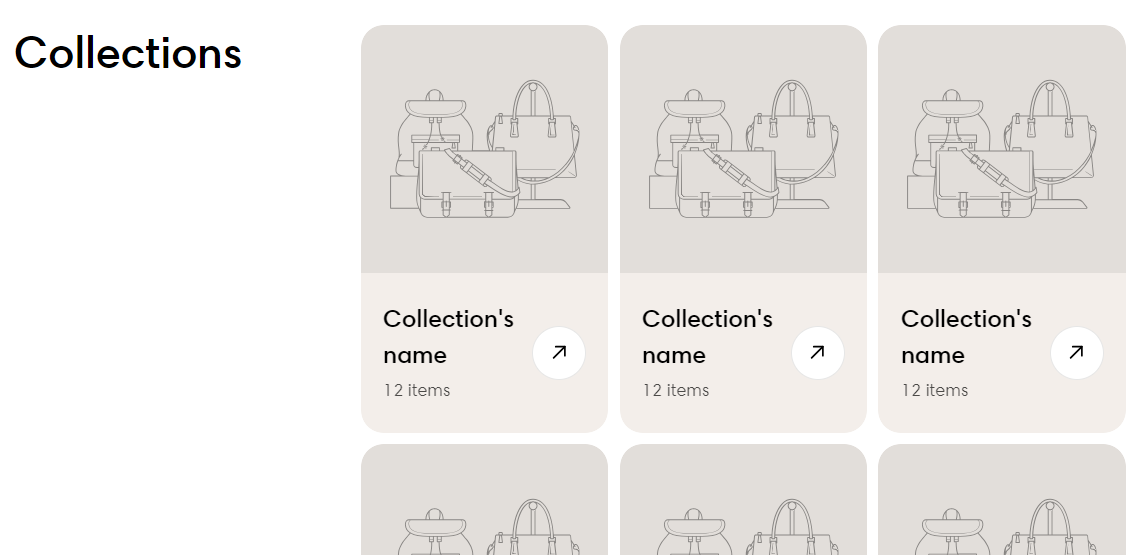
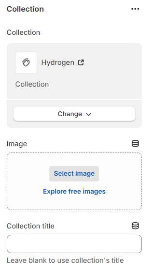
Each collection block has its own settings such as Collection title (Leave blank to use collection's title), Image, and Collection link to choose from.

To know more about creating and editing collections, see .

To sync the Color scheme of the block with the section, select Use section color scheme checkbox.

You can Enable the carousel on desktop (when the number of collections added > the number of columns).

You can Enable swiping on mobile or display the collections in a 2-grid column layout.

✅
✅
✅
Collections
How to apply Highlight text to the section heading and block headings?