
FaqsGeneric
Image size guidelines
10 min read
Recommended image sizes for different sections & blocks
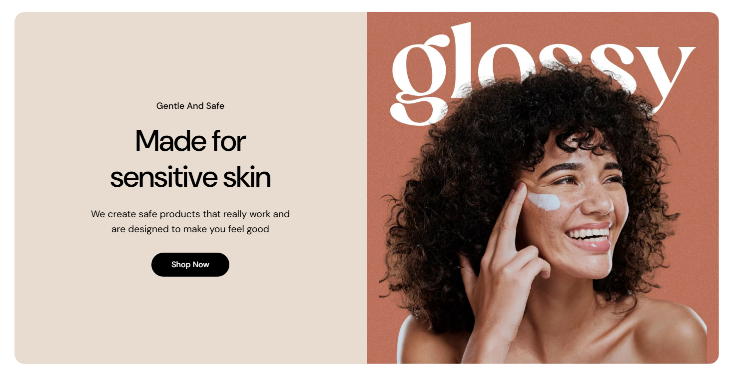
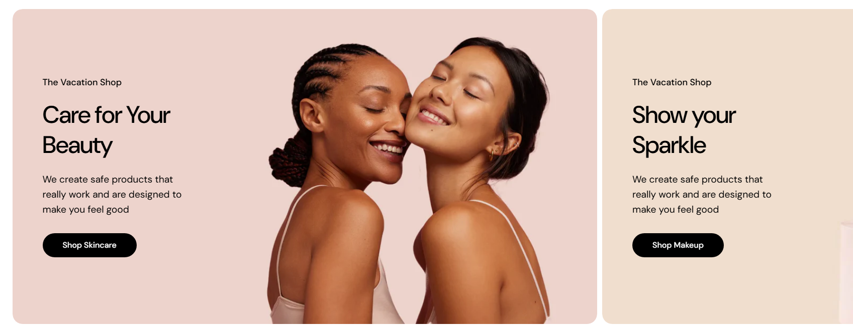
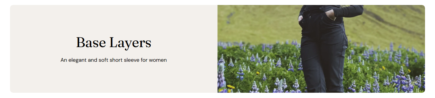
1. Image with texts
- Desktop image: 1058 × 1058px
| Option | Desktop height | Mobile height | Behavior |
| Adapt to first image | Auto | Auto | Height adapts to the first image ratio |
| Small | 450px | 337.5px | Cropped to fixed height |
| Extra small | 300px | 225px | Cropped to fixed height |
| Medium | 550px | 412.5px | Cropped to fixed height |
| Extra medium | 650px | 487.5px | Cropped to fixed height |
| Large | 800px | 600px | Cropped to fixed height |
- Adapt to image: Preserving the original proportions of your first image block. All other tabs will follow the same aspect ratio as the first image block.
- Fixed height options: Selecting a predefined height (e.g., Small, Medium, Large) ensures consistent section height but may crop images depending on their original ratio.
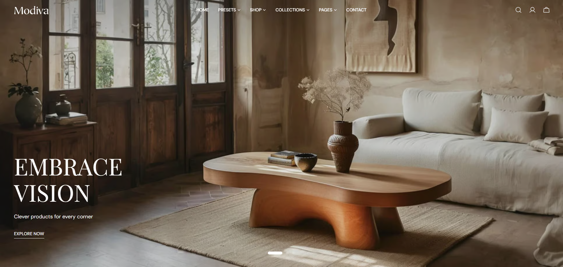
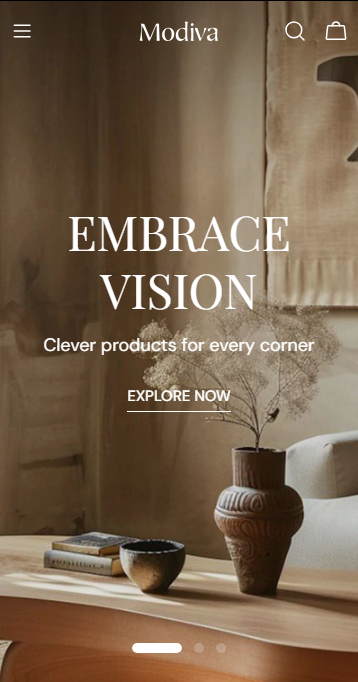
2. Slideshow
- Desktop image: 1920 x 900px
- Mobile image: 600 x 480px
| Desktop height | Mobile height | Behavior |
|---|---|---|---|
| Adapt to first image | Auto | Auto | Height adapts to the first image ratio |
| Small | 540px | 280px | Cropped to fixed height |
| Medium | 620px | 340px | Cropped to fixed height |
| Large | 720px | 420px | Cropped to fixed height |
- Adapt to image: The height of the before/after images will automatically adjust based on the aspect ratio of the first image block.
- Fixed height options: Using fixed height options (Small, Medium, Large), images may be cropped depending on their original proportions.
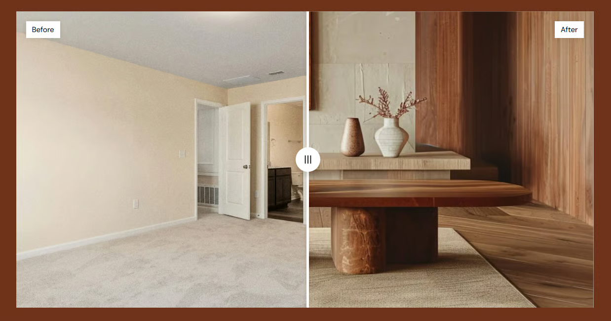
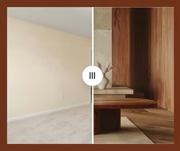
3. Before/after image slider
- Desktop image: 2340 × 1200px
- Mobile image: 686 × 562px
| Size | Desktop height | Mobile height | Behavior |
|---|---|---|---|
| Adapt to image | Auto | Auto | Height adapts to the aspect ratio of first image block |
| Small | 420px | 290px | Cropped to fixed height |
| Medium | 560px | 360px | Cropped to fixed height |
| Large | 720px | 420px | Cropped to fixed height |
- Adapt to image: The height of the before/after images will automatically adjust based on the aspect ratio of the first image block.
- Fixed height options: Using fixed height options (Small, Medium, Large), images may be cropped depending on their original proportions.
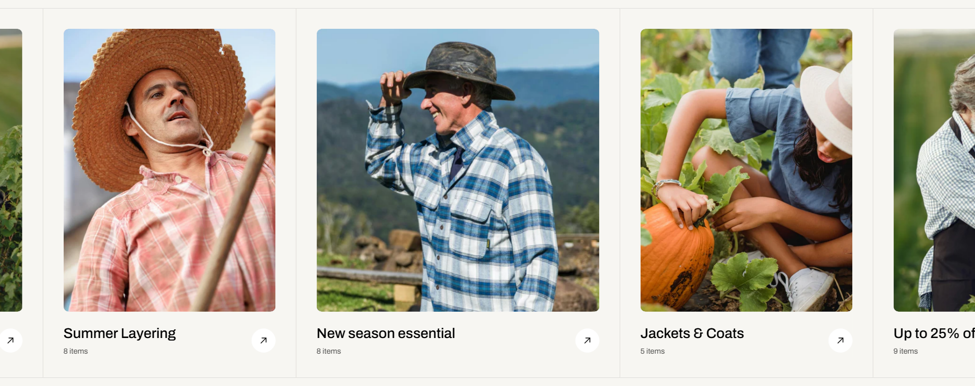
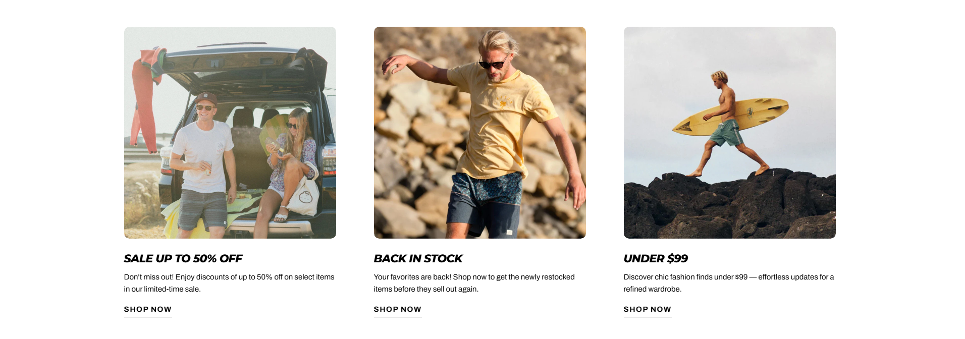
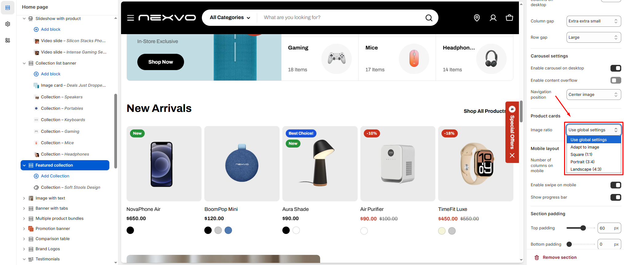
4. Card images
- Desktop image: 2110 × 1140px
- Mobile image: 515 × 900px

- Square (1:1) (Recommended): 1000 × 1000px
- Portrait (3:4): 1000 × 1333px
- Landscape (4:3): 1333 × 1000px
- Adapt to image: keeps original ratio (may look inconsistent)
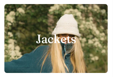
5. Collage tabs / Favorite products / Collections slider / Image gallery / Lookbook cards / Lookbook slider / Media with collection
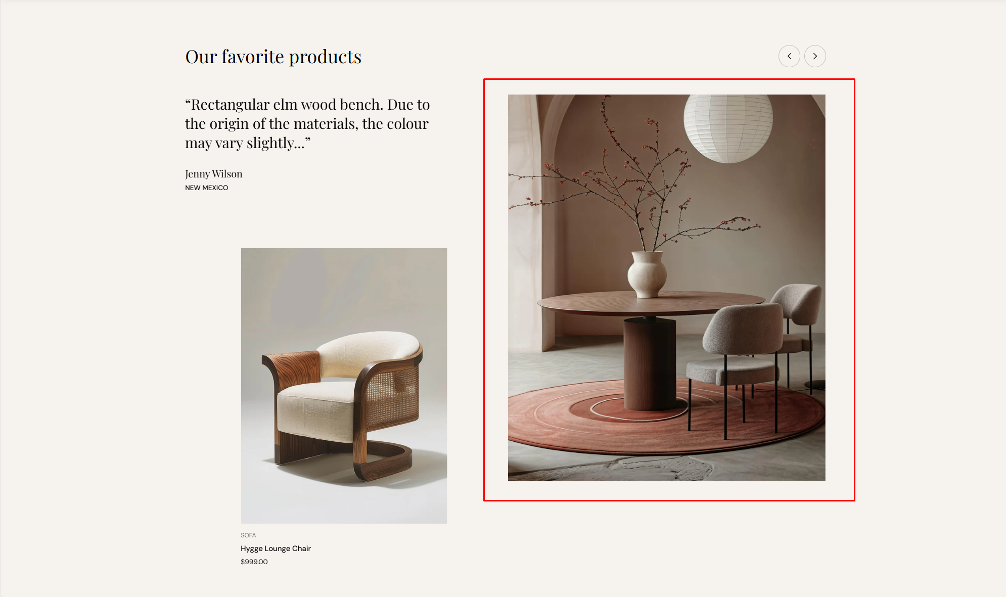
- Square (1:1) (Recommended): 1000 × 1000px
- Portrait (3:4): 1000 × 1333px
- Landscape (4:3): 1333 × 1000px
- Adapt to image: keeps original ratio (may look inconsistent)
6. Highlight text with image
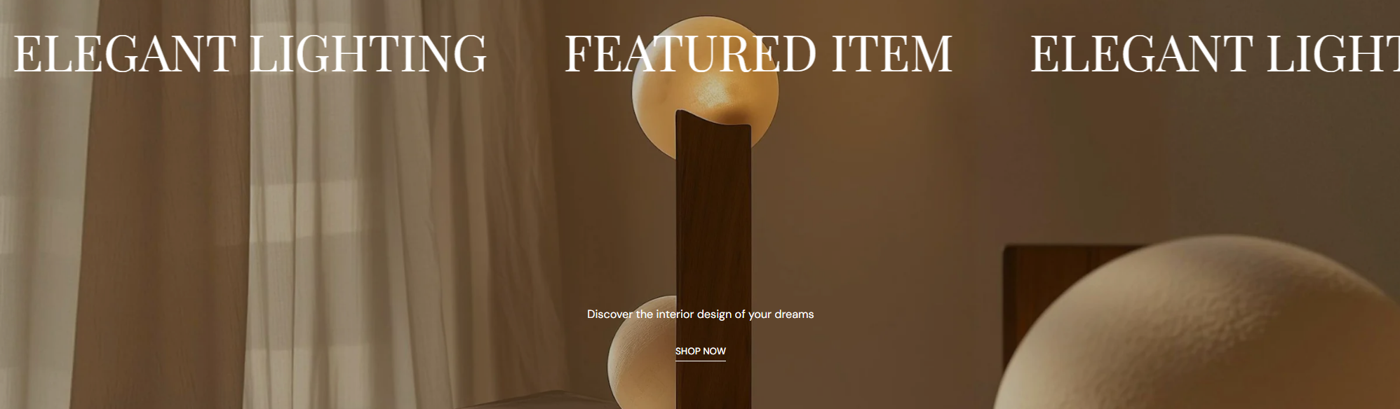
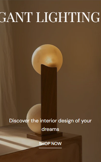
7. Image with text overlay
- Desktop image: 3360 × 1500px
- Mobile image: 750 × 1200px
| Size | Desktop height | Mobile height | Behavior |
|---|---|---|---|
| Adapt to image | Auto | Auto | Height adapts to the aspect ratio of first image block |
| Small | 400px | 300px | Cropped to fixed height |
| Extra small | 350px | Cropped to fixed height | |
| Medium | 550px | 400px | Cropped to fixed height |
| Extra medium | 650px | Cropped to fixed height | |
| Large | 700px | 500px | Cropped to fixed height |
| Extra large | 750px | 600px | Cropped to fixed height |
- Adapt to image: The height of the before/after images will automatically adjust based on the aspect ratio of the first image block.
- Fixed height options: Using fixed height options (Small, Medium, Large), images may be cropped depending on their original proportions.
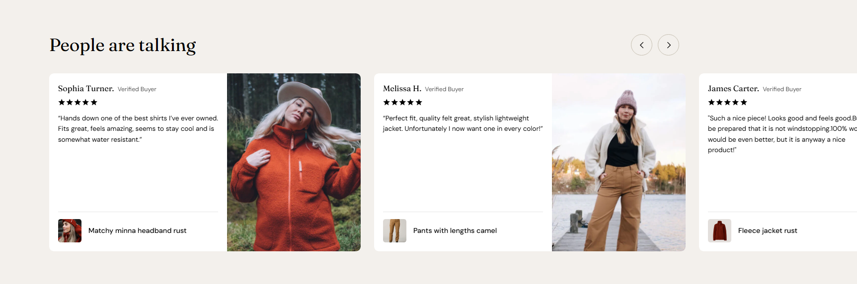
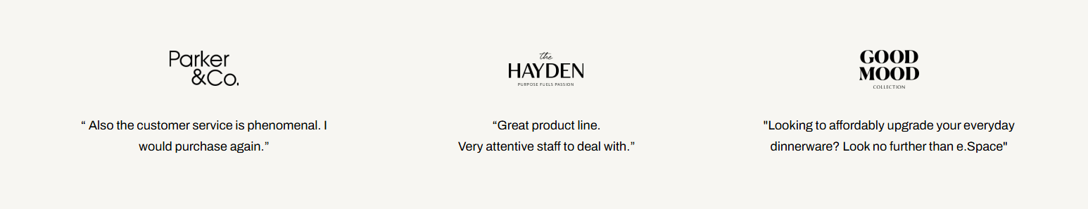
8. Testimonials - Layout 1
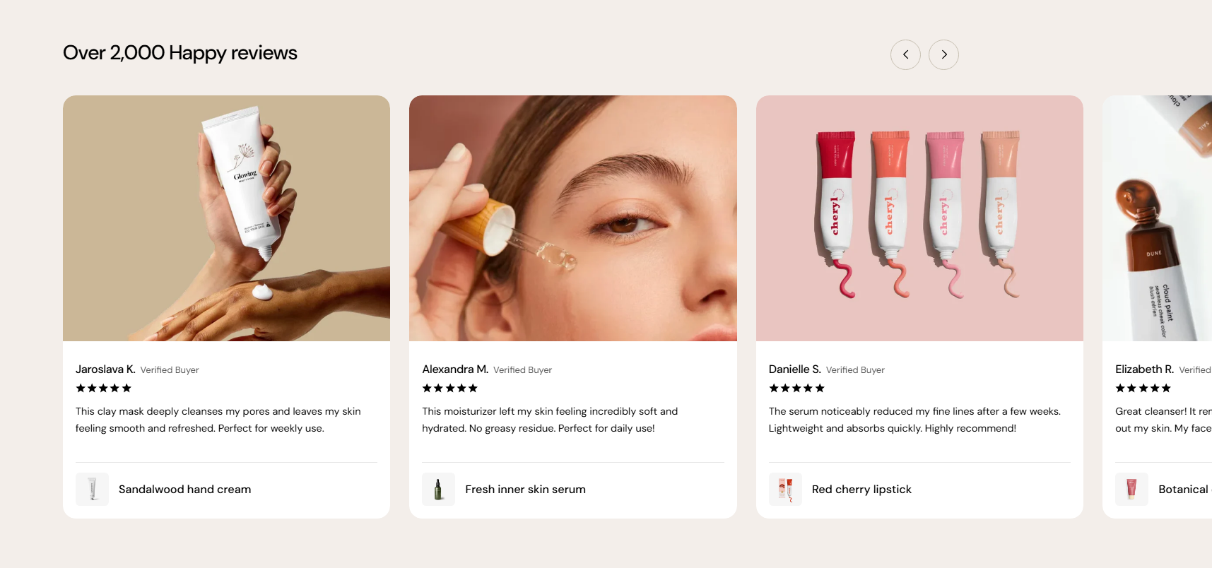
9. Testimonials - Layout 2
10. Blog post featured image
- Post’s thumbnail image (Blog listing page):
- Post’s featured image banner (Blog post page):
| Size | Desktop height | Mobile height | Behavior |
|---|---|---|---|
| Adapt to image | Auto | Auto | Height adapts to the aspect ratio of first image block |
| Small | 450px | 337.5px | Cropped to fixed height |
| Extra small | 300px | 225px | Cropped to fixed height |
| Medium | 550px | 400px | Cropped to fixed height |
| Extra medium | 650px | 487.5px | Cropped to fixed height |
| Large | 800px | 600px | Cropped to fixed height |
11. Collection banner
-
- 2820 × 600px (for image position: Top, Bottom, or Use image as background)
- 1410 × 600px (for image position: Left or Right)
| Option | Height | Behavior |
|---|---|---|
| Adapt to image | Auto | Follows the image’s original aspect ratio (no fixed height) |
| Extra small | 300px | Cropped to fixed height |
| Small | 450px | Cropped to fixed height |
| Medium | 550px | Cropped to fixed height |
| Extra medium | 650px | Cropped to fixed height |
| Large | 800px | Cropped to fixed height |
| Option | Height | |
|---|---|---|
| Auto | Extra small: 220 px Small: 337.5 px Medium: 412.5 px Extra medium: 487.5 px Large: 600 px | Inherits the desktop height setting (including ratio or fixed height) |
| Adapt to image | Auto | Uses the mobile image’s own aspect ratio (independent from desktop) |
- Adapt to image: The section height is determined by the image’s aspect ratio, preserving its original proportions and minimizing cropping.
- Fixed height options: Selecting a predefined height (e.g., Small, Medium, Large) ensures consistent section height but may crop images depending on their original ratio.
12. Featured products tab
- Adapt to image: keeps original ratio (Recommended size: 900 x 1200px)
- Square (1:1): 1000 × 1000px
- Portrait (3:4): 1000 × 1333px
- Landscape (4:3): 1333 × 1000px
13. Scrolling promotion
- Image: 160 × 160px

- Collection: 840 × 1120px
14. Multicolumn
- Image: 300 × 164px
- Image(Full width of column): 840 × 840px
| Size | Desktop width | Mobile width | Behavior |
|---|---|---|---|
| Full width of column | Auto | Auto | Filled to fix the width of the column |
| Small | 40px | 40px | Cropped to fixed width |
| Medium | 56px | 40px | Cropped to fixed width |
| Large | 72px | 48px | Cropped to fixed width |
| Extra Large | 150px | 120px | Cropped to fixed width |
15. Product images
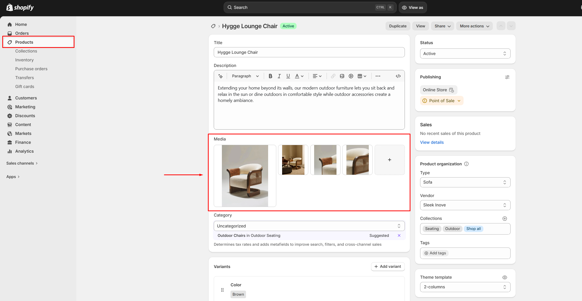
- Adapt to image
- Square
- Portrait
- Landscape
- Square (1:1): at least 2000 x 2000px
- Portrait (3:4): at least 2000 × 2667px
- Landscape (4:3): at least 2400 x 1800px
Best practices
- Maintain consistency: Use the same image dimensions and aspect ratio within each section for a uniform layout.
- “Adapt to first image”: When enabled, the first image defines the layout ratio. Ensure it has the correct proportions.
- Prepare images properly: Design images based on the selected ratio settings to avoid unexpected cropping.
- Desktop & mobile images: Upload separate versions when possible for better control across screen sizes.
- High-resolution images: Use images at approximately 2× the recommended size for sharp display on high-density screens.
- Avoid mixing ratios: Different aspect ratios in one section can create uneven layouts.
- Safe viewing area: Keep key content (text, focal points) centered to prevent cropping.
- Slides & galleries: Keep image sizes and ratios consistent for visual balance.
Last updated