
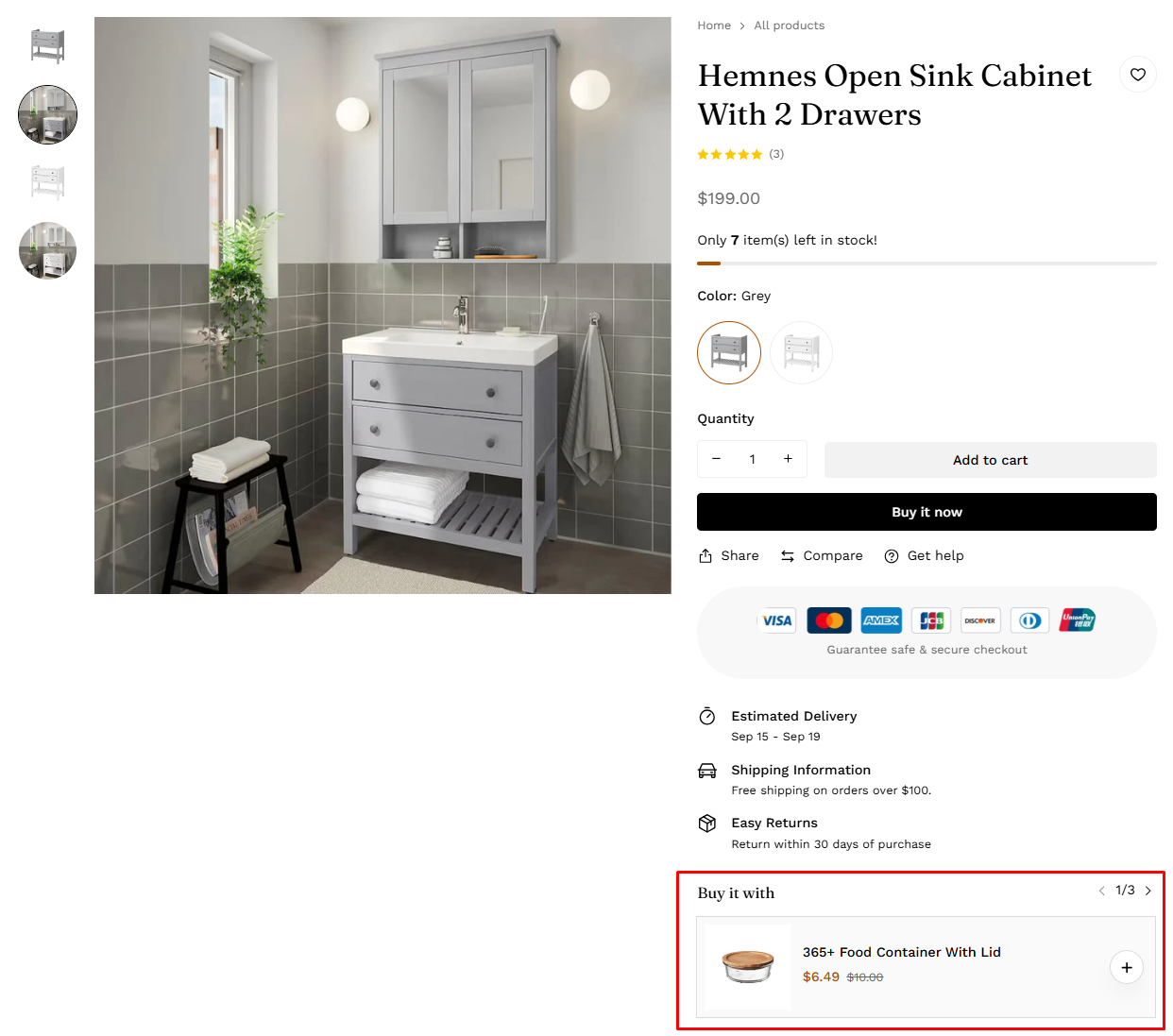
Product information
7 min read
- In the theme editor (Customize), open the template selector
- Select Products > then Default product.
- On the left-sidebar, add Product information.
- Make necessary changes > Save.
How to edit the Product information section
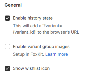
General settings
- Enable history state to the browser's URL;
- Enable the FoxKit's Variant group images feature
To set up Variant group images, see this article.
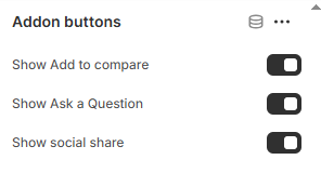
- Show the wishlist icon.
To set up your wishlist page, see this article.
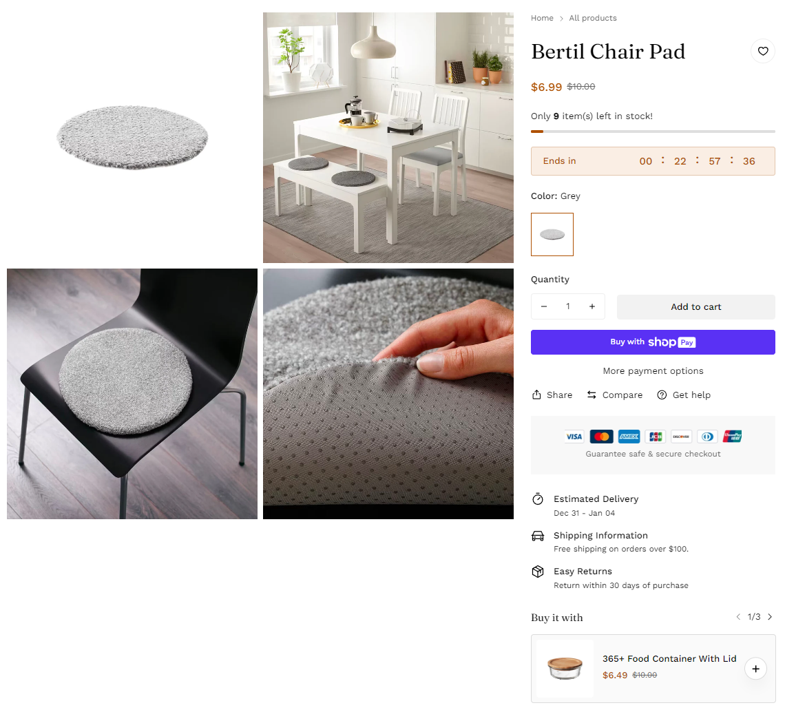
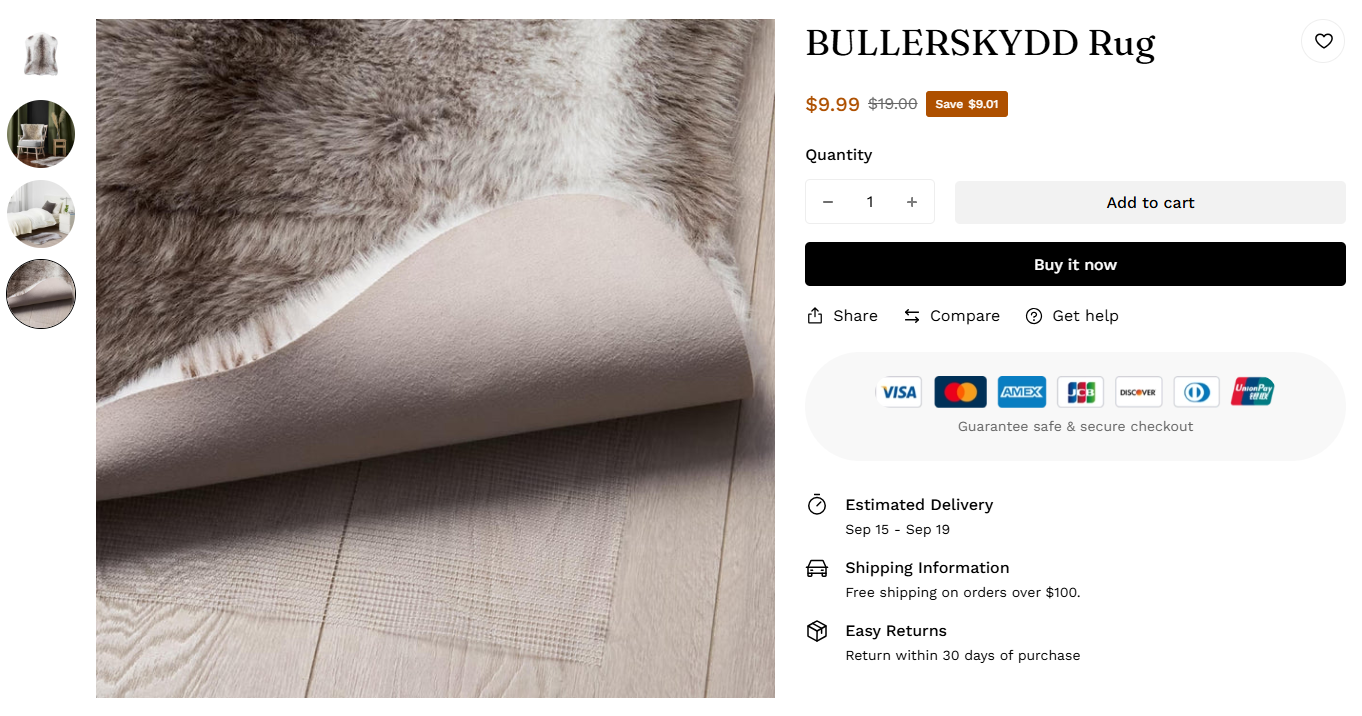
Product media
- Control the layout of the product media on desktop:
- Horizontal slider
- Grid
- Vertical slider
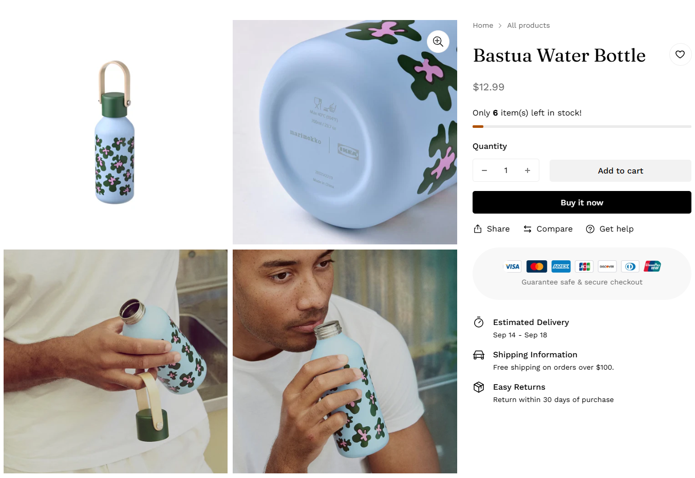
- Show featured media by default: To show the selected variant's image on the page load
- Enable image zoom: Turn on to allow customers to zoom into product images
- Enable video autoplay: Enable to automatically play product videos
- Show thumbnails on mobile: Turn on to display product image thumbnails under the main media on mobile devices.
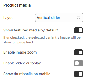
To know more about media, see Product media.
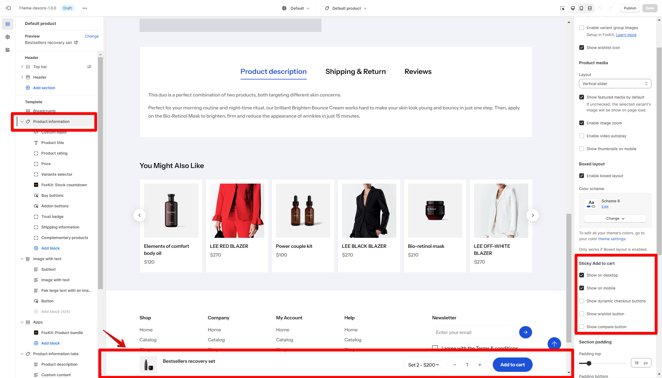
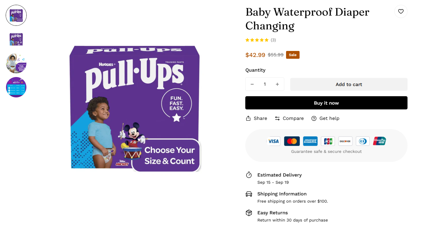
Sticky Add-to-Cart
- Show on desktop: Enable to display the Add to Cart bar at the bottom on desktop devices.
- Show on mobile: Enable to display the Add to Cart bar at the bottom on mobile devices.
- Show dynamic checkout buttons: Turn on to display quick checkout options.
- Show wishlist button: Enable to allow customers to save products to their wishlist.
- Show compare button: Allow customers to add products to a comparison list.
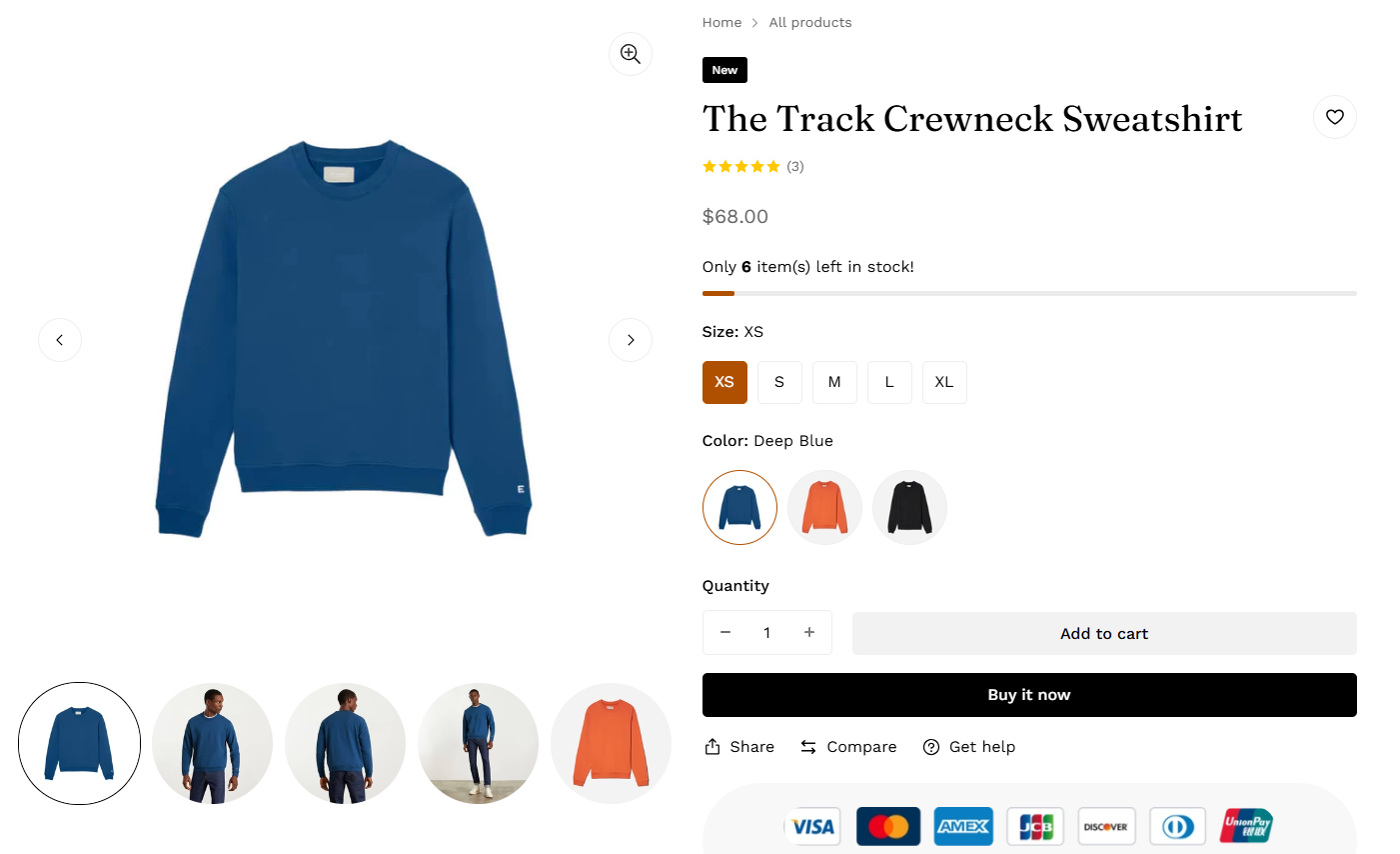
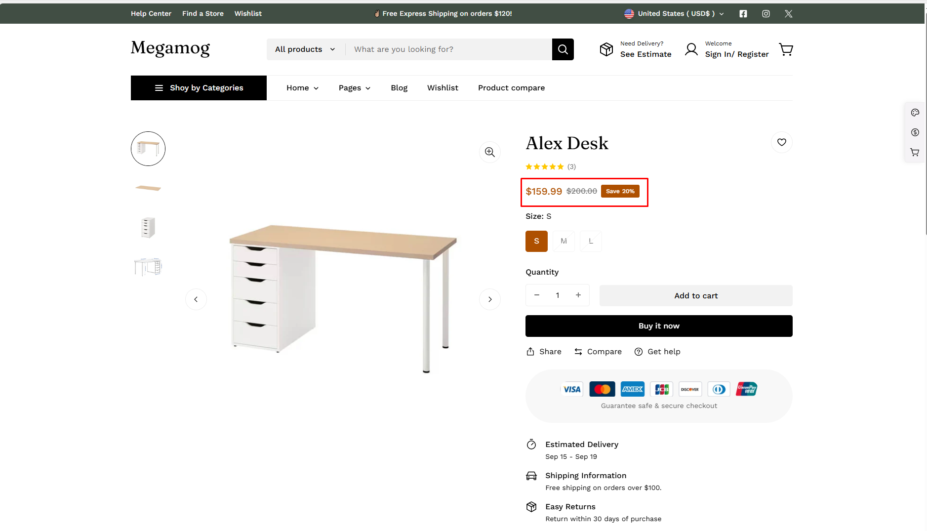
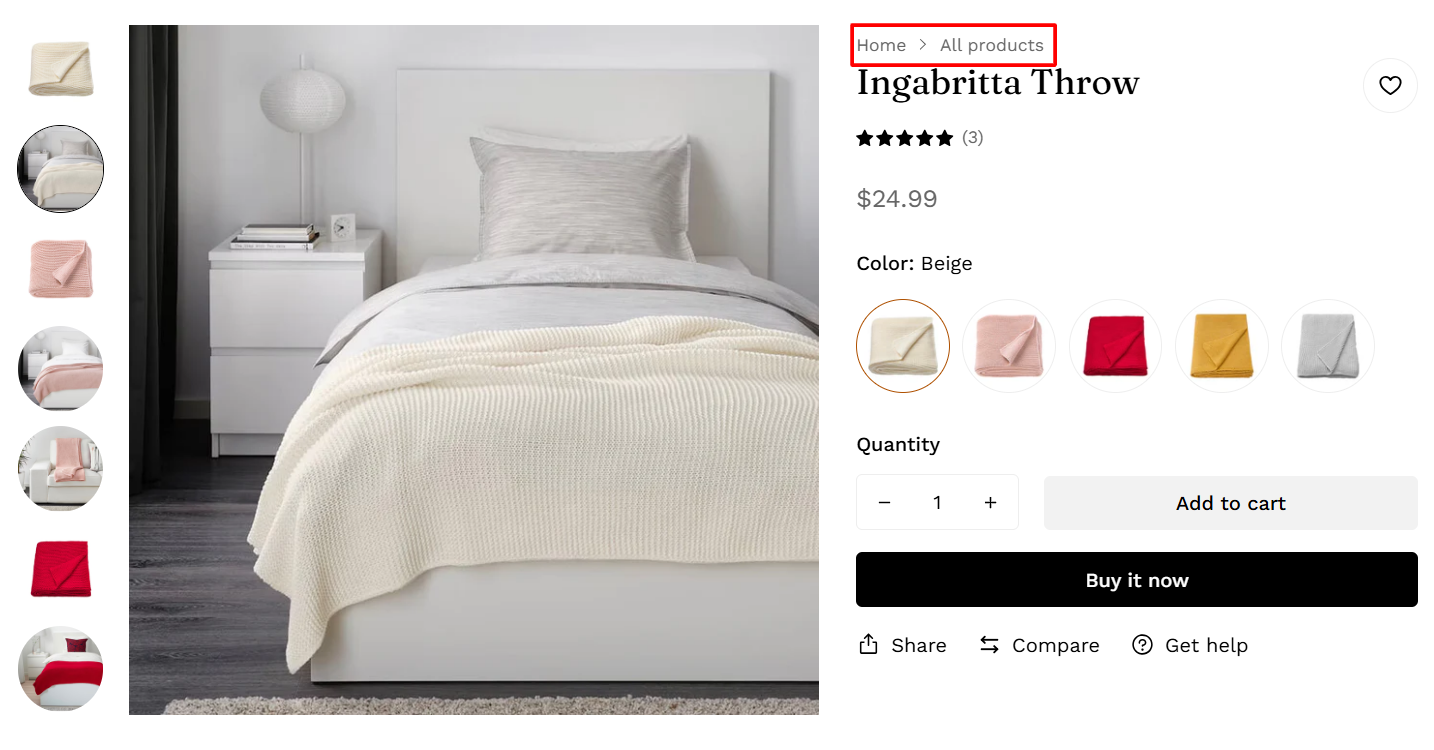
Product Information blocks
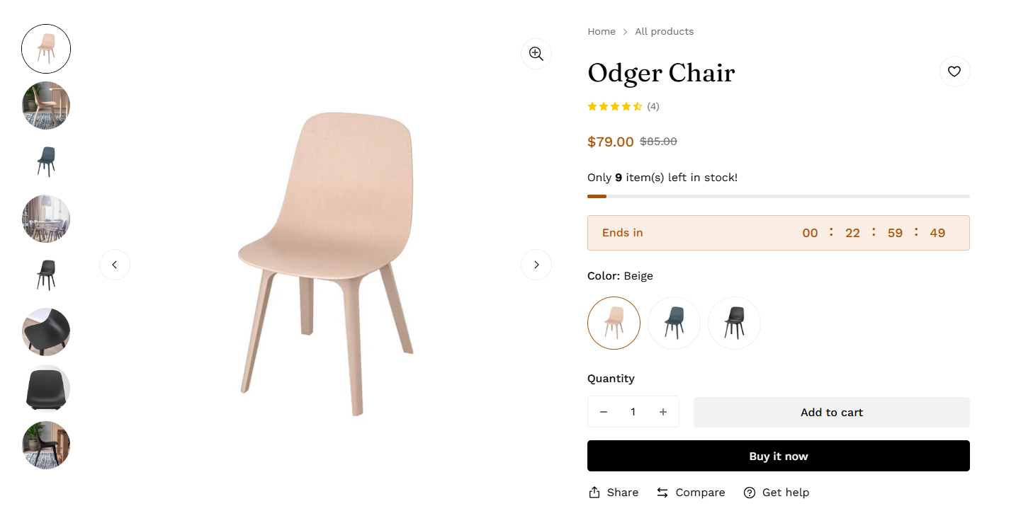
- Product title
- Price
- Short description
- Variant selector
- Buy buttons
- Addon buttons
- Shipping information
- Complementary products
- Richtext
- Custom tags
- Product meta
- Product rating
- Full description
- Text
- Custom liquid
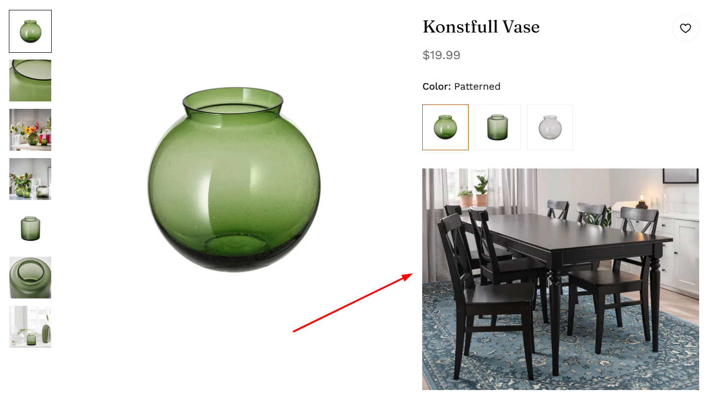
- Image
- Visitors counter
- Trust badge
- Collapsible tab
- Custom field
- Upload image field
- Breadcrumb
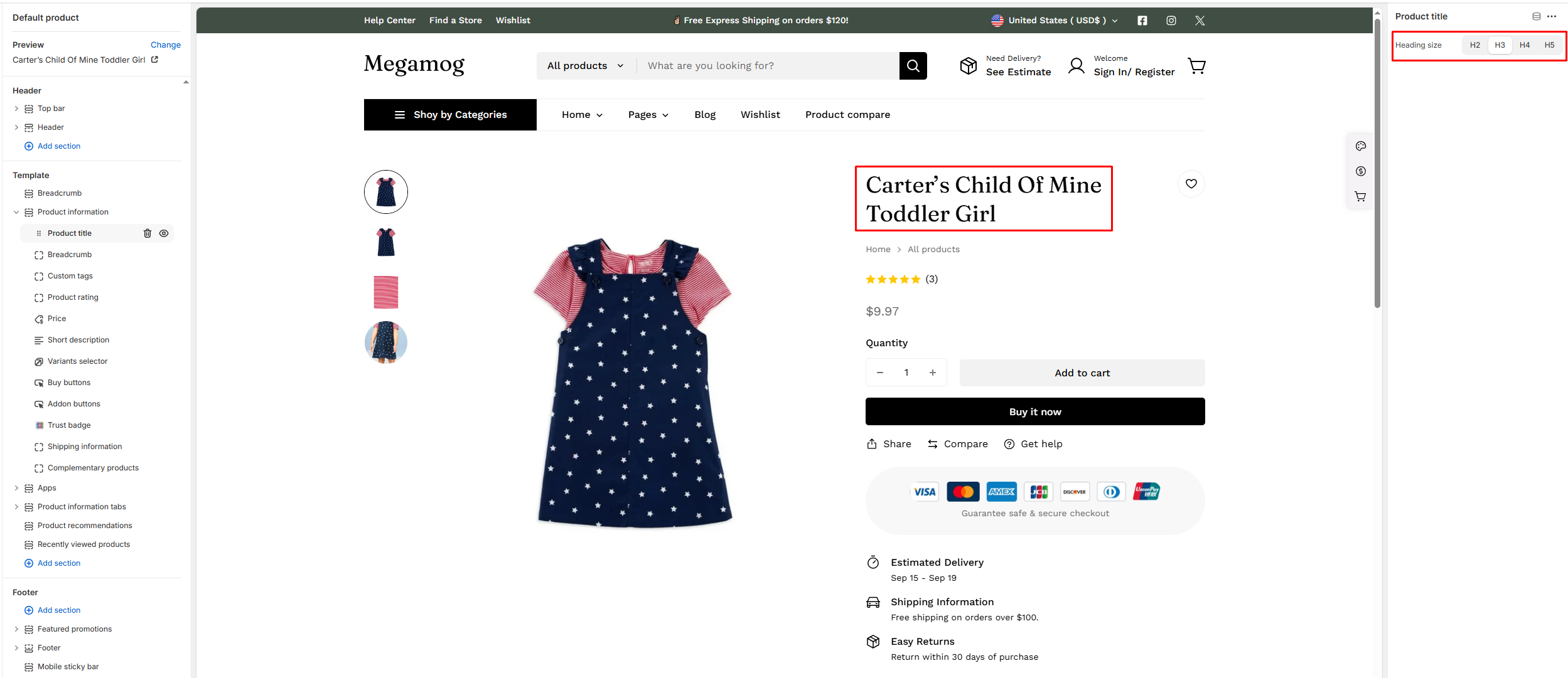
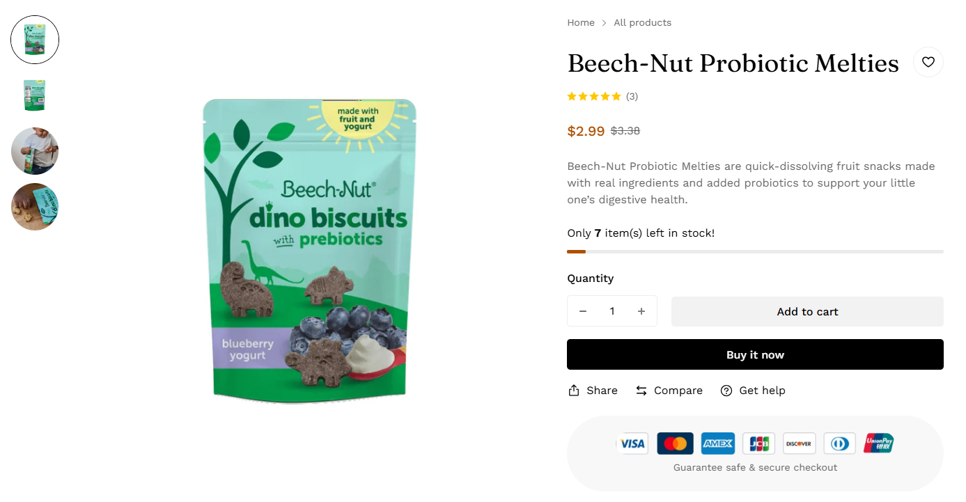
1. Product title
2. Price
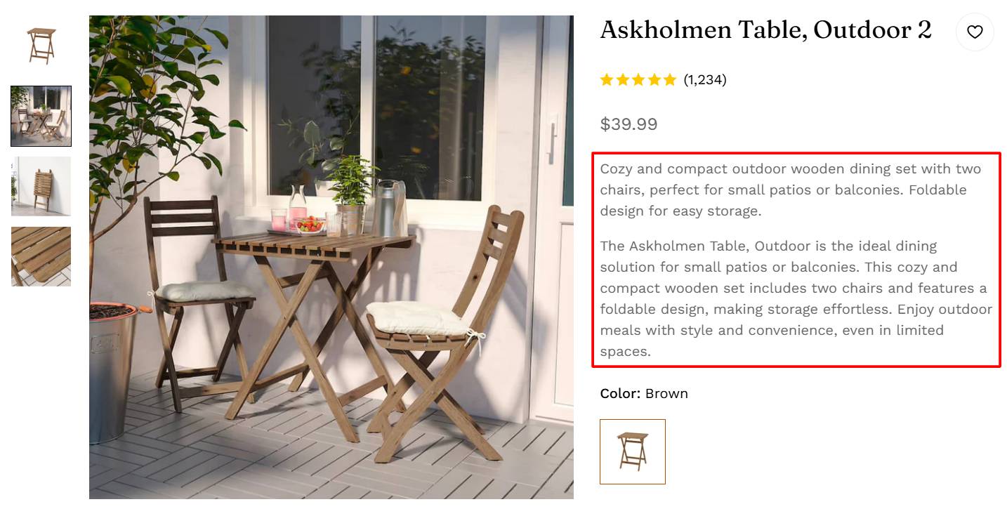
3. Short description
Learn more about Shopify Metafields here.
4. Variant selector
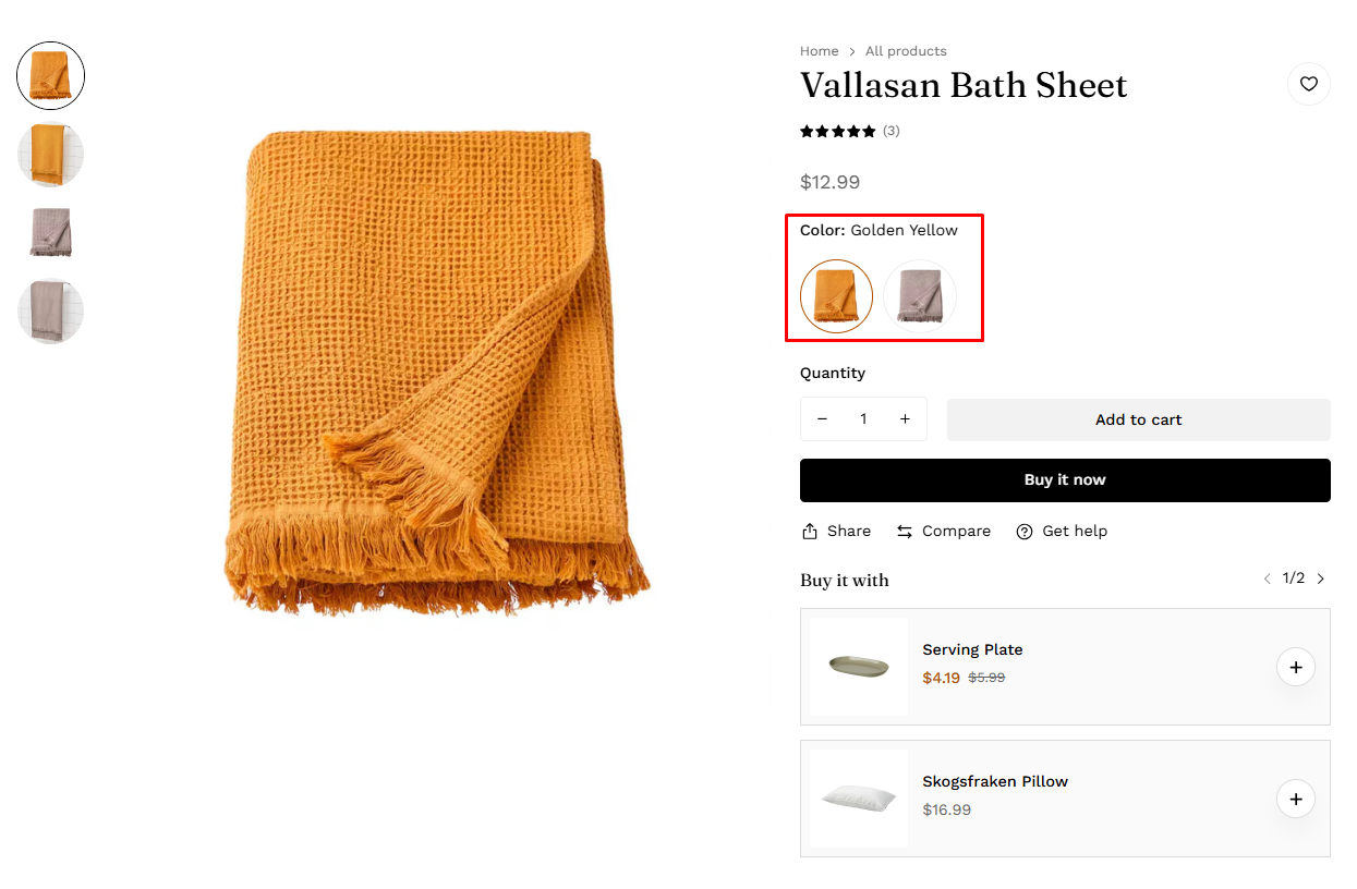
For more information about variant settings, refer to the product options swatches.
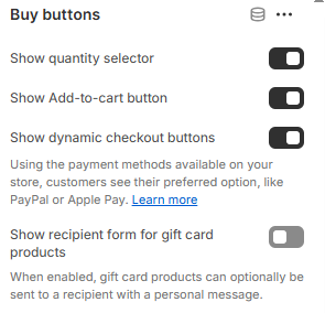
5. Buy buttons
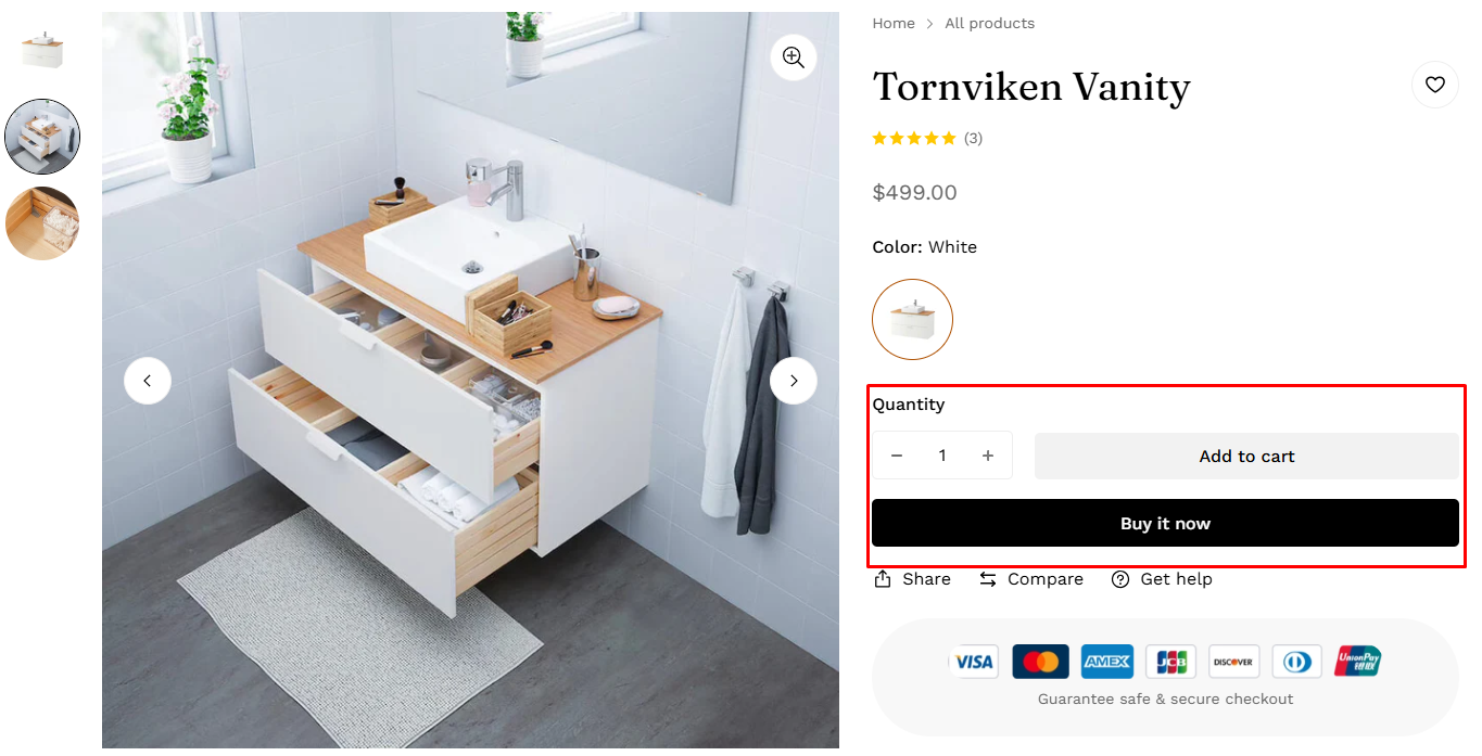
- Show quantity selector: To display the quantity selector
- Show Add-to-cart button: To display the Add-to-Cart button
- Show dynamic checkout buttons: To display dynamic checkout buttons
- Show recipient form for gift card products: To display a recipient form for gift card products with a personal message.
To set for accelerated checkout buttons, refer to accelerated checkout buttons.
6. Addon buttons
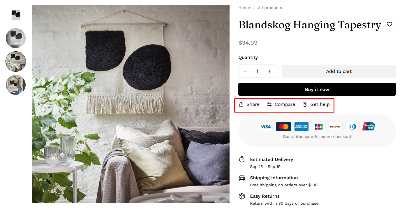
7. Shipping information
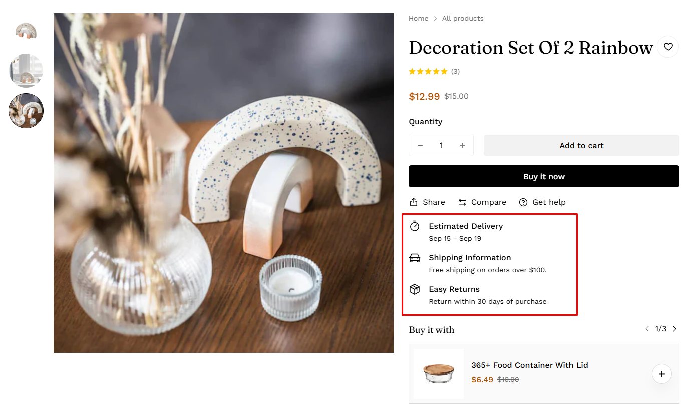
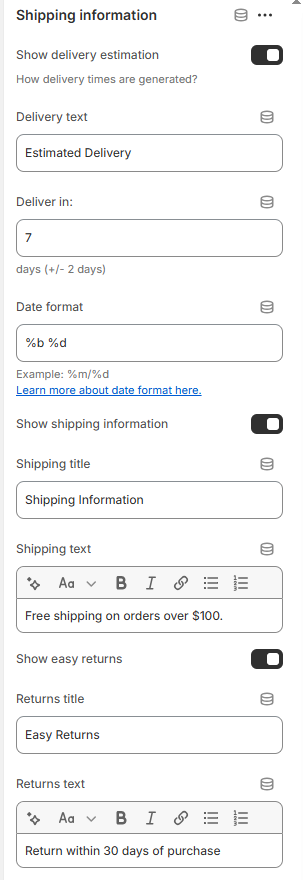
How do I set up shipping and delivery settings? Click this link to find out more.
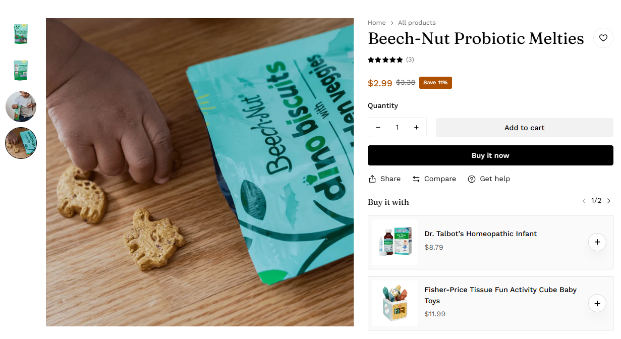
8. Complementary products
- Heading: Customize the section title
- Heading Size: Select the heading size based on H2/H3/H4/H5
- Maximum products to show: Set the maximum number of suggested products to display
- Rows: Choose to display 1 or 2 rows of products.
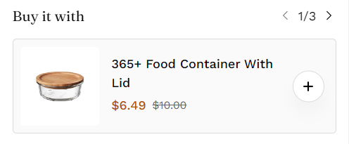
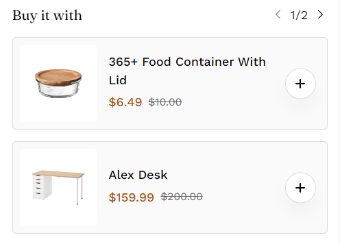
Set the image aspect ratio and select the Color scheme that fits your store design
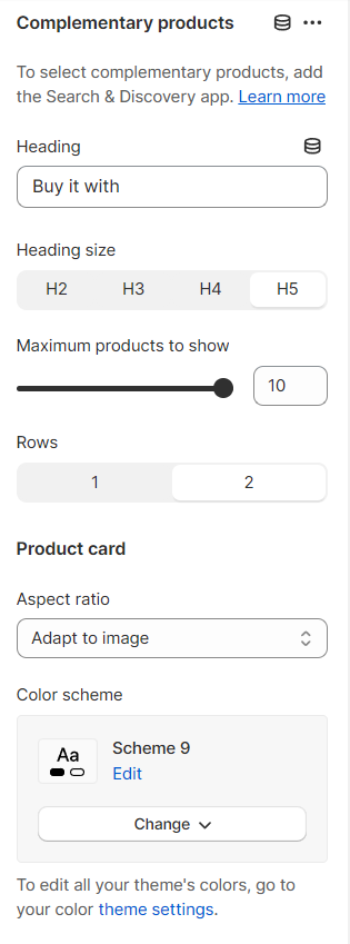
Learn how to use the Shopify Search & Discovery app to choose complementary products for your website’s product pages.
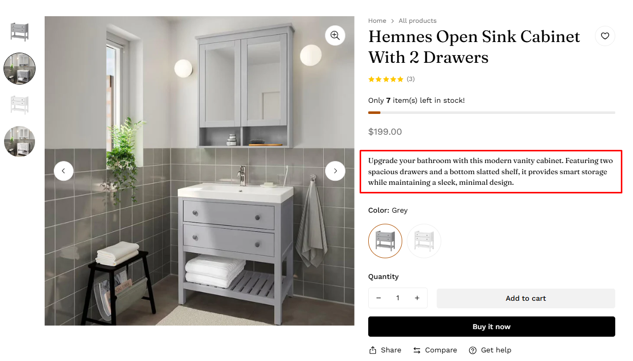
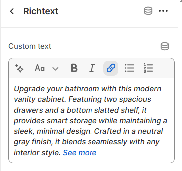
9. Rich text
10. Custom tags
How to add custom tags, see here custom tags.
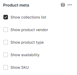
11. Product meta
12. Product rating
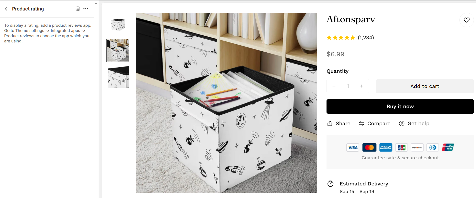
To integrate an app, see Intergrated apps.
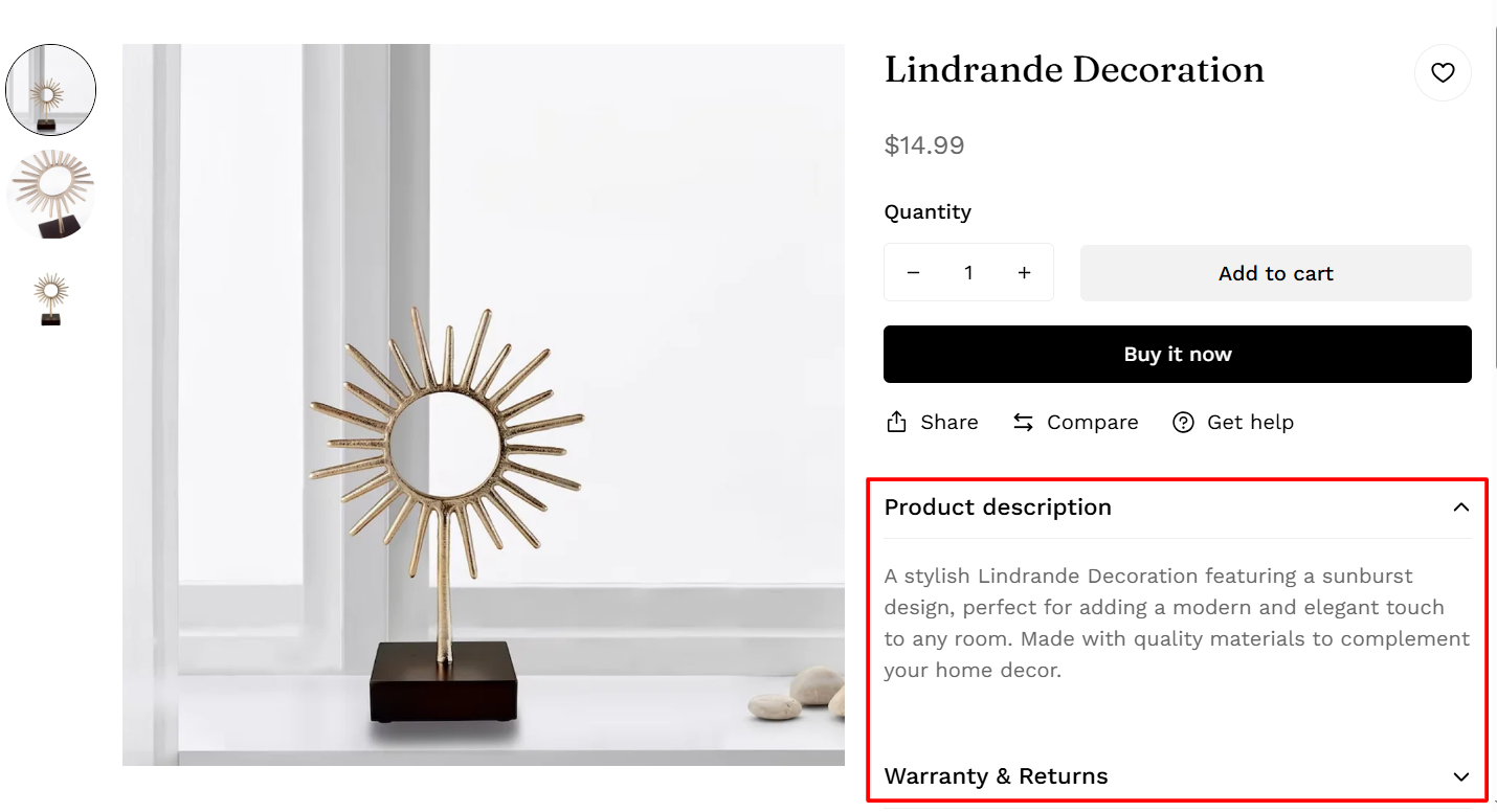
13. Full description

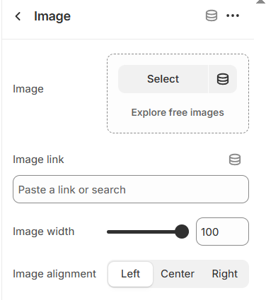
16. Image
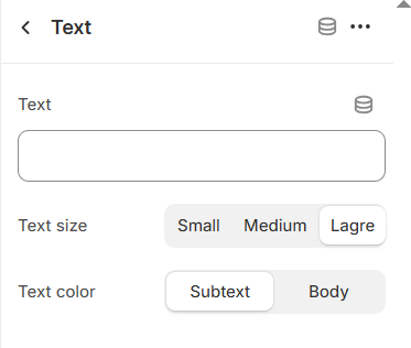
14. Text
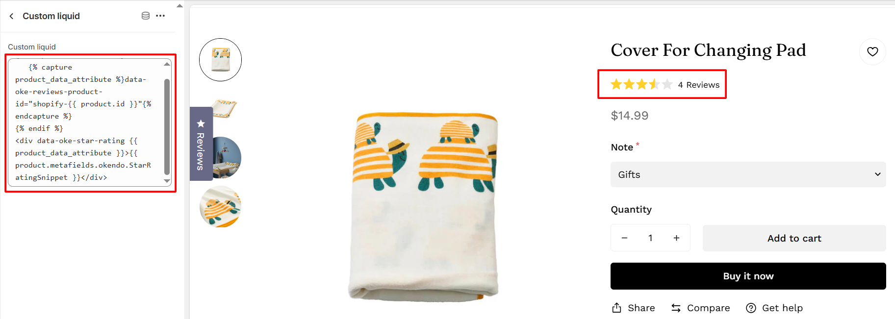
15. Custom liquid
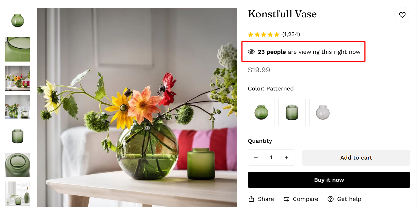
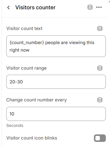
17. Visitors counter
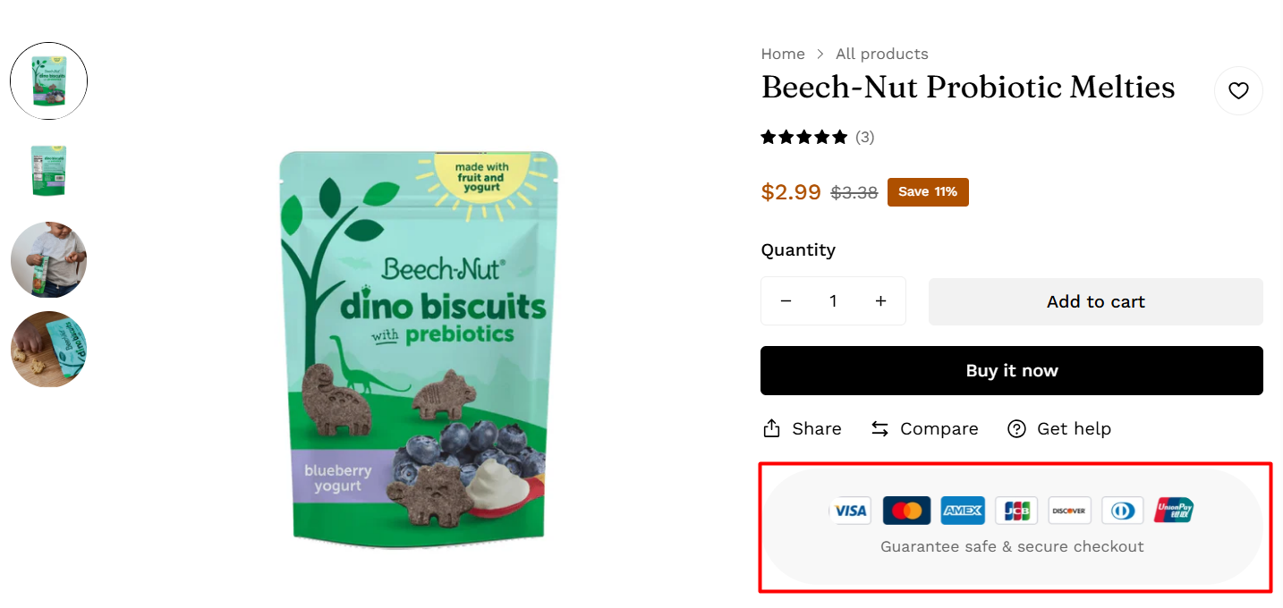
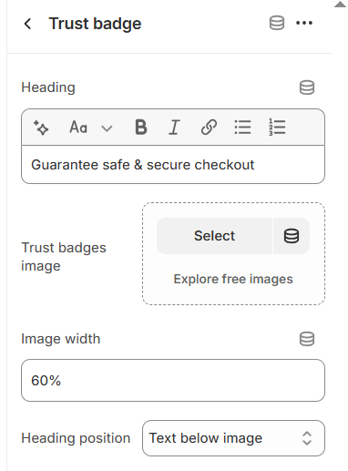
18. Trust badge
19. Collapsible tab
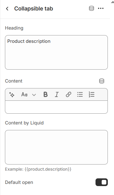
To learn more about the Collapsible tab, see Collapsible content.
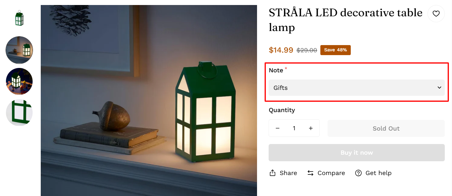
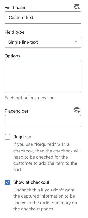
20. Custom field
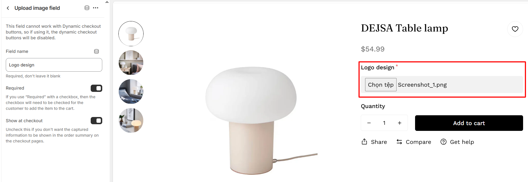
21. Upload image field
22. Breadcrumb
Refer to this link for more details about this feature.
Last updated