Megamog
Try Megamog freeResourcesOther solutions
  • What is Megamog theme?
  • Changelog
  • Refund policy
  • Support policy
  • Terms of Service
  • Getting started
    • Install Megamog theme
      • Install Megamog in 1-click fast way
      • Install Megamog manually
    • Add Custom code/ CSS correctly
    • Integrate Shopify Review apps
    • Mega menu
    • Purchase code & activation
    • Update Megamog theme
    • FoxHome
  • Build for success series
    • Product page for Beauty store like Kylie Jenner 🔥
    • Landing page for Fashion store like Bremont
  • Page's global sections
    • Announcement bar
    • Age verifier pop-up
    • Header
    • Footer
    • Mobile sticky bar
  • Theme sections
    • Before/ After image slider
    • Blog posts
    • Brand list
    • Collapsible content
    • Collection spotlight
    • Collection list
    • Collection links
    • Countdown timer
    • Custom content
    • Favorite product slider
    • Featured collection
    • Featured product
    • Featured promotion
    • Featured products slider
    • Google Maps
    • Image banner
    • Image with text
    • Instagram
    • Lookbook
    • Newsletter
    • Press
    • Product tabs
    • Recently viewed products
    • Scrolling promotion
    • Slideshow
    • Testimonials
    • Video
    • Video hero
    • Banner grid
    • Multiple columns
    • Store locator
  • Theme settings
    • General settings
    • Layout settings
    • Additional pages
    • Advanced
    • Animation
    • Article card
    • Badges
    • Cart settings
    • Checkout
    • Colors & Color schemes
    • Corner radius
    • Currency format
    • GDPR settings
    • Intergrated apps
    • Integration
    • Pop-up & drawer
    • Product card
    • Product options design
    • Product options swatches
    • Social sharing
    • Search settings
    • Store contact
    • Typography
  • Collections & Products
    • Product page
      • Product template
      • Page sections
        • Breadcrumb
        • Product information
        • Product information tabs
        • Product recommedations
    • Collection page
      • Collection template
      • Collection sections
        • Collection banner
        • Product listing
  • Other pages
    • 404 page
    • Blogs
    • Blog posts
    • Cart & Checkout
    • Password
  • FAQS
    • Add a gift wrap option to my cart
    • Add custom badges to my product card
    • Add recipient fields to my gift card product
    • Add/ Remove Social icons in footer
    • Change the default product order in collection
    • Customize search results
    • Move the collection description to under the product listing
    • Remove the tax-included information in product page
    • Set up local pickup
    • Show Payment icons on the Footer
  • TROUBLESHOOTING
    • Contact form submissions not found
    • Translation apps incompatibility
Powered by GitBook
On this page
  • Featured collection settings
  • 1. Section header:
  • 2. Collection
  • 3. Flash sale
  • 4. Grid settings and Product cards:
  • 5. Slider settings:
  • 6. Mobile settings
  • Product card
  1. Theme sections

Featured collection

Learn to use Featured Collection to display products from a selected collection in an engaging and attractive section.

PreviousFavorite product sliderNextFeatured product

Last updated 3 months ago

Featured collections can help promote sales and new collections.

Steps

  1. In the theme editor (Customize), click Add section

  2. Locate Featured collection

  3. Save

Featured collection settings

1. Section header:

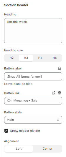
Use the provided text field to add a suitable heading. Leave any of the fields blank if you do not want to display them. Adjust the text alignment (left/center).

You can then select a button style and size to your likings.

2. Collection

Select the collection to show

3. Flash sale

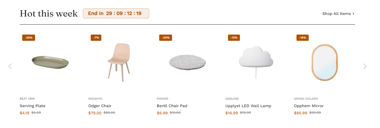
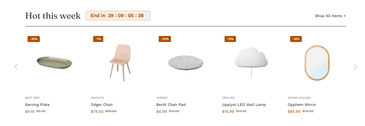
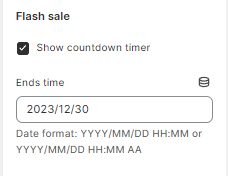
A flash sale creates urgency because of limited stock and/or limited time frame. This creates a sense of scarcity of the product and boosts your store conversions.

4. Grid settings and Product cards:

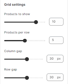
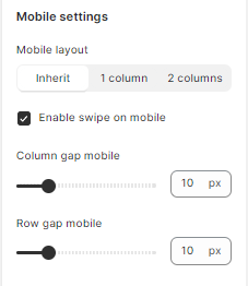
Adjust the number of shown products (between 2 and 12), products per row (between 2 and 6), and the column gap.

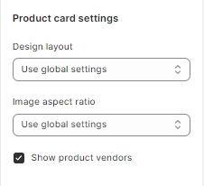
Choose the product card design as you prefer and the image aspect ratio. You can also enable/disable showing product vendors and product titles in this section.

5. Slider settings:

Enable/disable slider. You can also display navigation and pagination alongside the slider.

6. Mobile settings

This section lets you display your design for mobile view.

Product card

Each product is displayed in a sequence of cards with an add-to-cart, a Quickview feature, etc. It also includes the design layout and image ratio for the product cards.

Please refer to the link below for further info.

Product card