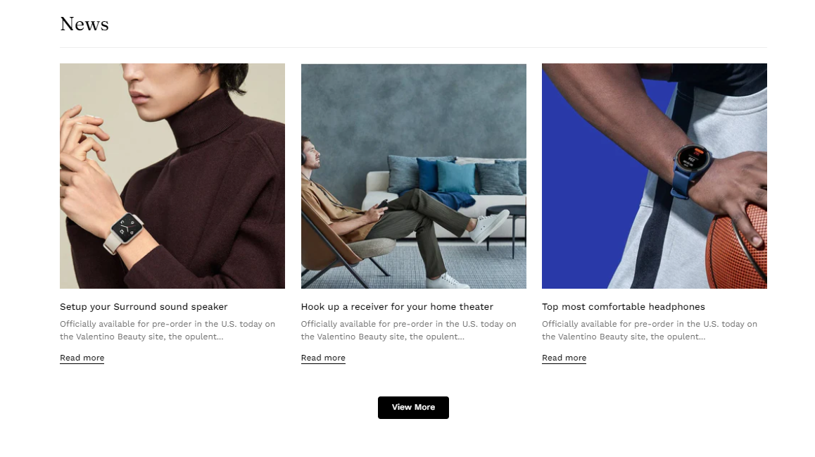
Blog posts The blog post section is useful when you want to show new product launches, tips, or other news.
Steps
In the theme editor (Customize) , click Add section
Locate Blog posts
Save To know more about how to add a blog to your online store, see
Blogs .
This article shows you how to display your blog posts on your website using the Megamog theme.
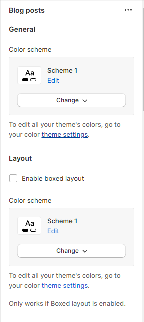
# 1. General and layout: Use the color scheme to change the style for this section.
Additionally, enable the box layout and the color scheme to change the style of it.
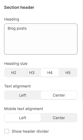
Use the provided text fields to add a suitable heading and change the heading size. Leave any of them blank if you do not want to display them.
Adjust the text alignment (left/center) along with the background color and container type on both mobile and desktop screens.
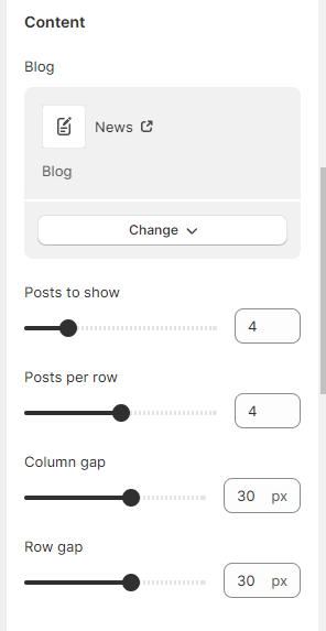
# 3. Content This section is for adding preferable blog posts. You can use the slider to adjust the number of blog posts per row and the number of displayed posts (between 2 and 12).
Additionally, the gap between each post can also be changed here.
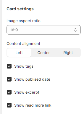
# 4. Card settings The card section is adjusting the blog image ratio and content alignment inside. Furthermore, you can enable/disable the card elements if needed:
Show tags: Display relevant tags of the blog post
Show published date: Display the date that the blog is issued
Show excerpt: Display a short summary of the blog
Show read more link: Lead the customers to the full blog post
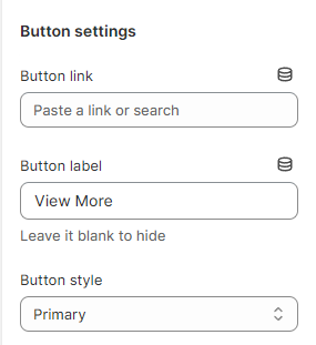
Display a call-to-action button to redirect customers to your desired pages. Add a Label and Link for one or both, then choose a Button style and adjust the Button size.
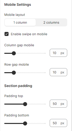
# 6. Mobile settingThis section lets you display your design for mobile view.
Last updated about 1 month ago