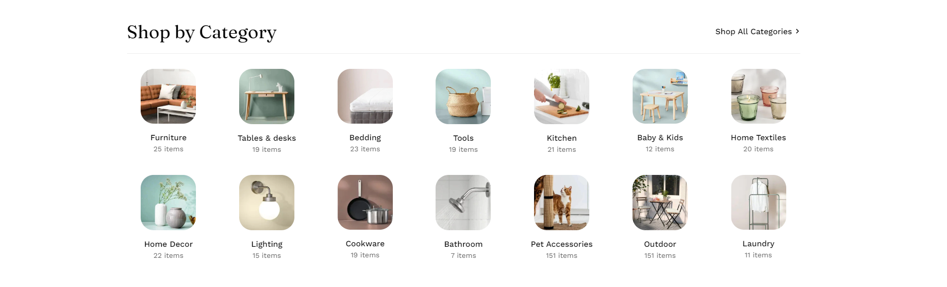
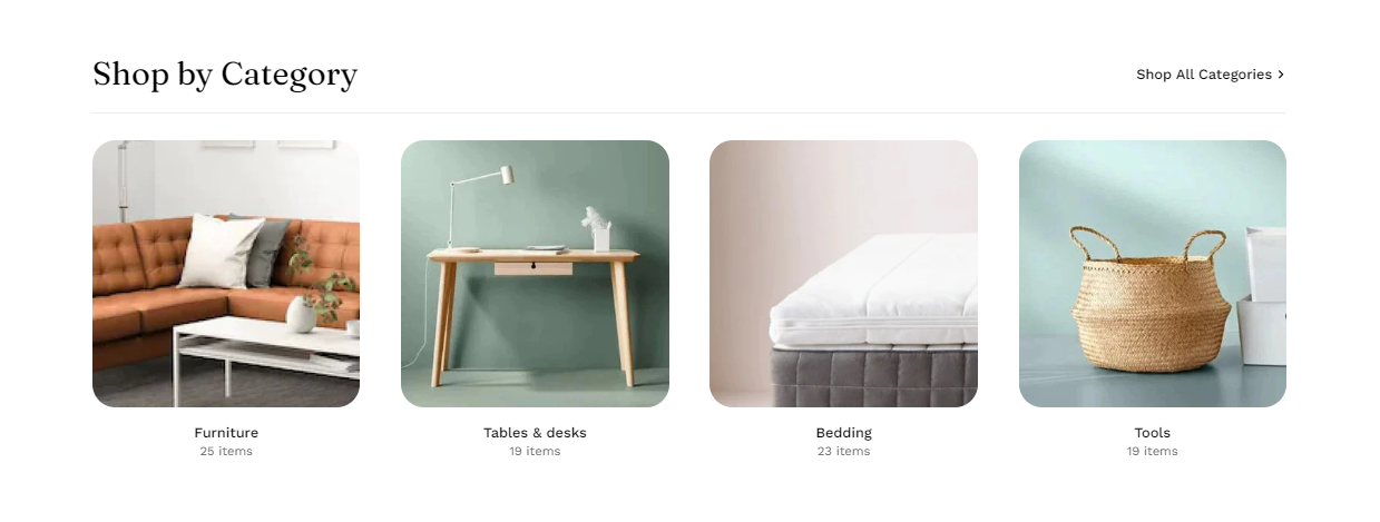
Collection list
The collection list displays a quick list of desired collections to catch visitors' attention.
Steps
In the theme editor (Customize ), click Add section.
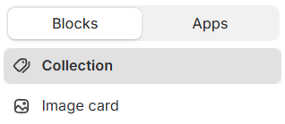
Locate Collection list.
Save. The collection list consists of collections and image card blocks.
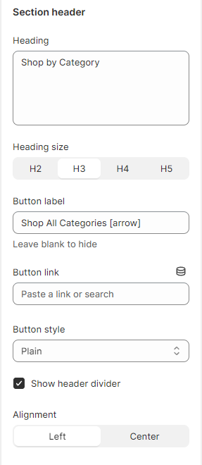
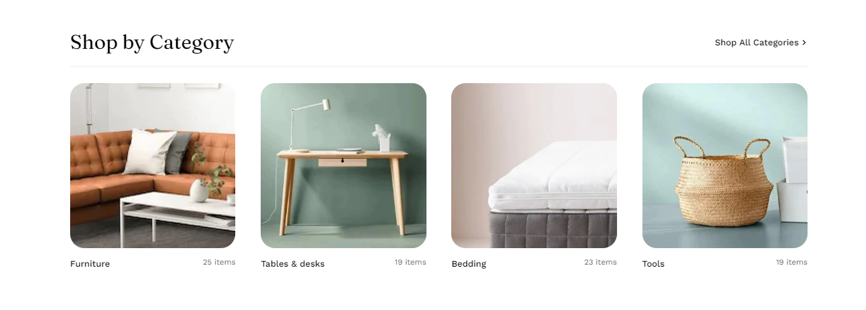
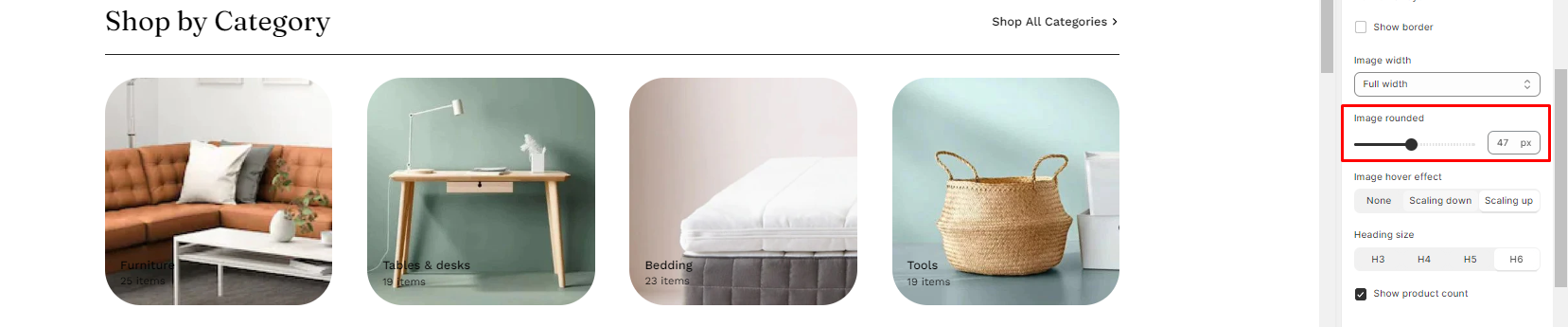
# Collection list settingsUse the provided text fields to add a suitable heading, heading size. Leave it blank if you do not want to display it. Adjust the text alignment as Left/Center
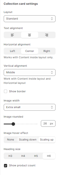
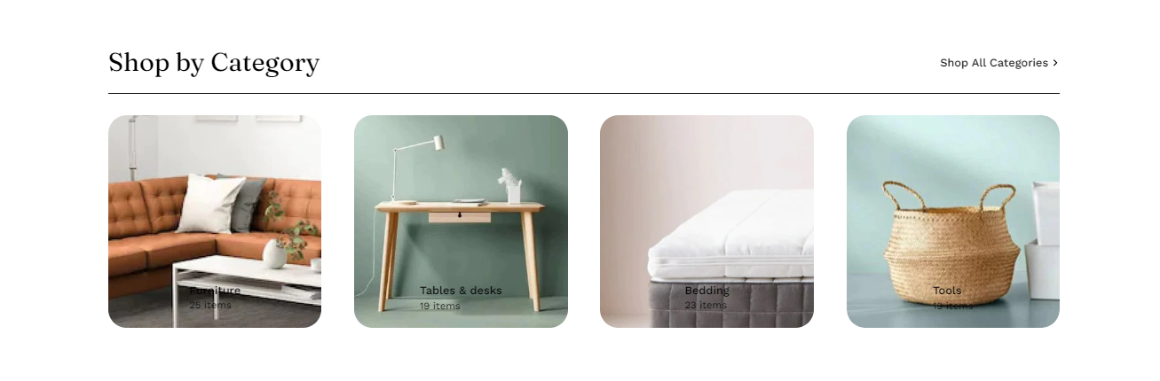
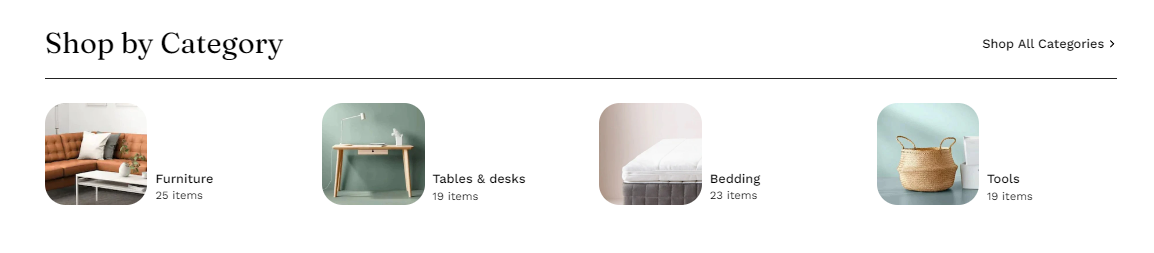
# 2. Collection Card settings: Modify the card style, text alignment (left/center), and hover effect by selecting options in the dropdown.
You can choose your Layout for the collection list as:
Card style includes:
Standard
Product count inline
Content inside
Hozirontal
Standard Product count inline Content inside Hozirontal
The hover effect includes:
You can enable showing product count and decide whether the numbers are in the same line with the collection titles or in a different line.
You can also make the collections' images rounded, images will then be cropped.
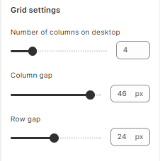
# Grid settingsDetermine the number of collections shown per row and the gap between columns.
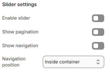
# 3. Slider settings Select Enable slider options to run the list automatically.
You can also use pagination or navigation for your collection list.
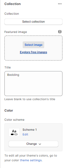
# Collection/banner block settingsEach collection/banner block has its own settings such as title, image, and collection link to choose from.
Last updated about 1 month ago