
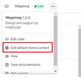
Theme Settings
Product card
2 min read
- In the theme editor (Customize), click Theme settings
- Locate Product card
- Make necessary changes
- Save.
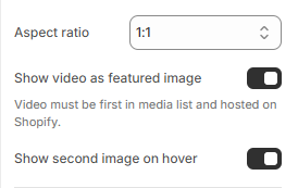
1. Layout and image
Card style
Content alignment
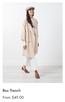
Image
- Adapt to image
- 1:1 (square image)
- 3:4
- 4:3
- 16:9
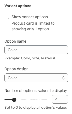
2. Variant options
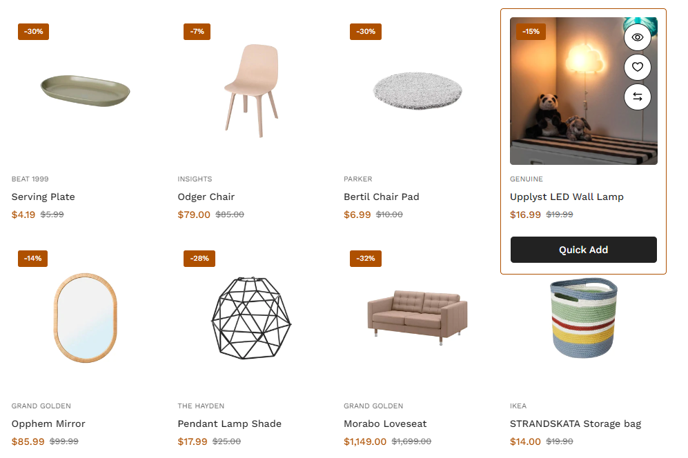
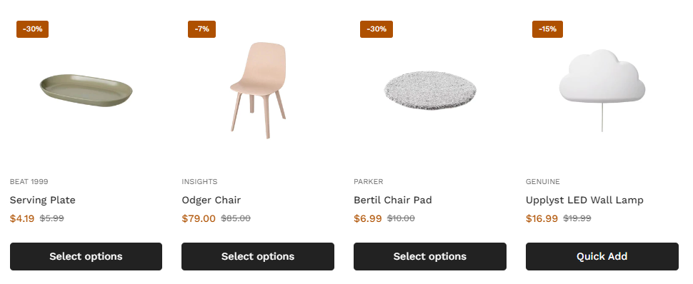
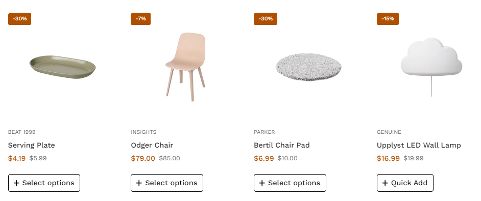
3. Content and Badges
Content
- Add to cart button: let customers add items to the cart without leaving the current page.
- Quickview button: let customers preview product basic information without going to the product page.
- Wishlist button: let customers add their favorite products to the list.
- Compare button: let customers add products to the comparison page to check the differences and similarities among stores' products.
See how to set up Wishlist and Compare page here:
Additional pages
Additional pages
- Countdown: display time when there is an event for the product to release/discount.
- Actions when clicking the Select options button: It either pops up the Select options dialogue or goes directly to the product page.
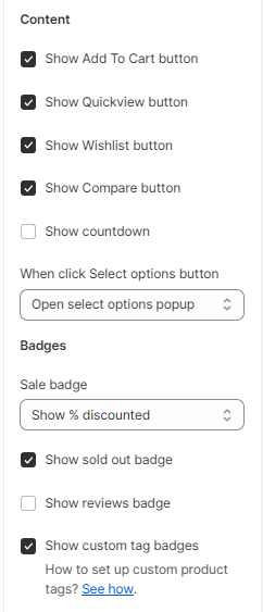
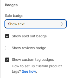
Badges
- Sale badge: hide or show the sale badge in % discount or text.
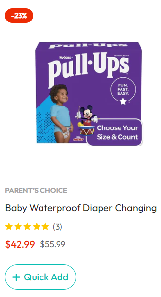
- Sold-out badge: display badge to let customers know which products are out of stock.
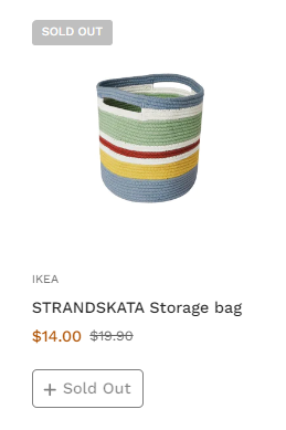
- Reviews badge: display ratings from the customers (A review application is required).
- Custom badges: display/hide other badges rather than sale and sold-out badges. To display custom badges, you need to add tags to your products, see Product tags.
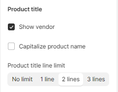
Product titles
- Show vendor: display vendor/brand names under the product title.
- Capitalize product name.
- Product title line limit: control the maximum line of the product titles as No limit/1 lines/2 lines/3 lines.
Product prices
Last updated