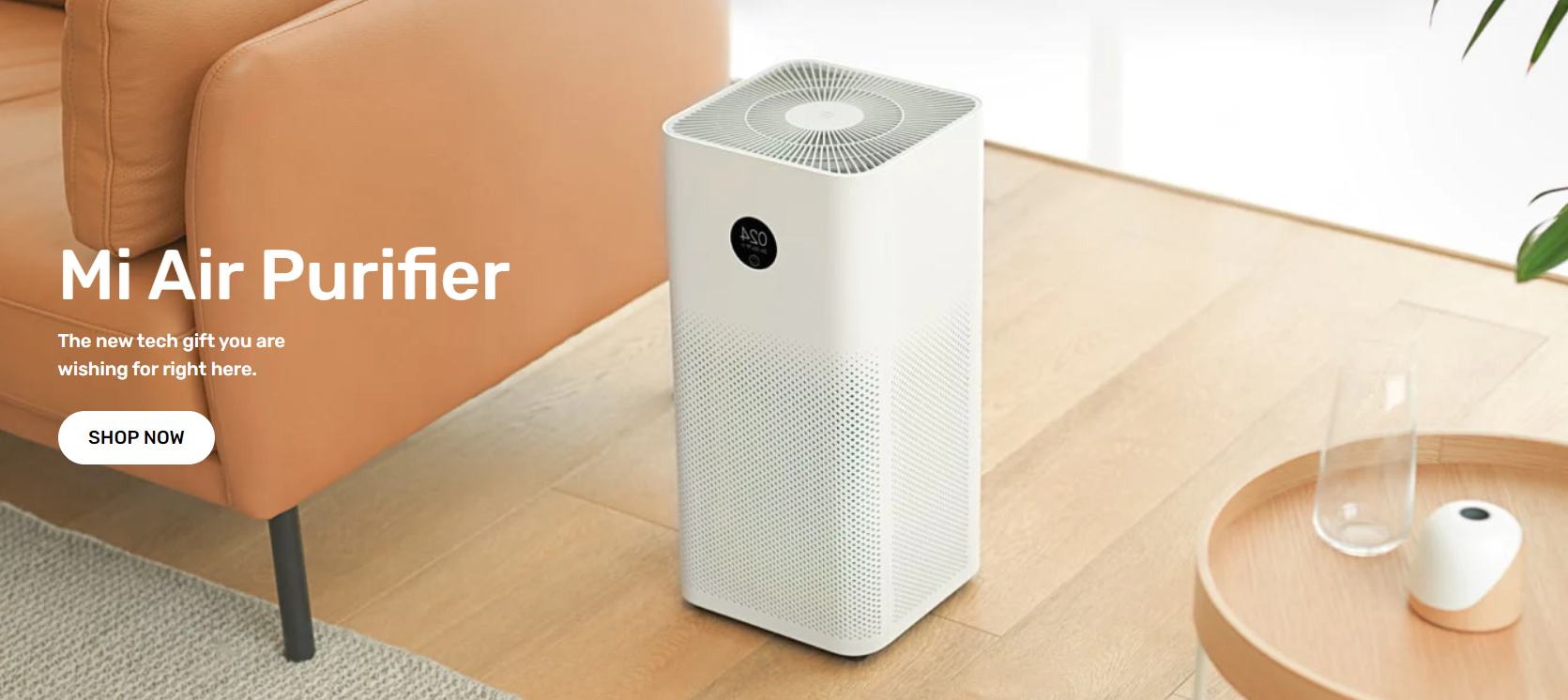
Image banner
The Image banner section uses a high-resolution image, text, and a call-to-action button to display immersive content.
Steps
- In the theme editor (Customize), click Add section
- Select Image banner
- Save
#Section settings
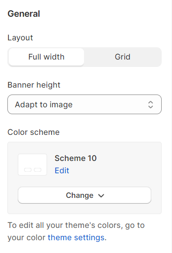
#General settings
Change the Layout, Banner height, and the Color scheme.
Banner height options include:
- Adapt to image
- Small
- Medium
- Large
- Full screen
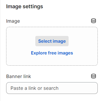
#Image settings
Add an image and a link to redirect customers to your desired page (if needed).
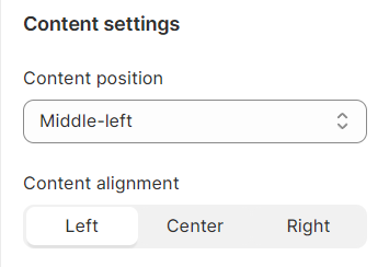
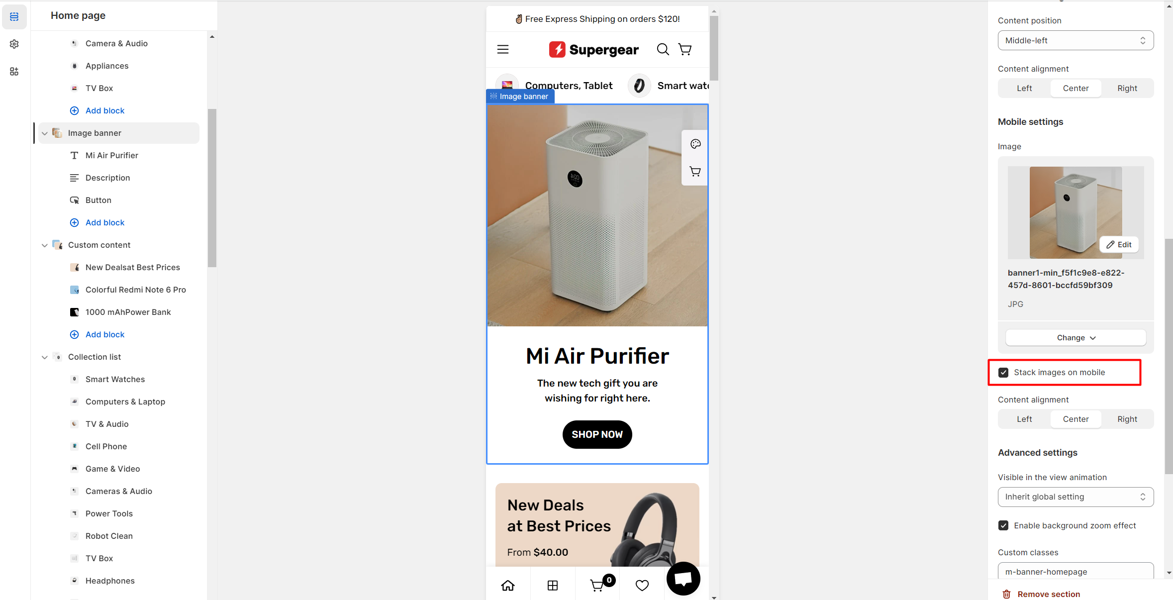
#Content settings
Set your Content position and Content alignment.
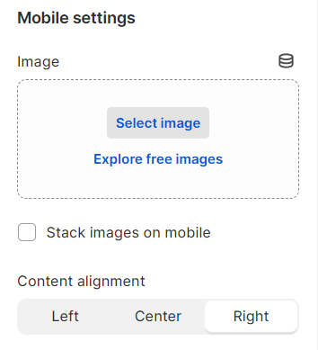
#Mobile settings
You can set a different image banner for your mobile view.
If you want to display your content under the image for mobile view, check the option Stack images on mobile.
Adjust the Content alignment for the mobile view as Left/Center/Right.
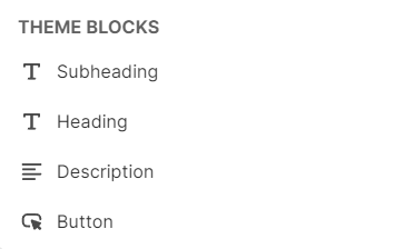
#Block settings
Add and edit your Heading, Subheading, Description, and Button to your liking. You can drag and drop the block to reorder it.
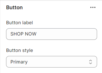
Give your button a label and select its style.
Button styles include:
- Primary
- Secondary
- Outline
- Underline
- Plain
Last updated