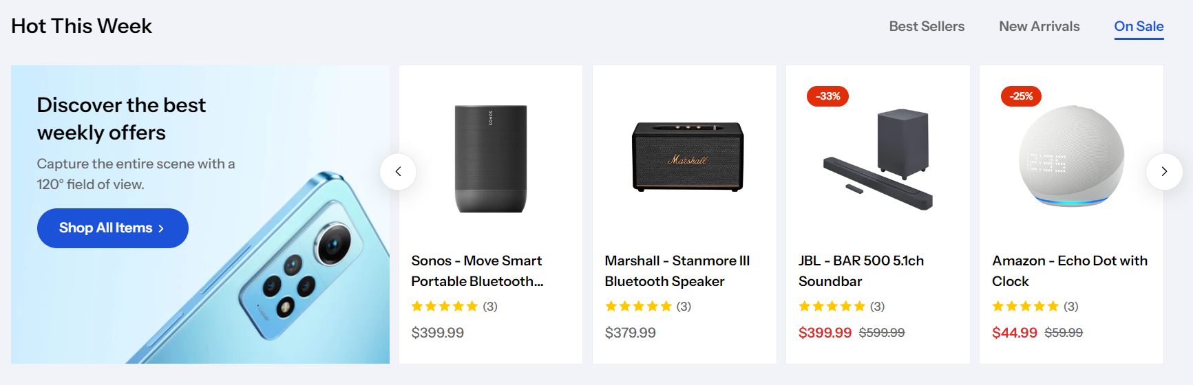
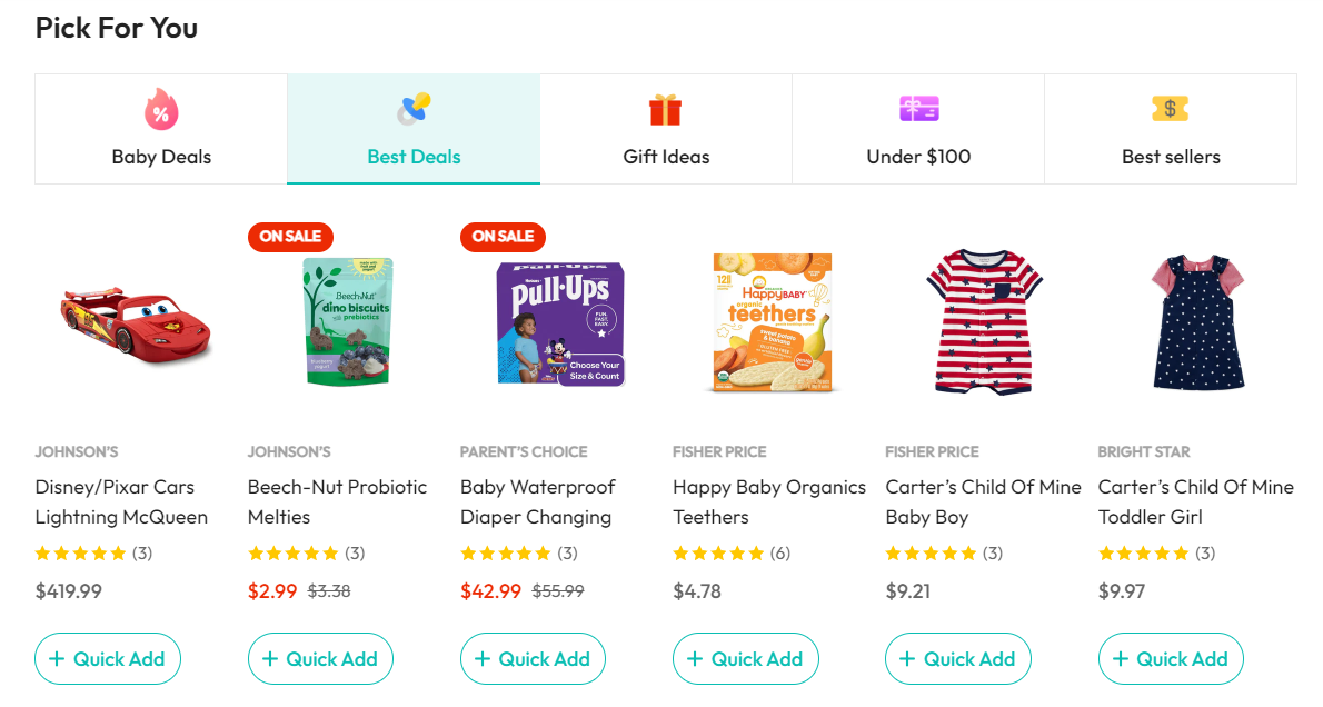
Display your products from a selected collection in an engaging and attractive section.
Steps
- In the theme editor (Customize), click Add section
- Locate Product tabs
- Save
#Section settings
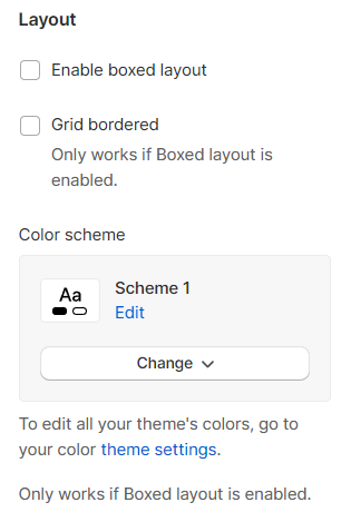
#Layout settings
Enable boxed layout for your section and the Grid bordered if needed.
You can also set the Color scheme for your Boxed layout.
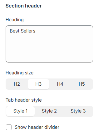
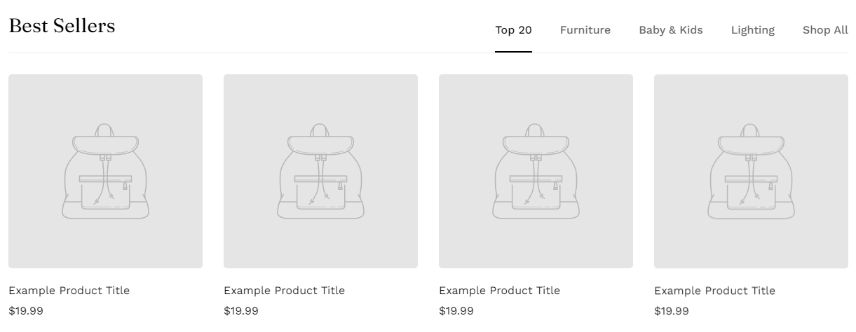
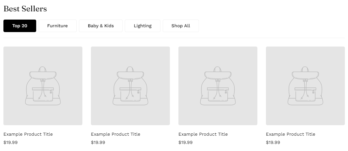
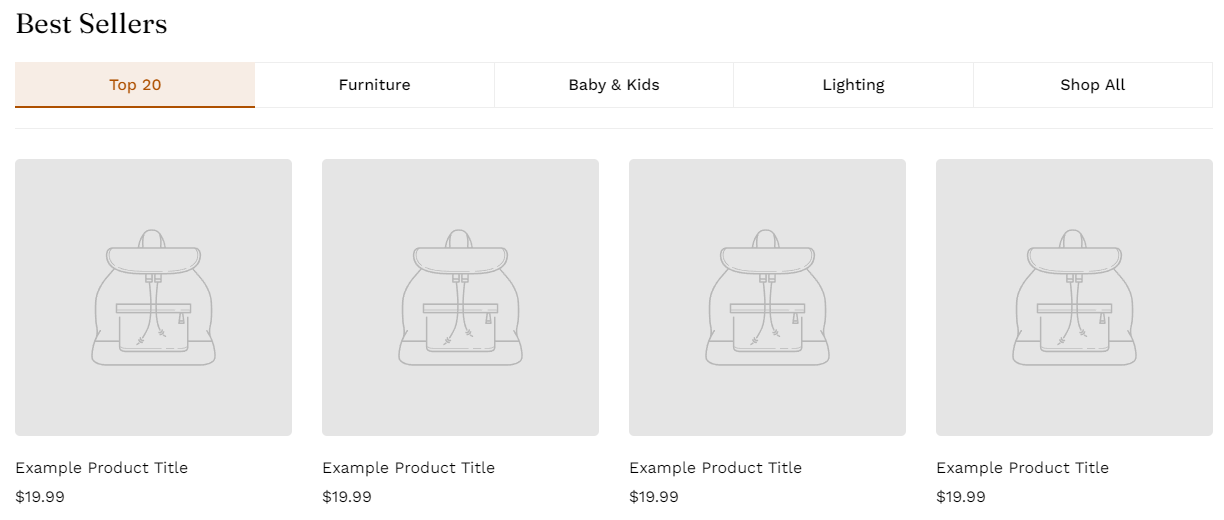
Insert your section's heading, its size, and select the tab header style.
Tab header styles include:
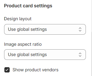
#Product cards settings
Select your Product card's design layout and its image aspect ratio.
You can also show the product vendors in this section.
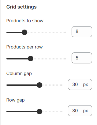
#Grid settings
Select the number of shown products (4-18 products) and the number of products per row (3-8 products).
Then, adjust the gap between columns and rows accordingly (0-50px).
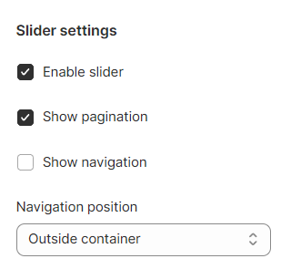
#Slider settings
You can check the Enable slider option to make your product list appear as a slider (the number of products to show > the number of products per row).
Show the pagination or navigation, or both to let visitors navigate the slider.
Navigation can be added Outside container/ Inside container/ Inline.
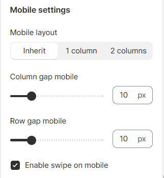
#Mobile settings
Adjust how the section displays on mobile view.
- Mobile layout: Inherit/ 1 column/ 2 columns;
- Column gap on mobile view (0-50px);
- Row gap on mobile view (0-50px);
- Enable swipe on mobile or not.
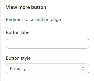
The view more button is used to redirect visitors to the collection page.
Give your button a label and select the button style. If you don't want to show the view more button, simply leave the label blank.
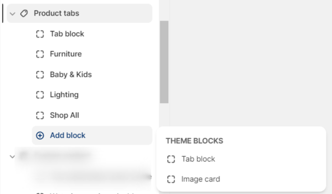
#Block settings
In the Product tabs section, you can add Tab blocks and an Image card.
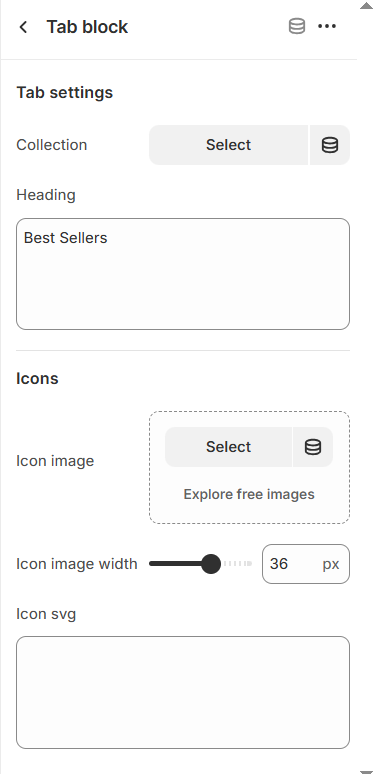
#Tab block settings
Select the collection you want to showcase in the tab.
Give the tab a heading.
You can also add an icon before your heading and adjust the icon width if needed.
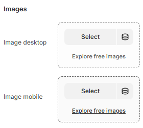
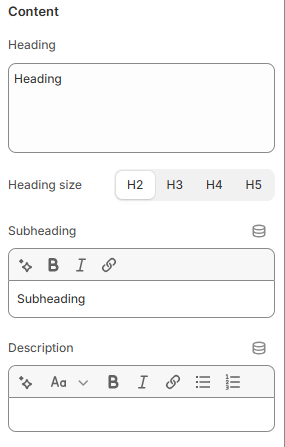
#Image card settings
You can select/upload the image for the desktop and mobile view separately.
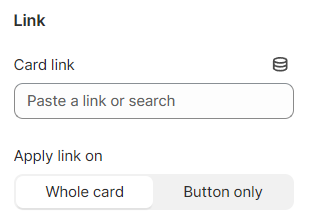
Give the image a link and select how the link is applied (on the whole image card or just the CTA button).
Then, you can add content to your card using the Heading, Subheading, and Description text fields.
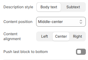
Change the Description style and select the position of the card content and its alignment.