
Custom content
For customers to have a better understanding of the store, you can utilize this Custom content section to achieve the requirements.
Steps
- In the theme editor (Customize), click Add section
- Locate Custom content
- Save
#Section settings
#1. Section header
Use the provided fields to add a suitable heading/subheading/description. Leave any of them blank if you do not want to display them. You can also adjust the text alignment here as Left/Center.
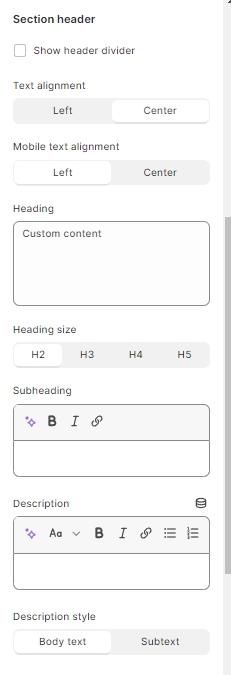
Select the container type and the color style for this section.
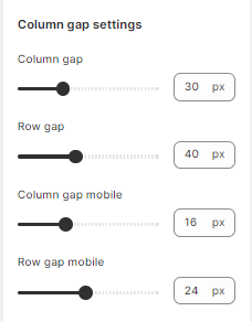
#2. Column gap settings
Change space and the gap between each column in desktop and mobile view.
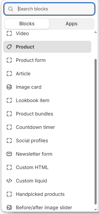
#Block settings
There are several blocks that can be added based on the requirements.
Some blocks are similar as they have appeared in theme sections such as countdown timer, product form (featured product), image cards, etc. Each of them will have its own settings.
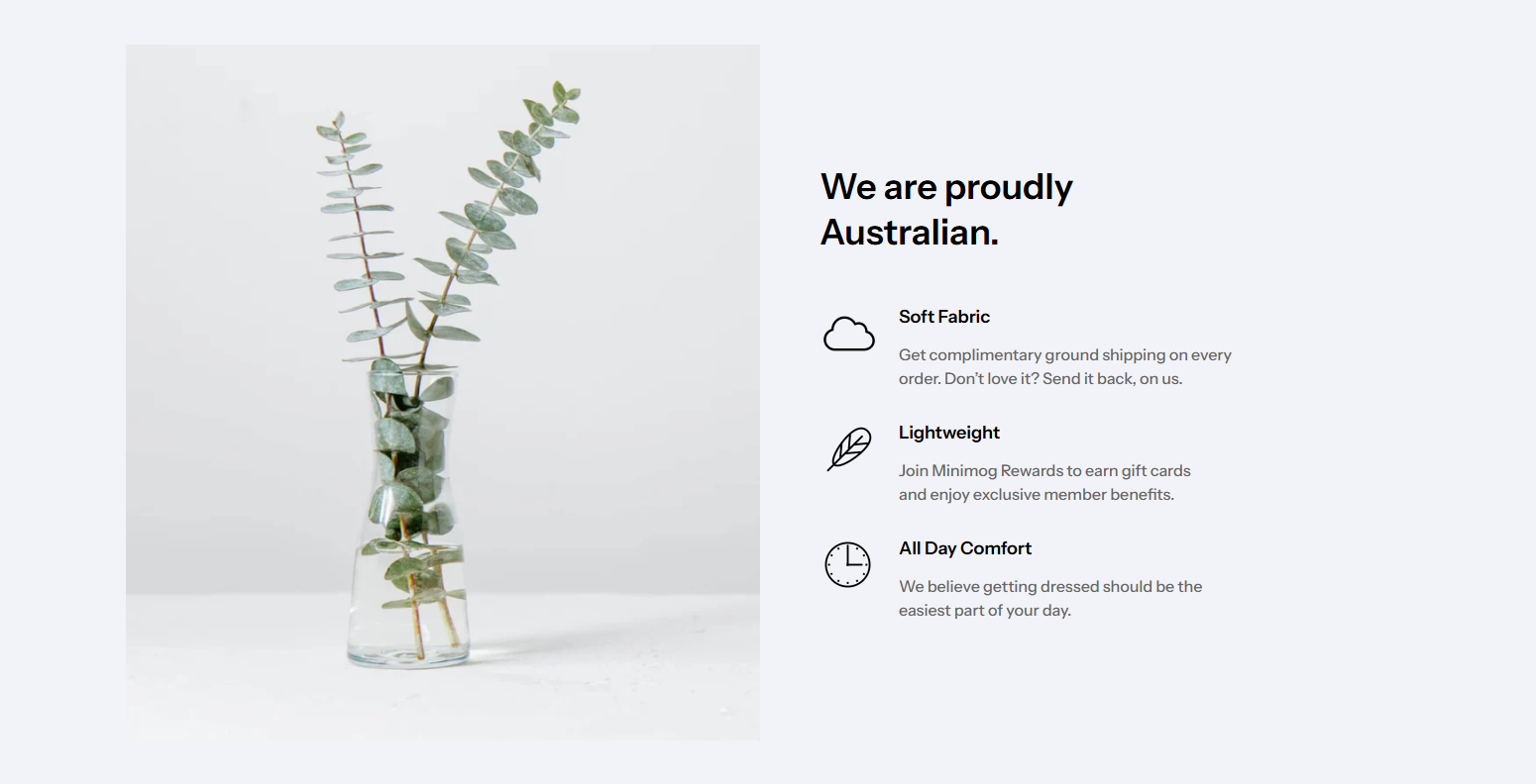
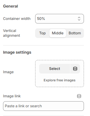
#Image and Text blocks
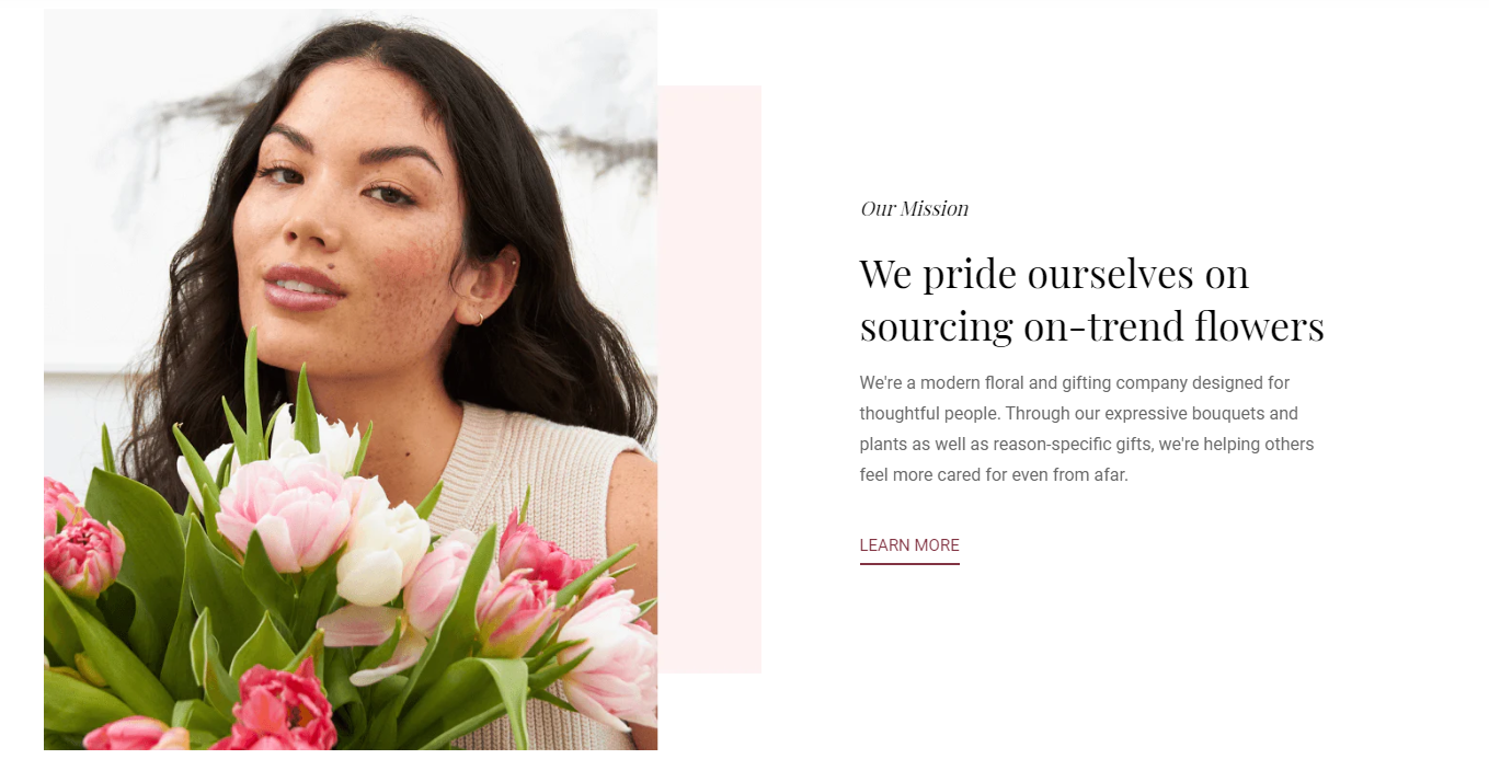
Use the provided text fields to add a suitable heading/subheading/description. Leave any of the fields blank if you do not want to display them. Control container width, text color/size, and alignment.
In this block, you easily add images and change the width and the alignment of the container.
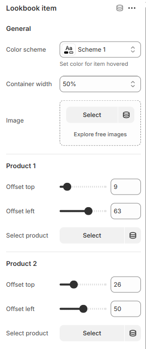
#Lookbook items and Product bundles blocks
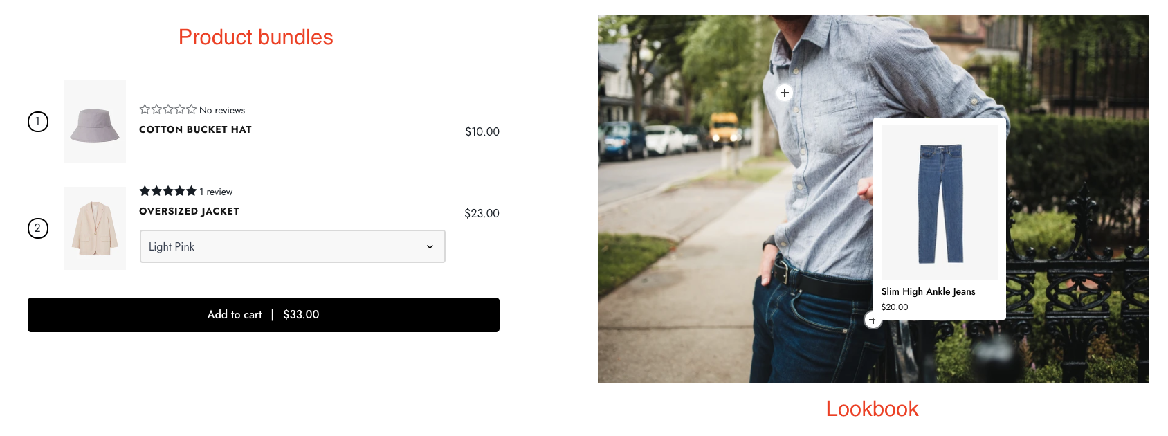
Use the provided text fields to add a suitable heading/subheading. Leave any of the fields blank if you do not want to display them. Control container width and add the products that you want to include in the bundles.
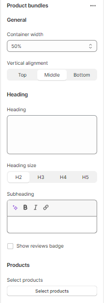
For tagging products on the item image, you must add the chosen products. They can be easily adjusted by using the offset percentage.
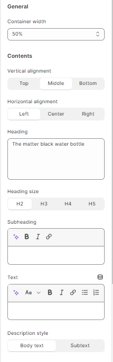
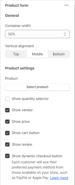
#Product and Product form blocks
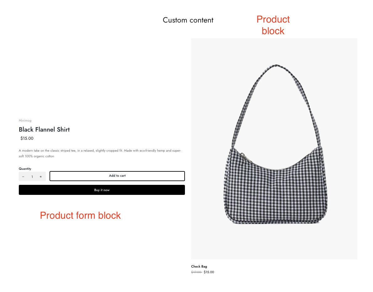
Add a product that merchants want to display for the block. Adjust the container width and alignment.
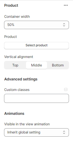
Add a product that merchants want to display for the block. Adjust the container width and alignment.
Enable/disable elements such as product price, vendor, cart button, etc.
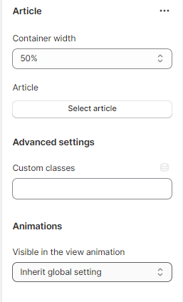
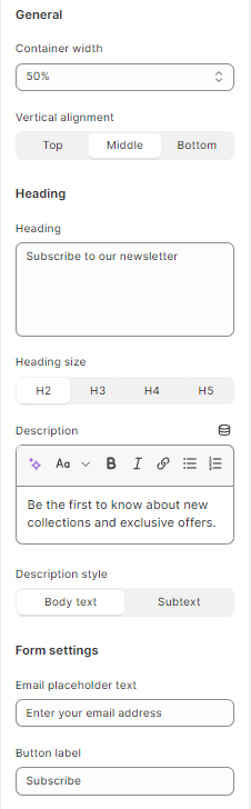
#Article and Newsletter form blocks
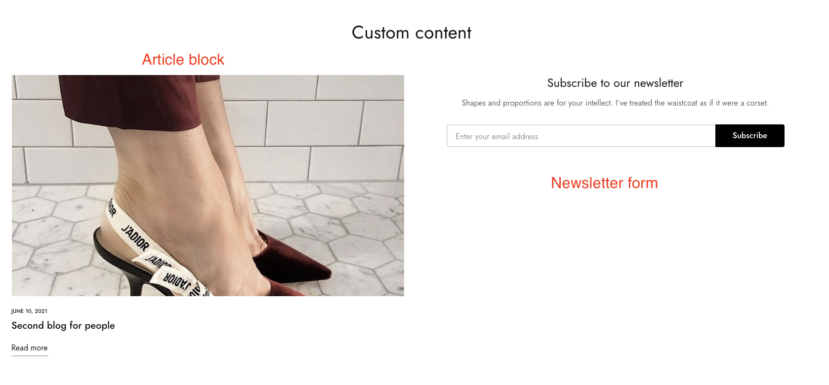
Add an article that you want to display for the block. Adjust container width, alignment.
Use the provided text fields to add a suitable heading/description as well as the email placeholder and button label. Leave any of them blank if you do not want to display them. Control form style and container width.
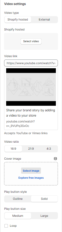
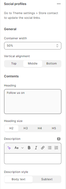
#Video and Social profiles blocks
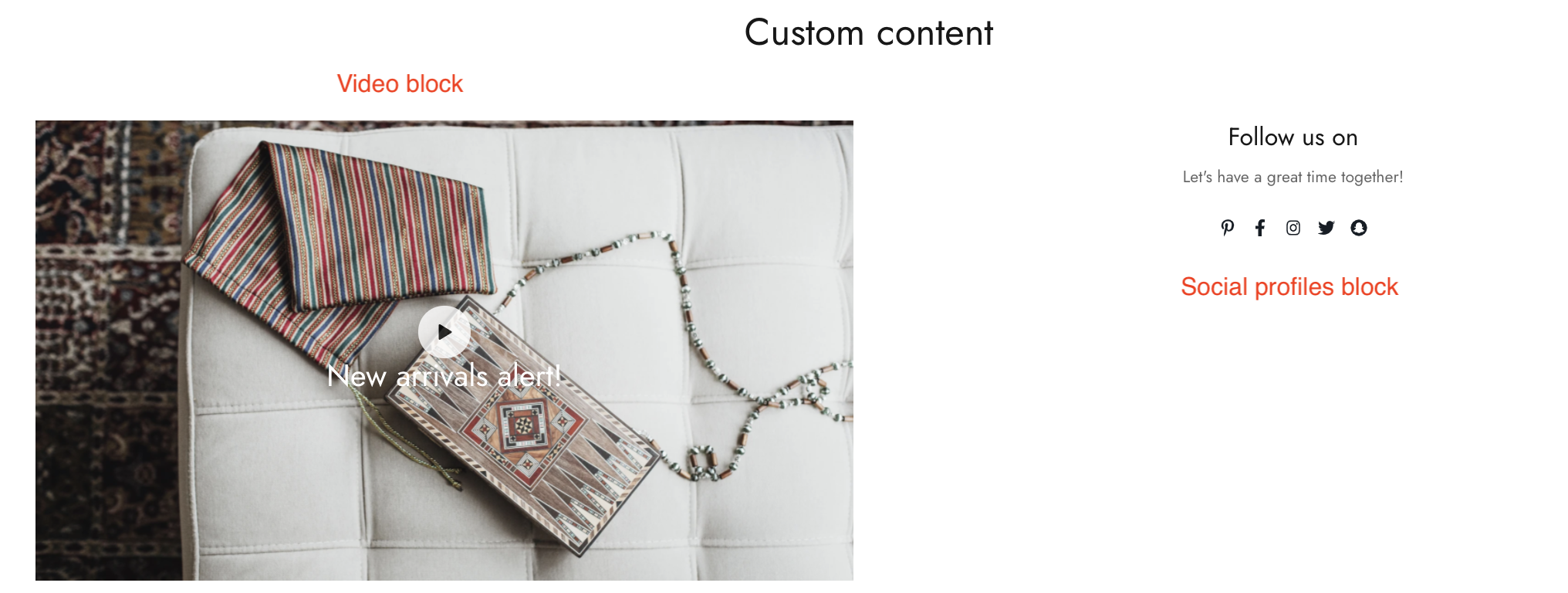
Add a Youtube video link and adjust its ratio. Video image cover can be left blank if yous want to use the video thumbnail.
Use the provided text field to add a suitable heading and change its color and size. Can leave it blank if merchants do not want to display it.
Modify the video button style, size, and video width. Additionally, the video can be played in loop and autoplay when customers visit the site.
Use the provided text fields to add a suitable heading/description. Leave any of the fields blank if you do not want to display them. Control the container width.
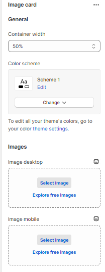
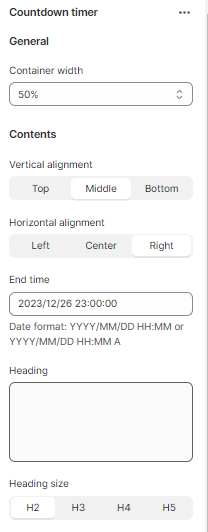
#Image card and Countdown timer blocks
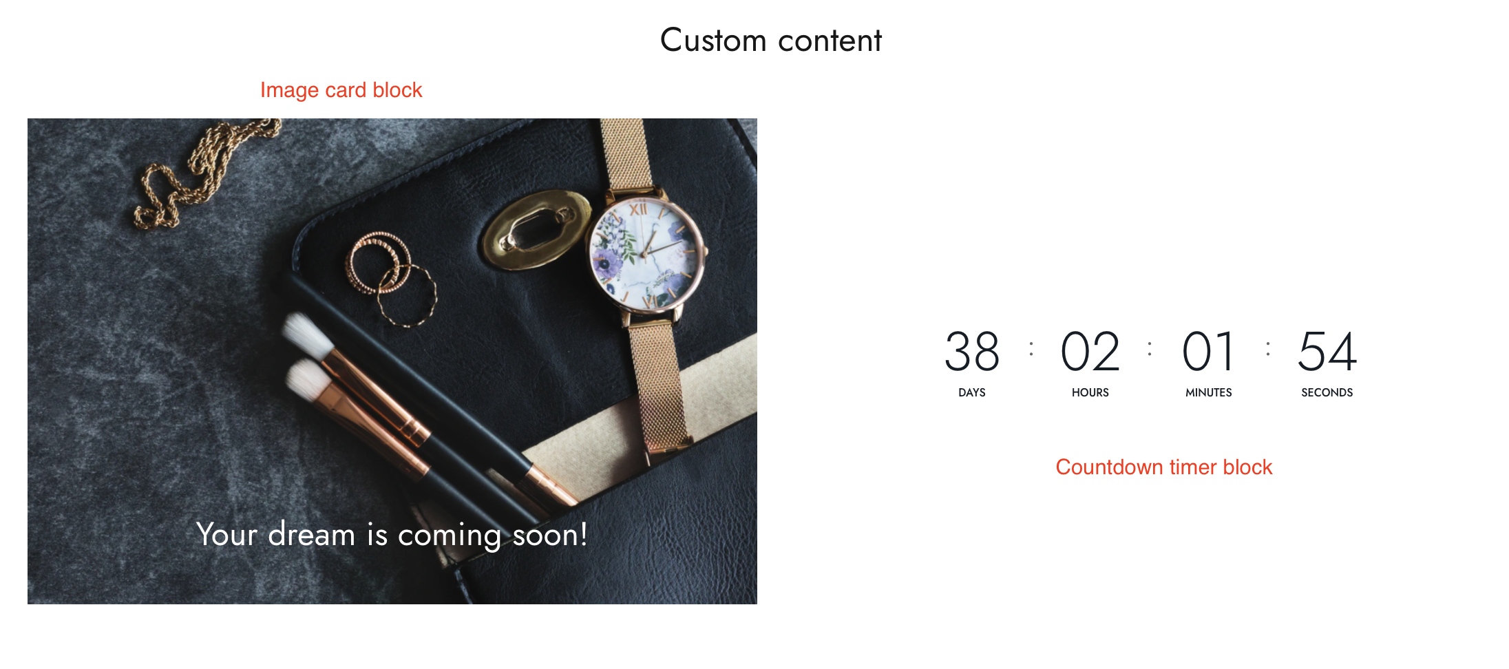
Use the provided text fields to add a suitable heading/subheading/description. Leave any of the fields blanks if you do not want to display them.
Adjust the container width, content position, etc.
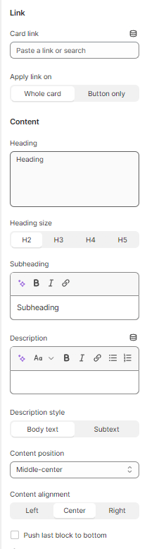
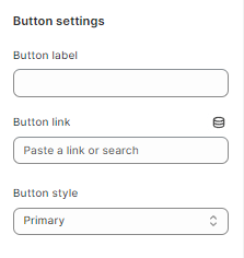
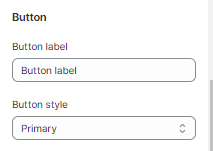
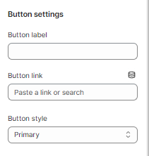
Add a call-to-action button to direct customers to the product detail page. Add a Label then choose a Button style and adjust the Button size.
Adjust the container width, alignment, and end time of the timer.
Add a call-to-action button to direct customers to the product detail page. Add a Label then choose a Button style and adjust the Button size.
#Custom HTML block
You can check the example below on how to display the HTML correctly.
_HOdn0toB.png)