Banner grid
The Banner grids section offers unique ways to showcase your image cards.
Steps:
- In the theme editor (Customize), click Add section
- Select Banner grid 1/2/3 that has the layout your prefer
- Make necessary changes
- Save the settings.
#Section settings
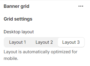
#Grid settings
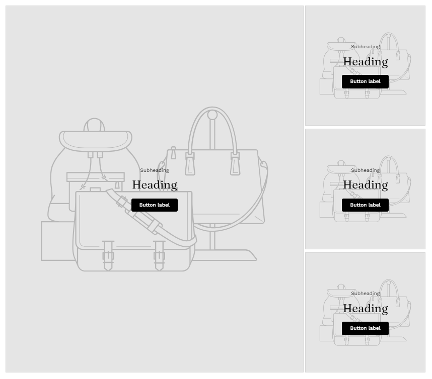
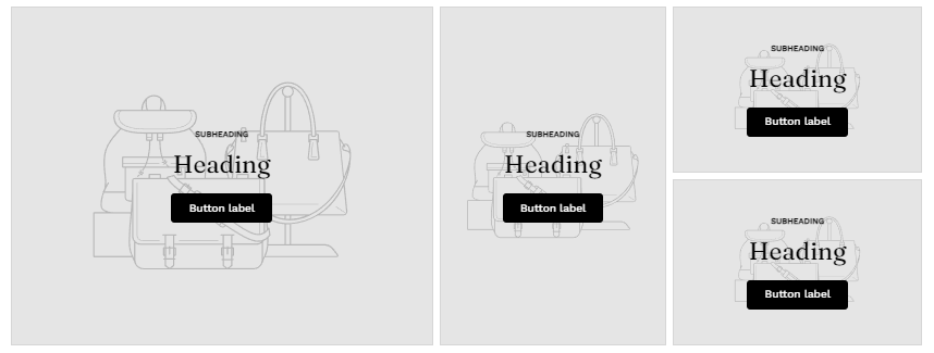
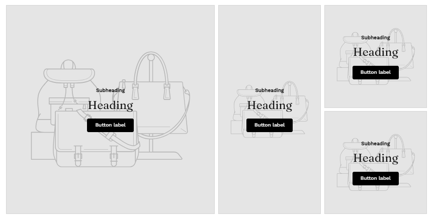
Change the section's layout on Desktop. The layout is automatically optimized for mobile view.
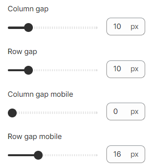
Adjust the gap between columns and rows on desktop and mobile.
#Block settings
A maximum of 4 image cards can be added to the section.
Each block comes with the following settings:
#Image settings
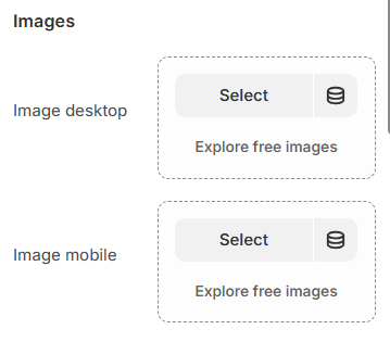
Select an image for your desktop view and mobile view.
#Link settings
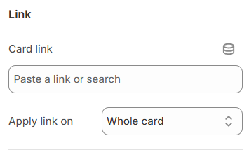
Link your image card with a desired page by selecting from your Shopify pages or pasting the URL.
Determine how the link is applied (on the whole card or the button only).
#Content settings
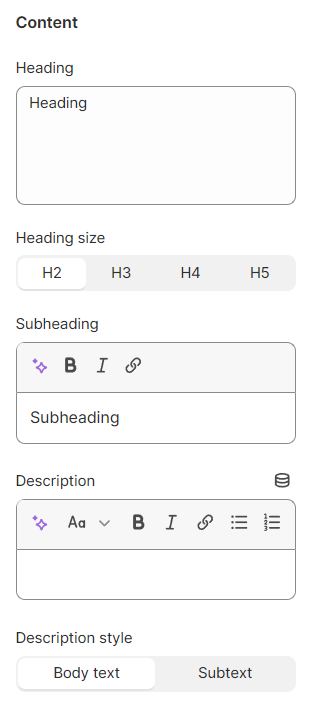
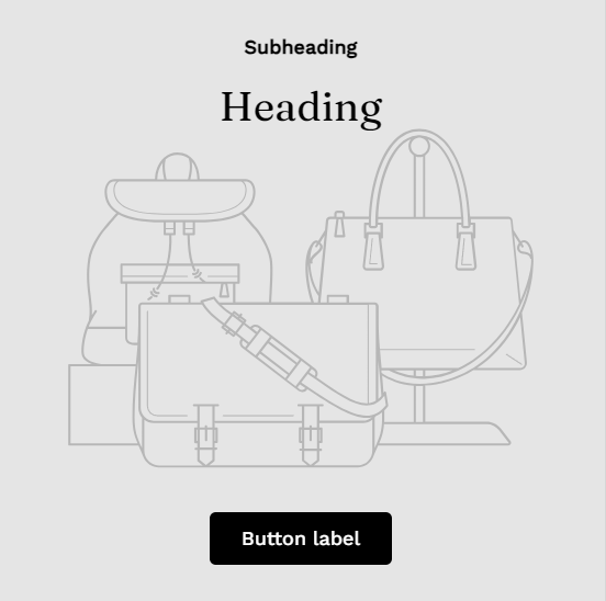
Insert your card's heading, subheading and description. Select the heading size and description style you prefer.
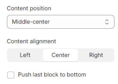
Adjust the content position and content alignment.
Select 'Push last block to bottom' option if you want to separate your card's content and the button.
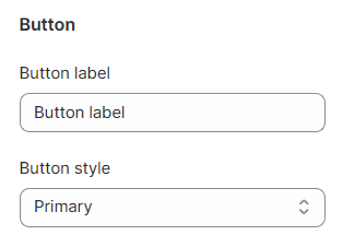
Insert your button label and select the button style.
If you don't want to show the button in the image card, simply leave the label blank.
Last updated