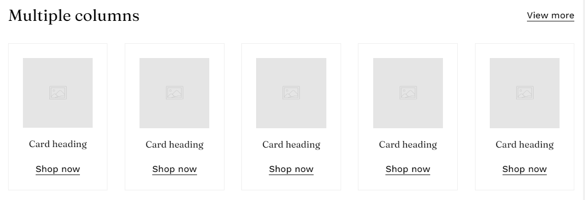
Megamog
Try Megamog freeResourcesOther solutions
  • What is Megamog theme?
  • Changelog
  • Refund policy
  • Support policy
  • Terms of Service
  • Getting started
    • Install Megamog theme
      • Install Megamog in 1-click fast way
      • Install Megamog manually
    • Add Custom code/ CSS correctly
    • Integrate Shopify Review apps
    • Mega menu
    • Purchase code & activation
    • Update Megamog theme
    • FoxHome
  • Build for success series
    • Product page for Beauty store like Kylie Jenner 🔥
    • Landing page for Fashion store like Bremont
  • Page's global sections
    • Announcement bar
    • Age verifier pop-up
    • Header
    • Footer
    • Mobile sticky bar
  • Theme sections
    • Before/ After image slider
    • Blog posts
    • Brand list
    • Collapsible content
    • Collection spotlight
    • Collection list
    • Collection links
    • Countdown timer
    • Custom content
    • Favorite product slider
    • Featured collection
    • Featured product
    • Featured promotion
    • Featured products slider
    • Google Maps
    • Image banner
    • Image with text
    • Instagram
    • Lookbook
    • Newsletter
    • Press
    • Product tabs
    • Recently viewed products
    • Scrolling promotion
    • Slideshow
    • Testimonials
    • Video
    • Video hero
    • Banner grid
    • Multiple columns
    • Store locator
  • Theme settings
    • General settings
    • Layout settings
    • Additional pages
    • Advanced
    • Animation
    • Article card
    • Badges
    • Cart settings
    • Checkout
    • Colors & Color schemes
    • Corner radius
    • Currency format
    • GDPR settings
    • Intergrated apps
    • Integration
    • Pop-up & drawer
    • Product card
    • Product options design
    • Product options swatches
    • Social sharing
    • Search settings
    • Store contact
    • Typography
  • Collections & Products
    • Product page
      • Product template
      • Page sections
        • Breadcrumb
        • Product information
        • Product information tabs
        • Product recommedations
    • Collection page
      • Collection template
      • Collection sections
        • Collection banner
        • Product listing
  • Other pages
    • 404 page
    • Blogs
    • Blog posts
    • Cart & Checkout
    • Password
  • FAQS
    • Add a gift wrap option to my cart
    • Add custom badges to my product card
    • Add recipient fields to my gift card product
    • Add/ Remove Social icons in footer
    • Change the default product order in collection
    • Customize search results
    • Move the collection description to under the product listing
    • Remove the tax-included information in product page
    • Set up local pickup
    • Show Payment icons on the Footer
  • TROUBLESHOOTING
    • Contact form submissions not found
    • Translation apps incompatibility
Powered by GitBook
On this page
  • Section settings
  • Section header
  • Card settings
  • Grid settings
  • Slider settings
  • Mobile settings
  • Block settings
  1. Theme sections

Multiple columns

A way to showcase image cards of the same style in rows

PreviousBanner gridNextStore locator

Last updated 3 months ago

Steps:

  1. In the theme editor (Customize), click Add section

  2. Select Multiple columns

  3. Make necessary changes

  4. Save the settings.

Section settings

Section header

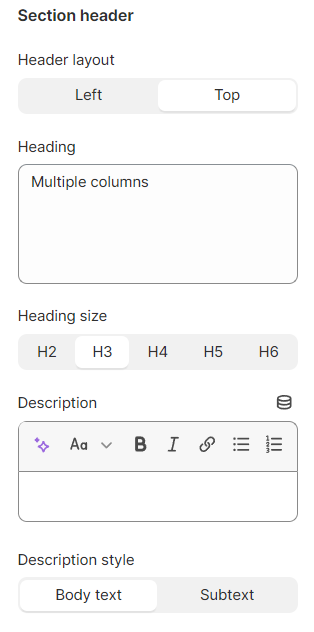
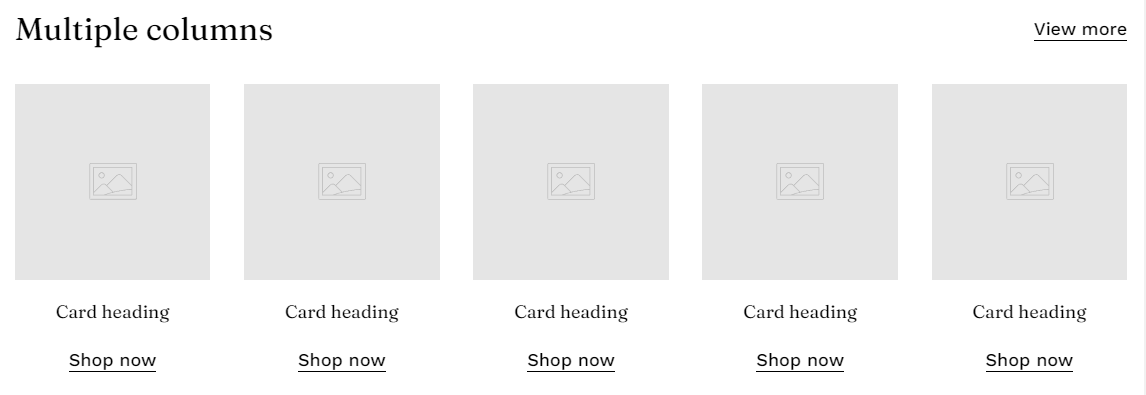
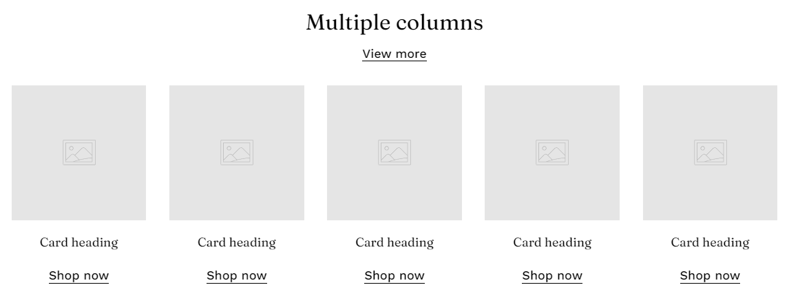
Select the header layout (on the Left of the whole cards or the Top).

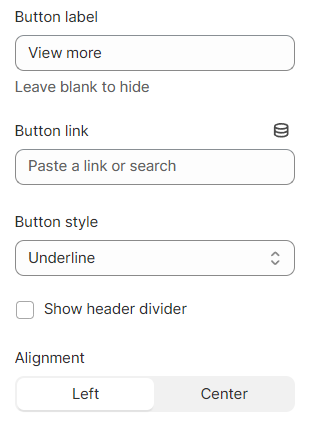
Give the section a heading, description, and a button. Leave any fields blank if you don't want to show them.

You can also set the alignment of your section header's button.
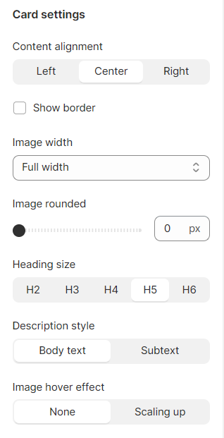
Card settings

  • Cards' content alignment: Left/Center/Right;

  • Show border

  • Image width: Extra small/ Small/ Medium/ Large/ Extra large/ Full width;

  • Image rounded: 0-100 px;

  • Heading size: H2-H6;

  • Description style: Body text/ Sub text;

  • Image hover effect: None/ Scaling up.
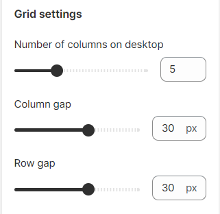
Grid settings

Set the number of columns for desktop view (2-12 columns) and adjust the gap between the columns and rows.
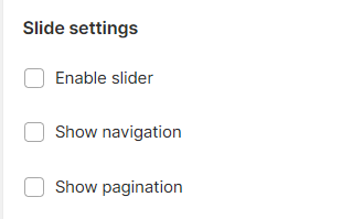
Slider settings

Enable the slider for the section if needed (the number of cards > the number of columns).

Show the navigation and/or pagination to navigate the columns.
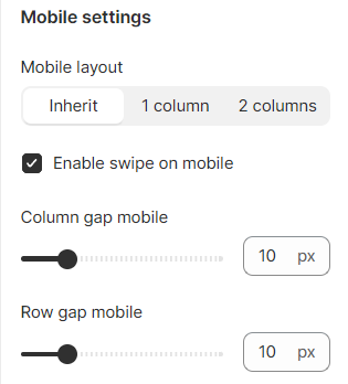
Mobile settings

Set the number of columns on mobile view: Inherit/ 1 column/ 2 columns.

You can also make the section swipeable.

Then, adjust the gap of the columns and rows on mobile (between 0-50px).

Block settings

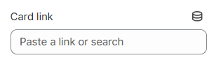
Link your card to your desired page. Visitors will be directed to your attached page when clicking on the image or the button.

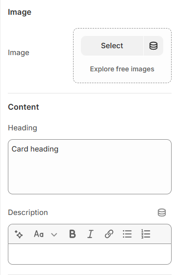
Select an image and insert its content (heading and description).

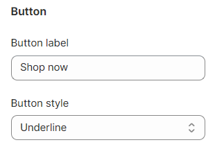
Give your button a label and select the button style.

An example when the option 'Show border' is selected